You are here
History of the NIH Logo
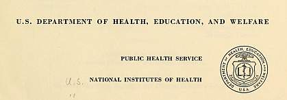
The National Institutes of Health (NIH) dates back to 1887 and began as the laboratory arm of the U.S. Public Health Service (PHS). In its early years, the agency used the PHS seal or logos of the Department of Health, Education, and Welfare (now the Department of Health and Human Services).
1960s

In 1965, a committee appointed by President Johnson was charged with conducting a study of NIH operations. Committee recommendations, set out in a report named for committee chair Dr. Dean E. Wooldridge, called on the NIH to improve communications with the public. As part of the agency’s response, in-house staff took on the development of the first NIH logo. The resulting design was a triangle with rounded sides and the initials "NIH" in the center. Some saw the logo as representing research, treatment and education; others thought it meant searching, serving, and teaching.
1970s

In 1976, NIH began work on an updated logo, one that would reflect the agency’s relationship with grantees and other health institutions. Designers opened the ends of the triangle to resemble glassware used in NIH laboratories and to demonstrate the agency’s openness to the outside. The new mark could be used with or without the spelled out agency name, and it could easily be rendered in color. In November 1969, the new logo premiered as part of the NIH Record masthead. While highly recognizable, the logo, over time, came to be called “the coat hanger logo” and the “beaker logo,” and it served the NIH for three decades. It even made a TV appearance in 2005, when it was included in a hospital scene on NBC’s short-lived, prime time series Medical Investigation, although it appeared upside down.
1980s

NIH also had a logo created especially for the agency’s 1987 centennial. To create the logo, the agency sponsored a design contest in 1984. Several hundred individuals submitted 1,354 entries, according to the NIH Record, which tracked the contest. A Clinical Center nurse won the $500 prize for her design featuring the number 100 with a microscope set within interlocked zeros and the words "A Century of Science for Health National Institutes of Health, 1887-1987" surrounding it.
2012

In May 2012, the NIH began a trans-NIH effort to strengthen the NIH’s identity behind a unified, letters-only logo to replace dozens of institute, center, and office logos that proliferated over the years. The resulting new logo made its debut at the agency’s high-profile “Celebration of Science” event, held in September 2012. The design focused on a single arrow indicating forward movement and advancement. The arrow pointed to National Institutes of Health or individual IC names, each with its own characteristic color or a central blue and gray scheme. In 2015, the logo became a hit with visiting kids participating in the NIH’s popular Take Your Child to Work Day activities when it was printed in 3D.
2013

In August 2013, NIH trademarked the phrase “NIH . . . Turning Discovery Into Health,” registered as 4,388,184 by the U.S. Patent and Trademark Office. The slogan, trademarked to promote “federally funded biomedical and scientific research on human health and human diseases,” is widely used today and also appears as a companion design to the main NIH logo.
The current logo and tagline continue to provide the NIH with a unique, instantly recognizable, and fortified identify that conveys the mission and impact of the NIH.
More from the NIH Record
- Report on NIH Is Reassuring and Challenging — LBJ (1965)
- NIH Record Centennial Logo contest (call for entries, September 1984)
- NIH Record coverage, Centennial Logo contest (photo caption, November 1984)
- NIH Centennial Observance (April 1986)
- NIH Centennial Observance (October 1986)
- Employees Invited To Design New NIH Logo (1988)
- Prime-Time Television Show Offers NIH Opportunity (2005)
- Communication Effort Emphasizes NIH Identity (2013)
- NIH Celebrates Take Your Child to Work, Earth Day (2015)
This page last reviewed on August 28, 2019
