. 2023 Dec;624(7992):586-592.
doi: 10.1038/s41586-023-06757-3. Epub 2023 Nov 29.

Human mobility networks reveal increased segregation in large cities

Affiliations

Human mobility networks reveal increased segregation in large cities

Hamed Nilforoshan et al. Nature. 2023 Dec.

Abstract

A long-standing expectation is that large, dense and cosmopolitan areas support socioeconomic mixing and exposure among diverse individuals1-6. Assessing this hypothesis has been difficult because previous measures of socioeconomic mixing have relied on static residential housing data rather than real-life exposures among people at work, in places of leisure and in home neighbourhoods7,8. Here we develop a measure of exposure segregation that captures the socioeconomic diversity of these everyday encounters. Using mobile phone mobility data to represent 1.6 billion real-world exposures among 9.6 million people in the United States, we measure exposure segregation across 382 metropolitan statistical areas (MSAs) and 2,829 counties. We find that exposure segregation is 67% higher in the ten largest MSAs than in small MSAs with fewer than 100,000 residents. This means that, contrary to expectations, residents of large cosmopolitan areas have less exposure to a socioeconomically diverse range of individuals. Second, we find that the increased socioeconomic segregation in large cities arises because they offer a greater choice of differentiated spaces targeted to specific socioeconomic groups. Third, we find that this segregation-increasing effect is countered when a city's hubs (such as shopping centres) are positioned to bridge diverse neighbourhoods and therefore attract people of all socioeconomic statuses. Our findings challenge a long-standing conjecture in human geography and highlight how urban design can both prevent and facilitate encounters among diverse individuals.


Conflict of interest statement

The authors declare no competing interests.

Figures

Fig. 1
Fig. 1. Exposure segregation captures the likelihood of exposure between people of different socioeconomic backgrounds and reveals increased segregation in highly populated metropolitan areas.
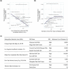
a, For 9.6 million individuals (mobile phones), we infer their SES (rent or rent equivalent) from their home address on the basis of their location at night (see the ‘Inferring home location’ section of the Methods). We then capture path-crossing events (that is, being at the same location at the same time) to identify pairs of individuals who were exposed to each other (see the ‘Constructing exposure network’ section of the Methods). b, The nationwide network of 1.6 billion exposures spans 2,829 counties and 382 MSAs. Our exposure network contrasts with a conventional measure of economic segregation, the neighbourhood sorting index, which assumes that individuals are exposed to other residents only within their home census tract. Graphs pertain to a sample community of 50 individuals residing in ten census tracts in San Francisco, CA. Nodes represent individuals; edges represent exposures. This sample illustrates the importance of capturing cross-tract exposures, which are undetected by conventional segregation measures. c, For each geographical region (either MSA or county), we estimate exposure segregation, defined as the correlation between an individual’s SES and the mean SES of those with whom they cross paths; 1 signifies perfect segregation and 0 signifies no segregation. This definition is equivalent to the conventional neighbourhood sorting index, but with the key difference that it leverages real-life exposure from mobility data instead of synthetic exposures from individuals grouped by census tracts. For two MSAs, we show the raw data; each point represents one individual. San Francisco–Oakland–Hayward, CA, is 2.2× more segregated (P < 10−4, 95% CI = 1.6–2.8×; two-sided bootstrap; see the ‘Hypothesis testing’ section of the Methods) than Napa, CA. d,e, Contrary to the hypothesis that highly populated metropolitan areas support diverse exposures and socioeconomic mixing, we find that larger MSAs are more segregated (d). Exposure segregation presented as a function of population size; each dot represents one MSA; the purple line indicates the LOWESS fit. An upward slope reveals that urbanization is associated with higher exposure segregation (Spearman correlation = 0.62, n = 382, P < 10−4; two-sided Student’s t-test; see the ‘Hypothesis testing’ section of the Methods). The top ten largest MSAs by population size are 67% more segregated (P < 10−4, 95% CI = 49–87%; two-sided bootstrap; see the ‘Hypothesis testing’ section of the Methods) than small MSAs with fewer than 100,000 residents. Associations are robust to controlling for potential confounding factors and are similar for population density and exposure segregation (Extended Data Table 1 and Supplementary Table 7). e, Exposure segregation across the 2,829 US counties. The analysis was limited to counties with at least 50 individuals present in the dataset. Exposure segregation varies substantially across counties in the United States. Moreover, as with MSA-level segregation, county-level exposure segregation is also positively associated with both population size and population density (Extended Data Fig. 4).
Fig. 2
Fig. 2. Exploring the dynamics of exposure segregation reveals that socioeconomic differentiation of spaces accounts for increased segregation in large cities.
a, Each point represents the segregation estimate in one of the n = 382 MSAs; the vertical coloured lines represent the median across MSAs. Top, exposure segregation is 38% lower (P < 10−4, 95% CI = 37–41%; two-sided bootstrap; see the ‘Hypothesis testing’ section of the Methods) than the conventional segregation measure—the neighbourhood sorting index. Bottom, a breakdown of exposure segregation into its component parts. Exposures in which both people are within their home census tract (green) are most segregated, reflecting the homophily effect in which people preferentially encounter those of a similar SES in their home tracts. Out-of-tract exposures (orange and red) are less segregated, reflecting the visitor effect in which entering other tracts exposes individuals to economically diverse individuals. As a small minority (2.4%, 95% CI = 2.4–2.4%; two-sided bootstrap; see the ‘Hypothesis testing’ section of the Methods) of exposures happen within the home tract, the visitor effect dominates the homophily effect and exposure segregation is therefore lower than the conventional neighbourhood sorting index. b,c, Exposure segregation varies by tie strength and location type. Each point represents segregation in one of n = 382 MSAs using only exposure pairs occurring with a specific tie strength (b) or in a given location type (c). The boxes indicate the interquartile range across MSAs. Segregation increases with tie strength and is especially high for the strongest ties (5+ exposures; median exposure segregation, 0.57). Segregation is highest at golf courses and country clubs (median exposure segregation, 0.42) and lowest at performing arts centres (median exposure segregation, 0.16) and stadiums (median exposure segregation, 0.17). df, A case study of full-service restaurants illustrates the relationship between urbanization and exposure segregation. Highly populated metropolitan areas are more segregated not only because they offer a wider choice of venues but also because these venues are more socioeconomically differentiated. d, Larger MSAs have more restaurants within 10 km of the average resident, giving residents more options to self-segregate. e, Moreover, restaurants in larger MSAs vary more in the median SES of their visitors, meaning that a greater choice of socioeconomically differentiated restaurants is offered. The coefficient of variation across restaurant SES (that is, the median SES of a restaurant’s visitors) in the ten largest MSAs is 63% more (P < 10−4, 95% CI = 37–100%; two-sided bootstrap; see the ‘Hypothesis testing’ section of the Methods) than the coefficient of variation in small MSAs (with fewer than 100,000 residents). f, Consequently, exposure segregation within restaurants is higher in larger MSAs. These relationships are also detectable at the scale of city hubs (defined as higher-level clusters of POIs such as plazas and shopping centres) as well as at the neighbourhood level (Extended Data Figs. 5 and 6).
Fig. 3
Fig. 3. Exposure segregation is lower when frequently visited hubs bridge socioeconomically diverse neighbourhoods.
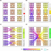
a, We developed an index (see the ‘Bridging index’ section of the Methods) to quantify the extent to which highly visited hubs bridge socioeconomically diverse neighbourhoods. The metric was constructed by clustering homes by the nearest hub, then measuring the within-cluster diversity of SES. Two plots illustrate that the bridging index is distinct from conventional measures of residential segregation such as the neighbourhood sorting index. The bridging index ranges from 0 (no bridging; top) to 1 (perfect bridging; bottom), while residential segregation is constant (high-SES and low-SES individuals are highly segregated by census tract, denoted by purple and yellow bounding boxes). We compute our bridging index with hubs defined as commercial centres (such as shopping centres and plazas) because the majority (56.9%, 95% CI = 56.9–56.9%; bootstrapping; see the ‘Hypothesis testing’ section of the Methods) of exposures across all 382 MSAs occur in close proximity (within 1 km) to a commercial centre, even though only 2.5% of land area is within 1 km of a commercial centre. b, Our bridging index strongly predicts exposure segregation (Spearman correlation = −0.78, n = 382, P < 10−4; two-sided Student’s t-test; see the ‘Hypothesis testing’ section of the Methods). The top ten MSAs with the highest bridging index are 53.1% less segregated (P < 10−4, 95% CI = 44–60%; two-sided bootstrap; see the ‘Hypothesis testing’ section of the Methods) than the ten MSAs with the lowest bridging index. The bridging index predicts segregation more accurately (P < 10−4; two-sided Steiger’s Z-test; see the ‘Hypothesis testing’ section of the Methods) than population size, SES inequality, neighbourhood sorting index and race, and is significantly associated (P < 10−4; two-sided Student’s t-test; see the ‘Hypothesis testing’ section of the Methods) with exposure segregation after controlling for these variables and other potential confounding factors (Extended Data Tables 2 and 3). c,d, A case study of Fayetteville, North Carolina, an MSA with low exposure segregation (21st percentile) despite having an above-median population size (64th percentile) and income inequality (60th percentile). c, Exposure heat map of Fayetteville; all visually discernible hubs are associated with one or more commercial centres. d, Hubs are located in accessible proximity to both high-SES and low-SES census tracts (bridging index = 0.90, 62nd percentile), leading to diverse exposures. An illustrative example of one hub (Highland Center) in Fayetteville and a random sample of ten exposures occurring inside of it. The home icons demarcate home locations of individuals (up to 100 m of random noise was added for anonymity); the colours denote individual and mean tract SES. The maps in c and d were generated using OpenStreetMap data.
Extended Data Fig. 1
Extended Data Fig. 1. Unbiased estimates of exposure segregation using our mixed model compared with (downwardly biased) naive estimates using a sample Pearson correlation.
We first compute a gold standard estimate of exposure segregation. We do so by eliminating data sparsity (that is, restricting our analysis to individuals who crossed paths with at least 500 other people) and computing the ‘naive’ Pearson correlation coefficient between each individual’s SES and the mean SES of those with whom they crossed paths (for each MSA). Next, for each person, we randomly downsample their path-crossings to 5, 10, 50, 100, and 200 (x-axis). On this noisy downsampled data, we estimate exposure segregation using both our mixed model (orange) and using the ‘naive’ Pearson correlation (blue). The y axis shows the ratio of these new estimates to the gold standard for each MSA. This analysis reveals that our mixed model enables us to obtain unbiased estimates of exposure segregation, whereas the ‘naive’ Pearson correlation is downwardly biased when observed path-crossings are sparse.
Extended Data Fig. 2
Extended Data Fig. 2. This studies’ exposure network predicts population-scale friendship formation and upward economic mobility outcomes.
We measure the external validity of our definition of exposure by linking our exposure network to outcomes across two gold-standard, large-scale, datasets. We find that at the zip code, county, and MSA-level, our exposure network mirrors population-scale outcomes resulting from dynamic human processes: (a-b) the Facebook social connectedness index measures the relative probability of a Facebook friendship link between a given Facebook user in location i and a given user in location j. FB social connectedness index has been used to study social segregation, and has also been linked to economic, and public health outcomes. We reproduce the social connectedness index using our exposure network (#ExposurePairsi,j#Individualsi#Individualsj) at the county (a) and zip code (b) level, and find strong correlations across county pairs (Spearman Correlation 0.85, N = 121, 595, p < 10−4; Two-sided Student’s t-test; see the ‘Hypothesis testing’ section of the Methods) and zip code pairs (Spearman Correlation 0.73, N = 1, 053, 539, p < 10−4; Two-sided Student’s t-test; see the ‘Hypothesis testing’ section of the Methods). Furthermore, we find that our exposure network is a stronger predictor of friendship formation than distance (Supplementary Tables 23-24). (c-d) The Chetty et al. intergenerational mobility dataset quantifies upward economic mobility from federal income tax records for each MSA as the mean income rank of children with parents in the bottom half of the income distribution. We find that exposure segregation at the MSA-level (c) correlates to (absolute) upward economic mobility (Spearman Correlation -0.37, N = 379, p < 10−4; Two-sided Student’s t-test; see the ‘Hypothesis testing’ section of the Methods), and does so significantly more strongly (p < 10−4; Two-sided Steiger’s Z-test; see the ‘Hypothesis testing’ section of the Methods) than (d) the conventional segregation measure, neighbourhood sorting index (Spearman Correlation -0.12, N = 379, p < 0.05).
Extended Data Fig. 3
Extended Data Fig. 3. Understanding why exposure segregation varies significantly across leisure sites.
We identify three primary facets of socioeconomic differentiation between POIs which explain the heterogeneous segregation levels of different leisure POIs (Fig. 2c): (a) localization, (b) quantity, and (c) stratification. (a) Localization (average travel distance to the nearest POI of a category) strongly predicts segregation across all POI categories (Spearman Correlation -0.75, N = 17, p < 0.001 Two-sided Student’s t-test; see the ‘Hypothesis testing’ section of the Methods). POIs which are more locally embedded into neighbourhoods (e.g., religious organizations) are more segregated than POIs which serve multiple neighbourhoods (e.g., stadiums). (b) The quantity of POIs also explains segregation (Spearman Correlation 0.69, N = 17, p < 0.01; Two-sided Student’s t-test; see the ‘Hypothesis testing’ section of the Methods). Leisure activities with more options (e.g., restaurants) have differentiated venues catering to a specific socioeconomic groups (e.g., Michelin-star restaurants) compared to POIs which are small in number and cater to the overall city (e.g., stadiums). (c) Golf courses and country clubs (golf clubs) are an anomaly in that they have a small number of unlocalized POIs, but are highly segregated. We conduct a case study of the top and bottom golf clubs by mean visitor SES in five of the ten largest MSAs. We find that the high segregation of golf clubs is due to extreme stratification between venues; for instance the minimum cost to play at the high-SES golf course in Miami, FL is 11717 × higher than at the lowest-SES golf course. By contrast, the average cost of a MacDonalds Big Mac ($5.65) is only 63 × higher than the average cost of a Michelin 3-star restaurant ($357). Overall, these findings foreshadow the bridging index, which captures POI localization, quantity, and stratification (Extended Data Fig. 8).
Extended Data Fig. 4
Extended Data Fig. 4. Large, dense counties are more segregated.
We compute exposure segregation across 2,829 USA counties (90% of the counties in the USA), excluding counties in which there are less than 50 individuals in our dataset. We find that at the county-level, exposure segregation is also positively correlated with population size (Spearman Correlation 0.45, N = 2829, p < 10−4; Two-sided Student’s t-test; see the ‘Hypothesis testing’ section of the Methods) and population density (Spearman Correlation 0.45, N = 2829, p < 10−4; Two-sided Student’s t-test; see the ‘Hypothesis testing’ section of the Methods). These correlations reveal that the association between large, dense urban areas and exposure segregation (Fig. 1d) is not an artifact of city boundaries, and may in fact be an emergent property from dynamics of individuals residing in highly populated, dense geographic areas, which persists across multiple scales of granularity.
Extended Data Fig. 5
Extended Data Fig. 5. At higher levels of scale, spaces in large cities are more differentiated and consequently more segregated:  hubs.
(a-c) We conduct an analysis for a city’s hubs analogous to that for restaurants in Fig. 3c-e for a city’s hubs. We find that higher segregation is driven by an increase in highly differentiated choice of hubs in large cities: (a) Larger MSAs have more hubs, giving residents more options to self-segregate (Spearman Correlation 0.81, N = 382, p < 10−4; Two-sided Student’s t-test; see the ‘Hypothesis testing’ section of the Methods). (b) Consequently, hubs in larger MSAs vary more in terms of the mean SES of their visitors (Spearman Correlation 0.58, N = 382, p < 10−4; Two-sided Student’s t-test; see the ‘Hypothesis testing’ section of the Methods) and as a result, (c) exposure segregation within hubs is higher in larger MSAs (Spearman Correlation 0.64, N = 382, p < 10−4; Two-sided Student’s t-test; see the ‘Hypothesis testing’ section of the Methods). Overall, this analysis suggests that across multiple levels of scale, large cities offer a greater choice of differentiated spaces targeted to specific socioeconomic groups, promoting everyday segregation in exposures.
Extended Data Fig. 6
Extended Data Fig. 6. At higher levels of scale, spaces in large cities are more differentiated and consequently segregated: home neighbourhoods.
(a-c) Similar to the analysis for restaurants in Fig. 3c-e, we find that higher segregation is driven by an increase in highly differentiated choice of neighbourhoods in large cities: (a) Larger MSAs have more census tracts, giving residents more options to self-segregate (Spearman Correlation 0.97, N = 382, p < 10−4; Two-sided Student’s t-test; see the ‘Hypothesis testing’ section of the Methods). (b) Consequently, census tracts in larger MSAs vary more in terms of the mean SES of their residents (Spearman Correlation 0.58, N = 382, p < 10−4; Two-sided Student’s t-test; see the ‘Hypothesis testing’ section of the Methods) and as a result, (c) both residential segregation (neighbourhood sorting index) and exposure segregation are higher (Spearman Correlations 0.52 and 0.35, N = 382, p < 10−4 and p < 10−4; Two-sided Student’s t-tests; see the ‘Hypothesis testing’ section of the Methods). However, (c) also shows that home tract exposure segregation (green series) rises more slowly with population than conventional segregation (blue series), suggesting that within-home-tract homophily, which increases exposure segregation but not conventional segregation, is not more pronounced in large MSAs. Substantiating this, (d) shows that when home tract exposure segregation is computed using an alternate SES measure so it captures only within-home-tract-homophily, it is not higher in large MSAs (Spearman Correlation -0.01, N = 382, p > 0.1; Two-sided Student’s t-test; see the ‘Hypothesis testing’ section of the Methods). The alternative SES measure is computed by subtracting the mean SES in each census tract. Overall, this analysis suggests that the higher home tract segregation in large MSAs is driven by people’s greater choice of neighbourhoods of varying SES in which to live, but not by a greater tendency to cross paths homophilously within their own neighbourhood.
Extended Data Fig. 7
Extended Data Fig. 7. Computing bridging index.
Illustration of our analytical pipeline for calculating the bridging index. (a) Bridging index is computed from the locations and number of POIs in the MSA which are expected to be hubs of exposure (that is, frequently visited POIs), as well the locations and SES values of all homes within MSA boundaries. We intentionally develop bridging index without using mobility data, with the intention of identifying a modifiable extrinsic aspect of a city that can be intervened on to impact mobility patterns and decrease exposure segregation. (b) In order, we (1) cluster all homes by nearest hub (using straight line distance from home to hub), partitioning all homes into K clusters, where K is the number of hubs in the MSA (2) compute the weighted average economic diversity (i.e., Gini index) of the clusters, normalized by the overall economic diversity of the MSA to allow for comparisons between different MSAs of varying baseline levels of economic diversity (Extended Data Table 1). (c) The graphical definition of Gini index is provided, which is a standard measure of economic dispersion. Results are robust to the definition of economic diversity, and hold true when using variance in SES instead of Gini index (Supplementary Fig. S14).
Extended Data Fig. 8
Extended Data Fig. 8. Understanding the determinants of the bridging index.
The bridging index is a single metric which captures three important factors of built environment (see Supplementary Fig. S13 for contributions of these factors to explaining exposure segregation): (1) The locations of hubs—if hubs are located in between diverse neighbourhoods, the bridging index will be high as hubs will bridge together diverse individuals. (2) The numberof hubs—as number of hubs decreases, bridging index increases (e.g if there is only 1 hub in a city, bridging index will be 1.0 as all individuals are unified by a single hub) (3) Residential segregation, i.e., the locations of homes and their associated SES—as residential segregation decreases we can expect that individuals residing near each hub will be more diverse. This figure builds intuition for how the bridging index may vary for a single simulated city, consisting of highly segregated neighbourhoods. We hold residential segregation (3) constant, and vary the location (1) and number (2) of hubs across panels (a), (b), (c), (d), in order of increasing bridging index. Note that the bridging index in (c) is substantially higher than the bridging index in (b), because hubs in (c) are better positioned to bridge diverse neighbourhoods—even though the number of hubs remains constant.

Similar articles

Cited by

References

    1. Jacobs, J. The Death and Life of Great American Cities (Random House, 1961).
    1. Wirth, L. Urbanism as a way of life. Am. J. Sociol.44, 1–24 (1938).10.1086/217913 - DOI
    1. Milgram, S. The experience of living in cities. Science167, 1461–1468 (1970). 10.1126/science.167.3924.1461 - DOI - PubMed
    1. Derex, M., Beugin, M.-P., Godelle, B. & Raymond, M. Experimental evidence for the influence of group size on cultural complexity. Nature503, 389–391 (2013). 10.1038/nature12774 - DOI - PubMed
    1. Gomez-Lievano, A., Patterson-Lomba, O. & Hausmann, R. Explaining the prevalence, scaling and variance of urban phenomena. Nat. Hum. Behav.1, 0012 (2016).10.1038/s41562-016-0012 - DOI

MeSH terms

LinkOut - more resources