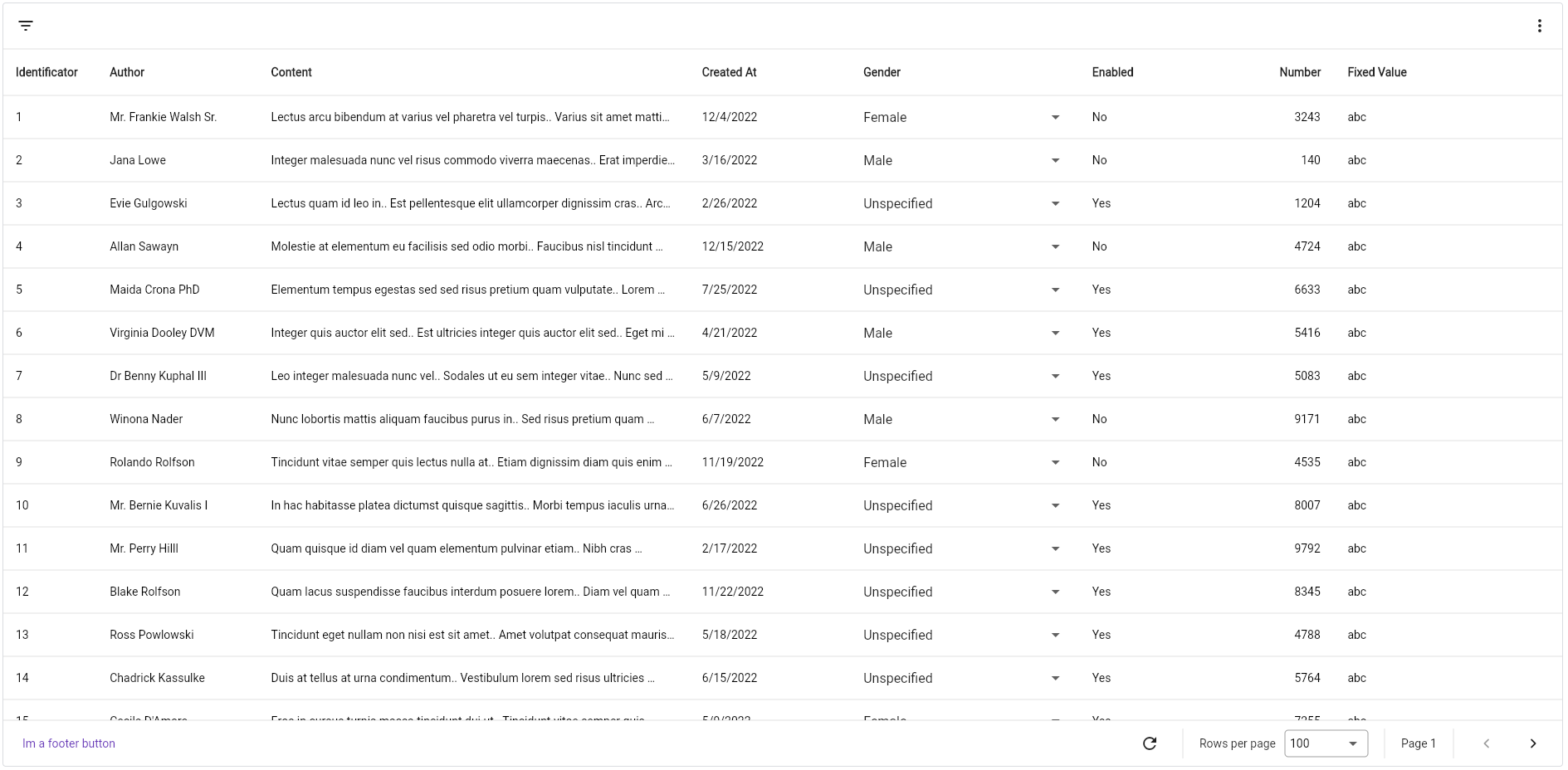
Completely customisable data table which supports cursor and offset pagination out-of-the-box. It's written from scratch, no dependency from Flutter's DataTable nor Table.
Designed to follow Google's Material You style.
- Row updating on demand, preventing you to create other views for updating fields of a class. Now you can update an object from the table directly.
- Cursor and offset pagination, you decide how to paginate your data.
- Filtering by date, text, number, whatever you want!
- Sorting by predefined columns
Everything you need is a PagedDataTable<TKey, TValue> widget, which accepts two generic arguments, TKey and TValue, the type of object you will use as paging key and the type of object you will be showing in the table.
Create a new PagedDataTable<TKey, TResultId, TResult> and fill the required parameters
TKeyrepresents the type of key you use as page indicator. For example, if you use cursor pagination, it will be aString.TResultIdis the type of the property yourTResulthas as primary key.TResultis the type of object you are showing.
Both
TKeyandTResultIdmust extendsComparable.
PagedDataTable<String, String, User>(
    fetchPage: (pageToken, pageSize, sortBy, filtering) async {
        return MyRepository.getUsers(
            pageToken: pageToken,
            limit: pageSize,
            sortByFieldName: sortBy?.columnId,
            byName: filtering.valueOrNullAs<String>("userName"),
            byGender: filtering.valueOrNullAs<Gender>("gender")
        );
    },
    idGetter: (user) => user.id,
    initialPage: "",
    columns: [],
)Every column inherits the base class BaseTableColumn<T>, being T the same as TValue when creating the widget. The most basic column you can create is TableColumn<T>, suitable for most cases if you only want to display data.
TableColumn(
    title: "User Name",
    cellBuilder: (item) => Text(item.userName)
)What if you want to specify a different size for the column? No problem! Every BaseTableColumn<T> comes with a double property called sizeFactor, which you can use to modify its width. It defaults to .1, so, if you dont configure any of them, all your columns will take 10% of the available width. If you explicitly set it to null, the table will distribute the left width between all columns with sizeFactor: null.
NOTE: when specifying
sizeFactor, keep in mind that the sum of all you column'ssizeFactorcannot exceed 1, because it would take more space that its allowed to.
If you will display a number of a column, be sure to set isNumberic to true, so it will be displayed aligned to the right.
If you want your users to be able to sort the resultset based on a column, set sortable to true and specify an id for the table. That is the id you will be receiving in the sortBy argument in the fetchPage callback.
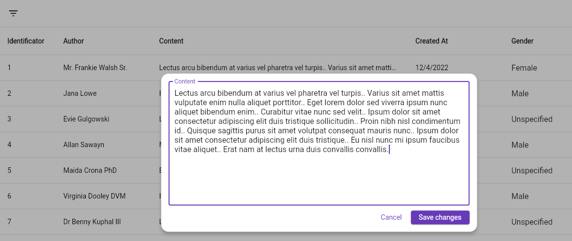
DropdownTableColumn<TType, TValue>renders a dropdown in the cell, useful for updating enum fields.TTypeis the same asTValuewhen creating thePagedDataTableandTValueis the type of items the dropdown will be displaying.TextTableColumn<TType>display text likeTableColumn, but when you double-click it, a text field will be displayed, allowing you to edit its content and save on enter.LargeTextTableColumn<TType>acts likeTextTableColumn, but when you double-click it, an overlay is shown with a multiline text field.If you need more, you always can create your own column.
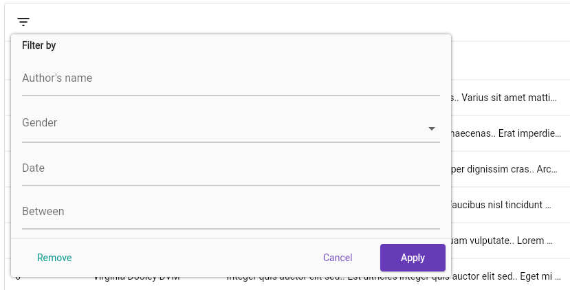
Filters allows your users to, well, filter your dataset. It's rendered like a dialog. To get started, define them in the PagedDataTable widget:
PagedDataTable<String, String, User>(
    ...
    filters: [
        TextTableFilter(
            id: "userName",
            title: "User's name",
            chipFormatter: (text) => "By $text"
        )
    ]
)
Every filter type requires an id, a title and a chipFormatter. You will use the id in the fetchPage callback, from the filtering parameter. title is the label of the field when displaying the filter popup, and chipFormatter is how it will be shown in the filter bar after applying it.
TextTableFilterallows to filter by raw text, it renders a TextField.DropdownTableFilter<TValue>allows selecting the filter value in a Dropdown, beingTValuethe type of items the Dropdown will be holding.DatePickerTableFilterrenders a TextField that opens aDateTimePickerwhen clicked.DateRangePickerTableFilterworks the same asDatePickerTableFilterbut forDateTimeRange.If you need more, you always can create your own filter
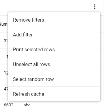
You can display a popup menu at the top right corner:
PagedDataTable<String, String, User>(
    ...
    menu: PagedDataTableFilterBarMenu(
        items: [
            FilterMenuItem(
                title: Text("Print hello world"),
                onTap: () => print("hello world")
            ),
            FilterMenuDivider(),
            FilterMenuItemBuilder(
                builder: (context) => ListTile(title: Text("My custom item"))
            )
        ]
    )
)If you want your users to be able to select rows:
PagedDataTable<String, String, User>(
    ...
    rowsSelectable: true
)
This will display a checkbox in every row that allows the user to select the row.
You can render custom widgets in the space left in the table's header and footer. Also, you can configure aspects of the table with the configuration field.
PagedDataTable<String, String, User>(
    ...
    footer: TextButton(),
    header: Row(),
    configuration: PagedDataTableConfigurationData()
)
The
PagedDataTableConfigurationDatais well documented, so you can check it out while working.
By using a PagedDataTableController<TKey, TResultId, TResult> (being TKey, TResultId and TResult the same as the PagedDataTable widget) you can control the data table programatically. It allows you to:
refresh()the entire table, clearing the cache and fetching from source.setFilter(String id, dynamic value)apply a filterremoveFilter(String id)remove a filterremoveFilters()remove all filtersgetSelectedRows()returns aList<TResult>with the selected rows.unselectAllRows()unselects all selected rows.selectAllRows()selects all the rows.unselectRow(TResultId itemId)unselects the row whose id isitemId.selectRow(TResultId itemId)selects the row whose id isitemId.modifyRowValue(TResultId itemId, void Function(TResult item) update)allows to modify a row's value by applyingupdateto the cached value.refreshRow(TResultId itemId)refresh a row to reflect the changes made to the object its displaying (if it's not a deep copy.)
You can configure every PagedDataTable widget by providing a PagedDataTableTheme to your
widget tree, or configure individual widgets by setting the theme property to the PagedDataTable you want to configure.
Every property in the PagedDataTableThemeData is well documented.
If you want to make a custom column, that is not editable, extend the BaseTableColumn<TType> class and render you widget in the buildCell method. It gives you the item that is going to be displayed and the index of the row.
In the other hand, if you want your new column to be editable, extend the EditableTableColumn<TType, TValue> class. TType is the type of item you are displaying, and TValue the value type that is going to be modified. It gives you the same buildCell method but when creating editable columns, a setter and a getter methods are needed. The getter only retrieves the value to edit, and setter is responsible of updating that value. It can be a Future if you need to perform any network operation, and must return a boolean indicating the status of the operation. Returning true will update the cell's value, otherwise, it will remain the same, as it's interpreted that the operation failed.
To create your own filter, extend the TableFilter<TValue> class, with TValue being the type the filter will handle. Again, it gives you a method called buildPicker(BuildContext, TableFilterState>, used to build the picker field in the popup dialog. TableFilterState is used to report changes in the field, for example, take a look at the TextTableFilter's source:
@override
Widget buildPicker(BuildContext context, TableFilterState state) {
    return TextFormField(
      decoration: decoration ?? InputDecoration(
        labelText: title
      ),
      initialValue: state.value,
      onSaved: (newValue) {
        if(newValue != null && newValue.isNotEmpty) {
          state.value = newValue; // here we are notifying about a new value in the filter
        }
      },
    );
}At the moment of writing this, two locales are supported, en for english, and es for spanish. To localize the table, make sure to add the following to your localizationsDelegates list:
localizationsDelegates: const [
    PagedDataTableLocalization.delegate
  ],
And you're done.
Any suggestion to improve/add is welcome, if you want to make a PR, you are welcome :)


