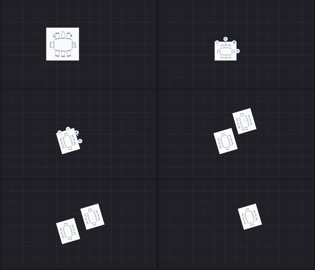
A Flutter widget that has pre-defined design for scaling, rotating, moving interaction.
The main idea of this widget is to allow integrating interactive features (e.g: scaling, rotate, move, copy, ...) without the need to DIY the widget by yourself. Developers can also implement the custom logic to handle the InteractiveBox widget.
Stack(
  children: [
    InteractiveBox(
      initialSize: Size(300, 300), // required

      /*  If you want to show a widget */
      child: Image.asset(
        "assets/table.png",
        fit: BoxFit.fill,
      ),

      /**
        If you want to show a shape instead of a widget, please refers to [Customize shape] in this README file below..
       */
    )
  ]
)
InteractiveBox(
      // properties from simple use
      ...,
      initialPosition: Offset(100, 100),
      initialRotateAngle: 45,
)Default will use all available actions, refers to ControlActionType
InteractiveBox(
      // properties from simple use
      ...,
      includedActions: const [
        ControlActionType.copy,
        ControlActionType.move,
      ],
)Refers to Shape for more shapes.
InteractiveBox(
      // properties from simple use
      ...,
      shape: Shape.oval,
      shapeStyle: const ShapeStyle(
        borderWidth: 5,
        borderColor: Colors.red,
        backgroundColor: Colors.black,
      ),
)InteractiveBox(
// properties from simple use
...,
circularMenuDegree: 360,
circularMenuIconColor: Colors.green,
// icon size for menu items
iconSize: 40,
// custom icons
copyIcon: Icon(Icons.abc),
scaleIcon: Icon(Icons.abc),
rotateIcon: Icon(Icons.abc),
deleteIcon: Icon(Icons.abc),
cancelIcon: Icon(Icons.abc),
// start position
startFromDegree: -45,
)Default will use all ToggleActionType.onTap, refers to ToggleActionType for more gestures.
InteractiveBox(
    // properties from simple use
    ...,
    // will now open menu by double tap
    toggleBy: ToggleActionType.onDoubleTap
)InteractiveBox(
// properties from simple use
...,
scaleDotColor: Colors.purple[600]!,
overScaleDotColor: Colors.red[400]!,
// only use specific scale directions
includedScaleDirections: const [
ScaleDirection.topCenter,
ScaleDirection.bottomCenter,
ScaleDirection.topRight,
],
// borders
defaultScaleBorderDecoration: BoxDecoration(
border: Border.all(
width: 5,
color: Colors.purple[700]!,
),
shape: BoxShape.rectangle,
),
overScaleBorderDecoration: BoxDecoration(
border: Border.all(
width: 5,
color: Colors.red[700]!,
),
shape: BoxShape.rectangle,
),
// Set to true if you want to show overscale border when both width and height is equal to maxWidth and maxHeight
maxWidth: 300,
maxHeight: 300,
showOverscaleBorder: true,
)InteractiveBox(
// properties from simple use
...,
rotateIndicator: const Icon(Icons.abc),
rotateIndicatorSpacing: 50,
)