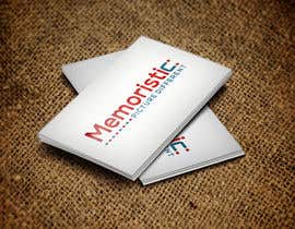
Memoristic logo
- Stav: Closed
- Odměna: $50
- Přijatých návrhů: 141
- Vítěz: Maaz1121
Instrukce k soutěži
Hi Guys ,
We are looking for logo to our new company.
Company name is : Memoristic
Tagline/slogan is : "Picture Different"
Business: The first service of our company is creating instant photo magnets for any occasion (corporate parties, weddings, conferences, bar mitzvas, etc.)
how it works : In a nutshell, at an event, our professional photographer walks around capturing real time moments of the guests having fun. Our On-site production team instantly transfers the images onto magnets using a lab quality photo printer. Once ready the magnets are displayed on a magnetic whiteboard for the guests to take home as party souvenirs.
see attached picture magnet for an example .
About the Logo:
We want a magnet (see some pictures attached for example) to be integrated into the word “Memoristic” within the characters M, O, or C.
for example you can flip the M on its side and integrate the magnet or turn the C in to the shape of a magnet .
The tagline /slogan “Picture Different“ should be in a different color than the company name.
We like better the logo color red and blue but we open also for other colors like yellow and gray.
About the font : please show font SANS-SERIF and other high -tech font .
Please see pictures attached of Magnets for inspiration:
A NOTE :
A lot of the logos I received look like it belongs to a tech company or a bank. It doesn't scream creative, photography, or event productions which is what I need. From all the logos - I like when the magnet is integrated onto the "C" at the end of "Memoristic". I prefer the letters to be lower case, where the initial "m" can be either capital letter or lower case but either way not too big compared to the other characters.
Doporučené dovednosti
Zpětná vazba od zaměstnavatele
“Maaz did a great job with the design of the logo. He always respond in timely fashion and he understand English quite well. The biggest issue that I had was that the colors of the logo I chose didn't match the files sent to me. They were off in a very noticeable way. His response was that the entry was just for presentation and it is a mock up. When I choose a logo, I do expect the final product colors to look extremely close to what I chose and it didn't. He really tried to accommodate but after several back and forth I decided just to try and do it myself. His work product is good and he is very responsive but to get what I wanted was a bit hard. ”
![]() nirnsd, United States.
nirnsd, United States.
Veřejná nástěnka k vyjasnění projektu
Jak začít se soutěžemi
-

Zveřejněte svou soutěž Rychlé a snadné
-

Získejte spousty návrhů Z celého světa
-

Zvolte nejlepší návrh Stáhněte si soubory - Je to snadné!

