Chatujte s Avou - vaší obchodní konzultantkou pro umělou inteligenci
Ahoj, jsem Ava, váš průvodce umělou inteligencí, který vám pomůže zlepšit vaše podnikání!
Ať už podnikáte, nebo sníte o tom, že ho založíte, jsem tu, abych vám pomohl proměnit vaši vizi ve skutečnost pomocí nezávislých pracovníků s umělou inteligencí. Podělte se o své obchodní cíle a společně vytvoříme projekt, na který se mohou přihlásit naši talentovaní freelanceři. Pojďme proměnit vaši vizi ve skutečnost!
Mám firmu
Začínám podnikat
Při odesílání konverzace na váš e-mail se něco pokazilo. Zkuste to později.
Konverzaci můžete uložit pouze jednou za hodinu. Zkuste to prosím později.
Váš rozhovor je příliš krátký. Pokračujte v konverzaci s Ava, abyste mohli ukládat.
10 examples of single page websites we love
One isn't always the loneliest number. Single page websites can be a great way to present information in a beautiful format.
4. 5. 2020 • 8 minut čtení

Kopírování do schránky se nezdařilo. Zkuste to znovu po upravení vašeho přístupu.
Zkopírováno do schránky.

Sometimes the best websites are also the simplest
Once a visitor lands on your website, you have seconds to catch their attention. And with short attention spans, visitors need to find what they look for quickly or they lose patience.
It is no secret that single page websites are great for mobile phone devices. They load within a few seconds and are easy to navigate. Multi page websites are difficult to navigate from mobile devices.
Caring about a user’s behavior and reactions to your website so they convert into a paying customer is important. But there are a few points to keep in mind for single page websites. Is the information logically organized? Does the content tell users what they want to know? Do users click your calls to actions? These are all essential questions to consider when choosing a single or multi page website and the layout.
Users these days are impatient and looking for instant gratification. So, if the information is not easy to find or they have to click through to find it they often hit the back button back to Google.
Keep it simple
When done well, single pages give the user a functional and simple experience. They do not burden them with too much information or links to click.
The whole purpose is to keep it simple but clever. From the copy to images to navigation, tell users how to get the most out of your single page website.
Here are 10 single page websites we love along. And following are some pros and cons and tips for building single page websites.
Angry Bear Design Agency
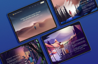
The Angry Bear Design Agency uses a stunning nature-themed design in its single page website. It even incudes a floating menu for easy navigation of the information. They keep it simple as you scroll down the waterfall into the forest.

Rest
The page is short without the need to need to scroll all the time. And the two navigation buttons snaps the user right to the information.

Balsoy

Unleashed

Mercury Annual Report 2019

A Vodka

Pest Stop Boys
A bright colored, eye catching single page website. The Pest Stop Boys website is short, simple and to the point with bright lettering that unmistakably get the message across. The cursor becomes a magnifying glass that chases the bugs running across the screen.

Our Stories in Stem

Inventure

Covid-19 Global Data Dashboard
The Covd-19 Global Data Dashboard presents worldwide pandemic data in a clear, simple visual report using a series of easy to understand charts. The single page format has a series of circles on the right-hand side that takes you directly to different sections of information.

Single page websites are perfect for specific target markets
A single page website is perfect for brands who want to reach specific target markets. It is easy to control how they behave and guide them to take action without the need to click on different pages.
All the information is on a single page in the order that works for your business. This is important for SEO when there is only a set number of keywords to target.
Remember, if users need to scroll through a long page of irrelevant information to find what they are looking for it will turn them off. It is important to only include content that serves a purpose on a single page website. It should be simple and relevant to the outcome you want to achieve.
SEO drawbacks for single page websites
There are some SEO drawbacks for single page websites. It is difficult to achieve keyword rankings. The point of single page websites is to design them around one concept so there is not the ability to use a wide range of keywords.
A multi-page site has multiple opportunities to use a variety of keywords on each page. So, if you rely on Google to send you traffic, a multi-page website is the way to go. But it will not be a problem if your priority is not Google ranking.
Shortage of detailed content on single page websites
Single page websites do not allow for detailed content. In short, there is just not the space. You present all your content on just one page. This is why you need to be super organized using a good layout.
Even when your layout is extraordinary, users may still find your website lacks relevant content. This will be a problem for those looking for in-depth information about specific topics.
You can define sections for content with a separate section for each new topic. This can be enough to meet consumers needs and they will not automatically bounce back to Google.
Single page website building tips
Has seeing these single page websites got you craving to build one for your brand? The main elements you need to consider are:
Knowing your goals for the website.
Strong calls to action.
Easy navigation.
What are your goals?
Before you even consider a single page website you need to know its goal. What you want it to achieve. Knowing this helps you make the right decisions for building your website even if you decide a single page website will not suit your brand.
For example, if you are a cake business and you want your website to show off your creations to drive leads for orders online, you only need a single page. But if you are teaching people to decorate cakes, you need a website with more pages. Why? You need the space to dedicate to classes and products. And this would look out of place and clutter a single page.
Ask yourself, “What is my website’s goal? What is my business goal? What do I want my website to achieve?” Once you answer these questions you can determine the approach to a single page website.
Establish strong calls to action
A single page website needs a strong call to action (CTA). When there is no CTA, visitors do not know what they are meant to do. This means less engagement and leads with few conversions.
To come up with CTAs, take a look at the goals for the website:
Is the purpose to have people sign up to your email list? If so, there should be a sign up button at the top of the page to make it easy to sign up.
Do you want visitors to join you on social media? You need to add social media icons to take them there.
Are you showcasing your latest projects to potential clients? Then you need anchor links so they can access them easily.
Do you want visitors to contact you for a quote? Make sure you direct them to contact details so they can get in touch easily.
This is where research into your target market is important. Once you understand your users, you can target their goals and pain points. Interacting with clients will give you insight to develop your CTAs.
For example, you are running a photography course and you want people to sign up to take a free class. A compelling CTA may be something like, “Sign up for a free class on digital camera basics”.
It is important to use your target market’s language.
Add easy navigational aids
It is crucial your single page website is easy to navigate from anywhere. Here are a few ways you can help website visitors get around:
Find a great designer
Single page websites rise and fall on the strength of their design. If you want your single page website to succeed, you need to work with a talented graphic designer to help bring it to life.
A freelance graphic designer can be a great choice. You'll pay much less than working with an agency or hiring in-house. And, unlike working with an agency, you'll be working directly with the designer to help bring your ideas to fruition.
You'll want to figure a few things out before you hire a graphic designer. Fortunately, we've distilled the entire process of building a website into a simple, 15-step guide .
Key takeaways
While single page websites are not so good for SEO but this will not matter if this is not the purpose. Your target market may be a niche area so you do not need to rely on SEO to drive people to your website.
Before creating a single page website, determine the goals of your brand and what you want your website to achieve. You also need to consider what it takes for your target audience to have a great experience.
Using clever design and copy to organize your website can have incredible results. As long as it is easy to use and the information is not hard to find, it makes it easy for brand messages to express why they need your product or service.
Podobné příběhy
Spojte se s některým z našich technických kopilotů, aby vám pomohl s vaším projektem
Doporučené články přesně pro vás

A specifications document, or spec, helps you determine who to get to build your website, how to build it and how much it will cost.
9 min read

Finding the right freelance graphic designer for your project can be easy if you know the right questions to ask and the skills to look for.
5 min read

A mood board helps you effectively communicate your web design requirements to others. In this post we'll teach you how to create one for free.
5 min read

Web design is a unique beast in the field of graphic design, so you'll need some unique tools. We've found the 7 best web design tools you need.
3 min read
Díky! Poslali jsme vám e-mailem odkaz pro získání kreditu zdarma.
Při odesílání e-mailu se něco pokazilo. Zkuste to prosím znovu.
Načítání náhledu
Bylo uděleno povolení ke geolokaci.
Vaše doba přihlášení vypršela a byli jste odhlášeni. Přihlaste se znovu.

