Chat with Ava - Your AI Business Consultant
Hi I'm Ava, your AI guide to supercharging your business!
Whether you're already running a business or dreaming of starting one, I'm here to help turn your vision into reality using AI powered freelancers. Share your business goals, and together, we'll create a project that our talented freelancers can bid on. Let's make your vision a reality!
I have a business
I'm starting a business
Something went wrong while sending the conversation to your email. Please try again later.
You can only save your conversation once per hour. Please try again later.
Your conversation is too short. Keep chatting with Ava to enable saving.
103 Brand Guideline Examples to Inspire Your Designs
Links to brand guidelines and PDFs that 103 of the world’s biggest brands use for promoting clear, consistent and recognizable brand identities.
Apr 7, 2021 • 29 minute read
Updated on Jun 18, 2021 by Closed User
F
Closed User
Copy to clipboard failed, please try again after adjusting your permissions.
Copied to clipboard.

Are you looking to take your brand to the next level? Tired of the same old design?
For some inspiration, we’ve pooled together the top 100 brand guides and style guides that will give you insights into the wide world of branding and marketing.
1. Google Brand Guidelines
Great style guides should have a good balance between its graphic and content. This style guide by Google is a perfect example of this as it captures an array of material icons, design guidelines, colour palettes and resizing options. The clever multi coloured use of tones and graphics really sets it aside from competitors as it channels their rainbow design logo. Take a look at the Google brand guidelines via their website here .

2. Nike Brand Guidelines
This simple Nike tick is recognizable anywhere you go with their logo being a fashion label for many. The business has kept the lion’s share of the athletic shoe market through intelligent branding and brilliant marketing strategies. Nike’s brand guidelines speak the common language of sport where you can visit their visual centre to check out their vibrant brand assets. Take a look at the Nike style guide here!

3. Disney Brand Guidelines
Chances are you already know the happiest place on planet Earth - Disney. With a huge film and production studio, gigantic theme parks, and stores all over the world, the brand depicts the magic of fun and entertainment. Their online style guide provides you with a comprehensive marketing guideline of all you need to know about Disney’s print and online materials across their Walt Disney World Resort, Cruise Line and Disney Park. Check out the magic through the Disney brand guide PDF here.

4. Twitter Brand Guidelines
Ever wondered how Twitter features its brand and online assets across their online platform? Search no longer because Twitter’s designed a guide to help you use all of their brand assets including their content, logos and trademarks. The best part? There’s no need to worry about negotiating legal agreements for using these at any time! Check out their brand guide and download the PDF for the same here.

5. Airbnb Brand Guidelines
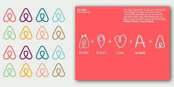
Airbnb’s style guide is super slick and well organised, designed for the user’s convenience. The site features a customisation tool for colour, facilities including destination/number of guests, arrival/departure along with a personalised dashboard and profile. Browse and help buttons are also thoughtfully provided for the user’s needs. Overall, this is a compact and efficient site. Check out all the fun via dribble here.
6. Coca-Cola Brand Guidelines
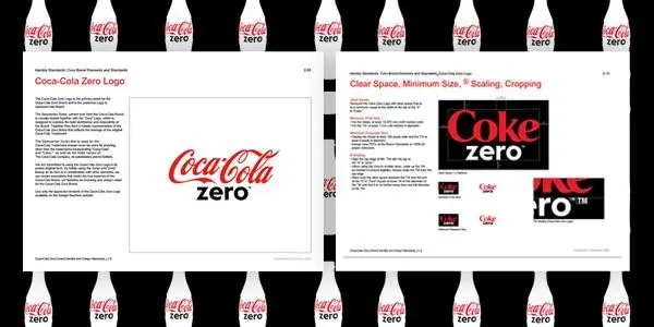
Your style guide should channel your brand's vision and mirror the principles and overall look of your business. Included in Coca-Cola’s style guide is an insight into their logo specifications, colour, positioning, their signature bottle graphics, typography and spacing. There’s an impressively detailed “do’s and don'ts” list for its brand assets and marketing materials for both online and print. The colour and calibration displayed in each packaging type really sets the Coca-Cola style guide apart from its competitors. The popular logo is even available for display on vehicles! Check out the Coca-Cola brand guidelines on issuu here .
7. Dyson Brand Guidelines
This is a very colourful style guide that is easy to use and understand for all to read. There are colour wheels and examples of how colour should be used in various situations. On top of that, there are enough images to explain logo and brand concepts clearly. The guide is easy to follow and understand. Join in on the fun and download the Dyson style guide PDF here.

8. Amazon Brand Guidelines
The Amazon style guide provides clear guidelines on how to apply colour size and spacing of the brand logo and icons with notes on presentation styles. There is a helpful overview with guidelines on the brand usage in CTA (call to action), which encourages potential customers to click on promotional offers. Download the Amazon brand guidelines PDF here.

9. Heineken Brand Guidelines
What better way to grab your audience's attention than to use vibrant colour palettes and unique designs? Heineken’s style guide maintains their distinct brand image with it’s signature green coloured brand logo featured throughout all of its content. There are plenty of images with reference to their brand colours and logo placement, making this both stylish and visually appealing ! Take a look at teh Heineken brand guide via scribd here.

10. National Geographic Brand Guidelines
With styling and colour just like their magazines, this guide is beautifully presented. It has plenty of charts and grids for your convenience and understanding. There’s a lot of information, but it reads well and isn't boring. The guide covers everything you need to know about National Geographic’s marketing and branding materials. Take a look via gretelny here.

11. McDonalds’ Brand Guidelines
These Golden Arches are easily recognizable by consumers worldwide. The McDonald’s style guide manual gives an exclusive look into how they maintain their consistency in visual messages and apply proper usage of their logo. Check out the basics of McDonalds' colour, logos and prices and recognise how they’re practically applied to stores! Take a look via issue here.

12. Jamie Oliver Brand Guidelines
Jamie Oliver’s style guide has done a brilliant job of branding while also focusing on marketing and packaging material. Their style guide depicts all sorts of materials that you would find in cook books, helping to turn a simple homemaker into a world-class chef! Check out their style guide on issu here.

13. Ikea Brand Guidelines
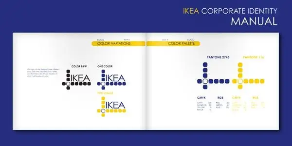
The IKEA style guide provides an insight into the origin, growth and way of operation of the company. Beginning with the basics, it provides explicit instructions that leaves no room for doubt, on the precise design of the company logo, business card and envelope. There is a noteworthy section on promotional items like postcards coupons and banners. Depiction of aisle signs guiding towards each department and restroom signs are all done with the intention of the viewer’s convenience. Last but not the least, there is a note on storage and packaging items too. All in all, this is a storehouse of information. Take a look at the Ikea brand guide via issuu.
14. NASA Brand Guidelines
NASA’s brand guideline is a simple and compact manual that details the standards of the NASA brand logo which is also worn by personnel. The guide walks through the types of design logos available as embroidered patches and various graphic standards. It specifies the nuances in the colour, spacing and background details of the brand logo on various garments like blazers, suits and on hats. The logo for emergency personnel gets a special mention. There are also guidelines provided on the brand logo used in vehicles, publications and signboards. Check out their guide via their website here .

15. Spotify Brand Guidelines
This Spotify guide is edgy and fun! With an entertaining slide show, you will be blown away by the layout. Visually attractive using its vibrant greens, it is also informative. It does take time to navigate the guide, but it covers what you need to know. There are plenty of charts and grids to detail the look and feel. Join in on the fun and take a look at their brand guidelines via issue here.

16. Facebook Brand Guidelines
Millions of users log onto Facebook every day, and chances are you’re one of them. If you're looking to build a brand guideline then Facebook's brand guides may just give you some inspiration. Find Facebook assets, logos, products names and images on their online brand guide and learn how to use them. The guide sheds some light on the best, most effective way to integrate the Facebook brand and posts into any broadcast. Get inspired and take at the Facebook style guide look here .

17. Microsoft Brand Guidelines
This guide is both easy to use and read! Interactive, fun, and very stylish, it is everything you would expect from Microsoft. It uses a range of grids and charts and is easy to understand. There are plenty of pictures and images to make the brand personality clear for readers. Take a look at the Microsoft brand guide via their online website here.

18. Adobe Corporate Brand Guidelines
Adobe’s Corporate Brand Guidelines gives you everything you need to know about their brand and marketing communications. Their style guide features everything from their logo, visual identity and branded merchandise to corporate templates, legal guidelines and editorial voices.Their red tag logo is featured and represents the business throughout the guide in visual form. Download the style guide PDF here.

19. Netflix Brand Guidelines
Are you after a style guide that is visually appealing and attention grabbing? The Netflix style guide is exceptionally eye catching in its content as well as mode of presentation. The details referring to the particulars of the elements and conditions of usage of the logotype and secondary art are clearly mentioned throughout the guide. On the final page, important rules which need to be adhered to and additional resources are also provided. Check the Netflix brand guide here.

20. YouTube Brand Guidelines
Effective branding doesn’t need to be overly complex. Clarity shouldn’t be sacrificed in an effort to stand out. YouTube’s branding guidelines do an amazing job of walking you through all you need to know about spacing, size, typography and the “do’s and don’ts” of using their logo. This straight-forward guide also supplies the user with hyperlinks for color specifications and downloading logos - there’s no room for error! Check out the guide here .
21. Snapchat Brand Guidelines
Snapchat’s style guide shows exactly why it so easily grabs the attention of its potential users. A snazzy logo, a bright color palette and a formal yet inviting typography are essential elements of Snapchat’s branding. Snapchat’s style guide clearly lays out each of these branding elements and how you can and cannot use them. This is a crisp and useful guide for a quick understanding of Snapchat’s principles. Download the Snapchat brand guidelines PDF here .

22. Skype Brand Guidelines
What better way to design a brand guideline than to incorporate both creativity and detail ? Skype’s brand guidelines cover everything from their well known blue and white logo and type faces to their strap lines. The guide even details how to use their speech bubbles in print and online material! Check out how Skype leverages their brand assets across, print laptop, tablet, or smartphone online media via their brand guidelines PDF here .

23. LinkedIn Brand Guidelines
Are you looking for bits, pieces, guides and gizmos? Then LinkedIn’s Brand Resources will give you all you need! Choose to grab just the brand elements you require or better yet, download the whole LinkedIn package in one single .zip file! The guide features an impressive array of their well known blue and white logo designs, colour palettes and swatches. Check out the LinkedIn brand guide via their website here.

24. Walmart Brand Guidelines
If you’re after an engaging and vibrant brand centre then Walmart’s new styling guide does just that. Check out their quick links to logos, templates and their own Style Guidelines manual ! The guidelines walk through their core identity, colour palette, typography, imagery and voice. To see how it’s all applied in action check out their style guide here.

25. Pinterest Brand Guidelines
Pinterest’s Style Guide is an organised manual that is methodical in operation. The user is systematically guided on joining, getting started and utilising several tools that are made available on the page. Tips are given on marketing making use of different marketing developer partners. Information on the company trademark and copyright, blog and business utilities are conveniently provided at the bottom of the page. Also provided there are help centres and instructions on the terms of privacy. Pinterest’s Style Guide proves to be very handy to the prospective pinners. Check it out here.

26. Instagram Brand Guidelines
There’s no doubting that we’re visual beings. Ever wonder how Instagram packs such a powerful visual punch? Just look at their style guide. With a video that gives a brief introduction to the company's mission, and the multi-coloured camera image as their logo, Instagram does a fantastic job of conveying their strict branding rules, in an easy-to-digest manner. Be inspired and check it out via their website here .

27. Starbucks Brand Guidelines
The Starbucks style guide presents a comprehensive and candid illustration of their brand logo. The manual itself is well presented and gives succinct guidelines on their inline block based grid lines and float based grid lines. For some inspiration, take a look at the Starbuck brand guide via their online website here.

28. Uber Brand Guidelines
Uber is swiftly pushing the taxi industry off the road, allowing riders to experience transport at its finest. However, Uber is more than just that. The service has developed an influential brand that is well recognized all over the world. With innovative new technological ideas, its brand guide depicts all that Uber is - a stylish, new and vibrant growing business. Join the ride and check out their new look here .

29. MailChimp Brand Guidelines
There aren’t many people you know that don’t recognise Freddie the Chimp, MailChimp’s very own mascot! Mailchimp is setting itself apart from other social media and communication guides through its innovative and recognisable brand. Their guide includes their stylish logo and their very own typeface – Helvetica Neue. Their quirky icons can provide inspiration for anyone looking to start their own style guide. Check it out via their website here.

30. YMCA Brand Guidelines
A youth-oriented non-governmental organization needs to have a youthful and vibrant appeal in its styling style. The YMCA achieves this through its bold and colorful logo and an extensive color palette that shows the organization’s diversity. The YMCA style guide highlights acceptable uses and versions of its distinctive logos, typography and colors. It also discusses the kind of images and illustrations that can go with the YMCA brand. Learn more by downloading their official style guide PDF here .

31. Medium Brand Guidelines
The pictures in this guide really make an impact! The visual aids make it simple to get the information you need in just a few seconds. Using medium primary colours in dark, white, and a bright green to create the Medium brand, the logo really pops and is appealing to the viewer. The use of weighted font keeps everything interesting and visually fresh. Check it all out via behance here.

32. IBM Brand Guidelines
Whoever said you have to compromise? This IBM style guide captures the perfect balance between colour and content! Easy to navigate and fun, with strikingly beautiful animations to boot, IBM ensures an informative and entertaining experience for all readers. Covering everything from their logo to grammar, this guide shares everything you need to know about building your own style guide . A perfect example of creativity and genius colliding - their interactive table of contents will allow you to find all the information you need in no time. Check it out via their website here .

33. Pepsi Brand Guidelines
Visually stimulating, the style guide of Pepsi is very straight forward. The focus of the brand identity is the red, white, and blue logo. The colours are vibrant and custom to the brand while the trademark font is fun and all lower case without exception. The guide covers a lot of the do's and don'ts of advertising the brand. For the go-to-guide download Pepsi’s style guide PDF here .

34. Whatsapp Brand Guidelines
Sometimes simple is just better. This powerful WhatsApp branding guide doesn’t need tricks or gimmicks to impress you. The use of colour is what really makes this style guide pop. This no-nonsense guide pays homage to the vibrant green colours that we have all come to know and love. There are colour guides for easy viewing, and its minimalistic layout makes it a pleasure to read through! Well put together and reader friendly, this guide hits all the points, quick and easy. Be sure to check it out via their website here .

35. Android Brand Guidelines
As one of the most sophisticated smartphone operating systems on the market, Android does a fantastic job of branding themselves as a prominent leader in the industry. Their style guide features material designs for Android devices with themes, lists and cards, animations and drawables. The guide also details their material design specifications that are available for Android 5.0. For some inspiration check out the guide via their website here.

36. Sony Brand Guidelines
One of the world leader’s in electronics, Sony has expanded their brand over the last few decades. What makes Sony so successful in branding is that they keep the logo simple and the identity of their products impressively advanced. To take a look at their stylish Brand Identity guidelines via issuu, check it out here.

37. Ben & Jerry's Brand Guidelines
Are you after a well structured style guide? Ben & Jerry’s style guide is easy to navigate and offers a confusion-free table of contents so that the user isn't searching for what they need. Based on a 12 column grid framework and with the classic chunky letter font that is identified with the Ben & Jerry's brand, the guide is conducive with the brand site. The imagery is to be reduced using an optimization tool found in basic Photoshop applications. Download their style guide PDF here .

38. Vodafone Brand Guidelines
If you’re looking for a guide that’s detailed, visual and vibrant then check out Vodafone’s Visual Identity and Digital Guidelines. The guide covers the “all you need to know '' about visual identity in the digital world, typography, signatures, calls to actions, badges, rich media and so much more! This telecom giant also gives readers an idea of how to leverage their social media with their brand assets including profiles, display pictures and backgrounds. Have a look around via issuu here.

39. Kickstarter Brand Guidelines
Yet another example of a skillfully presented and simple branding manual - Kickstarter’s style guide offers a comprehensive look at their brand direction summed up in just three golden rules. Short and sweet. All key brand assets are masterfully (and subtly) presented under a big, tempting “search projects” button. Go on, explore the possibilities via their website here .

40. Volkswagen Brand Guidelines
It’s a good idea to design a style guide that's easy to read and navigate. Volkswagen’s branding guidelines capture their style specifications in a simple and structured format. The guide features Volkswagen’s signature logo with a wide variety of colour selections and marketing materials. There are plenty of examples and grids included that depict the brand's key features and assets. For some insights, download the Volkswagen style guide PDF here .

41. Pixar Brand Guidelines
Looking for inspiration? Pixar’s style guide is harder to navigate but is stunning, featuring the beautiful artwork of Pixar artists. They use the lamp icon in their logo, which is kept simple with black font on a white background. They focus on the creativity of their artists to design the site, with vibrant colour patterns. They use a navigation bar that is complex and looks like a reel of film. Get inspired and check it out here .

42. Commonwealth Bank Brand Guidelines
Don’t be afraid to use bold colours throughout your guide and ensure consistency across each section.This style guide of Commonwealth Bank uses plenty of pictures in the trademark black, white and yellow to demonstrate their branding style. There is an easy to follow font, logo placement and typeface that is consistent across each page. The guide also breaks down the correct placement and use of logo, images, and typeface. Check out the style guide PDF here .

43. Lexus Brand Guidelines
This beautifully designed guide offers clear and easy to use chapters covering a range of topics. The Lexus style guide uses several diagrams to explain their popular logo and brand signatures. There are rich and luxurious colour palettes included that are harmoniously balanced. Get inspired and check it out here.

44. FIFA Brand Guidelines
The FIFA World Cup style guide sure makes an impact! Following the introductory brief on the purpose of the manual, and public guidelines, the various official marks like the emblem, slogan element, logo, trophy etc. are beautifully presented with notes on correct usage. The manual on concluding note cautions against usage of the official marks for private advertisements and offers the supply of the digital files detain the graphic guidelines of the official marks on request for reproduction. Check it out here.

45. Dell Brand Guidelines
What better way to present your style guide than to connect with your audience and provide brand transparency? This style guide focuses on preserving Dell's corporate personality through the use of their distinct colours and brand assets. Their traditional blue and white logos have been used as standalone brand identifiers, a sure way to gain recognition. The guide also uses an appealing modern and approachable typeface. To know more, download their brand guidelines PDF here !

46. LG Brand Guidelines
The LG style guide is an informative and inspirational manual to users, pointing out the essentiality of protecting and maintaining brand identity. It throws light into various aspects of brand platforming and on distinctive communication styles. The guide provides eloquent illustrations on good and bad logos, the nuances in colour format and positioning. Also enlisted are the different styles of photography that are used, different colour bars and their applications along with a note on the don’ts. The viewer also gets an idea of the different advertisements used with the recommended guidelines for each. Specific instructions related to the usage of logos in different sites and media are helpfully provided. Download LG’s style guide PDF here .

47. Ebay Brand Guidelines
Ebay’s style guide offers detailed illustrations on their logos, with specifications on the configuration/ colour/size and spacing. Notes on third party usage, rights of the user on the logo with special mention on the don’ts are provided. The manual concludes with the legal guidelines necessary to keep the company and the brand safe. Check it out via their website here.

48. Expedia Brand Guidelines
Expedia’s style guide is a short and slick manual that provides categorical guidelines to the user. The elements of the brand are detailed with specifications on colour/spacing and background combinations with special mention on improper usage. Illustrations on one colour logo are also given with notes on correct and incorrect ways of usage. There are very clear instructions detailing the minimum logo size for both vertical and horizontal logo signatures along with information on tagline and typography. Download Expedia’s style guide PDF here .

49. Subway Brand Guidelines
Subway’s style guide takes the viewer through a swift tour throwing light on the design elements of the brand logo and the rules for the usage. It is based on the standards for advertising and trademark use in the United States. Beginning with the overview on the brand equities, it gives an insight into price points and provides guidelines to advertise based on product type and availability in respective markets. Check out the colourful guide via scribd here.

50. Toshiba Brand Guidelines
Are you looking for high visibility and brand awareness? Leading technological giant, Toshiba reinforces its visibility and message of its visionary and lively brand throughout all of its marketing material. The descriptive style guide covers all the bases for master art, positioning, colour coordination and guides for business cards. If you’re new to styling, then this guide will help you navigate all there is to know. Take a look at Toshiba’s brilliant style guide here.

51. Woolworths Brand Guidelines
As a store that features a wide variety of fresh food for consumers, Woolworths has established itself as one of Australia’s most influential supermarkets and provides a comprehensive guide on its exact design style. The Vendor Guidelines not only shows how to emblazon the Woolworths logo on items but also gives detailed description on how to display its marketing material for print and television! The guide is an easy “how - to” manual for anyone interested in their vibrant brand assets and marketing materials. Take a look at their guidelines via their website here .

52. Virgin America Brand Guidelines
Ever wondered how Virgin's branding assets were designed? Then take a look at Virgin's very own style guide! There's a focus on the use of colour and font with a variety of pictures to demonstrate the look and feel of the brand. There are plenty of examples to show the user exactly what the brand personality is and what colours and fonts best show these points. Explore the guide here.

53. HSBC Brand Guidelines
This guide is simple and gets straight to the point! It uses colour grids to show acceptable colours for the separate logos. The logos are simple and the typeface is easy to read whilst also being clear and easy to navigate! Take a look via scribd here.

54. BPR Brand Guidelines
This BPR guide is largely focused on digital branding and icons. There are several grids explaining those icons and colour used. Short and to the point, this guide quickly outlines the branding process. There is a good use of colour and font in this guide. See how you can incorporate it into your style guide here.

55. SalesForce Brand Guidelines
Do you know the basics of setting up your very own style guide? Perhaps Salesforce can help you out ! Their style guide features their Lightning Design System where you can build custom applications that are consistent with the look of Salesforce’s features. Take a look through the platform-agnostic CSS framework and download their guide here !

56. Dropbox Brand Guidelines
Are you after a simple and memorable logo guide? Not only is the Dropbox logo easy to distinguish but they also have an authentic color scheme that is easily integratable on virtually any website! The company also provides a wide variety of colorful artwork that can be accessed and downloaded. Check it out via their website here.

57. Apple Brand Guidelines
The moment you see this slick silver fruit, you know you are looking at something related to Apple, the super business that has captured the minds of millions of smartphone, tablet and computer users around the world. Their stylish and innovative brand can be seen across their identity guide which features their sizing instructions, colour breakdowns and logos. Check it out via Behance here.

58. Bing Brand Guidelines
Bing’s branding guidelines gives you all you need to know about usage specifications, brand assets and graphics. The bing logo, symbol and typology are explained and communications are covered. To check out Bing’s branding guidelines, download the PDF for the same here.

59. Animal Planet Brand Guidelines
The television station that aims to teach the world about millions of animal species that inhabit this earth has taken its reputation and expanded its branding internationally. Their cool logos and colour values will give you an insight into how to successfully market any business. Be inspired and take a look via issuu here.

60. Double Knot Brand Guidelines
Double knot’s style guide provides clear guidelines for their brand logo and fun graphics. The nuances in the colour, background, size and spacing is specified across the guide. The significance of brand identity and its associated guidelines are also explained well. This digital style guide is a visual treat! Check it out via Pinterest here.

61. Mastercard Brand Guidelines
The Mastercard style guide covers plenty of branding assets and is surprisingly easy to follow in spite of its length. There’s a diverse selection of logo examples and colour guidelines. The guide uses the classy Mastercard colouring to dress up the style in the overall presentation. Take a look for yourself via their website.

62. Pizza Hut Brand Guidelines
Pizza Hut’s style guide is a well presented and creative manual, designed to cover all of the company’s brand standards! The style guide walks through its logo designs, colour palettes, topping icons, brand protection and premiums. Take a look for yourself via Sribd here.

63. Wordpress Brand Guidelines
Looking for a simple and stylish guide? This style guide by Wordpress is the right place to go to, especially if you’re looking to show some Wordpress pride with a button on a personal blog. Check it out for yourself on their online website here.

64. Lloyds Brand Guidelines
The feel of the Lloyds style guide reflects the company it was designed for. With understated colours and strong text, this guide presents their marketing materials clearly.There are great examples of logo and colour included just for you to browse through. Take a look via their website here.

65. Best Buy Brand Guidelines
This Best Buy style guide is not only colourful but well written! It has plenty of grids and charts to help readers understand how to effectively use colour and text. There are detailed sections on logo usage, typography, photography, icon styles and print examples. Check it out here.

66. Cisco Brand Guidelines
Bright and colourful, this guide is anything but boring. Though rather compact and frugal with visual aides, this guide nonetheless covers the basics without being too wordy. The Cisco style guide is nicely laid out and uses style and colour to keep the reader engaged. It is easy to understand and gets straight to the point! Check it out via their website here.

67. Yahoo Brand Guidelines
Yahoo’s style guide is anything but dull! The style guide features a range of graphics and logos that reinforce the brand image throughout the manual. If you’re after a style guide specifically for the web then this guide can help you out! Take a look here.

68. HP Brand Guidelines
HP’s style guide is an exhaustive list detailing the brand character, significance of its promise and the nuances in the factors like composition, stretch, typography and colours that gives the brand its distinctive appearance. Very explicit illustrations; on what is acceptable and non-acceptable in the usage of the logo is provided to the viewer. There are notes on company brand name and trade name with specifications on usage, and products with their descriptors, with a concluding one on legal and trademark information and copyright. Download the HP brand guidelines PDF here.

69. Optus Brand Guidelines
The Optus Digital Guidelines provides you with everything you need to create online awesomeness and help ‘get stuff done’. Check out their style guide for essential tools, tips and assets. It doesn’t matter if you’re talking about great templates or creating patterns for a website, this guide is definitely worth a read! Get inspired and read through it all here.

70. Foursquare Brandbook Brand Guidelines
Need some creativity ? Foursquare can help you there ! Their style guide features their latest icons, colourful palettes, typography for print and web and even how to use their crown icons ! Their colourful badges and iconography really sets them apart in the market and is a great starting point for any style guide enthusiast. Download Foursquare’s style guide PDF here.

71. TEDx Tokyo Brand Guidelines
The TEDx Tokyo style guide is a visual delight! It provides an amazing glimpse into the marketing materials organised by the community in Tokyo. It certainly works wonders in promoting the community’s efforts towards noble causes. The idea of using both English and Japanese in the promotional brochures is innovative and helpful in invoking local support. Join the movement and take a look via pinterest here.

72. Disqus Brand Guidelines
The Disqus style guide has plenty of examples of colour and icons! It’s pretty short and is written simply, making it easy to comprehend. The charts also capture great information and are incredibly informative. Check it all out via their website here.

73. KFC Brand Guidelines
The KFC brand identity standard manual is designed to set suitable standards for the international market with access limited to specific users mentioned inside. There's an overview on the additions to the master logo and its several formats intended to revitalise the original colonel icon targeting the young and the old alike, as the company marches along the 21st century. Clear-cut rules on the colour, tilt, size, positioning along with the definite don’ts on all the master logo letter type and secondary artwork are specified so as to enhance the brand image. The formatting of the branded logo in apparels, the design for secondary graphics and the express logo also get a mention here. To top it all, instructions to download all these are also provided. Download the KFC’s style guide PDF here!

74. PayPal Brand Guidelines
PayPal’s style guide is a compact, convenient and practical manual for any user. Instructions with help support to download the logo are provided. Apart from the login and sign up buttons, there are buy, sell and send buttons with dropdowns showing options of service the user may wish to choose.To add to the convenience, this manual even provides sitemap, and job buttons. Check out the style guide via PayPal's online website here.

75. Barricade Brand Guidelines
The success of a company can be dependent on how it presents itself in the market. A style guide is a great tool for achieving this! Barricade’s style guide provides great designs and styles that are visual and vibrant for any reader. With great colour schemes, custom fonts, and graphics, this is a place where fun begins. Check it out via Pinterest here.

76. Honeywell Brand Guidelines
Honeywell’s style guide is very colourful and sophisticated while still being easy to navigate. There are great charts to explain colour and line usage, as well as how to properly use the logo. They use standard typeface of selected weights of Helvetica font with internal substitutions of Aerial font. Download Honeywell’s brand guidelines PDF here.

77. Logitech Brand Guidelines
The Logitech style guide has a well-furnished structure where any information the viewer might be after is just a click away. Useful information with pictures about all products can be gathered by clicking on the different product buttons aligned in a row at the top of the page. Various details on the company including milestones, executive biographies, office locations, overview and even press releases and awards are given under “company information”. At the bottom, the pages for career, special offers, contact and those detailing terms of use and returning policy are found. Even the images of company logos and executives are supplied. Logitech presents a logical and systematic page to the user which you can find via their website here .

78. FedEx Brand Guidelines
Nobody likes a complicated style guide. The FedEx guide is very straightforward and easy to use. They use a simple font and easy to understand table of contents that is uncomplicated and hassle free! Detailed graphs and images complete the overall look of this guide to illustrate how to use colour and logo. Download FedEx’s style guide PDF here.

79. Grey Goose Brand Guidelines
There's a great use of colour in this style guide! It's both easy to read and to navigate with plenty of pictures to show the look and feel of the brand. There’s plenty of emphasis on colour and personality. The guide emphasizes the haute couture vibe and modern feel through both its colour and font! Have a look via Scribd here.

80. Black Watch Global Brand Guidelines
This style guide is modern and focuses on the flexibility of brand identity. The colour palette is mostly muted blue and gray, with black typeface. They use a chevron style logo beside the company name while the feel of the brand is both modern and simple. For some colourful ideas, check it out here.

81. Intel Brand Guidelines
Want a step by step manual on logo use and colour? Intel’s style guide does just this while using a clear and concise font and simple style as their trademark. The brand is a simple white font on a blue background. There are strict guidelines on how to use the logo or trademarks of Intel's products. For more insights, check it out here.

82. Stihl Brand Guidelines
Stihl’s Style Guide is very simple and to the point. They use large fonts and very clear directions on how to use colour and font. They really leave no room for error with such clear do's and don'ts. The visual examples are great. The guide is simple and easily understandable! Check it out via behance here.

83. Varig Brand Guidelines
This style guide covers everything in very easy to understand terms. Everything from font to uniforms is covered with plenty of visual aides to make key points clear for readers. This guide is well thought out and well written for anyone's needs ! The use of colour and font makes this style guide appealing to the viewer. Take a look through via abduzeedo here.

84. Warby Parker Brand Guidelines
This is a truly beautiful style guide with easy to understand tones and language, covering a wide range of topics! There are plenty of images to demonstrate the look that they are after and an emphasis on grammar and writing styles. There’s heaps of ground covered in this guide to drive home the brand personality they are going for. Check it out via their website here.

85. T-Mobile Brand Guidelines
As one of the four largest telecommunications companies in America, T Mobile has taken a pink background and some stars wrapped around “T Mobile” to turn this into one of the most recognizable companies there is.Their consistent branding has made them a key competitor in the industry. Check out how T Mobile uses their brand assets and colours here.

86. Pivotal Brand Guidelines
Pivotal’s style guide provides an informative manual that depicts its unique brand and stylish marketing assets. If you’re after a go to guide for your starter project take a look through their online style guide for tips and handy tricks. Check it out via their online website here.

87. Code for America Brand Guidelines
If you’re looking to get some insights into branding style, particularly for your website, then Code for America is the place to go. This company provides users with a wide variety of color schemes, layouts, and header options that would be perfect as the foundation for any website. They also provide well recognized icons, like the American Flag, Skype, Facebook, and Twitter logos, and much more, that can be made to fit your particular color scheme. Get some inspiration and check out their style guide here.

88. Atlassian Brand Guidelines
While having a great product is an important first step in getting your business going, the package design is also crucial. A package has to show what the product is about, and provide any relevant information that is needed to persuade the consumer that this is for them, all while displaying an attractive package. Not all are as creative in being able to do this, and this is where Atlassian’s style guide delivers. This style guide shows you all you need to create an incredible package design that works well with the overall brand of your company. Check it out here.

89. Lonely Planet Brand Guidelines
‘My world is the size of a crayon box’. This nifty saying is all too true for Lonely Planet which showcases a wide variety of graphics and color schemes in their online style guide. Their primary and secondary colour palettes, typography and icons presents a great picture of the brand and its assets! Check it out via their online website here.

90. Ubuntu Brand Guidelines
Short and to the point, this style guide covers all the basics you need to know! There are several good examples of font and typeface included. This guide is easy to understand and easily accessible. Check it out for yourself via ubuntu here.

91. Yelp Brand Guidelines
This guide covers a lot of ground! Easy to read, this guide has plenty of visual aides for your convenience using vibrant colours. To top it all off, the Yelp style guide also focuses on grammar and font. Take a look through their colour palettes and spacing options here.

92. Mozilla Brand Guidelines
Not sure what colour palettes would be suitable for your style guide? Mozilla’s style guide incorporates plenty of colour and great artwork to keep you entertained and inspired! There’s a large focus on brand image and colour in this guide, with visually appealing graphics. Take a look via their online website here.

93. Buffer Brand Guidelines
Straight to the point and incorporating lots of grids, charts, and examples, this guide is in-depth and informative! The Buffer style guide presents a grand display of colour and interesting fonts. As a lengthy guide, it captures a diverse range of information in true professional style. Check it out via their online website here.

94. Asana Brand Guidelines
This is a very stylish style guide. With a custom font, the Asana guide sure does a great job at capturing your attention! It covers plenty of ground and is easy to read - a bonus ! There are plenty of guides and images for any reader to understand their brand image. Take a look via their online website here.

95. Red Cross Brand Guidelines
Good style guides should always provide in-depth information about branding and marketing materials. This guide is certainly informative and in-depth! It uses the signature Red-Cross logo across all of the Red Cross marketing materials with varied graphic forms. There are plenty of grids to explain colour and logo sizing. The Red Cross style guide keeps everything simple and easy to understand. Download the Red Cross’s brand guidelines PDF here.

96. Buzzfeed Brand Guidelines
Who hasn’t heard of Buzzfeed? This popular style guide is quite wordy and includes lists of commonly used terms and accepted grammar. The guide walks you through how to format and recommend writing styles. Be inspired and take a look through their online style guide here.

97. Trello Brand Guidelines
Trello’s style guide is both structured and incredibly informative.The components explain colour and logo usage with html code and plain wording. This guide is precise without being overly lengthy. Take a look through it all here.

98. Codecademy Brand Guidelines
Codecademy’s style guide gives the viewer the undiluted impact of the new revamped image of the brand. The brand image was redesigned with the intentions of getting a new start and to project a more mature image ! The manual also cites the graphic languages which are used in the development of icons, badges and symbols for the benefit of the viewer. Take a look through their online website here

99. Envato Brand Guidelines
‘Simplicity is the ultimate sophistication’. This may just be right as Envato has left the flashy logos aside in their latest Market Guide. Their UI library forms the basic building blocks for a style guide including typography, buttons, alert boxes, patterns and forms. Check out their latest guide here.

100. Philips Brand Guidelines
Simply styled and to the point, this guide has a very detailed table of contents and covers a lot of topics. There are plenty of charts and tables explaining the style of the brand with a focus on grammar and language. The guide gives a walkthrough on how to set up text and colour for digital purposes. Take a look via issuu here .

101. WooThemes Brand Guidelines
Want some insight and access to graphic assets, crafted brand materials and internal resource guidelines? The WooThemes style guide can definitely help ! The guide builds beautiful themes for their website that are easy to install for inspiration. The guide also includes fonts, plugins, and other features that can really help you gain insights to brand building. Take a look through their style guide on their online website here.

102. Vimeo Brand Guidelines
The Vimeo style guide is an outstanding manual providing a candid picture about its branding guidelines. Clear and precise instructions while using the brand name Vimeo or their letter scripts are provided. Users are also offered the opportunity to download the Vimeo brand logo and icons through the links supplied! The guideline issues friendly advice readers in making reference to the brand. Check it out via Vimeo here.

103. UCLA Brand Guidelines
Educational institutions are recognizing the importance of branding and how strongly their students, faculty and staff represent their brand. As a premier educational institution, UCLA has crafted a spot-on branding style of its own. It conveys this style to its stakeholders through a comprehensive, easy-to-use style guide. UCLA’s style guide delineates different stylistic best practices for different marketing channels like print, email, social media, videos and websites. Take a look at UCLA’s style guide here .

Need a style guide for your business?
Hiring a freelance designer to create your design guidelines is a great way to establish your business's brand both online and offline.
Simply post a project today and receive bids from freelance designers in seconds. A great starting point is to direct your freelancer to a few of your favourite examples from the list above.
Related Stories
Talk to one of our Technical Co-Pilots to help with your project
Recommended Articles Just for You

If you're thinking of hiring a graphic designer to design your logo, there are some details you should think through first.
6 min read

A mood board helps you effectively communicate your web design requirements to others. In this post we'll teach you how to create one for free.
5 min read

Corporations may have millions to spend on branding and logos, but these 10 small businesses prove you can get a great logo on a budget
6 min read

What type of graphic design should you use for business? In this exhaustive guide we discuss every different type of design your business might need.
23 min read
Thanks! We’ve emailed you a link to claim your free credit.
Something went wrong while sending your email. Please try again.
Loading preview
Permission granted for Geolocation.
Your login session has expired and you have been logged out. Please log in again.


