Discuter avec Ava - Votre IA Conseiller d'Affaire
Bonjour, je suis Ava, une IA pour dynamiser votre entreprise !
Que vous ayez déjà une compagnie incroyable et que vous n rêviez d'en démarrer une, je suis ici pour vous aider à donner vie à votre vision en utilisant les freelances alimentés par les IA. Partagez les objectifs de votre entreprise, nous créerons un projet sur lequel nos freelances talentueux pourront faire des offres. Donnons vis à votre vision !
J'ai une compagnie
Je lance une compagnie
Une erreur a eu lieu lors de l'envoi de la conversation sur votre e-mail. Veuillez réessayer ultérieurement.
Vous ne pouvez sauvegarder votre conversation qu'une fois par heure. Veuillez réessayer ultérieurement.
Votre conversation est trop courte. Continuez à discuter avec Ava pour rendre la sauvegarde possible.
Web Design
Web design combines art and science to create a website that your target market wants to use.
19 avr. 2022 • 22 minute de lecture
Mis à jour le 6 mars 2023 par Lee J.

Échec de copie dans le presse-papier, veuillez réessayer après avoir ajuster vos permissions.
Copié dans le presse-papier.

Fact | Description |
|---|---|
Fact | Description |
Fact | Description |
Fact | Description |
Fact | Description |
Fact | Description |
Introduction to Web Design
Web design combines art and science to create a website that your target market wants to use. The key to getting it right is to always remember that user experience is the most important factor in any website design and development project.
Whether you keep it in-house or hire a freelance web designer, keep in mind that these days, web design is a multi-faceted process that requires you to consider a whole range of factors and how they can add to the overall user experience. These include:
Aesthetic design
Usability
Functionality
Web apps
Mobile apps
UX design
UI design
SEO
With so much to get your head around, it can seem a daunting task. So, before you get started it’s important to strip things right back to the basics and ask yourself a few fundamental questions about your website:
What do you want it to do?
Who are your target users?
How will your website complement and enhance your branding?
If you haven’t already thought about these questions, do it now.
What do you want your website to do?
A website designed to grab data will have a very different look and feel from one for which the primary function is to display and sell products.
When we talk about ‘conversion’ in web design terms, we’re talking about users carrying out a specific action based on your CTA (Call to Action). This might be to sign up, make a purchase, provide an email address or pretty much anything else you want to use your site for.
Do you want to include a photo gallery? Will your site be enhanced with video? Do you need to include a contact form? All of these considerations will feed into your decision as to what type of website you create.
Only when you know what you want from your site can you expect to design it or convey your expectations clearly to a web designer.
Who are your target users?
Chances are you have already carried out some market research and know your target market. When transferring that information to web design, you must establish the user experience (UX) that they expect. Why will they visit your site? What information will be most important to most users? How will your target users interact with your website? What do competitor sites lack that would make yours stand out?
It's vital that you have a clear idea of customer expectations so you can create the ideal customer experience. Great usability will go largely unnoticed by even your most loyal customers.
Why? Because it’s what they expect…no demand!
Poor usability will make your site stand out for all the wrong reasons.
How will your website complement and enhance your branding?
Branding is what separates you from your competitors. It includes everything about how your business’ public image and must be unique. Good branding instantly recognisable and keeps you at the forefront of your customers’ minds.
As an example, imagine a huge golden ‘M’. Now try to imagine how anybody could fail to associate that with McDonalds.
Whatever your logo, slogan or color palette, your web design must be consistent but also add something to the overall perception of your brand.
Source: Pexels
Your answers to these three questions will help inform your design choices in terms of the aesthetics and functions of your website.
A high-performing website is:
Easy to navigate
Provides clear, concise and relevant messages
Increases conversions
So, let’s take a look at each element of web design in turn.
Site structure
This is the foundation of your site and one of the most important aspects of web design. Site structure is an area in which web design and web development crossover. The structure of the site, while technically an aspect of web development, must be created with one eye on the long-term design of the site in terms of its intended look, feel and functionality. Get this bit wrong and you may find that you’re very quickly back to the drawing board as your site fails to engage your audience.
Site structure should focus on enabling the functionality and navigation determined by your web designers.
Source: Getty
Written content
It’s easy to neglect the written content that will appear on your site in favor of bright colors and snazzy logos, but it is one of the most important elements of great web design. Sure, pretty pictures and color combinations are appealing to the eye. But most of the time when people visit a webpage it is to obtain information. And that information is mostly conveyed via text.
So, make it relevant and ensure it answers questions quickly. Your key points should be prominently displayed, and the text should be engaging and to the point. Too much text can intimidate users but too little can leave them with unanswered questions. Ensure all necessary information is included and every word earns its place on the site.
Use headings to guide users to the chunks of text they are looking for. In some cases, the text blocks will need to have lots of words to accurately get the message across. But don’t make your customers’ lives difficult by expecting them to track down what they want in a jungle of words.
If you’re not confident in your ability to write engaging content or if you want it proofread, hire a freelance writer to get it bang on.
Source: Pexels
The main body of the content must be something that will engage and convert your users. Don’t get bogged down explaining who you are and the history of your brand on your home page, no matter how interesting you think the story is.
For landing pages and the homepage stick to content that highlights the features and benefits of your product or service. The ‘About Us’ page is your opportunity to show the personality behind your brand. Engaged customers may well delve a little deeper into what you stand for and how your business started once they have the information they initially came for. Bombard them with information they don’t want too early into their journey and that may be the last you see of them.
Font
The font you choose must match your branding and be easy to read. If your site includes a lot of technical writing, Comic Sans is going to clash with your content and be jarring for users.
That said, a unique font that complements your branding can help make your site memorable.
When selecting your font, don’t neglect the background color. If you don’t think black text on a white background is right for your brand, think about other combinations that use dark text against a lighter color. There are millions of different hues out there so don’t be afraid to play about and see what works. The important thing to remember is that the background color should balance the text color and make it stand out without being garish.
A web designer can help you decide on the right font to match your branding and message.
Colors
Make sure the colors on your web pages match your brand identity. If you’re starting from scratch with branding, you may want to look into color psychology. But if you already have an established color palette it’s more important that your website is consistent with those that you are already using.
Source: Pexels
Header and footer
The header is the ideal place for the top line information such as:
Business name
Logo
Link to contact information
Menu
The header should be unfussy and on-brand as it will appear on every page of your website.
Your footer appears at bottom of the page and lends itself to:
Contact details
A location map
Social media links
Email sign up bar
Layout & navigation
This is crucial to user experience (UX). One of the key things to remember in web design is that less is more. Think about why visitors have ended up on your site. Many will have arrived via a search engine and will be looking for a particular piece of information or a specific product or service. So, make it easy for them to find it.
Space things out on your site so that webpages don’t look too busy and make it hard for visitors to use. They won’t thank you for it – and chances are they won’t hang around very long.
Getting the layout right relies first of all on understanding your target users. Think about what they are most likely to be looking for and design your site to answer their most common questions without them having to work at it.
If the purpose of your website is to attract local people to a physical location, make your address and opening hours clear to anyone landing on your site. To highlight a bestselling product that most customers want, a ‘Buy it Now’ button overlaid on an image of said product might attract the eye. If it’s email addresses you want, make that obvious and ensure users are directed to a quick and easy way to provide the information you’re after.
If you’re unsure about where to place the buttons on your site for maximum effect, take a look at competitor sites or find a website designer who will help you get this crucial aspect of your site just perfect.
Source: Unsplash
The layout of your site is one of the most important aspects in guiding users around your site. Always remember, your website is a two-pronged marketing tool – it must give customers what they want while also directing them along their journey according to your navigation.
Think about ways to balance the content so your site appears well-thought out. This will give it a professional edge as well as making it easy for visitors to navigate their way around your site.
Remember, what is important to your users is important to you and vice versa. Make sure the most vital buttons and CTAs stand out. And make buttons obviously buttons. These are the key to increasing conversions so don’t leave anything to chance.
Menu
One of the easiest ways to help users navigate around your site is with a menu. While the menu should match the overall theme of your site, it must be easy to locate and use. Your menu is not the place to be getting flashy with design. It is a practical element of the site and that must be at the forefront of your mind when designing it.
There are several standard menu designs to choose from:
Header menu – Very popular, the menu is clearly displayed in the website’s header using the standard font and color palette of your site.
Sticky menu – Sometimes called a ‘floating menu’ this menu remains on screen as users scroll up and down. This option provides constant visible reminders of the site content and makes switching between pages simple. However, it can be distracting when visitors have found the page they want and no longer want to see the menu.
Dropdown menu – Another classic that is a slight twist on the header menu. This is a good choice if you have lengthy submenus and don’t want your header to look overcrowded.
Hamburger menu – The three lines in the top corner of the screen – Most users know that the three lines represent your menu. This style is tucked away and unobtrusive.
Sidebar menu – Similar to the header menu but with options on the side of the screen rather than across the top.
Background
As a constant part of your website that accompanies visitors wherever they go, selecting your background is an important design decision. Whether you opt for a solid, textured or animated background, it must be on-brand without distracting the viewers’ eye.
Background is one of those web design elements that should be understated and ‘blend in’ so that it enhances the overall aesthetic without taking over. Often, if you can spot the or remember the background too readily, it needs to be toned down.
For beginners, it’s best to stick to a static background and focus on colors that complement your brand image. Only experienced web designers should be let loose with animated backgrounds as they ramp up the design cost of the site and the risk of it failing to engage users.
Images
A picture tells a thousand words, and the images you choose can have a huge impact on the overall impact of your website.
Images should be a pictorial representation of what your written content says. Ideally, they should connect with your audience on an emotional level.
Exactly how you use images will be largely determined by the product or service you provide but photos on websites tend to fall into 3 main categories:
Pictures of the product (e.g. a photo of a bottle of carpet cleaner)
Pictures of the problem (e.g. a photo of a stained carpet)
Pictures of the solution (e.g. a photo of someone using the cleaner with a smile on their face)
It may be that you choose different pictures for each webpage as you guide your user through the customer journey. The important thing is that you consider what you are trying to convey with each image and don’t simply paste pictures into your webpages because they broadly match what your business does.
Often, images of your team or photos of an event can add something unique to your site and help to show the personality behind the brand.
You can get free images to use on your site from:
Just be wary when using these sites as many of the pictures are obviously stock images. If you choose an image that has been used by lots of other companies – particularly your competitors – you won’t help your website stand out.
Without being too clever, try to apply lateral thinking to your choice of imagery to give your site visual impact and make it memorable.
Video & animation
The ease with which high quality video can be produced, uploaded and viewed on mobile devices has seen it used more and more in web design.
Used well, it can add a new dimension and help to enhance the user experience. It’s important to note that people consume and retain information in different ways. While a written explanation of how a product works might be ok for some users, others will only be persuaded by seeing it in action.
Video can be a very powerful marketing tool, but sometimes it is inserted into web design simply because people think they should include one or to just to fill space. These are two of the worst possible reasons to add a video to your webpage. If you want to take advantage of video or animation in your web design but are unsure how to get it right, a professional web designer can help you nail it.
A relevant, well-placed video can enhance your webpage and CX. But video can also be distracting so if it is not adding value, move it to somewhere where it is, or get rid of it.
Animation can be equally distracting if it has no obvious connection to your core message. While there are some great positives to be achieved through use of animation, it is something you should use sparingly and only after serious consideration about how it feeds into your overall marketing strategy.
User interface (UI)
Part of your design decision should be pre-empting the various ways in which your target users will interact with the site and making sure you are accommodating their intentions and expectations.
Mobile is now the preferred method of accessing online content so make sure your site is mobile-friendly and performs just as well on the small screen and with the limited power of handheld devices as it does for desktop users.
Source: Unsplash
Although you are attempting to guide users through your site, make sure they remain in control of their journey. Guide them by designing a logical way around the site rather than forcing them to access content they don’t want to see.
Be sure to avoid:
Auto-play video or audio
Pop ups
Scroll-jacking
Provide ways for users to interact with the site on their own terms.
SEO
SEO is an ongoing task that involves far more than just web design. But it is a key part of every successful online presence, and your web design should take it into consideration.
Your site’s loading speed, UX and ease of navigation will have a bearing on how well your web pages are viewed and ranked by search engines.
Search engines use ‘crawler bots’ to index web pages and rank them in search results according to a range of criteria that includes:
A domain name that is memorable and representative of your brand
Relevance to search terms
Keywords
Use of headings in your content
Meta descriptions for your most relevant pages
Landing pages for your most searched for content
Alt tags for images
Loading speed
Duration of visit
When writing your content, it is important to strike the right balance between using keywords that your audience will use in their searches while not cramming them into the content. That practice worked in the past but is now outdated as algorithms are more complex.
One of the key drivers now is the duration of each visit – and this is affected by loading speeds on your site. If the site takes more than about 3 seconds to load or if there are delays when navigating between pages, users will not hang around on your site for very long.
Likewise, if the information they want is not on the site or is not easily accessible, users will move on.
Lots of short visits to your site will indicate to search engines that users did not find what they were looking for and will push your pages further down the rankings. It’s worth noting here that 90% of internet searches never make it to page 2 of Google results .
When users find information on your site is relevant and accessible, they are more likely to stay on it. If it is easy to navigate around, that further increases the time they spend on your site. Search engines will recognise this and assume your site provided the necessary answers or solutions the user was looking for. The end result is a satisfied customer who may well return, improved conversion rates and greater SEO.
Contact information
This may be the only reason someone visits your site so make it clear and obvious how to get in touch. Buttons in colors that standout are a good way to attract attention.
You can add a link to the contact information section of your site to your menu or put your email address or phone number at the top of the home screen. If you’re using a contact form – maybe as a way of grabbing email addresses of users – make it obvious you want people to contact you that way with strategically placed buttons on your site. Try to place them just after mention of a key benefit or special offer that may tempt somebody to click on it.
Contact details are vital and there is no problem including them in the header and footer of every page so long as you insert them organically and don’t make them appear to have been shoehorned in.
Source: Pexels
CTA
Every element of web design is focused on creating a great user experience. But never take your eye off the fact that every element of creating a great user experience is focused on your CTA (Call to Action). Of course you value your customers and you want to provide a pleasant user experience, but ultimately it is the strength of your CTA that will determine how web design affects ROI.
This is the part where you tell users what you want them to do. Spoiler alert – most of them want to be told what to do. Don’t shy away from making your CTA bold and to the point.
Don’t ask them to ‘Browse Products’, invite them to ‘Buy Now’.
Don’t request that they ‘Please Sign Up’, tell them to ‘Join Here’.
Users that enjoy using your site and find it valuable will keep coming back. But if you don’t turn that opportunity into increased revenue, all your design efforts are in vain.
Choosing a web design tool
So, you’ve established the basics of web design and it’s time to put them into practice. The next decision is whether you design your own website or have a web designer do it for you.
If you decide to create your own webpage, your first big decision is which web design to use.
Desktop app
This is the more expensive option but is commonly used for complex websites. The process involves splitting the tasks into development elements and design elements and passing each to a specialist in that field who will work separately but in collaboration to ensure the end results nails both aspects.
If you have an in-house website design and development team, this is pretty straightforward. If not, you will need to enlist the help of a website design agency or find a freelance web designer.
When looking to outsource web design it’s important to discuss the exact requirements so all parties are clear on expectations from the outset:
Will the company or freelancer be responsible for design and development?
If so, will they use their own developer?
If they are only responsible for design is there a developer they regularly work with and can recommend?
Source: Pexels
You can create a website using a desktop app without using external web designers or developers, but you will need an eye for design and the necessary coding skills to bring your vision to life. When designing a website from scratch, you should start by creating wireframes. These are drawings that act as the skeleton of your website. When the various design elements are added to the wireframes they work harmoniously together.
This method of web design and development relies on knowledge of common coding language such as:
HTML (HyperText Markup Language) is the most basic building block on web design. It is a common language used for front end development which focuses on the graphical user interface for a website and the way the pages are linked to each other.
CSS (Cascading Style Sheets) is a coding language that relates to the way a website is displayed. It is used concurrently with HTML to implement the design choices such as font, color and padding into the end product.
If you’re new to coding, it’s wise to keep things fairly basic to begin with and concentrate on delivering a standard website that offers minimum functionality but does it perfectly.
If you choose to design your own website and launch it in this way, make sure you use a cross-browser testing tool to make sure it is compatible with all devices and browsers.
Website builders
Website builders include sites you may well have heard of such as:
Wix
Wordpress
Squarespace
Webflow
Pagecloud
These are sites that offer website templates known as CMS (Content Management Systems) and are designed to be used by novice web designers who want to create a standard web page but have no coding experience.
They tend to have a range of templates designed to suit a variety of industries so the only things you really need to get started are:
A high-performing PC or laptop
Written content
A logo
Good quality images
Naturally, there are limitations in terms of functionality and design options. Many templates are free but there are options to buy add-ons or plug-ins to enhance your site and make it more user-friendly.
Most website builder platforms include cross-browser testing so you shouldn’t need to carry out any independent testing.
Website builders tend to use a ‘drag and drop’ process to make construction easy. Ideally, you will have access to a desktop PC or laptop as these sites are not always easy to navigate using a mobile device.
Just how easy you find the drag and drop process will depend on your level of expertise. While website builders are designed for people with no previous experience and no knowledge of coding, they can be quite tricky to get used to for newcomers.
One solution for SMEs that need a fairly basic website is to find a freelance web designer who can create it for you using a website builder. Their eye for design and technical skills are usually sufficient for you to get a professional website designed and developed on a budget.
Website builders are increasingly popular with SMEs so the look and feel of the websites produced using this design method is familiar to users.
Source: Pexels
Adaptive v Responsive websites
It might surprise you to discover that choosing the right website style is actually easier now than it has ever been. That’s because the rise in use of mobile for web browsing has rendered many of the more traditional styles obsolete.
The only two styles you need to consider are:
Adaptive websites: Multiple versions of the same site which are customized according to screen sizes
Responsive websites: One website that reconfigures itself according to screen size
Adaptive websites are easier to build and rarely suffer from slow loading pages. Responsive websites are more complex, take longer to build and in most cases provide an excellent user experience regardless of device or browser.
Whichever route you use to bring your website to life, it’s important to remember that the world of web design never stands still. Once your site is up and running you will need to constantly monitor its performance and keep an eye out for the latest evolutions in web design to make sure it stays relevant.
If you chose to hire a freelance web developer, this means keeping in touch to maintain an ongoing working relationship. If you designed and created your own website, you will need to allocate time to analyze and amend your site as required at least once every three months.
Analyzing your website
Once your website is ready to launch, it’s important to have a final check to ensure it ticks all the boxes in terms of UX.
Once it is out there, your users will judge it and their reaction to the first iteration of your website can be the difference between success and failure.
Ask yourself whether the website that has been designed and developed is:
Useful: Does it deliver the solutions your users want?
Usable: Is it clear, concise and easy to navigate?
Findable: Have you included SEO principles in your design?
Credible: Does your site position you as an authority?
Desirable: Will your target users want to engage with it?
Valuable: Does it provide a product or service that is in demand?
Find the right web designer
Even if you have coding experience and technical expertise, designing and developing your own website may not be the best use of your time. Here are some tell-tale signs that you need to hire a freelance web designer:
You don’t have time to build your own website
Web design is time-consuming. So is running a business. Trying to balance the two is likely to mean that at least one is neglected.
You don’t have experience
Your website is too important to cut corners with. For many visitors it will be their first impression of your business. Don’t think about cost, think about ROI. Investing now can reap huge rewards later.
You don’t know how to design a website that drives conversions
It’s not uncommon. You’re an expert in what you do, but that doesn’t mean you’re necessarily an expert in designing a website that highlights the features and benefits of what you do. Sometimes, it’s best to let those with the knowledge take care of making sure your message lands with your target audience.
Source: Unsplash
Where can I find a web designer?
A quick internet search will bring up a plethora of web designers. The difficulty is knowing which you can trust.
It’s perfectly natural that each web designer will have a knock-out website that grabs your attention and tells you how great their service is. What it won’t provide is independent reviews.
For that, you need a site that has top web design talent from across the globe in one place – like Freelancer.com.
The good news is that there are no longer geographical barriers to hiring the best web designers and developers. You can hire somebody from anywhere in the world – and depending on where you live, you may find you can get the job done a whole lot cheaper by finding a freelance web designer from overseas.
With Freelancer.com you can set your own budget and invite interested freelance web designers to approach you and bid to take on the task.
How you choose the best freelancer is up to you. You can chat to them, check out their reviews and take a look at some of their past work.
When you post a project on Freelancer.com you cut out the legwork from finding the best web designer for your project because they come to you.
Why hire a freelance web designer?
Freelancers generally have fewer overheads than web design agencies so they can do the work at more affordable rates.
The working relationship tends to be more informal, and it is a good way to establish a connection with a person that you trust to help you with future amendments and updates to your site. When you use an agency, you can’t be certain that the same individual will carry out future tasks and this can create inconsistency on your site.
With a trusted freelancer, you can rest assured that you know the style and quality to expect.
How to find a freelance web designer
Before you start looking for the right freelance web designer for your site, there are a number of steps you need to take to prepare yourself:
Define your audience
Work out what you want from your website in practical terms
Decide on a CTA
Decide which pages are required and bullet point what you want the content to include
Make sure you are happy with your branding (logo, slogan, color palette, style, tone)
Search on Freelancer.com
Hiring a web designer on Freelancer.com
There are two ways to find a freelance web designer using the platform:
• Hire a freelancer directly
• Post a project
Searching freelancer profiles and hiring someone directly is more time-consuming than posting a project but if you have a particular skill set you are looking for it can be the best way to find your ideal web designer.
Narrow your search using the dropdown menus on the left of the screen and then check out the profiles of those freelancers who match your search criteria.
If you choose to post a project, interested freelancers who are available will contact you to discuss the job in more detail.
Click ‘Hire Me’ to send a message to your chosen freelancer about your web design project.
The other option is to post a project and invite freelancers to contact you.
You will need to include a detailed brief, budget range and an idea of how long you expect the task to take. You can use this guide to ensure you provide a comprehensive guide to what you expect of the project.
Including a clear brief will increase your chances of receiving bids from the top freelancers as well as demonstrate that you are professional and have clear expectations of what your website should look and feel lie when it goes live.
When you receive bids, check the following:
Bid amount (Don’t automatically rule out a bid that is outside your proposed budget. You may be able to negotiate a better price or decide that you are willing to pay a bit extra for that extra quality)
Written response (Is it specific to your brief? Does it answer any questions you asked? Does it give you confidence in them?)
Star rating (Out of 5)
What previous clients are saying about the freelancer
Evidence of working on projects similar to yours
Portfolio
Project completion rate
On-time rate
On-budget rate
Other factors to look out for include:
The Preferred Freelancer badge. The orange badge with a white star that indicates they have achieved a high rating and good reviews - and have been accepted into the elite Preferred Freelancer Program.
The Verified badge. The blue shield with the white tick that shows Freelancer.com has verified the freelancer’s identity.
Web design is one of the most fundamental aspects of online success. While your content and images might change over time, the basic design will be a mainstay of your branding and digital presence for years to come.
This is something worth investing time and money in to make sure you have a site that helps you achieve your business goals.
Find a freelance web designer today and get your website working for you.
Histoires connexes
Parlez avec un de nos Co-pilotes techniques pour aider avec votre projet
Articles recommandés juste pour vous

In this guide learn how to spot good graphic design from bad, how graphic design can benefit your business and how to find the best graphic designer.
13 min read

Here's what you can expect to pay a designer for tasks like logo creation to website design - whether it's an employee, an agency or a freelancer.
8 min read
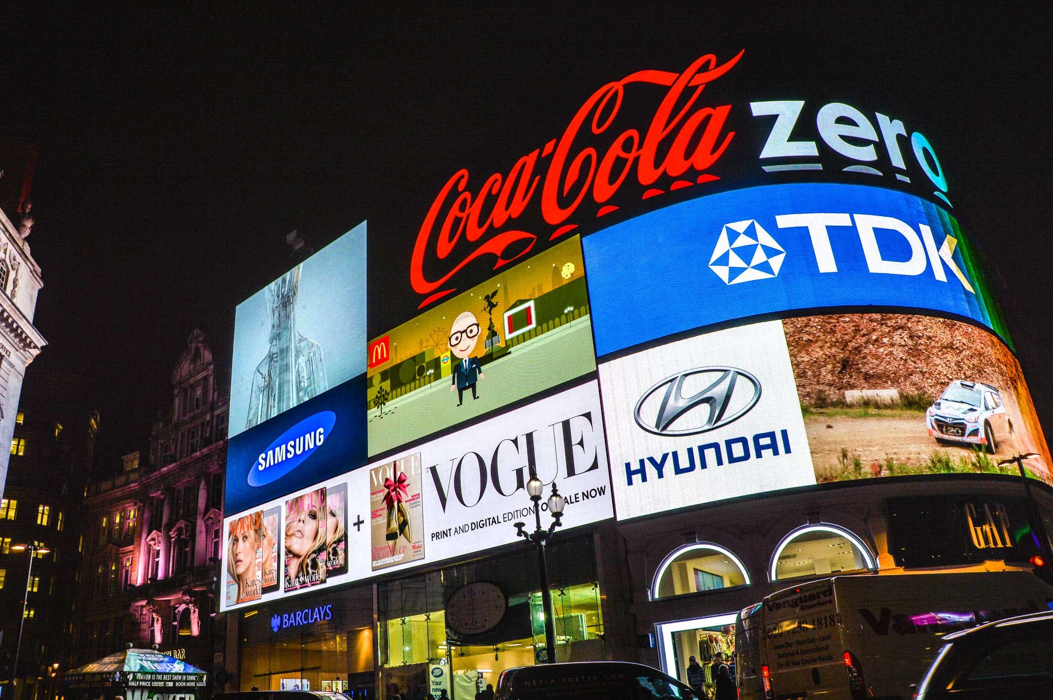
Links to brand guidelines and PDFs that 103 of the world’s biggest brands use for promoting clear, consistent and recognizable brand identities.
30 min read

The hidden meaning behind 40 of the coolest logo designs from the world's biggest brands.
7 min read
Merci ! Nous vous avons envoyé un lien par e-mail afin de réclamer votre crédit gratuit.
Une erreur a eu lieu lors de l'envoi de votre e-mail. Veuillez réessayer.
Chargement de l'aperçu
Permission donnée pour la géolocalisation.
Votre session de connexion a expiré et vous avez été déconnecté. Veuillez vous connecter à nouveau.

