The making of the Figma Pattern Library

UI3 prompted us to rebuild our own design system from the ground up. Here’s how designers and engineers came together to create a new foundation for building consistent, accessible products.
Hero animation by Julia Schimautz
When we set out to redesign Figma’s interface with UI3, we faced a revealing truth: Our team—despite building the go-to tool for designers worldwide to create their own design systems—had been working with a fragmented design system of our own. Our internal system had become disjointed over years of rapid growth and product expansion. Detached instances ran rampant. Components that should have been consistent showed subtle but meaningful differences.
This fragmentation became impossible to ignore, especially as we started gearing up to launch UI3 across all Figma products by Config 2024. We needed more than just new designs—we needed a robust foundation that would empower teams across the organization to build consistently and efficiently at scale.
Taking a paired approach
“We realized that to truly make Figma more flexible, responsive, and accessible, we needed to start from the ground up,” says Wayne Sun, a product designer on the Product Foundations team. “That meant creating a system that could serve as both a source of truth and springboard for our UI overhaul.”
Pair programming is a collaborative software development technique where two programmers work together at a single workstation, with one actively writing code (the “driver”) while the other reviews and provides real-time feedback (the “navigator”).
Wayne and Engineering Manager Tom Williams assembled a tight-knit team of five designers and engineers. From day one, the team embraced an unusually collaborative approach. “It was like paired programming, except between engineering and design,” describes Josh Ferrell, one of the engineers tapped to build out the updated component and token system. This close partnership was necessary for establishing a shared system that would bridge the gap between design intent and technical implementation—and which would result in a brand new design system called Figma Pattern Library (FPL).
Creating a shared language with variables
The team’s first challenge was cleaning up years of accumulated technical debt. The original design system predated Figma’s variables feature, which meant designers relied on styles while engineers maintained color tokens in a separate Google Sheet. Predictably, the spreadsheet often lagged behind product updates, leading to inconsistencies between design files and shipped code.
Variables, combined with Figma’s REST API, offered a path forward by keeping designs and code aligned and automatically in sync. The team built new typography variables that could be aliased via existing typography styles, and migrated from color styles to color variables that would serve as a centralized source of truth. They even added CSS definitions to color variables so when developers use Dev Mode, the correct variable names appear in the inspection tab.
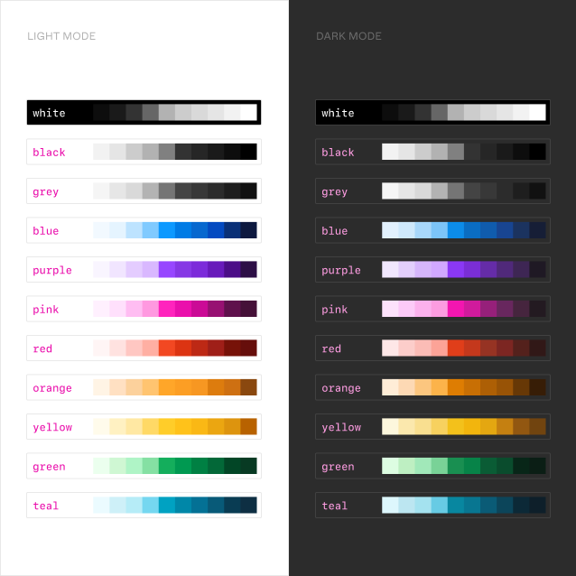
Color ramps are systematic sequences of colors that progress from light to dark (or vice versa) while maintaining consistent hue and saturation.
The team created two essential collections of color variables:
- Primitive variables based on color ramps, organized by hue from 100 to 1000
- Semantic variables following the schema established with dark mode, including modes for different themes (light/dark) and products (Figma Design, FigJam, Slides, Dev Mode)
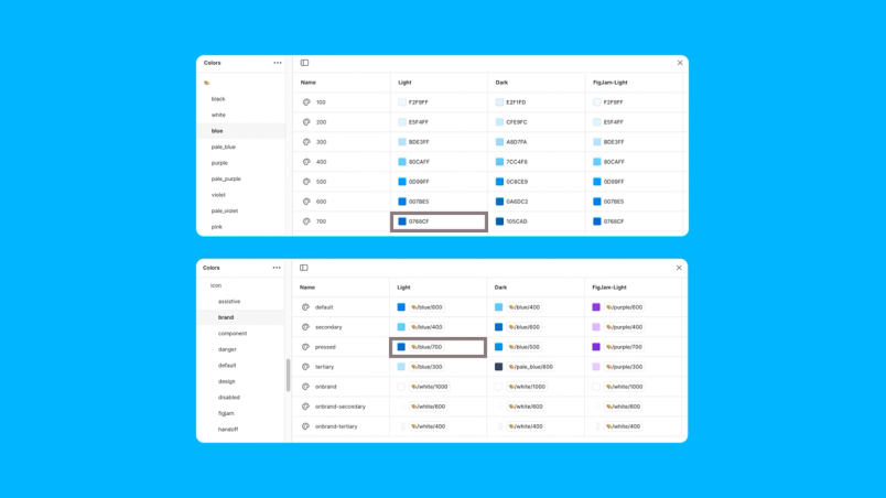
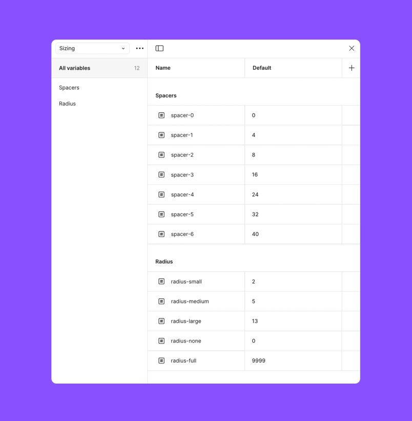
This structure allowed shared components to adapt seamlessly across different contexts while maintaining consistency. The team also established variables for radius and spacing to ensure a more consistent look and feel across products.
Automating consistency with APIs
Rather than rely on manual updates, the team used Figma’s REST API to automate synchronization between design tokens in code and variables in the Figma library.
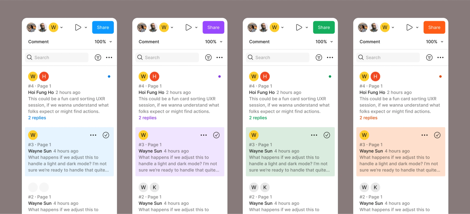
The team set up a GitHub Action that runs when variable changes are published, in turn creating a pull request that the team can then review and merge. “We were able to add all of the new brand colors for slides with almost no engineer time,” says Josh. Moving forward, designers only need to make the color definitions and—so long as developers are using the correct tokens “...which is very easy thanks to Dev Mode,” adds Josh—their colors will just work when new brands are added to the mix.
From audit to action
With their foundation in place, the team embarked on a five-month sprint to rebuild their components using the new variable system. They identified which components needed the most immediate attention, particularly those with high usage and impact on accessibility. “Components that appeared frequently in the app and had accessibility considerations needed more of our focus and attention,” Josh explains.
They started with checkboxes—a relatively straightforward component that helped build momentum—before tackling more complex elements like buttons and tabs with their multiple states and interaction patterns.
Bridging the implementation gap
Figma’s Director of Advocacy Tom Lowry and Developer Advocate Jake Albaugh talk about how to drive design system adoption with Code Connect at Config 2024.
The team discovered early on that perfect one-to-one mapping between Figma components and coded components wasn’t always possible or desirable. Rather than work around this challenge, they partnered closely with the team building Code Connect, a tool to help organizations boost design system adoption by making code more accessible and useful for developers.
“Code Connect was built in-sync with FPL,” Tom explains. “We met weekly to talk through features we wanted, how we could build them to get the most out of the project, and making sure we were using the product as intended.” As the first beta testers, the FPL team’s feedback helped evolve Code Connect into the tool we know today.
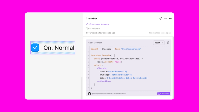
This close collaboration led to a new requirement: Every FPL component must have Code Connect support before it can be considered complete. “This helps with adoption,” Josh notes. “New hires and existing team members learn to inspect designs in Dev Mode and immediately see if an FPL component exists for the design.”
Besides supplying engineers with the code they need, Code Connect allowed the team to build components that were easy for designers to use. “Code Connect's extensibility lets us generate the right code from design components,” Tom adds. “This frees the design team up to create components that are intuitive for designers to use, even when they don't match engineering structures exactly. The translation between design and code components lives in Code Connect.”
Results that scale
After five months of intensive work, the team created:
- 680+ tokens for color, typography, sizing, spacing, and radius
- 22 component sets with more than 670 variants
- Comprehensive design documentation in the main Figma library
- A new documentation site for engineering teams, complete with use cases, APIs, and UI2-to-UI3 conversion guides
The impact extends beyond numbers. “Teams are reporting better component discoverability, more consistent experiences, and an easier path to building accessible features,” Tom notes. “We’re giving people the tools to create inclusive experiences without starting from scratch each time.”
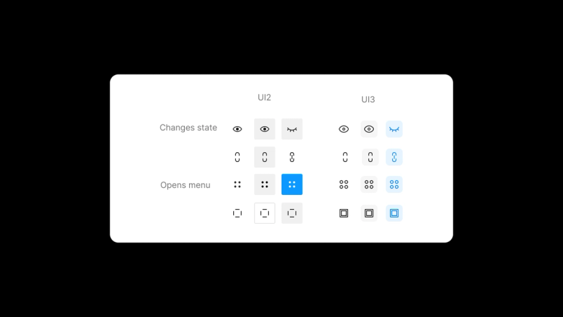
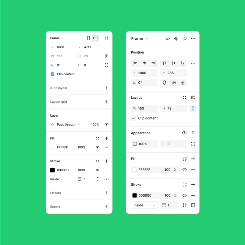
This improved consistency is visible throughout the UI. One clear example is the icon button transformation, where the team consolidated four different buttons with varying visual treatments and behaviors into a consistent, cohesive component set. Similarly, in the design panel, they re-designed the input fields and added a new combo input component to create a more consistent layout and support additional interactions.
Paving the way for future growth
FPL continues to evolve. The team has opened the library file for designers to propose changes via branches and is launching an internal advocacy program to strengthen collaboration between the FPL team and the wider design organization. For engineers, they’re providing unstyled primitives that enable experimentation while maintaining consistency.
“We want FPL to provide a strong foundation, but not at the cost of stifling creativity,” Josh explains. “It’s about finding the right balance between consistency and flexibility, allowing teams to experiment and push boundaries while still maintaining a coherent user experience.”
Wayne offers this advice for teams embarking on similar journeys: “Have an abundance mentality. Give your time. Give your attention. Give your ability. Building a truly effective design system is as much about fostering collaboration as it is about the technical details.”
This foundation is already transforming how Figma teams work together. As we continue to evolve our products, FPL stands as proof that sometimes moving forward requires taking a step back to build something stronger. The real power of a design system isn’t just in its components or documentation—it’s in its ability to bring teams together to build better products.

Ana Boyer is a designer advocate at Figma, where she is building community and empowering design teams across industries. She believes in collaboration and iteration and is always looking to build systems and establish processes where there is ambiguity.
