ShopDreamUp AI ArtDreamUp
 z-design on DeviantArthttps://www.deviantart.com/z-design/art/Trifold-Brochure-Shidler-158126360z-design
Deviation Actions
Comments118
Join the community to add your comment. Already a deviant? Log In
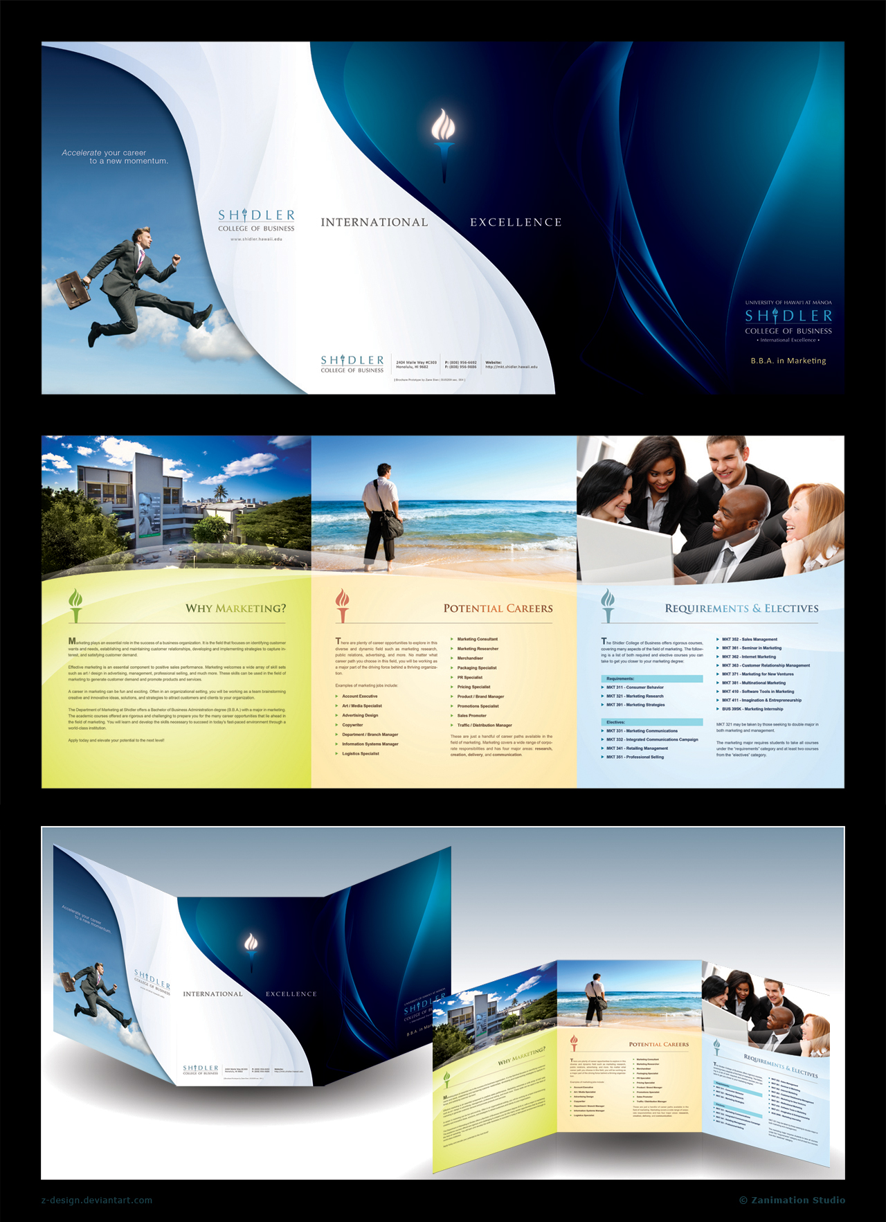
The front!
Nice choice of colors, as blue is a favorite of mine it really spoke to me. Like the aero wind and the white to contrast the blue...though the man "floating" in the clouds is a downer, since I come from a family of business people this is the exact opposite what real business people tell you, the main focus is to have your feet on the ground and goals and ideas global and "in the clouds"...but that’s my opinion. Nothing much else i can say about the front, overall its very nice and appart from the flying business guy I like it, though its nothing original or overly stunning, which in fact for this pamphlet is a sign of professionalism, clean work!
The content side!
Again nice choice of colors, standard looking jet professional...I believe it is easier to give critique than think of all the possibilities when one is making sth like this...I know...been trough it...Picture choice, the first, no complaints, can’t think of anything, then it must be right. Potential careers, standing at the ocean side, maybe it’s the country I am from or something else but this is what goes through my mind when I see this, OMFG so many to choose I am like a drop in the ocean, do I really have to struggle that much to find what I am looking for, who will notice a single drop anyway?! The last picture! ...this is a difficult one for me, for you see if I were to get this pamphlet in my university or where ever I would first be like WTF, as there are black people happily smiling with white people, this does not happen here, as there are no black people here... hard to believe, and we are part of the EU...that aside as you are in the US, I’ll try to have a cosmopolitan approach...I'd still go wtf, smiley people happy to study...never seen that happen, really never seen it, in all my time at the university, that’s why pamphlets here depict studding more than joy and smiley people...
Conclusion...The cover: Nice concept, simple, pure and professional. 4.5 out of 5, as it’s not that original (may be because I have had similar ideas)...sry
The interior: nothing new, pretty standard if u ask me, tho again professionally done and good choice of colors!
Hope this has been some help! (take this as a different view, from another culture and understanding