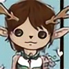


![Curious [Finished]](https://images-wixmp-ed30a86b8c4ca887773594c2.wixmp.com/f/8a76c993-bf58-4f6a-82d8-c515ac41467e/dfm63c8-07411135-bf3c-4dde-97ba-6449b7072663.png/v1/fill/w_700,h_334,q_70,strp/curious__finished__by_fiachmara_dfm63c8-350t.jpg?token=eyJ0eXAiOiJKV1QiLCJhbGciOiJIUzI1NiJ9.eyJzdWIiOiJ1cm46YXBwOjdlMGQxODg5ODIyNjQzNzNhNWYwZDQxNWVhMGQyNmUwIiwiaXNzIjoidXJuOmFwcDo3ZTBkMTg4OTgyMjY0MzczYTVmMGQ0MTVlYTBkMjZlMCIsIm9iaiI6W1t7ImhlaWdodCI6Ijw9NjEyIiwicGF0aCI6IlwvZlwvOGE3NmM5OTMtYmY1OC00ZjZhLTgyZDgtYzUxNWFjNDE0NjdlXC9kZm02M2M4LTA3NDExMTM1LWJmM2MtNGRkZS05N2JhLTY0NDliNzA3MjY2My5wbmciLCJ3aWR0aCI6Ijw9MTI4MCJ9XV0sImF1ZCI6WyJ1cm46c2VydmljZTppbWFnZS5vcGVyYXRpb25zIl19.9WhCTYP1ZEm-G94VecYoIVRkS8Bh1Lb1LjfF9QO0WS8)
- United States
- Deviant for 14 years
Badges


Join the community to add your comment. Already a deviant? Log In
snow
0 min read
It is so strange here. Spring has sprung winter has officially passed they are threatening a winter storm lol oh well we need the moisture.
Join the community to add your comment. Already a deviant? Log In
Devious Journal Entry
0 min read
Hey look I got Tagged:So here's the deal :icondagirl4ever: dagirl4ever tagged me to do this fun silly getting to know you kinda thing here's all the info.Rules:
1. You must post these rules.
2. Each person must post 10 things about themselves on their journal.
3. Answer the questions the tagger set for you, and create ten (10) new questions for the people you tag to answer.
4. You have to choose 10 people to tag and post their icons on your journal.
5. Go to their pages and tell them you have tagged her/him.
6. No tag backs.
7. No crap in the tagging section about "you are tagged if you're reading this." You have to tag 10 people.10 Things...
Join the community to add your comment. Already a deviant? Log In
Profile Comments 26
Join the community to add your comment. Already a deviant? Log In
Hello I am new in deviant art... Basically I just joined can you please look at my new post and give me some videos back about how I can get better? It's OK I you don't want to
Thanks
Thanks
Hey there, I am happy to look over your newest piece and give you some feedback. I'm going to assume you are referring to your mixed media piece with the CD's and the horse profile. This piece is really cool. I love the mix of the iridescent cd mosaic against the bold black lines. It reminds me of stained glass. I like the simplicity. You could try doing a watercolor background to mimic the soft colors in the CD if you wanted but it really isn't needed. Another thing that could help ramp things to the next level is your linework. I wasn't sure what type of brush you used but I would use a round brush to paint the lines, it'll give you a nice point if you take your time. This will help to clean up the lines and make them appear clean and crisp. I also wish you had finished the mosaic by bringing the CD tiles down the neck portion. Overall this was super cool.
I thought this would be super fun on plastic. You could trace out your pattern with sharpie, then lay out your tiles. You could use a mix of glue and black paint to fill in the lines the if you wanted, use regular paint, use puff paint, or depending on size just leave the sharpie. I would experiment. The cool thing is this could then be hung up to catch the light.
I also looked at the other pieces that you posted. The figure drawings are super fun. You show a great eye for proportion. Even though they were simple they were well balanced. I especially like the piece titled Broken World. This was super intriguing and I would love to see further development on this concept. It looks like a fast sketch and it would be interesting to see what you could turn it into if you revisited the idea and further fine-tuned your details.
Overall I really enjoyed looking at your work, thank you for asking me to visit your page. (^_^)
Thanks for the watch!

No problem ")
 Hello there wonderful stranger!
I wanted to thank you for adding me to your watch!

I really appreciate your support in my journey to become a professional artist

Thank you again and have a most marvelous day!

Thanks kindly for the  and attention to my gallery
  The support is greatly appreciated!