Many companies aim to be customer-centered, but it’s hard to meet that commitment without mapping out practical ways to make that mentality a reality. Some organizations keep a steady cadence of customer calls or on-site visits. Others run focus groups to get to know their customer—and their customers’ customer. Some hire their customers and integrate their DNA into the company.
At Stripe, we stay user-focused by empowering any employee to reach out to users. That was true when we had over 1,000 developers sign up before our launch, and it’s true today as we support more than 100,000 businesses worldwide. It’s less of a policy and more of an operating philosophy. Online surveys are one of the ways we enable—and encourage—all Stripes to connect with users.
Surveys have long been a channel to get useful customer feedback fast—unlocking user needs, pain points, and motivations in order to build better products and target the right markets. But great surveys are deceptively simple—it’s easy to accidentally create a survey template that frustrates users while totally confusing your team and you.
The goal of this guide is to share the main principles Stripe uses to build clear, intuitive, and engaging surveys. These survey best practices helped us more than triple both our survey response and completion rates. It’s also surfaced insights that have refined product development, improved internal operations, and, most critically, fostered closer ties with our users.
What makes a survey great
Think of a memorable survey you’ve taken.
If one comes to mind, odds are it’s not because it was praiseworthy. Great surveys, like other first-rate user experiences, reduce friction and fade into the background. It’s the painful surveys—such as one asking about “English proficiency” in English—that people remember. (True story.)
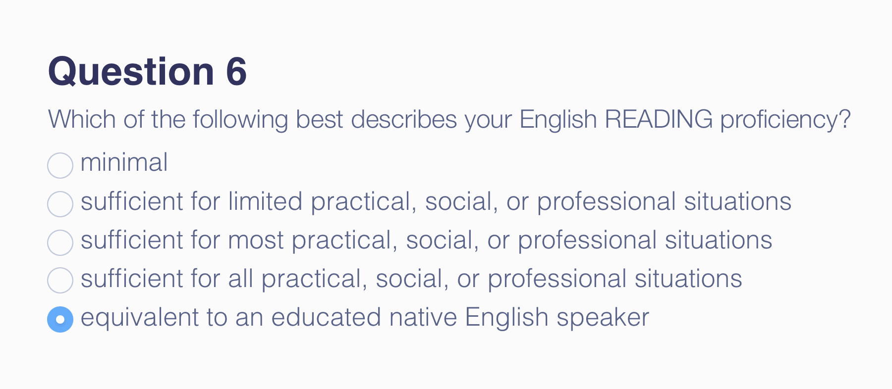
A particularly painful survey question
Great surveys—ones that forge better products and stronger relationships with users—distinguish themselves from the rest in five important ways. They:
- Increase the number of people who take and complete your survey
- Make it easier to pull insights out of your survey data
- Ensure your data analysis is valid and accurate
- Facilitate buy-in for survey-based decisions
- Change how people view your company and brand
The survey research design team, and all Stripes, refer to a few main principles to build great surveys—ones users love to take, teams love to analyze, companies love to act on, and, just maybe, make the world a better place.
Key principles behind great surveys
Principle 1: People aren’t here for surveys.
It’s safe to say that close to 0% of your customers proactively visit your website in search of an online survey. They’ve got something else in mind: They want to make a purchase, update their subscription, review a dashboard, or learn more about your brand.
If you’re going to put surveys between people and the tasks they want to accomplish, make their survey experience as painless as possible. They shouldn’t have to think too hard to answer your questions, and they should be able to quickly get back to their tasks at hand. Make their survey experience smooth and increase survey engagement by following a few easy guidelines:
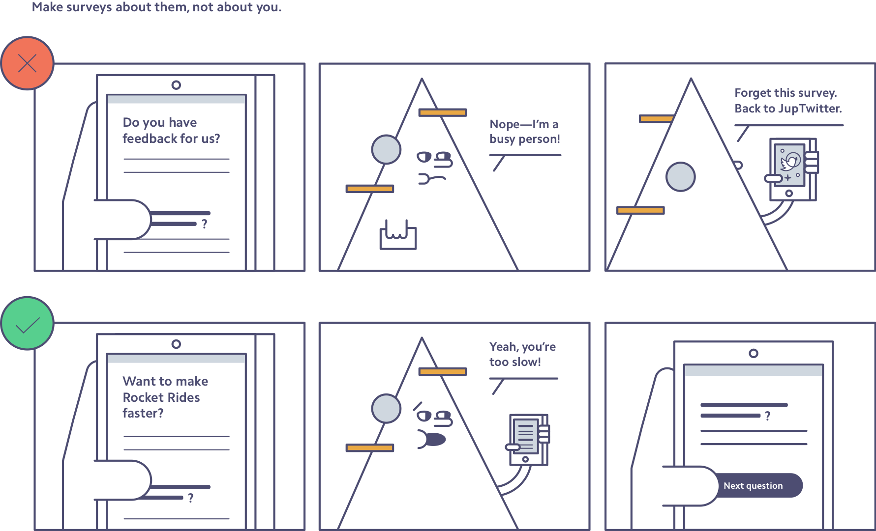
Make surveys about them, not about you. Remind people what’s in it for them when you introduce your survey. Don’t make general requests for feedback and ask, “Help us by taking this survey.” Tell them how their responses will benefit them, whether that’s making a page more useful, getting rid of a bug, or providing better service.
To illustrate this point, let’s say you work at interstellar travel company Rocket Rides. Your goal is to build better experiences for your users, and to do that you need to understand what your users are thinking. But to get them through your entire survey without quitting and checking Twitter, it must be clear and compelling for people (and space aliens alike):
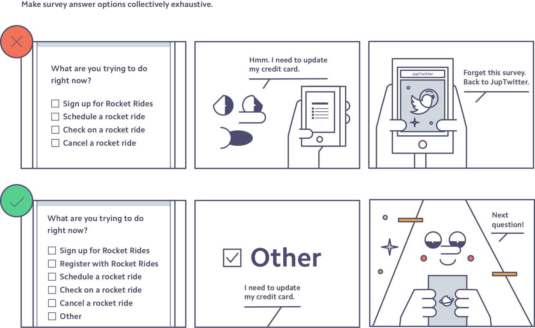
Make answer options collectively exhaustive. Every survey taker should be able to answer every question, which often means including an “I’m not sure” and an “Other (please describe):” response. Not only does this give each respondent something to click, but it also weeds out weak or unrelated answers. Here’s this tactic in action in the Rocket Rides survey:
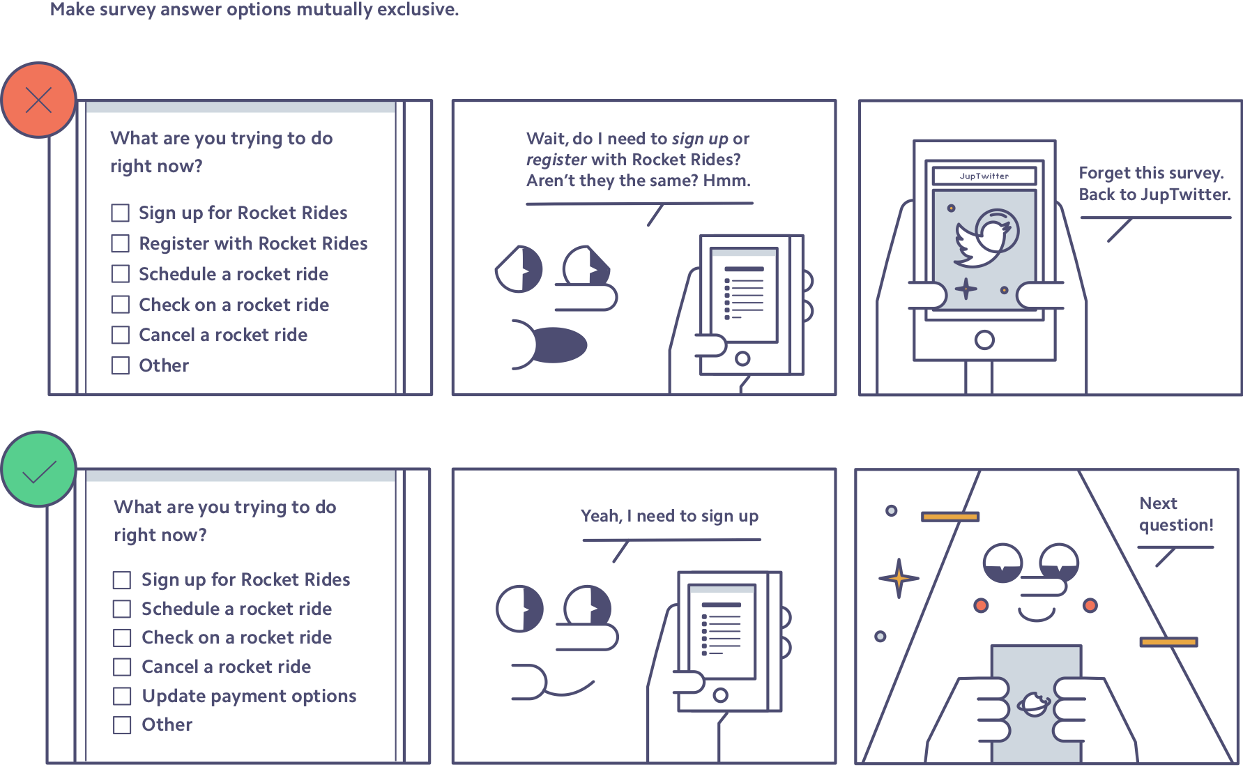
Make answer options mutually exclusive. When survey takers see answer options that overlap (e.g., “1–5 rides” and “5–10 rides”), they abandon the survey (a little too much to think about there) or answer inaccurately. Make sure all answer options are mutually exclusive (e.g., “1–5 rides” and “6–10 rides”) to avoid confusion—and survey respondent churn.
Once more, let’s see how Rocket Rides can improve its survey question:
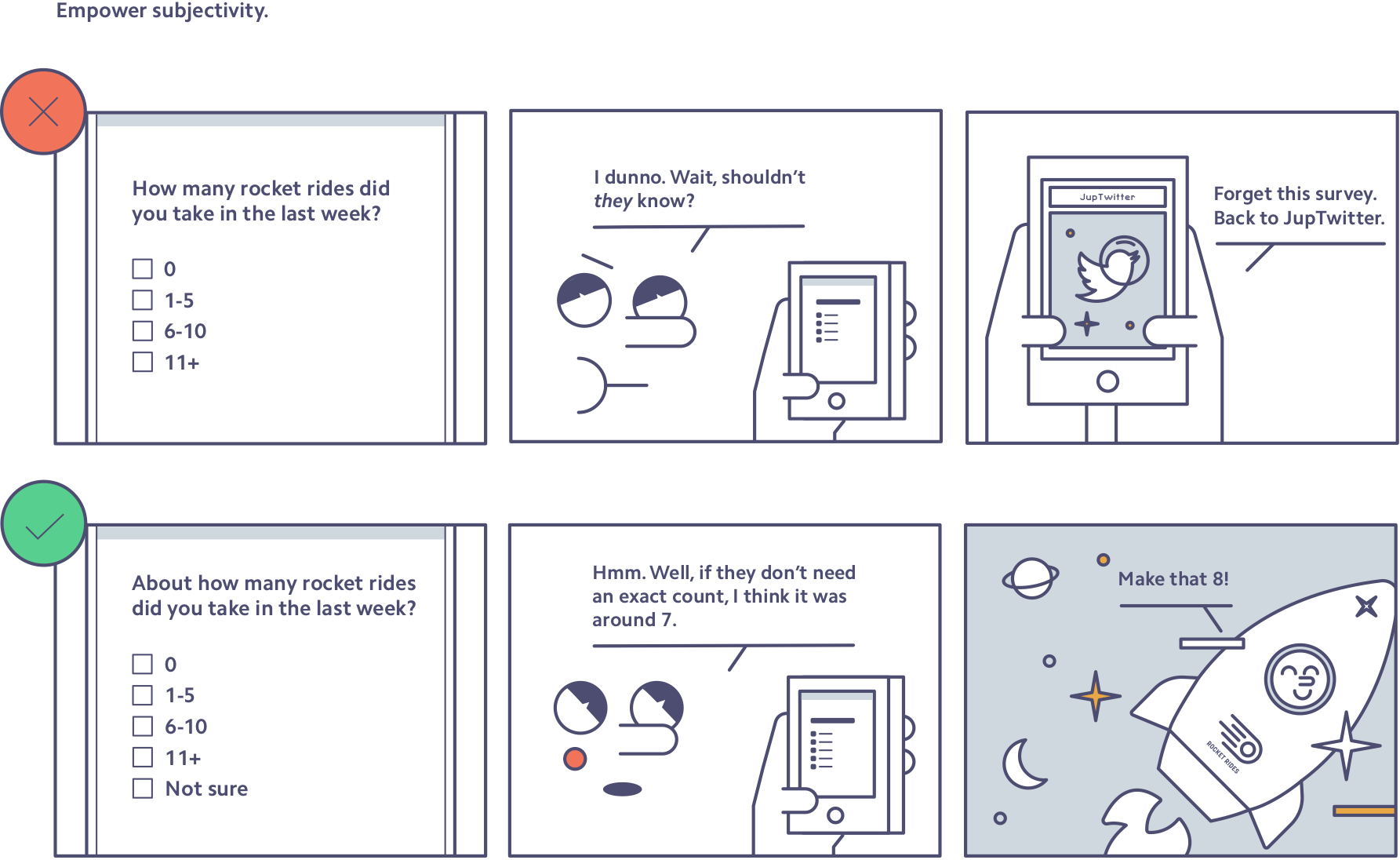
Use language that encourages people to be subjective. When asking people to recall or estimate information (e.g., how many customers they have or how many rocket rides they’ve taken recently), don’t make them stop and wonder the level of accuracy that’s needed. Instead, use words and phrases like “roughly,” “in your opinion,” “generally,” or “if you had to guess” to empower people to give subjective answers, as well as continue with the survey. Here’s how that might look:
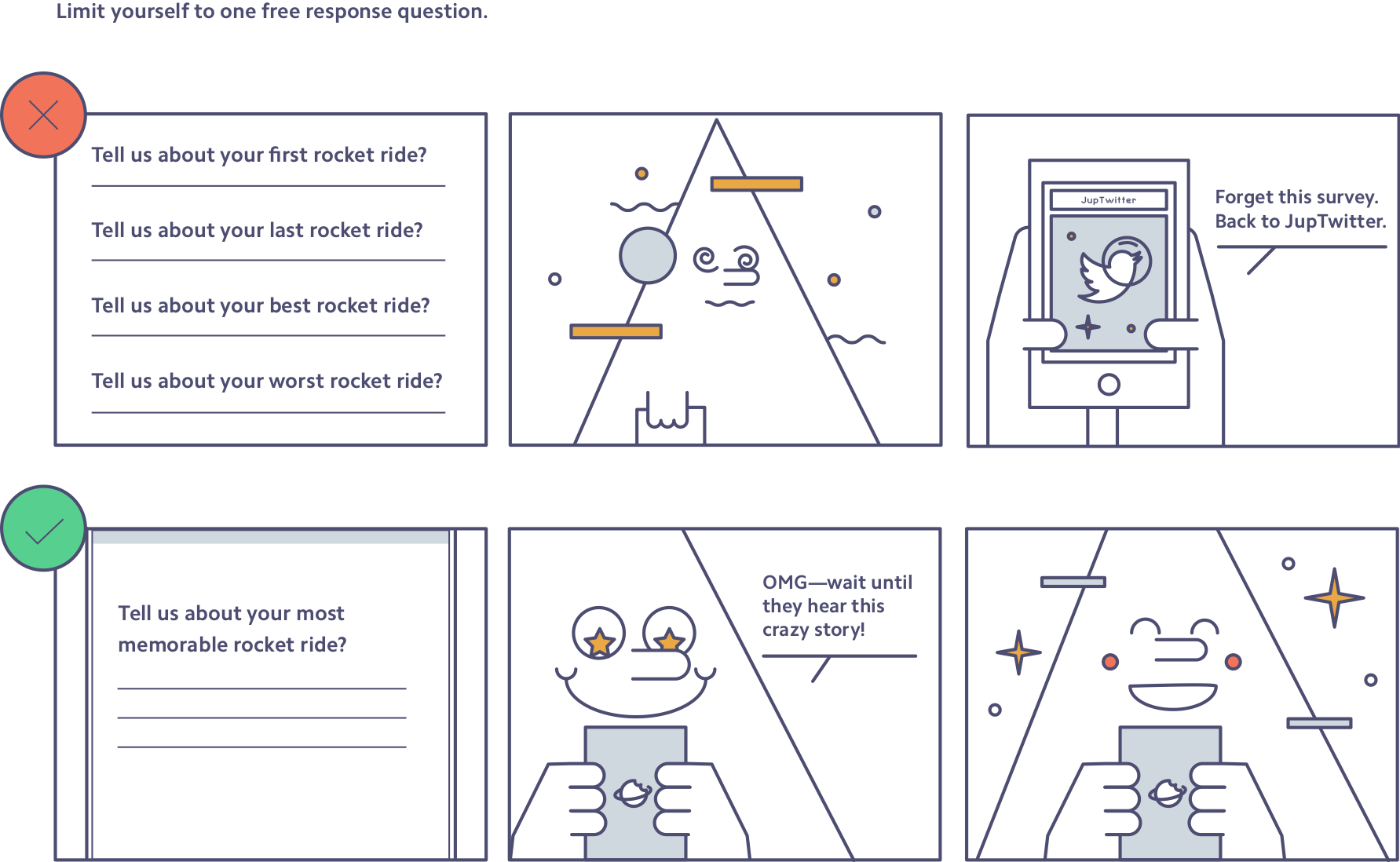
Use only one free-response question—at the end of a survey. Multiple-choice questions are easy to answer (especially if you follow the previous tips), but coming up with actual words to type in a box requires more work—especially on mobile. People are more likely to drop out of surveys when they encounter free-response questions, so it’s best to put them at the end of your survey. By that point, you’ve built trust with sound questions, warmed up a survey taker on the topic, and given them some direction on what you’re hoping to learn. So ask only one free-response question; only on rare occasions should you ask two.
Here’s how too many free-response questions can lose survey respondents:
Summary: During outreach, frame how a completed survey will benefit the respondent, not how it’ll help the company. Use the “Mutually Exclusive, Collectively Exhaustive” (MECE) rule to test all survey answer options. Let respondents be subjective and embrace ballpark figures—an approximate answer is better than an abandoned survey. Choose only one free-response question, and put it at the end of the survey to increase the likelihood of survey completion.
Principle 2: Surveys are branded content.
When people get an email from your company, they don’t think about the specific human who wrote the survey. They see the survey as a communication from the company at large. A survey is a direct-to-user message about your company’s priorities, attention to detail, and respect for their time. Create a survey experience that honors user time, and represents the best of your brand, by keeping these tips in mind:
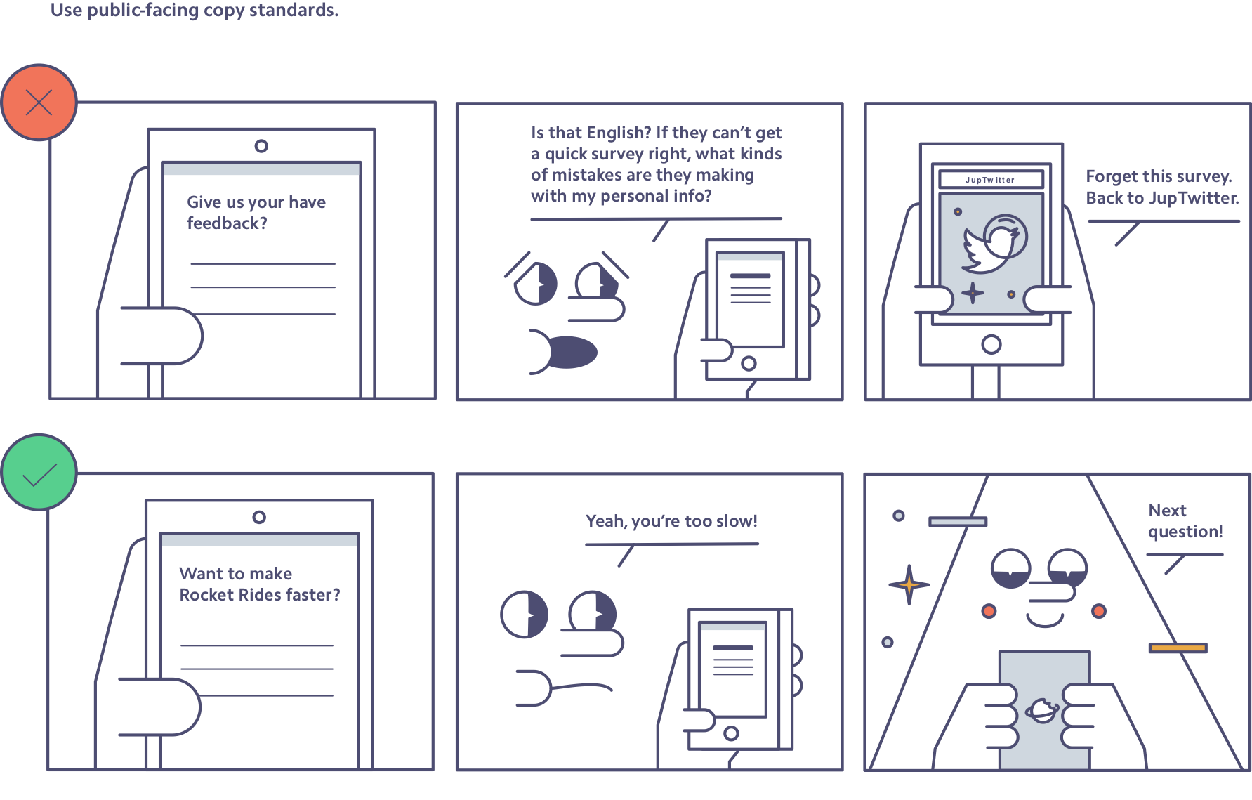
Use public-facing copy standards. Surveys may be sent privately with unique links, but they are still public-facing content and reflect your standards. They should have impeccable punctuation, grammar, spelling, content clarity, and tone. Typically the only way to ensure this is to bring in an extra set of eyes, so always ask someone to review a survey template before you send it to users. At Stripe, we make it a practice to share surveys with our teammates before shipping to help catch typos and unclear sentences.
Here’s how bad grammar or typos can send survey respondents down a spiral:
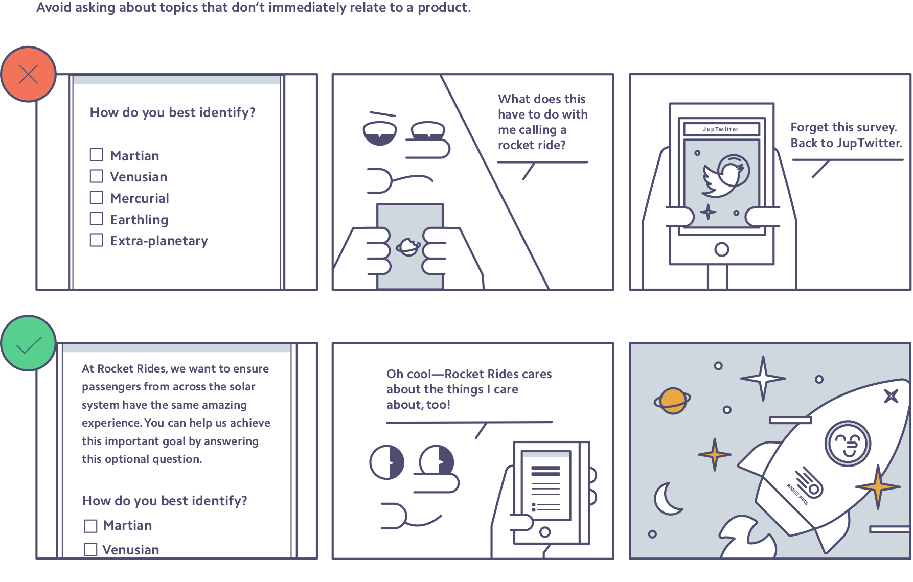
Avoid asking about topics that don’t immediately relate to a product. Here’s an easy rule of thumb: If you wouldn’t ask it of someone on the bus, don’t ask it in a survey. Topics that can be sensitive, provocative, and have no immediate relationship to your product portfolio—political, religious, sexual orientation; health status; family and education history—are especially tricky in survey format. There are thoughtful ways to ask these kinds of questions, but they require a lot of care. Most importantly, you’ll want to be sure survey respondents understand why you’re asking them the personal question, tying it clearly to things they care about. Generally, avoid including these topics unless they’re critical to your business success (and then be sure to consult an expert, such as a comms person, first).
Here’s how Rocket Rides might frame a question about demographics:
Respect users’ time. Only include questions that truly target what you need to know. Good questions to ask yourself include: “Does this question respect people’s time? Does it reflect our company’s priorities?” If your survey’s too long, rank your company priorities and select only the questions that reflect the top few.
Test the survey with fresh—and diverse—eyes. Whether your survey is a first impression or another touchpoint, your brand’s reputation is in the balance. Review survey copy, content, and length yourself, and then get at least one other set of eyes on it. Ideally your reviewer can give feedback on survey voice and tone as well as catch any hard-to-understand language or terms. Someone from another part of the company is best, as they’ll be able to give a completely fresh perspective.
Summary: Let your surveys represent the best of your brand. That means copy that holds up in the public eye; doesn’t address unrelated, sensitive topics; and respects users’ time by only surfacing key priorities. Make it a practice to run surveys by an additional set of eyes—likely someone on your communications team, since surveys are branded content.
Principle 3: Always define and decouple concepts in survey questions.
It’s likely that your users spend far less time thinking about your product than you do. We often assume survey takers understand what we mean when they really don’t, so don’t barrel ahead presuming users will figure it out. Here’s how to get—and stay—on the same page as your survey respondents:
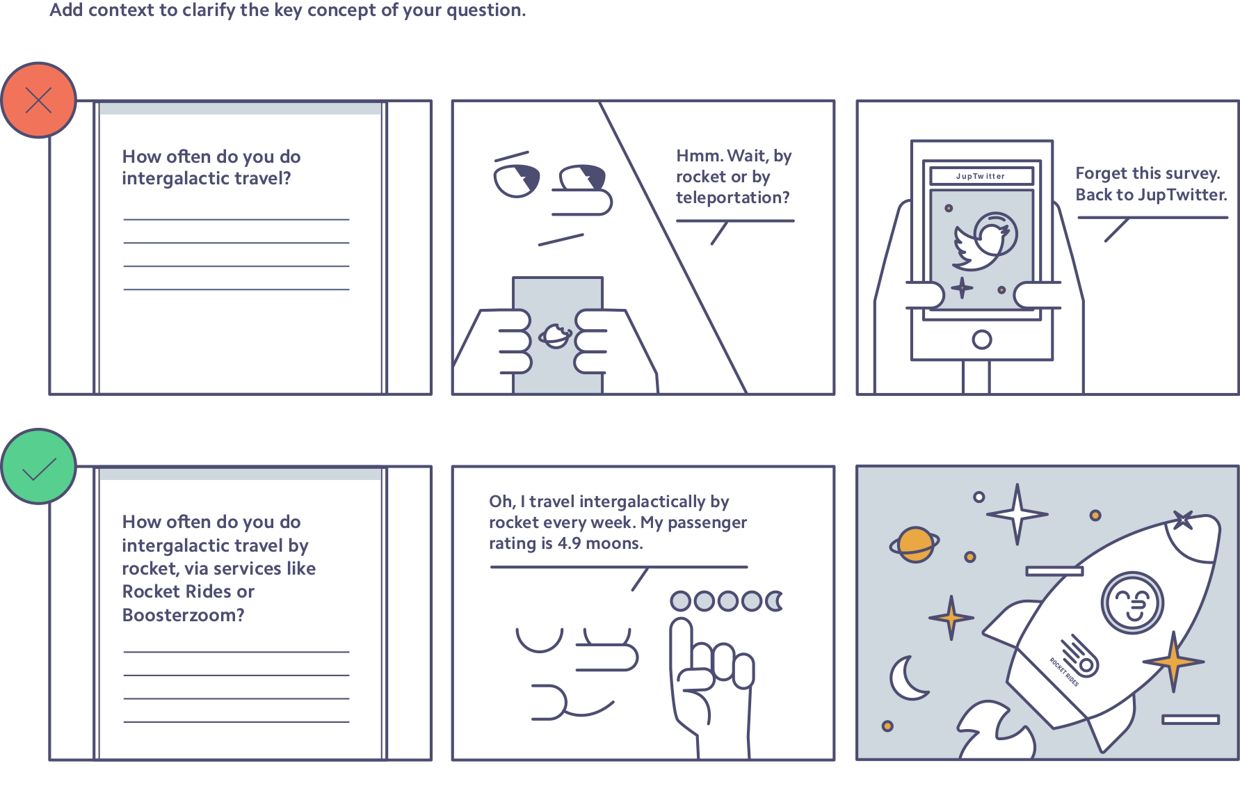
Describe in detail the key concept of your question. Each survey question should reference a topic that’s identifiable and clear to the respondent. Err on the side of caution when your key concept is a product name or technical term. Use multiple descriptors to indicate what you mean. For example, when Stripe sends out a survey, we shouldn’t just ask about “online payments.” We should give added context to ensure survey responders understand the question: “About how long have you been accepting online payments (through companies like Stripe, PayPal, Adyen, Braintree, or Square)?”
Here’s an example of adding context to make a question more precise and answerable:
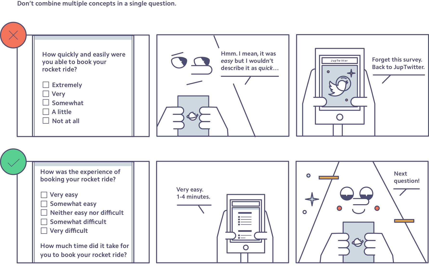
Never ask about multiple concepts in a single question. It can be tempting to ask about many parts of the customer experience in one fell swoop. Say you want to know if a customer’s experience is “quick and easy.” Asking, “How quick and easy was your experience?” is not only a leading question (see Principle 4 below), but potentially impossible to answer. If a person’s experience was extremely quick but not at all easy, how should she answer? Here’s another example: If you’re hoping to gauge how digestible a guide may be, don’t ask, “How informative and understandable is this guide?” Instead, break it into two concepts: “How much did you learn from this guide?” and “How clear or unclear is this guide?” By not stacking multiple concepts into a single question, you give your users a better survey-taking experience and make your data way easier to understand.
Here’s this tactic in action in a survey from Rocket Rides:
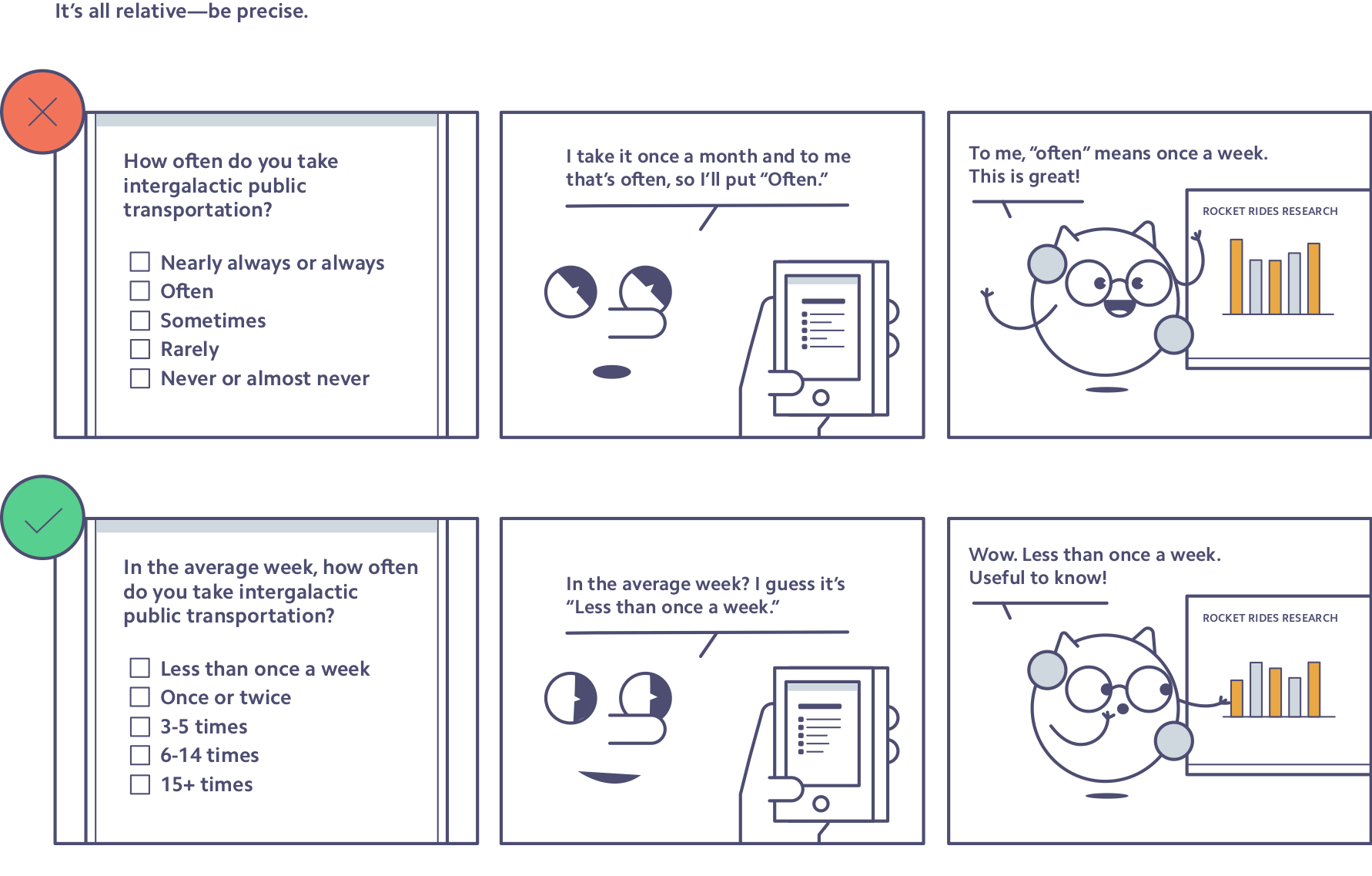
It’s all relative—be precise. Relative terms are an easy way to get bad data collection by accident. What you mean by “often” and what your users mean by “often” may be totally different. You may think “multiple times each day” and a user could be thinking “once a week.” Get very specific with your responses so you know what next steps to take next.
Here’s how Rocket Rides might improve a survey question—and the data it gets back:
Summary: Most issues stem from complexity and ambiguity. There are easy traps: product names or technical terms, agree-or-disagree questions, words up to interpretation like “often” or “sometimes,” or compound descriptions like “quick and easy.” So, when in doubt, question assumptions and spell it out. Many pitfalls can be sidestepped by providing context, clarifying language, or decoupling concepts.
Principle 4: Undercut agreeability.
Science says people are inclined to tell you what they think you want to hear. That’s a problem, because you need candid feedback to build the best products. These tips will empower your users to be honest when things aren’t working:
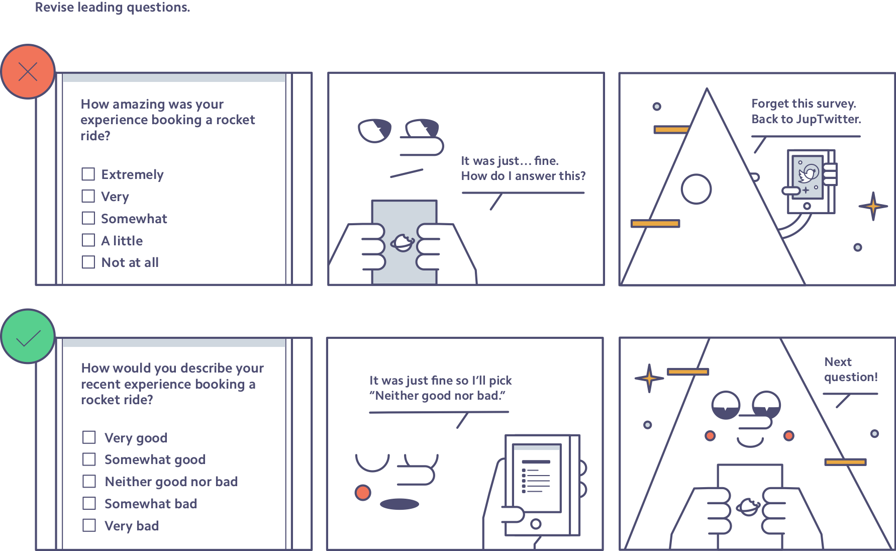
Revise leading questions. When asking respondents how positive (or useful, good, or accurate) they think something is, you nudge them to think in positive terms, and guide them to give a more positive answer. This behavior gets more complicated in an international context as survey research has shown that different regions answer survey questions in different ways. For example, in some countries (e.g., France, Greece, and India), people are less likely to choose a neutral (or center) option and more likely to respond with an extreme option. In other areas, like Northern Europe, people are less likely on average to give a positive response. This means it can be tricky to compare survey results between two countries. Carefully constructing questions in a nonleading way can help neutralize those discrepancies across markets, and, in any event, is a best practice.
Here’s a list of questions, showing the spectrum from an overtly leading question to a neutral, nonleading question:
- How great was this survey?
- How much did you like this survey?
- How often would you recommend this survey?
- Would you recommend this survey?
- How would you rate this survey?
Here’s how Rocket Rides might reframe a leading question:
Avoid agree-disagree scales. Questions with agree-disagree scales, where the choices often range from strongly agree to strongly disagree, lead to acquiescence bias, a fancy way of saying they lead people to give positive or agreement answers more often. While there are some instances when agree-disagree scales work well—typically when the question is extremely simple and clear—item-specific responses are better 95% of the time. Item-specific responses mean that the survey responses map onto the survey question. So, instead of agreeing or disagreeing with a statement, you’re sharing to what degree you feel a specific thing, or how often you do something.
Here’s how Rocket Rides might reword a question with an agree-disagree scale:

Let people disagree. Set a tone of feedback and willingness to learn from the start by letting users know that you want honest feedback in an introduction page or paragraph. Studies show that asking for honest feedback at the start of the survey can encourage more thoughtful responses. Also consider asking users for feedback using a free-response box—even if they already said they liked your product or experience. This is another way to show you truly want to hear how you can make things better. It also captures feedback from people who might have been influenced by acquiescence bias.
Summary: Encourage your users to be honest and direct with you. Begin surveys by telling respondents that you want their candor—and leave a door open for feedback at the end of the survey. Cut or revise any leading questions. Be careful not to influence respondents with positive terms or agree-disagree scales.
The understated role of online surveys
Surveys are sobering mirrors of the companies that send them. People may welcome the opportunity to interact with, support, and improve your brand—and take your survey. Or respondents might reject it out of distraction, disinterest, or suspicion. Regardless of the initial reception, the task is the same: getting feedback to improve products to better serve people.
A survey makes headway when the mirror moves to reflect the respondent, not the company. The more the survey respondent comes into focus, the better. That shift happens when:
- It’s painless to take surveys at every turn—from mutually exclusive, collectively exhaustive answer options to placement of a free-response question.
- People design, draft, and review surveys as branded content.
- Survey questions include context, define ambiguous terms, and decouple concepts.
- Surveys actively let respondents disagree and share candid feedback.
Stripes have surveyed users from the start, but it’s still early days. Our survey research team continues to refine how to equip any employee with the tools to draft and deploy surveys, while making sure users have a good experience completing them. The outcome we want is also an equilibrium: at once projecting Stripe—with a tone that’s straightforward and warm—via the survey, while making it so frictionless that people share their feedback and then continue supporting their business.
The balance is challenging, but the reward is worth it.
Tell us if you’ve tried—or will try—these tactics, or if you’ve got tips on survey design best practices. We’re all ears. Email us at research@stripe.com. Or if you want to work with us and build out research at Stripe, apply here.
