. 2023 Sep 28;186(20):4345-4364.e24.
doi: 10.1016/j.cell.2023.08.042.

Tracking cell-type-specific temporal dynamics in human and mouse brains

Affiliations

Tracking cell-type-specific temporal dynamics in human and mouse brains

Ziyu Lu et al. Cell. .

Abstract

Progenitor cells are critical in preserving organismal homeostasis, yet their diversity and dynamics in the aged brain remain underexplored. We introduced TrackerSci, a single-cell genomic method that combines newborn cell labeling and combinatorial indexing to characterize the transcriptome and chromatin landscape of proliferating progenitor cells in vivo. Using TrackerSci, we investigated the dynamics of newborn cells in mouse brains across various ages and in a mouse model of Alzheimer's disease. Our dataset revealed diverse progenitor cell types in the brain and their epigenetic signatures. We further quantified aging-associated shifts in cell-type-specific proliferation and differentiation and deciphered the associated molecular programs. Extending our study to the progenitor cells in the aged human brain, we identified conserved genetic signatures across species and pinpointed region-specific cellular dynamics, such as the reduced oligodendrogenesis in the cerebellum. We anticipate that TrackerSci will be broadly applicable to unveil cell-type-specific temporal dynamics in diverse systems.

Keywords: aging; cell-type-specific; neurogenesis; oligodendrogenesis; single-cell epigenome; single-cell transcriptome; temporal dynamics.


Conflict of interest statement

Declaration of interests J.C., W.Z., Z.L., and M.Z. are inventors of patent applications related to TrackerSci.

Figures
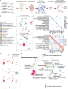
Figure 1.
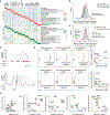
Figure 1.. TrackerSci enables single-cell transcriptome and chromatin accessibility profiling of rare proliferating cells in the mammalian brain
(A) TrackerSci workflow and experiment scheme. Key steps are outlined in the text. (B) UMAP visualization of single-cell transcriptomes (top) and single-cell chromatin accessibility profiles (bottom), including EdU+ cells (profiled by TrackerSci) and all brain cells (without enrichment of EdU+ cells), colored by main cell types. (C) Dot plot and heatmap showing gene expression and gene activity of marker genes for each cluster defined by TrackerSci-RNA (top) and TrackerSci-ATAC (bottom), respectively. (D and E) UMAP visualization of mouse brain cells, integrating the single-cell transcriptome and chromatin accessibility profiles of EdU+ cells and DAPI singlets (representing the global brain cell population). Cells are colored by sources (D, top), molecular layers (D, bottom), and main cell types (D). The identified neurogenesis and oligodendrogenesis trajectories are both annotated in (E).
Figure 2.
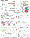
Figure 2.. TrackerSci captures rare newborn cells that are less represented in conventional single-cell studies
(A) Pie plots showing the proportion of main cell types identified in the global cell population (left) and the enriched EdU+ cell population (right) from single-cell transcriptome data. (B) Scatterplot showing the fraction of each cell type in the enriched EdU+ cell population by single-cell transcriptome (x axis) or chromatin accessibility analysis (y-axis) in TrackerSci, together with a linear regression line. (C) We integrated the TrackerSci dataset, including both EdU+ cells and DAPI singlets, with a large-scale brain cell atlas. The UMAP plots show the integrated cells, colored by assay types (left, cell types from TrackerSci are annotated) or cell annotations from the brain cell atlas (right, cells from TrackerSci are colored in gray).
Figure 3.
Figure 3.. Identifying epigenetic elements and TFs associated with heterogeneous cellular states of newborn cells in the mouse brain
(A) Heatmap showing the relative expression (top) and chromatin accessibility (bottom) of cell-type-specific genes across cell types. Each row represents the aggregated gene expression or promoter accessibility for a specific cell type. All conditions are included into the calculation. (B) Density plot showing the distribution of Pearson correlation coefficients between gene expression and the accessibility of promoter (red) or nearby accessible elements (±500 kb of the promoter, blue) across pseudo-cells. Background distribution by permuting pseudo-cells is colored in gray. (C) Genome browser plot showing links between distal regulatory sites and genes for a neurogenesis marker (Dlx2, top) and an oligodendrogenesis marker (Olig2, bottom). (D) UMAP plots showing the cell-type-specific expression (left), the accessibility of promoter (middle), and linked distal site (right) for genes Dlx2 (top) and Olig2 (bottom). (E) Density plot showing the distribution of Pearson correlation coefficients between TF expression and their motif accessibility across pseudo-cells. Background distribution by permuting pseudo-cells is colored in gray. (F) Scatterplots showing the correlation between the scaled gene expression and motif accessibility across cell types for Dlx2 (top) and Olig2 (bottom), together with a linear regression line. ASC, astrocyte; CBGN, cerebellum granule neuron; COP, committed oligodendrocyte precursor; DGNB, dentate gyrus neuroblast; ERY, erythroblast; MFO, myelin-forming oligodendrocyte; MG, microglia; NPC, neuronal progenitor cell; OBNB, olfactory bulb neuroblast; OBIN, olfactory bulb inhibitory neuron; OPC, oligodendrocyte progenitor cell; VC, vascular cell. (G) Scatterplots showing the correlation between the scaled gene expression and motif accessibility of less-characterized TF regulators, together with a linear regression line.
Figure 4.
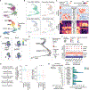
Figure 4.. Deciphering the impact of aging on the proliferation status and differentiation dynamics of different cell types in the mammalian brain
(A) Boxplot showing the fraction of EdU+ cells in the mouse brain after 5 days of EdU labeling from both single-cell transcriptome and chromatin accessibility experiments. Numbers represent the p values using the Wilcoxon rank-sum test. (B) With the single-cell RNA (scRNA)-seq or ATAC-seq data of TrackerSci, we first calculated the cell-type-specific fractions among EdU+ cells and multiplied them by the EdU+ ratio from FACS for both aged and adult brains. We then quantified the fold changes of the normalized cell-type-specific fractions. The scatterplot shows logFC correlation between scRNA and scATAC analysis. (C) Similar to the analysis in (B), the dot plot shows the log-transformed cell-type-specific fold changes between each condition and adult. (D) Area plot showing the cell-type-specific proportions in EdU+ cells over time. (E) UMAP showing integrated cells corresponding to OB neurogenesis (top), oligodendrogenesis (middle), and microglia (bottom) between TrackerSci and brain cell atlas, colored by cell type annotations in TrackerSci (left) and the expression of the NPC marker Mki67 (top), the COP marker Bmp4 (middle), and the aging/AD-associated microglia marker Csf1 (bottom). (F) Boxplots showing the cell-type-specific fractions of NPCs (top), COPs (middle), and aging/AD-associated microglia (bottom) across different conditions in the brain cell atlas (left) or newborn cells from TrackerSci (right). (G) Schematic showing the calculation of the self-renewal and differentiation potential of progenitor cells. (H) Left: line plot showing the estimated self-renewal potential of NPCs over time. Right: line plot showing the estimated differentiation potential of OPCs across three age groups.
Figure 5.
Figure 5.. Characterizing the impact of aging on neurogenesis
(A) UMAP plots showing the differentiation trajectory of neurogenesis, colored by main cell types (top) or pseudotime (bottom), inferred by RNA velocity analysis (top). (B) Scatterplots show the distribution of EdU+ cells harvested at different time points after 5-day EdU labeling and cells without EdU+ enrichment along neurogenesis. (C) Heatmap showing the dynamics of gene expression and motif accessibility of cell-type-specific TFs across the pseudotime of neurogenesis trajectories. Each bin along the x axis represents a collection of cells stratified based on their respective positions along the pseudotime trajectory. (D) Contour plots showing the distribution of EdU+ cells from TrackerSci-RNA in the neurogenesis trajectory across conditions. The arrows point to the significantly reduced cell states. (E) A neighborhood graph from Milo differential abundance analysis on the neurogenesis trajectory. Nodes represent cellular neighborhoods from the k-nearest neighbor (KNN) graph. Differential abundance neighborhoods are colored by the log-transformed fold change across ages. Graph edges depict the number of cells shared between neighborhoods. (F) The dot plots and heatmaps show the scaled gene expression and promoter accessibility of top differentially expressed genes in the NPCs. (G) Left: summary of the study design used to validate the knockout effects of aging-decreased genes in the NPCs. Right: boxplots showing the expression changes of aging-decreased genes from current study and the gRNA enrichment of these genes compared to randomly selected genes from the knockout study. Stars indicate p values using the Wilcoxon rank-sum test. Left: p = 3.94e−7; right: p = 0.00285. (H) Left: boxplot showing the top gene candidates that impair neurogenesis after CRISPR knockout from the published study. Right: bar plot showing their decreased expression in NPCs comparing aged to adult in our current study. Error bars represent standard error of mean (SEM).
Figure 6.
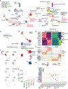
Figure 6.. Characterizing the impact of aging on oligodendrogenesis
(A) UMAP plots showing the differentiation trajectory of oligodendrogenesis, colored by main cell types (top) or pseudotime (bottom), inferred by RNA velocity analysis (top). (B) Contour plots show the distribution of EdU+ cells harvested at different time points after 5-day EdU labeling and cells without enrichment of EdU+ cells along oligodendrogenesis. (C) Heatmap showing the dynamics of gene expression and motif accessibility of cell-type-specific TFs across the pseudotime of the oligodendrogenesis trajectory. (D) Contour plots showing the distribution of EdU+ cells from TrackerSci-RNA in the oligodendrogenesis trajectory across conditions. The arrows point to the significantly reduced cell states. (E) A neighborhood graph from Milo differential abundance analysis on the oligodendrogenesis trajectory. Nodes represent cellular neighborhoods from the KNN graph. Differential abundance neighborhoods are colored by the log-transformed fold change across ages. Graph edges depict the number of cells shared between neighborhoods. (F) The dot plots and heatmaps show the scaled gene expression and promoter accessibility of top differentially expressed genes in the OPCs.
Figure 7.
Figure 7.. TrackerSci facilitates the identification of proliferating and differentiating cells in the human brain
(A) UMAP plots showing integrated cells between TrackerSci and the human brain dataset, colored by assay types (left, cell types from TrackerSci are annotated) or cell annotations from the human brain dataset (right, cells from TrackerSci in gray). (B) UMAP plots showing the subclustering analysis of cycling cells from the human dataset, colored by cell annotation. (C) UMAP plots same as (B), colored by the expression of markers for proliferation (MKI67 and TOP2A), microglia (P2RY12 and LY86), OPCs (VCAN and PDGFRA), and erythroblasts (CD36 and KEL). (D) UMAP plots showing the integrated trajectory of oligodendrogenesis-related cells between TrackerSci and the human dataset, colored by species (top), cell type annotations (middle), and pseudotime (bottom). (E) Heatmaps showing conserved gene expression dynamics along the oligodendrogenesis trajectory for human (left) and mouse (right), with key TF regulators annotated on the left. (F) Heatmaps showing divergent gene expression dynamics along the oligodendrogenesis trajectory enriched only in human (top) and mouse (bottom), with key genes annotated on the left. (G) Boxplot showing the fraction of COPs among oligodendrogenesis-related cells across different brain regions in each sample. (H) Dot plot showing examples of commonly changed and region-specific gene expression signatures across three differentiation stages along oligodendrogenesis.

Similar articles

Cited by

References

    1. Lugert S, Basak O, Knuckles P, Haussler U, Fabel K, Götz M, Haas CA, Kempermann G, Taylor V, and Giachino C (2010). Quiescent and active hippocampal neural stem cells with distinct morphologies respond selectively to physiological and pathological stimuli and aging. Cell Stem Cell 6, 445–456. - PubMed
    1. Spalding KL, Bergmann O, Alkass K, Bernard S, Salehpour M, Huttner HB, Boström E, Westerlund I, Vial C, Buchholz BA, et al. (2013). Dynamics of hippocampal neurogenesis in adult humans. Cell 153, 1219–1227. - PMC - PubMed
    1. Pollina EA, and Brunet A (2011). Epigenetic regulation of aging stem cells. Oncogene 30, 3105–3126. - PubMed
    1. Galvan V, and Jin K (2007). Neurogenesis in the aging brain. Clin. Interv. Aging 2, 605–610. - PMC - PubMed
    1. Sorrells SF, Paredes MF, Cebrian-Silla A, Sandoval K, Qi D, Kelley KW, James D, Mayer S, Chang J, Auguste KI, et al. (2018). Human hippocampal neurogenesis drops sharply in children to undetectable levels in adults. Nature 555, 377–381. - PMC - PubMed

Publication types