. 2020 Dec 10;183(6):1508-1519.e12.
doi: 10.1016/j.cell.2020.10.052. Epub 2020 Nov 3.

Compromised Humoral Functional Evolution Tracks with SARS-CoV-2 Mortality

Affiliations

Compromised Humoral Functional Evolution Tracks with SARS-CoV-2 Mortality

Tomer Zohar et al. Cell. .

Abstract

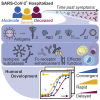
The urgent need for an effective SARS-CoV-2 vaccine has forced development to progress in the absence of well-defined correlates of immunity. While neutralization has been linked to protection against other pathogens, whether neutralization alone will be sufficient to drive protection against SARS-CoV-2 in the broader population remains unclear. Therefore, to fully define protective humoral immunity, we dissected the early evolution of the humoral response in 193 hospitalized individuals ranging from moderate to severe. Although robust IgM and IgA responses evolved in both survivors and non-survivors with severe disease, non-survivors showed attenuated IgG responses, accompanied by compromised Fcɣ receptor binding and Fc effector activity, pointing to deficient humoral development rather than disease-enhancing humoral immunity. In contrast, individuals with moderate disease exhibited delayed responses that ultimately matured. These data highlight distinct humoral trajectories associated with resolution of SARS-CoV-2 infection and the need for early functional humoral immunity.

Keywords: COVID-19; Fc receptors; SARS-CoV-2; antibodies; dynamics; innate immunity.


Conflict of interest statement

Declaration of Interests G.A. is a founder of SeromYx Systems, Inc. The Systems Serology platform is pending as a patent to G.A. No other authors have interests to declare.

Figures
None
Graphical abstract
Figure 1
Figure 1
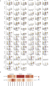
Weekly Evolution of SARS-CoV-2-Specific Humoral Immune Responses Following Symptom Onset across Different Clinical Courses There were 193 plasma samples from hospitalized SARS-CoV-2 infected individuals profiled against the SARS-CoV-2 spike (S) antigen. (A) Of the patients, 82 were not admitted to the ICU and were eventually discharged (moderate), 76 required ICU care but did not succumb to infection (severe), and 35 died of COVID-19 (deceased). Patients were sampled from 1–8 times during their hospital stay. np denotes the number of patients in a group, and nt denotes the total number of samples collected across all individuals. Distributions of titers (B), Fc receptors (C), and functions (D–G) across moderate (blue), severe (yellow), and deceased (red) over the course of 0–7, 8–14, and greater than 14 days against S. The solid white line represents the median, and the dotted lines represent the first and third quartiles. A Kruskal-Wallis test was used to evaluate statistical differences across groups for all intervals and features and was corrected for multiple hypothesis testing using the Benjamini-Hochberg procedure. If statistically significant, a two-sided Mann-Whitney U test was performed for post hoc comparisons. Significance corresponds to the Mann-Whitney U test p values (p < 5e−2, ∗∗p < 5e−3, ∗∗∗p < 5e−4, ∗∗∗∗p < 5e−5, ∗∗∗∗∗p < 5e−6). Antibody-dependent cellular phagocytosis (ADCP), antibody-dependent neutrophil phagocytosis (ADNP), antibody-dependent complement deposition (ADCD), antibody-dependent natural killer cell activation (ADNKA). See also Figure S1, Table S1, and Data S1.
Figure S1
Figure S1
Antibody Evolution by Week following Symptoms and RBD-Specific IgG1 Fc Receptor Coordination, Related to Figure 1 (A) 193 plasma samples from hospitalized SARS-CoV-2 infected individuals were profiled against SARS-CoV-2 spike antigen (S), receptor binding domain (RBD), nucleocapsid protein (N), subunit 1 of the spike protein as a trimer (S1 trimer), subunit 1 of spike protein (S1) as a monomer, and subunit 2 of the spike protein (S2). Distributions of titers across moderate (blue), severe (yellow), and deceased (red) individuals are shown in the violin plot over the first, second, and third week following symptom onset. The solid white line represents the median and the dotted lines the first and third quartiles. A Kruskal-Wallis test was used to evaluate statistical differences across groups for all intervals and features and was corrected for multiple hypothesis testing with the Benjamini-Hochberg procedure. If statistically significant then a two-sided Mann-Whitney U test was performed for post hoc comparisons. Significance shown corresponds to the Mann-Whitney U test p values (p < 0.5e-1, ∗∗p < 0.5e-2, ∗∗∗p < 0.5e-3, ∗∗∗∗p < 0.5e-4, ∗∗∗∗∗p < 0.5e-5). Antibody dependent cellular phagocytosis (ADCP), antibody dependent neutrophil phagocytosis (ADNP), antibody dependent complement deposition (ADCD), antibody dependent natural killer cell activation (ADNKA). (B) Spearman correlations were assessed within each clinical group at two- and three-weeks post symptom onset between IgG1 titers and FcɣR binding profiles to assess shifts and changes in antibody glycosylation. Red corresponds to higher correlation, white to no correlation, and blue to anti-correlation.
Figure 2
Figure 2
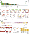
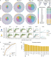
Weekly Evolution of Humoral Architecture The polar plots depict the mean percentile of each antibody feature at each interval across the severe (top) and the deceased (bottom) groups. The major slices 1–6 cover antigen-specific isotypes/subclasses, 7–11 antigen-specific antibody Fc receptor binding, and 12–16 antigen-specific antibody mediated functions. For segments 1–11, antigen specificities repeat in the following order: S, RBD, N, S1 trimer, S1, and S2. For segments 12–16, antigen specificities are repeated S, RBD, and N. The size of the wedge depicts the mean percentile ranging from 0–1. On the right, non-parametric combination global p values are shown, composed of Mann-Whitney U test p values for partial tests within each feature type and using the Fisher method for combination (p < 0.05).
Figure 3
Figure 3
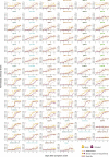
Temporal Evolution of SARS-CoV-2-Specific Antibody Features (A–C) Uniform Manifold Approximation and Projection (UMAP) was used to visualize the multivariate data in two dimensions. Each point represents a given individual at a single time point and colors indicate age (A), sex (B), and group (C). (D) Normalized antibody levels are shown over time, plotted by days after symptom onset, for the severe and deceased group. Each dot is an individual measurement, the lines show smoothed non-parametric regression models (loess), and the color indicates the antigen specificity. See also Figure S2 and Data S1.
Figure S2
Figure S2
Batch Effect Evaluation, Related to Figure 3 (A) The algorithm provides an overview of the evaluation pipeline. The first 40 principal components (PCs) explained more than 95% of the variance and were extracted from z-scored measurements. UMAP was applied to map the extracted PCs into two dimensions, in which the local diversity was quantified by the local inverse Simpson index (LISI). (B) UMAP visualizations highlight limited antibody profile differences across four of the treatments that were used in the SARS-CoV-2 patients. (C) UMAP visualizations show the influence of comorbid conditions – immunosuppression, pulmonary disease, and body-mass-index (BMI) - on antibody profiles. (D) UMAP visualization was used to probe for potential plate-batch effects, where each color represents a different plate run across Systems Serology. (E) The histograms show the distributions of LISI scores for past pulmonary disease, body-mass-index (BMI), age, sex, and well plate. LISI measures the degree of mixing in an embedding ranging from 1 to the number of categories (e.g., 2 for sex), where larger LISI scores indicate less separation and more mixing. Unknown samples were excluded and the continuous variables BMI and age were grouped in 4 and 7 categories, respectively (BMI: < 25, [25,30), [30, 35), ≥ 35, age: [30,40), [40,50), [50,60), [60,70), [70,80), [80,90), [90,100)). Overall, the histograms show no substantial skewing of the antibody profiles.
Figure 4
Figure 4
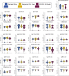
Dissecting Temporal Differences across Groups (A) The bar plot depicts the ΔAIC of the model without differences between the groups, where the higher height represents the features that explain trajectory differences best between the groups. The bars are colored according to antigen specificity, and the vertical line (ΔAIC = 10) indicates the commonly used threshold for rejecting models. (B) Four-parameter logistic growth curves were employed to dissect the specific temporal difference across the groups for each feature. The curves were built by y(t) = d + (a − d)/(1 + (t/c)b), with y(t) describing the temporal evolution of the antibody levels based on the days after symptom. Differences were then split by a = defining differences in initial levels, b = the seroconversion speed, c = the seroconversion time, and d = the asymptotic end levels. The influence of the parameters on the shape of the curve is shown for varying parameter values indicated by the color. (C) The top 10 different features that differed most between the groups are shown. Dots indicate individual patients, diamonds indicate the binned median, the lines indicate the fitted curves corresponding to the optimal model and the color indicates the group. The specific parameters, which differed for the displayed model, are indicated in the left corner. The dots and lines are color-coded according to the group. (D) The heatmap shows the Akaike weight averaged parameter differences between the groups. Each row represents a parameter (a, b, c, d) and is normalized across the features, the color intensity depicts how different the parameter is across the groups, and the color indicates in which group the parameter is higher. Along the x axis, individual specificities (S, RBD, N, S1 trimer, S1, and S2) are organized in the same repeating order across each Fc variable that was acquired (subclasses, isotypes, FcR binding, and functions). (E–G) Normalized enrichment scores (a metric of how different the feature is across the two groups) are shown for individual features collapsed by antigen (E), individual antigens (F), and feature “type” (G). The darker the color the more differentially that feature is expressed across the two groups. (H) Receiver operating characteristic (ROC) curve shows the model performance in a cross-validation framework. In light blue are the ROC curves for each replicate, and the orange is the mean ROC curve showing overall performance. Mean area under curve (AUC) is reported using the mean ROC curve. Classification accuracy was compared to permutated data and significance was assessed using exact p values of the tail probabilities (p < 0.05). TPR, true positive rate; FPR, false positive rate. (I) Features most often selected during the classification process in yellow are shown and ranked based on the magnitude of the enrichment across severe and deceased individuals. See also Figures S3 and S4.
Figure S3
Figure S3
Temporal Evolutionary Curves of Antibody Features, Related to Figure 4 For each antibody feature, the optimal model fit is shown for each group across each feature. Dots indicate individual patients, diamonds indicate the binned median, the lines indicate the fitted curves corresponding to the optimal model and the color indicates the group. The parameters which are different for the displayed model are indicated in the left corner and color-coded according to the group for which the parameter is higher.
Figure S4
Figure S4
Pre-existing Coronavirus Immunity, Related to Figure 4 60 plasma samples from hospitalized SARS-CoV-2 infected individuals were profiled against the receptor binding domain of HKU1, NL63, and a mixture of influenza antigens. Distributions of titers across moderate (blue), severe (yellow), and deceased (red) individuals are shown in the violin plot collected within the first five days following symptoms. The solid white line represents the median and the dotted lines the first and third quartiles. A Kruskal-Wallis test was used to evaluate statistical differences across groups for all intervals and features and was corrected for multiple hypothesis testing with the Benjamini-Hochberg procedure. No significant differences were detected.
Figure 5
Figure 5
Humoral Differences between Moderate and Severe Disease (A) The polar plots depict the mean percentile of each antibody feature at each interval across the moderate (top) and the severely (bottom) infected individuals. The major slices 1–6 cover antigen-specific isotypes and subclasses, 7–11 antigen-specific antibody Fc receptor binding, and 12–16 antigen-specific antibody-mediated functions. For segments 1–11, antigen specificities repeat in the following order: S, RBD, N, S1 trimer, S1, and S2. For segments 12–16 antigen specificities are repeated S, RBD, and N. The size of the wedge depicts the mean percentile ranging from 0–1. On the right, non-parametric combination global p values are shown, composed of Mann-Whitney U test p values for partial tests within each feature type and using the Fisher method for combination (p < 0.05). (B) Normalized antibody levels are shown over time, by days after symptom onset for the moderate and severe groups. Each dot is an individual measurement, the lines show smoothed non-parametric regression models (loess), and the color indicates the antigen specificity. (C) The ROC curve shows the model performance in a cross-validation framework. In light blue are the ROC curves for each replicate and the orange represents the mean ROC curve showing overall performance. Mean AUC is reported using the mean ROC curve. Classification accuracy was compared to permutated data, and significance was assessed using exact p values of the tail probabilities (p < 0.05). TPR, true positive rate; FPR, false positive rate. (D) Features most often selected during the classification process. In yellow are features enriched in the individuals with severe infection, and in blue are features enriched in the moderates.

Similar articles

  • Comparative analyses of SARS-CoV-2 binding (IgG, IgM, IgA) and neutralizing antibodies from human serum samples.
    Mazzini L, Martinuzzi D, Hyseni I, Benincasa L, Molesti E, Casa E, Lapini G, Piu P, Trombetta CM, Marchi S, Razzano I, Manenti A, Montomoli E. Mazzini L, et al. J Immunol Methods. 2021 Feb;489:112937. doi: 10.1016/j.jim.2020.112937. Epub 2020 Nov 28. J Immunol Methods. 2021. PMID: 33253698 Free PMC article.
  • Evolution of antibody immunity to SARS-CoV-2.
    Gaebler C, Wang Z, Lorenzi JCC, Muecksch F, Finkin S, Tokuyama M, Cho A, Jankovic M, Schaefer-Babajew D, Oliveira TY, Cipolla M, Viant C, Barnes CO, Bram Y, Breton G, Hägglöf T, Mendoza P, Hurley A, Turroja M, Gordon K, Millard KG, Ramos V, Schmidt F, Weisblum Y, Jha D, Tankelevich M, Martinez-Delgado G, Yee J, Patel R, Dizon J, Unson-O'Brien C, Shimeliovich I, Robbiani DF, Zhao Z, Gazumyan A, Schwartz RE, Hatziioannou T, Bjorkman PJ, Mehandru S, Bieniasz PD, Caskey M, Nussenzweig MC. Gaebler C, et al. Nature. 2021 Mar;591(7851):639-644. doi: 10.1038/s41586-021-03207-w. Epub 2021 Jan 18. Nature. 2021. PMID: 33461210 Free PMC article.
  • Systems serology detects functionally distinct coronavirus antibody features in children and elderly.
    Selva KJ, van de Sandt CE, Lemke MM, Lee CY, Shoffner SK, Chua BY, Davis SK, Nguyen THO, Rowntree LC, Hensen L, Koutsakos M, Wong CY, Mordant F, Jackson DC, Flanagan KL, Crowe J, Tosif S, Neeland MR, Sutton P, Licciardi PV, Crawford NW, Cheng AC, Doolan DL, Amanat F, Krammer F, Chappell K, Modhiran N, Watterson D, Young P, Lee WS, Wines BD, Mark Hogarth P, Esterbauer R, Kelly HG, Tan HX, Juno JA, Wheatley AK, Kent SJ, Arnold KB, Kedzierska K, Chung AW. Selva KJ, et al. Nat Commun. 2021 Apr 1;12(1):2037. doi: 10.1038/s41467-021-22236-7. Nat Commun. 2021. PMID: 33795692 Free PMC article.
  • Humoral immune responses and neutralizing antibodies against SARS-CoV-2; implications in pathogenesis and protective immunity.
    Carrillo J, Izquierdo-Useros N, Ávila-Nieto C, Pradenas E, Clotet B, Blanco J. Carrillo J, et al. Biochem Biophys Res Commun. 2021 Jan 29;538:187-191. doi: 10.1016/j.bbrc.2020.10.108. Epub 2020 Nov 7. Biochem Biophys Res Commun. 2021. PMID: 33187644 Free PMC article. Review.
  • Therapeutic antibodies for COVID-19: is a new age of IgM, IgA and bispecific antibodies coming?
    Zhang J, Zhang H, Sun L. Zhang J, et al. MAbs. 2022 Jan-Dec;14(1):2031483. doi: 10.1080/19420862.2022.2031483. MAbs. 2022. PMID: 35220888 Free PMC article. Review.

Cited by

References

    1. Ackerman M.E., Moldt B., Wyatt R.T., Dugast A.-S., McAndrew E., Tsoukas S., Jost S., Berger C.T., Sciaranghella G., Liu Q., et al. A robust, high-throughput assay to determine the phagocytic activity of clinical antibody samples. J. Immunol. Methods. 2011;366:8–19. - PMC - PubMed
    1. Akaike H. In: Second International Symposium on Information Theory. Petrov B.N., Caski F., editors. Akadémiai Kiadó; 1973. Information theory and an extension of the maximum likelihood principle; pp. 267–281.
    1. Amanat F., Stadlbauer D., Strohmeier S., Nguyen T.H.O., Chromikova V., McMahon M., Jiang K., Arunkumar G.A., Jurczyszak D., Polanco J., et al. A serological assay to detect SARS-CoV-2 seroconversion in humans. Nat. Med. 2020;26:1033–1036. - PMC - PubMed
    1. Atyeo C., Fischinger S., Zohar T., Slein M.D., Burke J., Loos C., McCulloch D.J., Newman K.L., Wolf C., Yu J., et al. Distinct Early Serological Signatures Track with SARS-CoV-2 Survival. Immunity. 2020;53:524–532.e4. - PMC - PubMed
    1. Bergqvist P., Stensson A., Lycke N.Y., Bemark M. T cell-independent IgA class switch recombination is restricted to the GALT and occurs prior to manifest germinal center formation. J. Immunol. 2010;184:3545–3553. - PubMed

Publication types