Distinct Early Serological Signatures Track with SARS-CoV-2 Survival
- PMID: 32783920
- PMCID: PMC7392190
- DOI: 10.1016/j.immuni.2020.07.020
Distinct Early Serological Signatures Track with SARS-CoV-2 Survival
Abstract
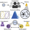
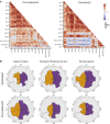
As SARS-CoV-2 infections and death counts continue to rise, it remains unclear why some individuals recover from infection, whereas others rapidly progress and die. Although the immunological mechanisms that underlie different clinical trajectories remain poorly defined, pathogen-specific antibodies often point to immunological mechanisms of protection. Here, we profiled SARS-CoV-2-specific humoral responses in a cohort of 22 hospitalized individuals. Despite inter-individual heterogeneity, distinct antibody signatures resolved individuals with different outcomes. Although no differences in SARS-CoV-2-specific IgG levels were observed, spike-specific humoral responses were enriched among convalescent individuals, whereas functional antibody responses to the nucleocapsid were elevated in deceased individuals. Furthermore, this enriched immunodominant spike-specific antibody profile in convalescents was confirmed in a larger validation cohort. These results demonstrate that early antigen-specific and qualitative features of SARS-CoV-2-specific antibodies point to differences in disease trajectory, highlighting the potential importance of functional antigen-specific humoral immunity to guide patient care and vaccine development.
Keywords: COVID-19 patients; SARS-CoV-2; SARS-CoV-2-specific antibody; functional antibody.
Copyright © 2020 The Authors. Published by Elsevier Inc. All rights reserved.
Conflict of interest statement
Declaration of Interests G.A. is a founder of SeromYx Systems.
Figures


Similar articles
-
Orthogonal SARS-CoV-2 Serological Assays Enable Surveillance of Low-Prevalence Communities and Reveal Durable Humoral Immunity.Immunity. 2020 Nov 17;53(5):925-933.e4. doi: 10.1016/j.immuni.2020.10.004. Epub 2020 Oct 14. Immunity. 2020. PMID: 33129373 Free PMC article.
-
Kinetics of SARS-CoV-2 specific IgM and IgG responses in COVID-19 patients.Emerg Microbes Infect. 2020 Dec;9(1):940-948. doi: 10.1080/22221751.2020.1762515. Emerg Microbes Infect. 2020. PMID: 32357808 Free PMC article.
-
S Protein-Reactive IgG and Memory B Cell Production after Human SARS-CoV-2 Infection Includes Broad Reactivity to the S2 Subunit.mBio. 2020 Sep 25;11(5):e01991-20. doi: 10.1128/mBio.01991-20. mBio. 2020. PMID: 32978311 Free PMC article.
-
Sensitivity in Detection of Antibodies to Nucleocapsid and Spike Proteins of Severe Acute Respiratory Syndrome Coronavirus 2 in Patients With Coronavirus Disease 2019.J Infect Dis. 2020 Jun 29;222(2):206-213. doi: 10.1093/infdis/jiaa273. J Infect Dis. 2020. PMID: 32427334 Free PMC article.
-
COVID-19: molecular diagnostics overview.J Mol Med (Berl). 2020 Jul;98(7):947-954. doi: 10.1007/s00109-020-01931-w. Epub 2020 Jun 13. J Mol Med (Berl). 2020. PMID: 32535768 Free PMC article. Review.
Cited by
-
Antibody Fc receptor binding and T cell responses to homologous and heterologous immunization with inactivated or mRNA vaccines against SARS-CoV-2.Nat Commun. 2024 Aug 27;15(1):7358. doi: 10.1038/s41467-024-51427-1. Nat Commun. 2024. PMID: 39191745 Free PMC article. Clinical Trial.
-
The longitudinal characterization of immune responses in COVID-19 patients reveals novel prognostic signatures for disease severity, patients' survival and long COVID.Front Immunol. 2024 Jul 29;15:1381091. doi: 10.3389/fimmu.2024.1381091. eCollection 2024. Front Immunol. 2024. PMID: 39136010 Free PMC article.
-
Primary SARS-CoV-2 infection in children and adults results in similar Fc-mediated antibody effector function patterns.Clin Transl Immunology. 2024 Jul 26;13(8):e1521. doi: 10.1002/cti2.1521. eCollection 2024. Clin Transl Immunology. 2024. PMID: 39071109 Free PMC article.
-
SARS-CoV-2 BA.4/5 infection triggers more cross-reactive FcγRIIIa signaling and neutralization than BA.1, in the context of hybrid immunity.J Virol. 2024 Jul 23;98(7):e0067824. doi: 10.1128/jvi.00678-24. Epub 2024 Jul 2. J Virol. 2024. PMID: 38953380
-
Heterologous Ad26/Ad5 adenovirus-vectored vaccines elicited SARS-CoV-2-specific antibody responses with potent Fc activities.Front Immunol. 2024 May 8;15:1382619. doi: 10.3389/fimmu.2024.1382619. eCollection 2024. Front Immunol. 2024. PMID: 38779671 Free PMC article.
References
Publication types
MeSH terms
Substances
Grants and funding
LinkOut - more resources
Full Text Sources
Other Literature Sources
Research Materials
Miscellaneous

