. 2020 Aug;584(7821):463-469.
doi: 10.1038/s41586-020-2588-y. Epub 2020 Jul 27.

Longitudinal analyses reveal immunological misfiring in severe COVID-19

Collaborators, Affiliations

Longitudinal analyses reveal immunological misfiring in severe COVID-19

Carolina Lucas et al. Nature. 2020 Aug.

Abstract

Recent studies have provided insights into the pathogenesis of coronavirus disease 2019 (COVID-19)1-4. However, the longitudinal immunological correlates of disease outcome remain unclear. Here we serially analysed immune responses in 113 patients with moderate or severe COVID-19. Immune profiling revealed an overall increase in innate cell lineages, with a concomitant reduction in T cell number. An early elevation in cytokine levels was associated with worse disease outcomes. Following an early increase in cytokines, patients with moderate COVID-19 displayed a progressive reduction in type 1 (antiviral) and type 3 (antifungal) responses. By contrast, patients with severe COVID-19 maintained these elevated responses throughout the course of the disease. Moreover, severe COVID-19 was accompanied by an increase in multiple type 2 (anti-helminths) effectors, including interleukin-5 (IL-5), IL-13, immunoglobulin E and eosinophils. Unsupervised clustering analysis identified four immune signatures, representing growth factors (A), type-2/3 cytokines (B), mixed type-1/2/3 cytokines (C), and chemokines (D) that correlated with three distinct disease trajectories. The immune profiles of patients who recovered from moderate COVID-19 were enriched in tissue reparative growth factor signature A, whereas the profiles of those with who developed severe disease had elevated levels of all four signatures. Thus, we have identified a maladapted immune response profile associated with severe COVID-19 and poor clinical outcome, as well as early immune signatures that correlate with divergent disease trajectories.


Conflict of interest statement

Competing interests

The authors declare no competing financial interests.

Figures

Extended Data Fig. 1:
Extended Data Fig. 1:. Age and BMI cohort distributions and Select Medications distributions.
a, b, Aggregated ages (a) and BMIs (b) were collected for patients with moderate, severe, and fatal COVID-19 and relative frequency histograms generated for comparison across disease sub-groups. Gaussian and lognormal distributions were fit through least squares regression and compared for goodness of fit through differential Akaike information criterion (AICc) comparison. All distributions were best described by a Gaussian model except for age in the ‛severe’ disease category, which was best modelled by a lognormal distribution. c, Proportion of patients admitted to YNHH receiving hydroxycholorquine (HCQ), tocilizumab (Toci), methylprednisolone (Solu-medrol), and remdesivir (Rem) are shown, stratified by disease severity. d, Medication and age adjustments for IL-6 and T cell count.
Extended Data Fig. 2:
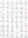
Extended Data Fig. 2:. Overview of cellular immune changes in COVID-19 patients.
Immune cell subsets of interest, plotted (a) as a concentration of millions of cells per mL of blood or (b) as a percentage of a parent population. (c) Phenotyping to TCR-activated T cells, cytokine-secreting T cells, and HLA-DR expression within monocytes and neutrophils. Each dot represents a separate time point per subject (HCW, n=49; Moderate, n=114; Severe, n=41). For all boxplots, the centre is drawn through the median of the measurement, while the lower and upper bounds of the box correspond to the first and third percentile. Whiskers beyond these points denote 1.5 x the interquartile range. Significance of comparisons were determined by two-sided, Wilcoxon rank-sum test and indicated as such; p-values accompany their respective comparisons.
Extended Data Fig. 3:
Extended Data Fig. 3:. Overview cytokine and chemokines profiles of COVID-19 patients.
(a) Quantification of cytokines in the periphery plotted as Log10-transformed concentrations in pg/mL. Each dot represents a separate time point per subject (HCW, n= 47; Moderate, n= 124; Severe, n= 45). For all boxplots, the centre is drawn through the median of the measurement, while the lower and upper bounds of the box correspond to the first and third percentile. Whiskers beyond these points denote 1.5 x the interquartile range. Significance of comparisons were determined by two-sided, Wilcoxon rank-sum test and indicated as such; p-values accompany their respective comparisons.
Extended Data Fig. 4
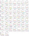
Extended Data Fig. 4. Longitudinal cytokines and chemokines of COVID-19 patients.
(a) Log10-transformed cytokine concentrations plotted continuously over time according to the days of symptom onset for patients with moderate disease (n= 112) or severe disease (n= 39). The dotted green line represents the mean measurement from uninfected health care workers. Regression lines are indicated by the dark blue (moderate) or red (severe) solid lines. Associated, Pearson’s Correlation Coefficients and linear regression significance are in pink (moderate) or dark blue (severe). 95% confidence intervals for the regression lines are denoted by the pink (moderate) or dark blue (severe) filled areas.
Extended Data Fig. 5:
Extended Data Fig. 5:. T cell immune profiles in moderate and severe patients.
(a) CD4+ and (b) CD8+ T cell populations of interest, plotted as a percentage of parent populations, over time according to the days following symptom onset for patients with moderate disease (n= 118) or severe disease (n= 41). Each dot represents a distinct patient and time point arranged by intervals of five days until 25 days. Dark blue or pink lines pass through the mean of each measurement at the specified time interval; error bars at this intersection denote the standard error the mean. The dotted green line represents the mean measurement from uninfected health care workers.
Extended Data Fig. 6:
Extended Data Fig. 6:. Early cytokine profile distinguishes moderate and severe outcomes.
(a) Log10-transformed cytokine concentrations plotted continuously NP viral load (expressed as log10 genomic equivalents (GE)/ml) per within an individual patient and time point. Regression lines are indicated by the dark blue (moderate) or red (severe) solid lines for patients with moderate disease (n= 112) or severe disease (n= 39), respectively. Associated Pearson’s Correlation Coefficients, and linear regression significance are in pink (moderate) or dark blue (severe). 95% confidence intervals for the regression lines are denoted by the pink (moderate) or dark blue (severe) filled areas. (b) Correlation map of highly correlated cytokines with NP viral load in patients with moderate (blue) or severe disease (red). Pearson’s Correlation Coefficients are indicated in grey, connecting the central node, NP viral load, with peripheral nodes; p-values for each correlation are indicated above each peripheral node. (c) Length of hospital stay plotted per patient against an individual’s baseline plasma cytokine measurements (<12 days from symptom onset), which were grouped according to high or low expression (>0.5 Log10 difference): IFNa2 (Hi:12, Lo:13), TNFa (Hi:6, Lo:4), IL4 (Hi:7, Lo:11), IL4 (Hi:8, Lo:6), IL1RA (Hi:8, Lo:7), IL1b (Hi:11, Lo:5), IL6 (Hi:8, Lo:7), IL18 (Hi:5, Lo:5). (d) Baseline plasma cytokine measurements for each patient who was either discharged from the hospital (n=83) or expired during treatment for COVID-19 (n=11). For all boxplots, the centre is drawn through the median of the measurement, while the lower and upper bounds of the box correspond to the first and third percentile. Whiskers beyond these points denote 1.5 x the interquartile range. Significance of comparisons were determined by two-sided, Wilcoxon rank-sum test; p-values accompany their respective comparisons.
Extended Data Fig. 7:
Extended Data Fig. 7:. Distribution of days from symptom onset stratified by collection time point and select cluster clinical data.
a, Correlation of days from symptom onset and samples collection time points. Violin plots comparing the distributions of days from symptom for each patient ordered by sequential IMPACT study time points (1–8). Study time points 7 and 8 are represented by discrete points for the single patient collected at each. Violin plots display median values (solid line) and associated quartiles (dashed lines). T1–8 (time point 1 to 8). b–h, Aggregated clinical data for patients in clusters 1–3. Displayed are laboratory values at time of admission to YNHH (“admit”); last recorded values from duration of admission (“last”); maximum recorded values from duration of admission (“max”); minimum recorded values from duration of admission (“min”); and average recorded values for duration of admission (“mean”). Scatter plots show cluster means with s.e.m. plotted above and below. Clusters were subsequently compared using ordinary two- way ANVOA and post hoc pairwise comparisons are identified where significant (adjusted P values displayed, Tukey’s method for multiple comparisons).
Extended Data Fig. 8:
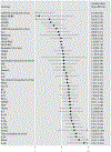
Extended Data Fig. 8:. Risk of ICU admission and death according to biomarkers levels.
Forest plots comparing the risk of death (b) among ill patients. Each effect estimate represents an individual regression estimate with a Poisson family, log link, and robust variance estimation; each model accounts for repeated measures within one individual through the use of generalized estimating equations (GEE). Measurements are divided into three time-periods: 0–11 days after symptom onset, 12–19 days after symptom onset, and ≥20 days after symptom onset. If an individual had more than one measurement of a biomarker during any particular time period, we used the average of all values. Each model controls for participant age and gender.
Extended Data Fig. 9:
Extended Data Fig. 9:. Gating strategies.
a, Leukocyte gating strategy to identify lymphocytes, granulocytes, monocytes, pDCs, and cDCs in Figs. 1b, c, 2d–f and Extended Data Fig. 2a. b, T cell surface staining gating strategy to identify CD4 and CD8 T cells, TCR-activated T cells, terminally-differentiated T cells, and additional subsets as shown in Extended Data Fig. 2b. c, Intracellular T cell gating strategy to identify CD4 and/or CD8 T cells secreting TNF, IFNγ, IL-6, IL-2, granzyme B, IL-4, and/or IL-17 in Extended Data Figs. 2c, 5a, b.
Figure 1.
Figure 1.. Overview of immunological features in COVID-19 patients.
a, Overview of cohort, including healthy donors (HCWs) and patients with moderate or severe COVID-19. Ordinal scores assigned according to clinical severity scale as described in Methods. D, deceased; ICU, intensive care unit; MV, mechanical ventilation. b, Heat map comparison of the major immune cell populations within PBMCs in patients with moderate (n = 121) or severe (n = 43) COVID-19, or HCSs (n = 43). n values represent a separate time point per subject Subjects are arranged across rows, with each coloured unit indicating the relative distribution of an immune cell population normalized against the same population across all subjects. K-means clustering was used to arrange patients and measurements. Eoso, eosinophil; ncMono, non-classical monocyte; neut, neutrophil; cMono, classical monocyte; intMono, intermediate monocyte; DC2 and DC1, type 2 and 1 dendritic cells, respectively; pDC, plasmacytoid dendritic cell; T-CD8 and T-CD4, CD8+ and CD4+ T cells, respectively; NKT, natural killer T cell; NK, natural killer cell. c, Immune cell subsets plotted as a concentration of millions of cells per millilitre of blood or as a percentage of live single cells. Each dot represents a separate time point per subject (HCW, n = 50; moderate, n = 117; severe, n = 40). d, Correlation matrices across all time points of 71 cytokines from patient blood, comparing patients with moderate and severe disease. Only significant correlations (<0.05) are represented as dots. Pearson’s correlation coefficients from comparisons of cytokine measurements within the same patients are visualized by colour intensity. e-g, Quantification of prominent inflammatory cytokines (e), interferons type I and II (f), and CCL1 and IL-17 (g) presented as log10-transformed concentrations. Each dot represents a separate time point per subject (HCW, n = 50; moderate, n = 117; severe, n = 40). Centre, median; box limits, first and third percentiles; whiskers, 1.5× interquartile range (IQR). Significance determined by two-sided, Wilcoxon rank-sum test.
Figure 2:
Figure 2:. Longitudinal immune profiling of moderate and severe COVID-19 patients.
a, Correlation matrices of 71 cytokines from patient blood comparing cytokine concentrations in patients with moderate or severe disease during the early phase (<10 DfSO) or late phase (>10 DfSO) of disease. Only significant correlations (<0.05) are represented as dots, and Pearson’s correlation coefficient from comparisons of cytokine measurements within each patient is visualized by colour intensity. b, c, Anti-viral interferons (b) and inflammasome-related cytokines (c) plotted as log10 concentrations over time and grouped by disease severity. d–f, Cellular and cytokine measurements representative of type 1 (d), type 2 (e) and type 3 (f) immune responses reported over time in intervals of days (left) and continuously as linear regressions (right). Left, each dot represents a distinct patient and time point arranged in intervals of 5 days until 25 DfSO; dark blue, moderate disease (n = 112), pink, severe disease (n = 40). Dark blue or pink lines pass through the mean at each time interval; error bars denote the s.e.m. Dashed green line, mean from healthy HCWs. Right, regression lines are indicated by the dark blue (moderate) or red (severe) solid lines. Associated Pearson’s correlation coefficients and linear regression significance are coloured accordingly; shading represents 95% CI.
Figure 3.
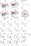
Figure 3.. Early viral and cytokine profiles distinguish moderate and severe outcomes.
a, Viral loads measured by nasopharyngeal swabs are plotted as log10 of genome equivalents against time after symptom onset for patients with moderate disease (n = 112) or severe disease (n = 39). Left, each dot represents a distinct patient and time point arranged in intervals of 5 days until 25 DfSO. Dark blue or pink lines pass through the mean of each measurement; error bars denote s.e.m. Right, longitudinal data plotted over time continuously. Regression lines are shown as dark blue (moderate) or red (severe). Associated linear regression equations, Pearson’s correlation coefficients, and significance are coloured accordingly. Green text is the regression analysis and correlation for all patients. Shading represents 95% CIs. Dashed green line denotes mean threshold for positivity. Dashed grey line indicates mean limit of detection. b, Correlation and linear regression of cytokines plotted, as Log10 of concentration, and viral load by nasopharyngeal swab, plotted as Log10 of genome equivalents (GE), regardless of disease severity (n=151). Each dot represents a unique patient time point; dark blue, moderate disease; red, severe disease. White line indicates the regression line for all patients. The associated linear regression equation, Pearson’s correlation coefficient, and significance are shown in green. Grey shading indicates 95% CIs. Dashed green line denotes mean threshold for positivity. Dashed grey line indicates mean limit of detection. c, Unbiased heat map comparisons of cytokines in PBMCs. Measurements were normalized across all patients. K-means clustering was used to determine clusters 1–3 (cluster 1, n = 46; cluster 2, n = 50; cluster 3, n = 16). d, Distribution of age and length of hospital stay (violin plots; solid lines, median; dotted lines, quartiles.) and frequency of coagulopathy and mortality (bar graphs) within each cluster. e, Top 20 cytokines by mutual information analysis to determine their importance for determining mortality. Significance of comparisons determined by two-sided, Wilcoxon rank-sum test.
Figure 4.
Figure 4.. Immune correlates of COVID-19 outcomes.
a, Unbiased heat map comparisons of cytokines within peripheral blood mononuclear cells (PBMCs) measured at distinct time points in COVID-19 patients. Measurements were normalized across all patients. K-means clustering was used to determine Clusters 1–3 (Cluster 1, n=84; Cluster 2, n=66; Cluster 3, n=20). b, c, Distribution of age (b) and length of hospital stay (violin plots) (c) of patients within each cluster. For statistical differences, adjusted P values calculated using one-way ANOVA with Tukey’s correction for multiple comparisons are shown (age: F(2, 90) = 3.115; P = 0.0492). Solid lines, median; dotted lines, quartiles. d, Disease progression measured by clinical severity score for patients in each cluster. Data (mean ± s.e.m.) are ordered by the collection time points for each patient, with regular collection intervals of 3–4 days (Extended Data Fig. 7). e, Percentage of patients in each cluster with new-onset coagulopathy or death.

Similar articles

Cited by

References

    1. Giamarellos-Bourboulis EJ et al. Complex Immune Dysregulation in COVID-19 Patients with Severe Respiratory Failure. Cell Host Microbe, doi:10.1016/j.chom.2020.04.009 (2020). - DOI - PMC - PubMed
    1. Zhou Z et al. Heightened Innate Immune Responses in the Respiratory Tract of COVID-19 Patients. Cell Host Microbe, doi:10.1016/j.chom.2020.04.017 (2020). - DOI - PMC - PubMed
    1. Huang C et al. Clinical features of patients infected with 2019 novel coronavirus in Wuhan, China. Lancet 395, 497–506, doi:10.1016/S0140-6736(20)30183-5 (2020). - DOI - PMC - PubMed
    1. Mathew D et al. Deep immune profiling of COVID-19 patients reveals patient heterogeneity and distinct immunotypes with implications for therapeutic interventions. bioRxiv, 2020.2005.2020.106401, doi:10.1101/2020.05.20.106401 (2020). - DOI - PMC - PubMed
    1. Hoffmann M et al. SARS-CoV-2 Cell Entry Depends on ACE2 and TMPRSS2 and Is Blocked by a Clinically Proven Protease Inhibitor. Cell, doi:10.1016/j.cell.2020.02.052 (2020). - DOI - PMC - PubMed

Publication types

MeSH terms