

The rainfall plot: its motivation, characteristics and pitfalls
- PMID: 28521741
- PMCID: PMC5437519
- DOI: 10.1186/s12859-017-1679-8
The rainfall plot: its motivation, characteristics and pitfalls
Abstract
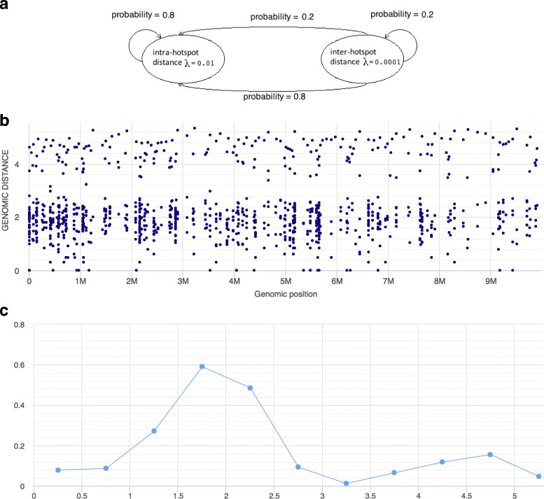
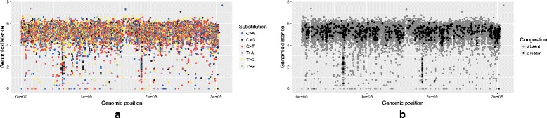
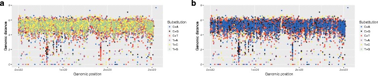
Background: A visualization referred to as rainfall plot has recently gained popularity in genome data analysis. The plot is mostly used for illustrating the distribution of somatic cancer mutations along a reference genome, typically aiming to identify mutation hotspots. In general terms, the rainfall plot can be seen as a scatter plot showing the location of events on the x-axis versus the distance between consecutive events on the y-axis. Despite its frequent use, the motivation for applying this particular visualization and the appropriateness of its usage have never been critically addressed in detail.
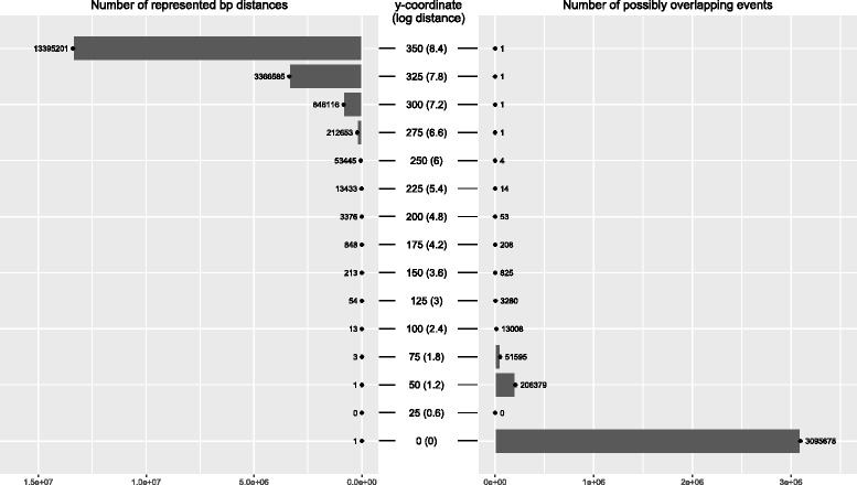
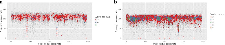
Results: We show that the rainfall plot allows visual detection even for events occurring at high frequency over very short distances. In addition, event clustering at multiple scales may be detected as distinct horizontal bands in rainfall plots. At the same time, due to the limited size of standard figures, rainfall plots might suffer from inability to distinguish overlapping events, especially when multiple datasets are plotted in the same figure. We demonstrate the consequences of plot congestion, which results in obscured visual data interpretations.
Conclusions: This work provides the first comprehensive survey of the characteristics and proper usage of rainfall plots. We find that the rainfall plot is able to convey a large amount of information without any need for parameterization or tuning. However, we also demonstrate how plot congestion and the use of a logarithmic y-axis may result in obscured visual data interpretations. To aid the productive utilization of rainfall plots, we demonstrate their characteristics and potential pitfalls using both simulated and real data, and provide a set of practical guidelines for their proper interpretation and usage.
Keywords: Genomics; Mutation; Rainfall plot; Visualization.
Figures
Similar articles
-
MetageneCluster: a Python package for filtering conflicting signal trends in metagene plots.BMC Bioinformatics. 2024 Jan 12;25(1):21. doi: 10.1186/s12859-024-05647-3. BMC Bioinformatics. 2024. PMID: 38216886 Free PMC article.
-
Contributions of throughfall, forest and soil characteristics to near-surface soil water-content variability at the plot scale in a mountainous Mediterranean area.Sci Total Environ. 2019 Jan 10;647:1421-1432. doi: 10.1016/j.scitotenv.2018.08.020. Epub 2018 Aug 3. Sci Total Environ. 2019. PMID: 30180348
-
3D parallel coordinate systems--a new data visualization method in the context of microscopy-based multicolor tissue cytometry.Cytometry A. 2006 Jul;69(7):601-11. doi: 10.1002/cyto.a.20288. Cytometry A. 2006. PMID: 16680710
-
Statistical plots in oncologic imaging, a primer for neuroradiologists.Neuroradiol J. 2024 Aug;37(4):418-433. doi: 10.1177/19714009231193158. Epub 2023 Aug 2. Neuroradiol J. 2024. PMID: 37529843 Review.
-
Drawing Guideline for 'Hip and Pelvis': Plot with Error Bar.Hip Pelvis. 2020 Dec;32(4):161-169. doi: 10.5371/hp.2020.32.4.161. Epub 2020 Dec 3. Hip Pelvis. 2020. PMID: 33335864 Free PMC article. Review.
Cited by
-
The uracil-DNA glycosylase UNG protects the fitness of normal and cancer B cells expressing AID.NAR Cancer. 2020 Aug 27;2(3):zcaa019. doi: 10.1093/narcan/zcaa019. eCollection 2020 Sep. NAR Cancer. 2020. PMID: 33554121 Free PMC article.
-
Deciphering genes associated with diffuse large B-cell lymphoma with lymphomatous effusions: A mutational accumulation scoring approach.Biomark Res. 2021 Oct 9;9(1):74. doi: 10.1186/s40364-021-00330-8. Biomark Res. 2021. PMID: 34635181 Free PMC article.
-
Spatial statistical tools for genome-wide mutation cluster detection under a microarray probe sampling system.PLoS One. 2018 Sep 25;13(9):e0204156. doi: 10.1371/journal.pone.0204156. eCollection 2018. PLoS One. 2018. PMID: 30252889 Free PMC article.
-
Genome-wide discovery of somatic regulatory variants in diffuse large B-cell lymphoma.Nat Commun. 2018 Oct 1;9(1):4001. doi: 10.1038/s41467-018-06354-3. Nat Commun. 2018. PMID: 30275490 Free PMC article.
-
Functional annotation of de novo variants from healthy individuals.Genomics Inform. 2019 Dec;17(4):e46. doi: 10.5808/GI.2019.17.4.e46. Epub 2019 Dec 23. Genomics Inform. 2019. PMID: 31896246 Free PMC article.
References
-
- Cooper CS, Eeles R, Wedge DC, Van Loo P, Gundem G, Alexandrov LB, et al. Analysis of the genetic phylogeny of multifocal prostate cancer identifies multiple independent clonal expansions in neoplastic and morphologically normal prostate tissue. Nat Genet. 2015;47(4):367–72. doi: 10.1038/ng.3221. - DOI - PMC - PubMed
MeSH terms
LinkOut - more resources
Full Text Sources
Other Literature Sources
