The emergence of longevous populations
- PMID: 27872299
- PMCID: PMC5137748
- DOI: 10.1073/pnas.1612191113
The emergence of longevous populations
Abstract
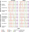
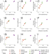
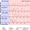
The human lifespan has traversed a long evolutionary and historical path, from short-lived primate ancestors to contemporary Japan, Sweden, and other longevity frontrunners. Analyzing this trajectory is crucial for understanding biological and sociocultural processes that determine the span of life. Here we reveal a fundamental regularity. Two straight lines describe the joint rise of life expectancy and lifespan equality: one for primates and the second one over the full range of human experience from average lifespans as low as 2 y during mortality crises to more than 87 y for Japanese women today. Across the primate order and across human populations, the lives of females tend to be longer and less variable than the lives of males, suggesting deep evolutionary roots to the male disadvantage. Our findings cast fresh light on primate evolution and human history, opening directions for research on inequality, sociality, and aging.
Keywords: biodemography; equality; lifespan; pace and shape; senescence.
Conflict of interest statement
The authors declare no conflict of interest.
Figures


Similar articles
-
Dynamics of life expectancy and life span equality.Proc Natl Acad Sci U S A. 2020 Mar 10;117(10):5250-5259. doi: 10.1073/pnas.1915884117. Epub 2020 Feb 24. Proc Natl Acad Sci U S A. 2020. PMID: 32094193 Free PMC article.
-
Biological Processes Modulating Longevity across Primates: A Phylogenetic Genome-Phenome Analysis.Mol Biol Evol. 2018 Aug 1;35(8):1990-2004. doi: 10.1093/molbev/msy105. Mol Biol Evol. 2018. PMID: 29788292 Free PMC article.
-
Directionality theory and mortality patterns across the primate lineage.Biogerontology. 2024 Nov;25(6):1215-1237. doi: 10.1007/s10522-024-10134-6. Epub 2024 Sep 6. Biogerontology. 2024. PMID: 39240404 Free PMC article.
-
Grandmother hypothesis and primate life histories.Am J Phys Anthropol. 2000 Nov;113(3):435-50. doi: 10.1002/1096-8644(200011)113:3<435::AID-AJPA11>3.0.CO;2-O. Am J Phys Anthropol. 2000. PMID: 11042542 Review.
-
[Age and aging as incomplete architecture of human ontogenesis].Z Gerontol Geriatr. 1999 Dec;32(6):433-48. doi: 10.1007/s003910050141. Z Gerontol Geriatr. 1999. PMID: 10654382 Review. German.
Cited by
-
Wild capuchin monkeys as a model system for investigating the social and ecological determinants of ageing.Philos Trans R Soc Lond B Biol Sci. 2024 Dec 16;379(1916):20230482. doi: 10.1098/rstb.2023.0482. Epub 2024 Oct 28. Philos Trans R Soc Lond B Biol Sci. 2024. PMID: 39463253 Review.
-
Cross-sectional Average Length of Life Entropy ( ): International Comparisons and Decompositions.Eur J Popul. 2024 Jul 25;40(1):25. doi: 10.1007/s10680-024-09711-9. Eur J Popul. 2024. PMID: 39060629 Free PMC article.
-
Using non-invasive behavioral and physiological data to measure biological age in wild baboons.Geroscience. 2024 Oct;46(5):4059-4074. doi: 10.1007/s11357-024-01157-5. Epub 2024 May 2. Geroscience. 2024. PMID: 38693466 Free PMC article.
-
Survival improvements of marine mammals in zoological institutions mirror historical advances in human longevity.Proc Biol Sci. 2023 Oct 25;290(2009):20231895. doi: 10.1098/rspb.2023.1895. Epub 2023 Oct 18. Proc Biol Sci. 2023. PMID: 37848064 Free PMC article.
-
Advancing methods for the biodemography of aging within social contexts.Neurosci Biobehav Rev. 2023 Oct;153:105400. doi: 10.1016/j.neubiorev.2023.105400. Epub 2023 Sep 20. Neurosci Biobehav Rev. 2023. PMID: 37739326 Free PMC article. Review.
References
-
- Smits J, Monden C. Length of life inequality around the globe. Soc Sci Med. 2009;68(6):1114–1123. - PubMed
-
- Baudisch A. The pace and shape of ageing. Methods Ecol Evol. 2011;2(4):375–382.
-
- Wrycza T, Baudisch A. The pace of aging: Intrinsic time scales in demography. Demogr Res. 2014;30:1571–1590.
Publication types
MeSH terms
Associated data
Grants and funding
LinkOut - more resources
Full Text Sources
Other Literature Sources
Miscellaneous

