. 2022 Oct;19(10):1250-1261.
doi: 10.1038/s41592-022-01616-x. Epub 2022 Oct 3.

BIONIC: biological network integration using convolutions

Affiliations

BIONIC: biological network integration using convolutions

Duncan T Forster et al. Nat Methods. 2022 Oct.

Abstract

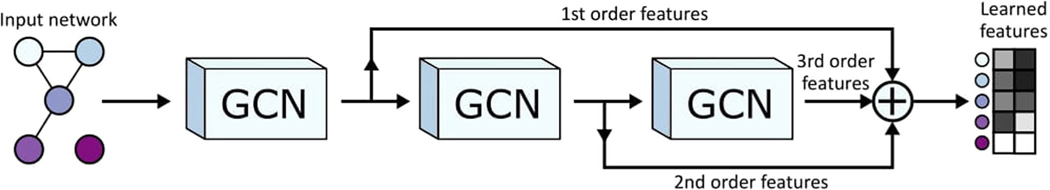
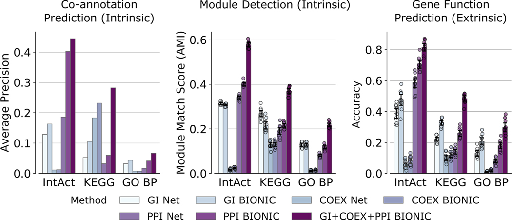
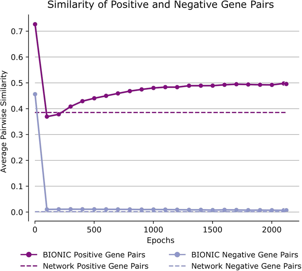
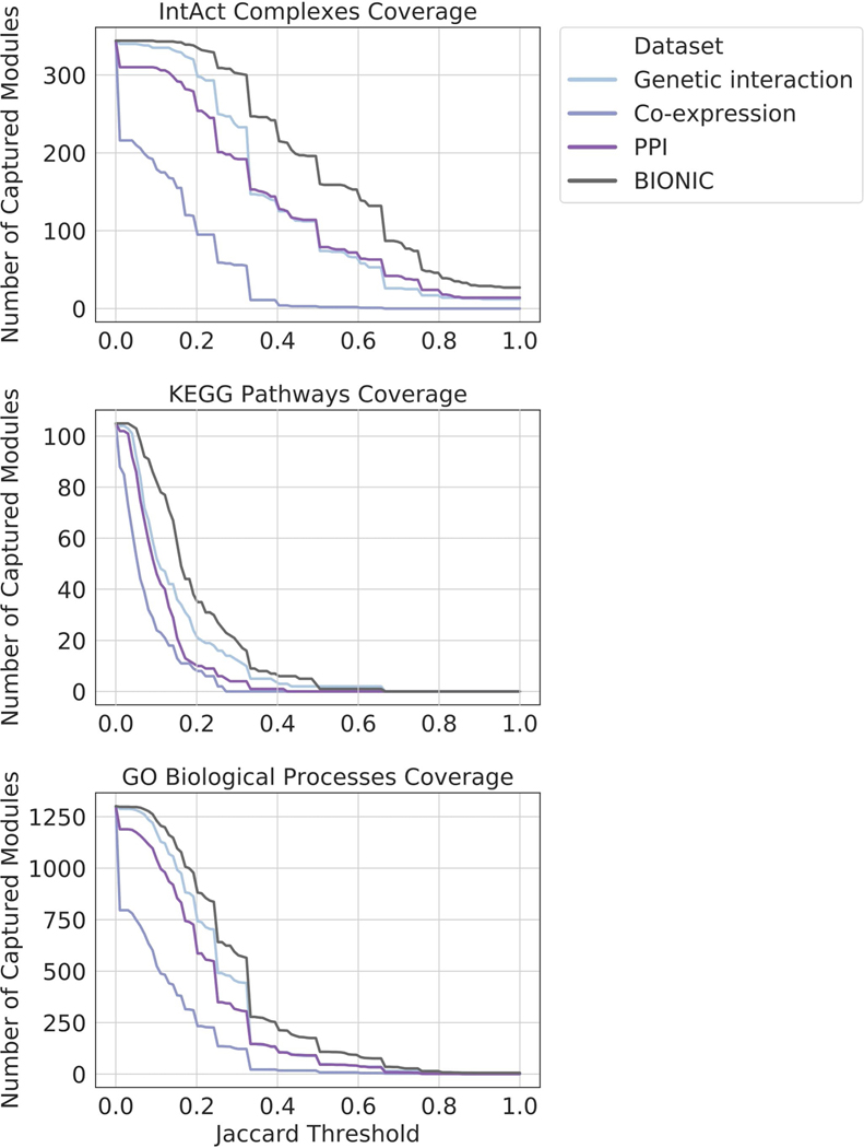
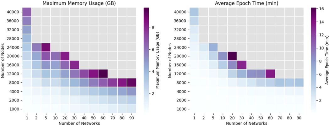
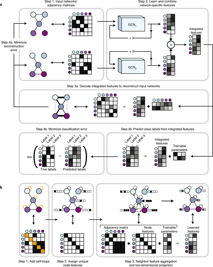
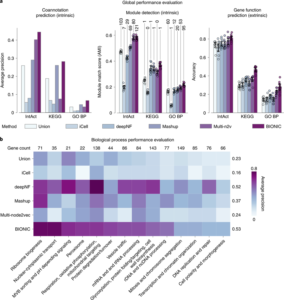
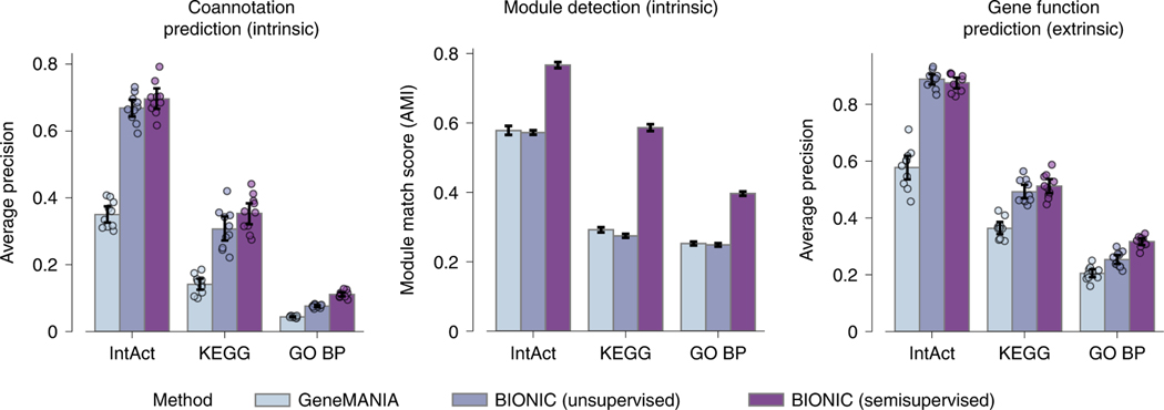
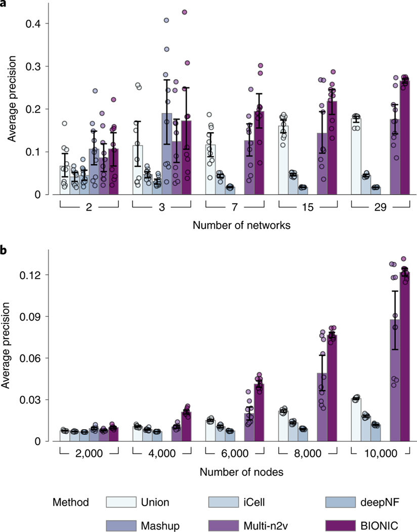
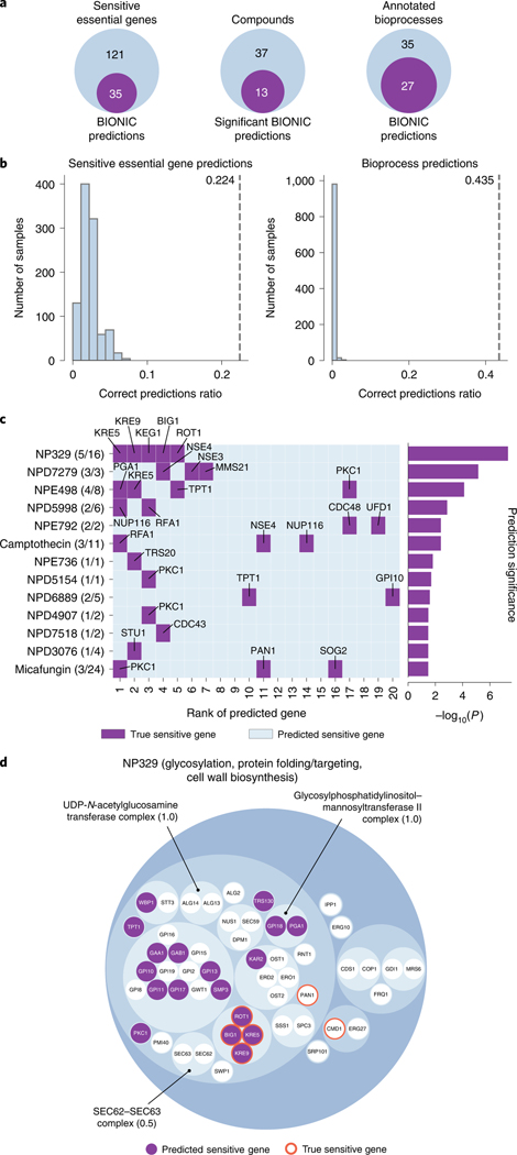
Biological networks constructed from varied data can be used to map cellular function, but each data type has limitations. Network integration promises to address these limitations by combining and automatically weighting input information to obtain a more accurate and comprehensive representation of the underlying biology. We developed a deep learning-based network integration algorithm that incorporates a graph convolutional network framework. Our method, BIONIC (Biological Network Integration using Convolutions), learns features that contain substantially more functional information compared to existing approaches. BIONIC has unsupervised and semisupervised learning modes, making use of available gene function annotations. BIONIC is scalable in both size and quantity of the input networks, making it feasible to integrate numerous networks on the scale of the human genome. To demonstrate the use of BIONIC in identifying new biology, we predicted and experimentally validated essential gene chemical-genetic interactions from nonessential gene profiles in yeast.


Figures

Extended Data Fig. 1 |
Extended Data Fig. 1 |. Detailed view of individual BIONIC network encoder.
A more detailed view of an individual network encoder, including residual connections. A network specific graph convolutional network is used to encode the input network for increasing neighborhood sizes. The first GCN in the sequence learns features for a given node based on the node’s immediate neighborhood (1st order features). The next GCN learns features based on the node’s second order neighborhood (2nd order features), and so on. The node feature matrices learned by each GCN pass are summed together to create the final learned, network-specific features. Summing the outputs of the various GCNs in this way creates residual connections, allowing features from multiple neighborhood sizes to generate the final learned features, rather than just the final neighborhood size. This figure shows three GCN layers, but BIONIC uses the same pattern of connections for any number of GCN layers. Note that the GCN layers for a given encoder share their weights, so in effect, there is a single GCN layer for each encoder.
Extended Data Fig. 2 |
Extended Data Fig. 2 |. Comparison of individual network features produced by BIONIC.
A comparison of individual networks (denoted ‘Net’), their corresponding features encoded using the unsupervised BIONIC (denoted ‘BIONIC’), as well as the BIONIC integration of these networks (denoted ‘GI+COEX+PPI BIONIC’). BP = Biological Processes, GI = Genetic Interaction, COEX = Co-expression, PPI = Protein-protein Interaction. These are the same networks and evaluations used in Fig. 2. Data are presented as mean values. Error bars indicate the 95% confidence interval for n = 10 independent samples.
Extended Data Fig. 3 |
Extended Data Fig. 3 |. Dynamics of BIONIC feature space through training.
Comparison of pairwise gene similarities (cosine similarity in the case of BIONIC, direct binary adjacency in the case of the network), as defined by IntAct Complexes for known co-complex relationships (positive pairs) and no co-complex relationships (negative pairs), between a yeast PPI network (as used in the Fig. 2 analyses) and the unsupervised BIONIC features produced from this network. The BIONIC similarities are shown throughout the training process (epochs), whereas the input network is constant so its pairwise similarities do not change. ‘Network’ denotes the input PPI network, ‘BIONIC’ denotes the features learned from this network using BIONIC.
Extended Data Fig. 4 |
Extended Data Fig. 4 |. Coverage of BIONIC and input network captured modules.
Coverage of functional gene modules by individual networks and the unsupervised BIONIC integration of these networks (denoted BIONIC), as determined by a parameter optimized module detection analysis where the clustering parameters were optimized for each module individually. The number of captured modules is reported for a range of overlap scores (Jaccard threshold). Higher threshold indicates greater correspondence between the clusters obtained from the dataset and their respective modules given by the standard. PPI = protein-protein interaction. These are the same networks and BIONIC features as Fig. 2.
Extended Data Fig. 5 |
Extended Data Fig. 5 |. Captured modules comparison for BIONIC and input networks for optimal clustering parameters.
Known protein complexes (as defined by the IntAct standard) captured by individual networks and the unsupervised BIONIC integration of these networks (denoted BIONIC). Hierarchical clustering was performed on the datasets and resulting clusters were compared to known IntAct complexes and scored for set overlap using the Jaccard score (ranging from 0 to 1). The clustering algorithm parameters were optimized for each module individually, unlike the analysis in Fig. 2 where the clustering parameters were optimized for the standard as a whole. Each point is a protein complex, as in Fig. 2c. The dashed line indicates instances where the given data sets achieve the same score for a given module. Histograms indicate the distribution of overlap (Jaccard) scores for the given dataset, and the labelled dashed line indicates the mean of this distribution. The individual modules shown here as well as for the KEGG Pathways and IntAct Complexes module standards can be found in Supplementary Data File 4. The LSM2–7 complex is indicated by the arrows. PPI = protein-protein interaction. This analysis uses the same networks and BiONIC features as Fig. 2.
Extended Data Fig. 6 |
Extended Data Fig. 6 |. Interpretability of BIONIC feature space.
Co-annotation evaluations of the unsupervised BIONIC features subset to different clusters of feature dimensions (denoted ‘Cluster’). The number of feature dimensions for each cluster is given in parenthesis. The performance of the original BIONIC features (denoted BIONIC (512)) is also displayed. Data are presented as mean values. Bars indicate 95% confidence interval for n = 10 independent samples.
Extended Data Fig. 7 |
Extended Data Fig. 7 |. Integration method performance for yeast-two-hybrid network inputs.
Performance comparison of 5 yeast-two-hybrid network integrations across functional standards, evaluation types and unsupervised integration methods. Data are presented as mean values. Bars indicate 95% confidence interval for n = 10 independent samples. BP = Biological Process, multi-n2v = multi-node2vec.
Extended Data Fig. 8 |
Extended Data Fig. 8 |. Effects of label poisoning on BIONIC semi-supervised and unsupervised performance.
Semi-supervised BIONIC comparisons. a) A label poisoning experiment, where progressively more permutation noise is added to the label sets the semi-supervised BIONIC is trained on. ‘Noise’ indicates the proportion of permutation noise applied (multiply by 100 for percentages). Data are presented as mean values. Bars indicate 95% confidence interval for n = 10 independent samples. b) UMAP plots comparing the embedding space of the TFIID complex and the 100 nearest neighbors of this complex for unsupervised and semi-supervised BIONIC over a range of label noise values. SS = average silhouette score of TFIID members.
Extended Data Fig. 9 |
Extended Data Fig. 9 |. Computational scalability of BIONIC.
Graphics processing unit (GPU) memory usage in gigabytes (left) and average wall clock epoch time in minutes (right) for a range of network sizes and number of networks. GB = gigabyte, min = minutes. Gray squares indicate a scenario where BIONIC exceeded the maximum memory of the GPU and failed to complete. The experiments were run on a Titan Xp GPU with a 2.4 GHz Intel Xeon CPU and 32 GB of system memory.
Extended Data Fig. 10 |
Extended Data Fig. 10 |. β-1,6-glucan levels in yeast strains.
The amount of glucan per cell was calculated using pustulan as a standard. Data are presented as mean values. Error bars indicate standard deviation for n = 3 biologically independent samples. kre6Δ compared to wild type p-value = 0.01473, Jervine compares to wild type p-value = 0.01520. * Significant difference (p-value < 0.05 after Bonferroni correction, Welch’s one-sided t-test).
Fig. 1 |
Fig. 1 |. BIONIC algorithm overview.
a, BIONIC integrates networks as follows: Step 1. Gene interaction networks input into BIONIC are represented as adjacency matrices. Step 2. Each network is passed through a graph convolution network (GCN) to produce network-specific gene features that are then combined into an integrated feature set that can be used for downstream tasks such as functional module detection. The GCNs can be stacked multiple times (denoted by N) to generate gene features encompassing larger neighborhoods. Step 3a. Unsupervised. BIONIC attempts to reconstruct the input networks by decoding the integrated features through a dot product operation. Step 4a. Unsupervised. BIONIC trains by updating its weights to reproduce the input networks as accurately as possible. Step 3b. Semisupervised. If labeled data are available, BIONIC predicts functional labels for each gene using the learned gene features. Step 4b. Semisupervised. BIONIC trains by updating its weights to predict the ground-truth labels and minimize classification error. b, The GCN architecture functions by: Step 1. Adding self-loops to each network node; Step 2. Assigning a ‘one-hot’ feature vector to each node for the GCN to uniquely identify the nodes; and Step 3. Propagating node features along edges followed by a low-dimensional, learned projection to obtain updated node features that encode the network topology.
Fig. 2 |
Fig. 2 |. Comparison of BIONIC integration to three input networks.
a, Functional evaluations for three yeast networks, and unsupervised BIONIC integration. Data are presented as mean values. Error bars indicate the 95% confidence interval for n=10 independent samples. Number of captured modules are indicated above the module detection bars as determined by a 0.5 overlap (Jaccard) score cutoff. b, Evaluations over high-level functional categories, split by category. Numbers above columns indicate gene overlap with integration results and the average performance of each method is reported (right of each row). c, Top row: comparison of overlap scores between known complexes and predicted modules. Each point is a protein complex. The axes indicate the overlap (Jaccard) score, where 0 indicates no members of the complex were captured, and 1.0 indicates the complex was captured perfectly. The diagonal indicates equivalent performance. Points above the diagonal are complexes where BIONIC outperforms the given network, and points below the diagonal are complexes where BIONIC underperforms. The arrows indicate the LSM2–7 complex, shown in d. A Venn diagram describes the overlap of captured complexes (score of 0.5 or higher) between the input networks and BIONIC integration. Numbers in brackets denote the total captured complexes for each method. Bottom row: the distribution of overlap scores between predicted and known complexes. The dashed line indicates the mean. d, Functional relationships between predicted LSM2–7 complex members and genes in the local neighborhood, as given by the three input networks and BIONIC integration. The predicted cluster best matching the LSM2–7 complex in each network is circled. The overlap score of the predicted module with the LSM2–7 complex is shown. Edges correspond to protein–protein interactions in PPI, Pearson correlation between gene profiles in coexpression and genetic interaction networks, and cosine similarity between gene features in the BIONIC integration. The complete LSM2–7 complex is depicted on the right. Edge weight corresponds to the strength of the functional relationship. PPI, protein–protein interaction; COEX, coexpression; GI, genetic interaction; BP, biological process.
Fig. 3 |
Fig. 3 |. Comparison of BIONIC to existing integration approaches.
a, Coannotation prediction, module detection and gene function prediction evaluations for three yeast networks integrated by the tested unsupervised network integration methods. The input networks and evaluation standards are the same as in Fig. 2. Data are presented as mean values. Error bars indicate the 95% confidence interval for n=10 independent samples. Numbers above the module detection bars indicate the number of captured modules, as determined by a 0.5 overlap (Jaccard) score cutoff. b, Evaluation of integrated features using high-level functional categories, split by category. Numbers above columns indicate gene overlap with integration results and the average performance of each method across categories is reported (right of each row). PPI, protein– protein interaction; BP, biological process.
Fig. 4 |
Fig. 4 |. Supervised performance of BIONIC compared with an existing supervised integration approach.
Performance comparison between a supervised network integration algorithm trained with labeled data (GeneMANIA), BIONIC trained without any labeled data (unsupervised) and BIONIC trained with labeled data (semisupervised). Bars indicate the average performance over ten trials of random train-test splits for the given benchmark (Methods). Data are presented as mean values. Error bars indicate the 95% confidence interval. n=10 independent samples for the coannotation prediction and gene function prediction evaluations, and n=100 for the module detection evaluation. BP, biological process.
Fig. 5 |
Fig. 5 |. Network quantity and network size performance comparison across integration methods.
a, Performance comparison of unsupervised integration methods across different numbers of randomly sampled yeast coexpression input networks on KEGG pathways gene coannotations. b, Performance comparison of unsupervised integration methods across four human protein–protein interaction networks for a range of subsampled nodes (genes) on CORUM complexes protein coannotations. In these experiments, the Mashup method failed to scale to seven or more networks (a) and 4,000 or more nodes (b), as indicated by the absence of bars in those cases (Methods). Data are presented as mean values. Error bars indicate the 95% confidence interval for n=10 independent samples. multi-n2v, multi-node2vec.
Fig. 6 |
Fig. 6 |. BIONIC essential gene chemical–genetic interaction predictions.
a, From left to right, the number of correct unsupervised BIONIC sensitive essential gene predictions across the 50 screened compounds, the number of compounds BIONIC significantly predicted sensitive essential genes for (ordered Fisher’s exact test) and the number of correctly predicted sensitive essential gene annotated bioprocesses, based on the bioprocess enrichment of BIONIC predictions for each compound. b, A comparison of correctly predicted sensitive genes (left) and correctly predicted biological process annotations (right) between BIONIC predictions (dashed line) and n=1,000 random permutations of BIONIC features gene labels (histogram). Correct prediction ratio is the number of correct predictions divided by the number of total sensitive essential genes (left) or annotated biological processes (right) across the 50 screened compounds. c, Rank of BIONIC sensitive essential gene predictions for the 13 significantly predicted compounds. The number of correctly predicted genes out of total sensitive genes are shown in parentheses beside each compound name. The statistical significance of the BIONIC predictions for each compound is displayed in the bar plot on the right. d, Hierarchical organization of essential genes in the glycosylation, protein folding/targeting, cell wall biosynthesis bioprocess based on integrated BIONIC features. Smallest circles correspond to genes, larger circles indicate clusters of genes. Six genes sensitive to the NP329 compound are indicated with orange borders, and corresponding BIONIC predictions lying in the bioprocess are indicated as purple circles. Captured protein complexes in the bioprocess are annotated and the corresponding overlap score (Jaccard) with the true complex is given in parentheses. Source data for this figure are provided in Supplementary Data File 7.

Similar articles

Cited by

References

    1. Fraser AG & Marcotte EM A probabilistic view of gene function. Nat. Genet 36, 559 (2004). - PubMed
    1. Malod-Dognin N. et al. Towards a data-integrated cell. Nat. Commun 10, 805 (2019). - PMC - PubMed
    1. Wang P, Gao L, Hu Y. & Li F. Feature related multi-view nonnegative matrix factorization for identifying conserved functional modules in multiple biological networks. BMC Bioinf. 19, 394 (2018). - PMC - PubMed
    1. Argelaguet R. et al. Multi-omics factor analysis—a framework for unsupervised integration of multi-omics data sets. Mol. Syst. Biol 14, e8124 (2018). - PMC - PubMed
    1. Mostafavi S, Ray D, Warde-Farley D, Grouios C. & Morris Q. GeneMANIA: a real-time multiple association network integration algorithm for predicting gene function. Genome Biol. 9, S4 (2008). - PMC - PubMed

Publication types

LinkOut - more resources