. 2021 Sep 12;13(9):1811.
doi: 10.3390/v13091811.

Integrating Spatiotemporal Epidemiology, Eco-Phylogenetics, and Distributional Ecology to Assess West Nile Disease Risk in Horses

Affiliations

Integrating Spatiotemporal Epidemiology, Eco-Phylogenetics, and Distributional Ecology to Assess West Nile Disease Risk in Horses

John M Humphreys et al. Viruses. .

Abstract

Mosquito-borne West Nile virus (WNV) is the causative agent of West Nile disease in humans, horses, and some bird species. Since the initial introduction of WNV to the United States (US), approximately 30,000 horses have been impacted by West Nile neurologic disease and hundreds of additional horses are infected each year. Research describing the drivers of West Nile disease in horses is greatly needed to better anticipate the spatial and temporal extent of disease risk, improve disease surveillance, and alleviate future economic impacts to the equine industry and private horse owners. To help meet this need, we integrated techniques from spatiotemporal epidemiology, eco-phylogenetics, and distributional ecology to assess West Nile disease risk in horses throughout the contiguous US. Our integrated approach considered horse abundance and virus exposure, vector and host distributions, and a variety of extrinsic climatic, socio-economic, and environmental risk factors. Birds are WNV reservoir hosts, and therefore we quantified avian host community dynamics across the continental US to show intra-annual variability in host phylogenetic structure and demonstrate host phylodiversity as a mechanism for virus amplification in time and virus dilution in space. We identified drought as a potential amplifier of virus transmission and demonstrated the importance of accounting for spatial non-stationarity when quantifying interaction between disease risk and meteorological influences such as temperature and precipitation. Our results delineated the timing and location of several areas at high risk of West Nile disease and can be used to prioritize vaccination programs and optimize virus surveillance and monitoring.

Keywords: Bayesian; West Nile virus; avian reservoir; disease biogeography; eco-phylogenetics; equine; horses; mosquito; spatial non-stationarity.


Conflict of interest statement

The authors declare no conflict of interest.

Figures
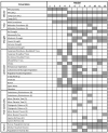
Figure A1
Figure A1
Evaluated model covariates. Covariates are listed by category in the first column. Columns following covariate name correspond to twelve models constructed to evaluate covariates (numbered 1–12) and are shaded by row to indicate covariate inclusion. The abbreviation SVC when listed with a covariate name indicates implementation as a Spatially Varying Coefficient, parenthetical listing of (D) signifies the covariate was added under assumption of a dynamic species pool (monthly varying), and parenthetical (S) indicates use of a static pool (seasonal, months May–August). Models 5–12 included climate SVC covariates and were subjected to model averaging to derive mean consensus estimates of WND risk.
Figure A2
Figure A2
Model validation. Top row depicts out-of-sample, model predicted 1-case exceedance probability for the months July, August, September, and October 2018. Bottom row depicts locations of actual 1-case exceedance as reported to the CDC.
Figure A3
Figure A3
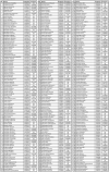
Detailed metadata for WNV avian host phylogenetic tree (Figure 3). Columns list the tree tip number (Tip), species name (Species), the proportion of occupied counties (Proportion), and estimated WNV prevalence for each avian species.
Figure A4
Figure A4
Dynamic avian host species richness. Species richness covariate under assumption of a dynamic species pool (monthly varying). Maps are color coded according to legend at bottom with darker tones indicating higher species richness.
Figure A5
Figure A5
Static avian host species richness. Species richness covariate under assumption of a static species pool (May–August). Map is color coded according to legend at bottom with darker tones indicating higher species richness.
Figure A6
Figure A6
Dynamic avian phylogenetic distance. Phylogenetic distance covariate (sum of branch lengths) under assumption of a dynamic species pool (monthly varying). Mapped values have been centered to highlight locations subject to relative phylogenetic clustering (higher than expected relatedness, blue colors) and dispersion (lower than expected relatedness, red colors).
Figure A7
Figure A7
Static avian phylogenetic distance. Phylogenetic distance covariate (sum of branch lengths) under assumption of a static species pool (May–August). Mapped values have been centered to highlight locations subject to relative phylogenetic clustering (higher than expected relatedness, blue colors) and dispersion (lower than expected relatedness, red colors).
Figure A8
Figure A8
Dynamic avian mean nearest taxon distance. Mean nearest taxon covariate under assumption of a dynamic species pool (monthly varying). Covariate reflects average genetic distance between nearest neighbors (sister species) within a community. Mapped values have been centered to highlight locations subject to relative phylogenetic clustering (higher than expected relatedness, blue colors) and dispersion (lower than expected relatedness, red colors).
Figure A9
Figure A9
Static avian mean nearest taxon distance. Mean nearest taxon covariate under assumption of a static species pool (May–August). Covariate reflects average genetic distance between nearest neighbors (sister species) within a community. Mapped values have been centered to highlight locations subject to relative phylogenetic clustering (higher than expected relatedness, blue colors) and dispersion (lower than expected relatedness, red colors).
Figure A10
Figure A10
Dynamic avian evolutionary distinctiveness. Evolutionary distinctiveness covariate under assumption of a dynamic species pool (monthly varying). Covariate reflects degree of species isolation on the phylogeny or the average distance of a species to all other species in the community. Mapped counties are color coded according to legend at bottom to indicate increased evolutionary distinctiveness with darker tones.
Figure A11
Figure A11
Static avian evolutionary distinctiveness. Evolutionary distinctiveness covariate under assumption of a static species pool (May–August). Covariate reflects degree of species isolation on the phylogeny or the average distance of a species to all other species in the community. Mapped counties are color coded according to legend at bottom to indicate increased evolutionary distinctiveness with darker tones.
Figure A12
Figure A12
Dynamic avian mean pairwise taxa distance. Mean pairwise taxa covariate under assumption of a dynamic species pool (monthly varying). Covariate reflects average phylogenetic distance among co-occurring species pairs in a community. Mapped values have been centered to highlight locations subject to relative phylogenetic clustering (higher than expected relatedness, blue colors) and dispersion (lower than expected relatedness, red colors).
Figure A13
Figure A13
Static avian mean pairwise taxa distance. Mean pairwise taxa covariate under assumption of a static species pool (May–August). Covariate reflects average phylogenetic distance among co-occurring species pairs in a community. Mapped values have been centered to highlight locations subject to relative phylogenetic clustering (higher than expected relatedness, blue colors) and dispersion (lower than expected relatedness, red colors).
Figure A14
Figure A14
Dynamic avian WNV mean molecular prevalence. Molecular prevalence covariate under assumption of a dynamic species pool (monthly varying). Covariate reflects avian community average WNV prevalence based on estimates reported by Tolsá et al. [54]. Mapped counties are color coded according to legend at bottom to indicate increased WNV prevalence with darker tones.
Figure A15
Figure A15
Static avian WNV mean molecular prevalence. Molecular prevalence covariate under assumption of a static species pool (May–August). Covariate reflects avian community average WNV prevalence based on estimates reported by Tolsá et al. [54]. Mapped counties are color coded according to legend at bottom to indicate increased WNV prevalence with darker tones.
Figure A16
Figure A16
Spatiotemporal distribution of equine WND relative risk. Maps depict the spatial and temporal distribution of model estimated WND relative risk by US County and month of year. Maps are color coded according to legend at bottom such that darker tones signify increased risk and lighter tones represent relatively lower risk. A relative risk value of 1 indicates that model predicted cases were comparable to the expectation given the number of horses in the county, values below 1 highlight counties with relatively low risk, and values above 1 suggest increased risk (higher than expected given the horse population).
Figure A17
Figure A17
Estimated equine WND case counts. Maps depict the spatial and temporal distribution of model estimated WND cases by US County and month of year. Maps are color coded according to legend at bottom such that darker tones signify increased case loads and lighter tones represent relatively lower case counts.
Figure A18
Figure A18
Estimated equine WND case counts. Maps depict the spatial and temporal distribution of model estimated WND cases by US County for select months during the peak WND outbreak season. Maps are color coded according to legend at bottom such that darker tones signify increased case loads and lighter tones represent relatively lower case counts. Case counts for all months of the year are provided with Appendix A (see Figure A17).
Figure 1
Figure 1
Network—correlation correlation graph. Networks display negative (left) and positive (right) correlations among evaluated input covariates and model estimated risk (larger text, upper left in each graph). Network nodes are labeled to indicate model covariate name and are sized to reflect the absolute magnitude of average Pearson linear correlation (r). Graph edges (lines) are color coded to indicate polarity (blue = negative, red = positive) with widths sized according to legend at bottom to signify absolute magnitude of pairwise correlation (range = −1 to +1). Graph structure among node positions (groups, clusters, or nestedness) approximate average connectivity (“node comunities”).
Figure 2
Figure 2
WNV detection probability. WNV surveillance covariate estimated from virus detections reported to the CDC. Mapped counties are color coded according to legend at bottom to indicate WNV detection probability (converted to percent chance). Darker tones indicate an elevated chance of virus detection whereas lighter tones represent a lesser chance of detection. Covariate construction is detailed in Section 2.2.
Figure 3
Figure 3
Phylogenetic tree for WNV avian hosts. Phylogenetic tree for 303 Passeriform species. Rectangular boxes near tree tips are color coded according to the legend at top right (Proportion) to indicate the proportion of US Counties where each species has been documented to occur. Rectangles coded as dark red indicate the species occurs in a high proportion of counties whereas lighter, yellow rectangles indicate relatively lower proportions. Circles surrounding tree tips correspond to legend at bottom right (Prevalence) and signify species-specific WNV molecular prevalence. Tree tips without circles indicate that prevalence information was not available at time of analysis. Figure A3 provided with Appendix A lists species names, proportion of occupied counties, and prevalence values for each tree tip.
Figure 4
Figure 4
Dynamic and static avian phylogenetic distance. Phylogenetic distance covariate under assumption of dynamic (monthly) and static (seasonal) species pools. Dynamic version is shown as a monthly varying time-series surrounding the larger map at center, which represents static phylogenetic distance (May–August). Mapped values have been scaled and centered to highlight locations subject to relative phylogenetic clustering with blue colors (higher than expected relatedness, lower mean genetic distances) and phylogenetic over-dispersion with red colors (lower than expected relatedness, higher mean genetic distances).
Figure 5
Figure 5
Avian host community composition, phylodiversity, and WNV prevalence posterior distributions. Vertical axis at left lists covariate names and horizontal axis provides numeric range of coefficient estimates. Distributions are color coded to indicate if the estimate corresponds to a dynamic (monthly varying) or static (season-based, May–August) avian species pool. Dashed vertical line intersects zero on horizontal axis to judge credible intervals and covariate polarity. The static implementations of mean nearest taxon distance, evolutionary distinctiveness, and molecular prevalence were determined not to be statistically significant based on 95% credible intervals. Neither the static or dynamic versions of mean nearest taxa distance were significant. All other other covariates were important indicators of WND risk.
Figure 6
Figure 6
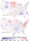
Spatially varying coefficients (SVCs) for climate. Maps show SVCs for temperature (top) and precipitation (bottom) by US County. Mapped colors correspond to legend at bottom and are scaled to show relative change (%) in equine WND cases with respect to the median case rate of 3.88 (1.83, 6.67 CI) cases/100,000 horses. Warm colors (reds) highlight locations where above average temperature (per 0.62 °C anomaly) and precipitation (per 31.52 mm anomaly) correlate to increased WND cases. Cooler colors (blues) indicate locations where above average temperature and precipitation correlate with decreased WND cases. Areas shown in white signify locations with little change in WND cases as temperature or precipitation increase.
Figure 7
Figure 7
Relationship of drought to equine WND. Vertical axis at left lists US Drought Monitor categories arranged (top to bottom) from the least to most dry stage. Horizontal axis is scaled to show relative change (%) in equine WND cases with respect to the median case rate of 3.88 (1.83, 6.67 CI) cases/100,000 horses, which is represented by the dashed vertical line intersecting zero. Point symbols in main plot area represent the mean coefficient estimate for each drought category with a corresponding line defining the 95% CI.
Figure 8
Figure 8
Temporal distribution of equine WND relative risk. Vertical axis at left describes model estimated log-risk (absolute risk, case counts on the log scale) and corresponds to smooth curve reflecting intra-annual changes in case intensity. Light gray lines surrounding smooth curve demarcate the estimated 95% CI. Horizontal gray line intersecting 0 (zero) on the left vertical axis represents the US annual median case rate of 3.88 (1.83, 6.67 CI) cases/100,000 horses. Horizontal axis at bottom lists the month of year. Bar chart in background corresponds to right vertical axis providing monthly standardized incidence rates (SIR).
Figure 9
Figure 9
Spatiotemporal distribution of equine WND relative risk. Maps depict the spatial and temporal distribution of model estimated WND relative risk by US County for the months July–October. Column aligned at center displays the Contiguous US with lateral columns providing closer views of locations demarcated on US map at top center. Maps are color coded according to legend at bottom such that darker tones signify increased risk and lighter tones represent relatively lower risk. A relative risk value of 1 indicates that model predicted cases were comparable to the expectation given the number of horses in the county, values below 1 highlight counties with relatively low risk, and values above 1 suggest increased risk (higher than expected given the horse population).

Similar articles

Cited by

References

    1. Strausbaugh L.J., Marfin A.A., Gubler D.J. West Nile Encephalitis: An Emerging Disease in the United States. Clin. Infect. Dis. 2001;33:1713–1719. doi: 10.1086/322700. - DOI - PubMed
    1. Rochlin I., Faraji A., Healy K., Andreadis T.G. West Nile Virus Mosquito Vectors in North America. J. Med. Entomol. 2019;56:1475–1490. doi: 10.1093/jme/tjz146. - DOI - PubMed
    1. Byas A.D., Ebel G.D. Comparative Pathology of West Nile Virus in Humans and Non-Human Animals. Pathogens. 2020;9:48. doi: 10.3390/pathogens9010048. - DOI - PMC - PubMed
    1. van den Hurk A.F., Ritchie S.A., Mackenzie J.S. Ecology and geographical expansion of Japanese encephalitis virus. Annu. Rev. Entomol. 2009;54:17–35. doi: 10.1146/annurev.ento.54.110807.090510. - DOI - PubMed
    1. Schuh A.J., Ward M.J., Leigh Brown A.J., Barrett A.D.T. Dynamics of the emergence and establishment of a newly dominant genotype of Japanese encephalitis virus throughout Asia. J. Virol. 2014;88:4522–4532. doi: 10.1128/JVI.02686-13. - DOI - PMC - PubMed

Publication types