. 2021 May;27(5):871-881.
doi: 10.1038/s41591-021-01309-6. Epub 2021 Apr 29.

Four distinct trajectories of tau deposition identified in Alzheimer's disease

Collaborators, Affiliations

Four distinct trajectories of tau deposition identified in Alzheimer's disease

Jacob W Vogel et al. Nat Med. 2021 May.

Abstract

Alzheimer's disease (AD) is characterized by the spread of tau pathology throughout the cerebral cortex. This spreading pattern was thought to be fairly consistent across individuals, although recent work has demonstrated substantial variability in the population with AD. Using tau-positron emission tomography scans from 1,612 individuals, we identified 4 distinct spatiotemporal trajectories of tau pathology, ranging in prevalence from 18 to 33%. We replicated previously described limbic-predominant and medial temporal lobe-sparing patterns, while also discovering posterior and lateral temporal patterns resembling atypical clinical variants of AD. These 'subtypes' were stable during longitudinal follow-up and were replicated in a separate sample using a different radiotracer. The subtypes presented with distinct demographic and cognitive profiles and differing longitudinal outcomes. Additionally, network diffusion models implied that pathology originates and spreads through distinct corticolimbic networks in the different subtypes. Together, our results suggest that variation in tau pathology is common and systematic, perhaps warranting a re-examination of the notion of 'typical AD' and a revisiting of tau pathological staging.


Figures
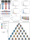
Figure S1
Figure S1
Methodological details. a) SuStaIn requires both spatial (e.g. brain regions) and pseudotemporal (e.g. Z-score waypoints representing advancing biomarker severity) features as input. SuStaIn models linear change between waypoints across multiple biomarkers and uses k-means clustering to fit subtype trajectories representing distinct biomarker sequences. b) Each spatial feature was z-scored in order to derive interpretable waypoints. Example: (top left), SUVR distribution in the left temporal lobe. (bottom-left) Distribution of standardized residuals after regression of choroid plexus. Gaussian mixture-modeling identifies “normal” (grey) and “abnormal” (red) tau-PET values within this distribution. (bottom right) Mean and SD of “normal” distribution used to normalize the whole distribution, creating “Tau Z-scores”. Tau Z-scores of 2, 5 and 10 are used as waypoints. (top-right) Tau-z scores superimposed onto the original SUVR distribution. For each subtype model (k=1–7), distribution of average negative log-likelihood, d) CVIC, and e) distribution of the probability of the maximum-likelihood subtype across cross-validation folds of left-out individuals. Higher log-likelihood, lower CVIC represents better model fit. f) Visualization of subtype solutions k=2–7. For each subtype, the rendered brains show significant regional tau difference between the subtype and all other subtypes in its solution. Connecting-line thickness indicates how many subjects are shared between a subtype and each subtype from its parent and child solutions. Circle color represents of the k=4 subtypes (outlined in the dashed box) each subtype is most similar to, in terms of the number of overlapping subjects. Red arrowheads indicate subtypes that were formed by pooling individuals from two different parent subtypes.
Figure S2
Figure S2
Details of subtype assignment. a) Several individuals classified as S2 (MTL-Sparing) were found to be tau-negative (i.e. no significant tau in the entorhinal cortex or precuneus). Cortical rendering shows the overall mean tau Z-scores (see Fig S1b) of S2: False individuals. Slightly elevated signal was observed throughout the cortex (but not MTL areas), including in regions where pathological tau is not observed until late AD. b) Proportion of Aβ+ (top) and cognitively impaired (bottom) individuals in S2: False to other S2 individuals (S2: True) and tau-negative individuals (S0). Using, χ2-tests with Tukey’s posthoc correction, a higher proportion of S2: False and S0 individuals were Aβ-and cognitively impaired (ps<0.0001) than S2: True individuals, but did not differ significantly from one another (ps>0.05). c) Using ANOVAs with Tukey’s posthoc correction, S0 and S2: False individuals were older and had higher MMSE scores than S2: True individuals, but did not differ from one another (ps>0.05). d) SuStaIn stage of all individuals stratified by subtype, with the poorly fitting subjects (those that had <0.5 probability of falling into any subtype) shown separately. All but one poorly fit subject exhibited very low SuStaIn stages. e) Probability of maximum likelihood subtype is low at SuStaIn stage 1, but quickly increases with increasing SuStaIn stage. f) Distribution of clinical diagnoses across SuStaIn stages. g) Distribution of clinical diagnoses across subtypes. h) Distribution of maximum-likelihood subtype probabilities for each clinical diagnosis. i) Distribution of PCA and lvPPA subjects from the UCSF sample into each subtype
Figure S3
Figure S3
Comparison of the mean tau-PET signal (tau-Z) across all ROIs, after adjustment for total cortical tau. A value of 0 represents a regional tau Z-score proportionate to the average cortical tau Z-score in that subtype. The left panel represents left hemisphere, the right panel represents right hemisphere. Confidence intervals represent standard error of the mean
Figure S4
Figure S4
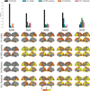
All subtypes observable across all contributing cohorts. The top Figure shows the proportions of each subtype (plus S0) within each of the five cohorts. All cohorts included individuals from each subtype. The bottom shows the mean tau Z image of each subtypes in a given cohort. Variation can be observed across cohorts, particularly regarding phenotypic severity, but subtype patterns are fairly consistent.
Figure S5
Figure S5
Individual fit to stereotypical subtype progression. Progression plots are created for each subtyped individual based on their progression through the events specific to their subtype. The outer images show regional tau z scores (see Fig S1) for an S2 (left) and S3 (right) individual. This data is summarized in lobar ROI z-scores (inner images). In progression plots under the images, each box represents a biomarker event, tied to a SuStaIn stage. A SuStaIn stage represents tau reaching a given severity (w) score at a given region (see Fig S1). Filled (tan) boxes indicate an individual fulfills the criteria for that SuStaIn stage. An empty (black) box indicates an individual does not. Note that each subtype has a different event order. A stepwise progression plot is shown for each subtype. Each row represents an individual, and each column represents a SuStaIn stage. A perfect fit would be represented by an individual (row) having every box filled before a given stage, and no boxes filled after it. The y-axis (subjects) are sorted from the least (top) to most (bottom) stages fulfilled. Across the population, this would be represented as a stepwise progression. Each subtype demonstrates a stepwise progression indicating good general fit. The average subject fit imperfection was 2.1 boxes.
Figure S6
Figure S6
SuStaIn creates nearly identical subtypes when initialized with different parameters (Table S5) see Methods: Replication Analysis). SuStaIn was rerun allowing a data-driven methodology to determine the number and value of z-score waypoints for each ROI. a) Qualitative contrasts of each subtype as defined using the original (Orig) parameters and the new data-driven (DD) parameters, where maps show regions significantly different between one subtype and all others (excluding S0) within the cohort (after FDR correction). b) Confusion matrix comparing subtypes identified in the original (orig) sample (y-axis), and subtypes separately identified in the data-driven parameter replication sample (x-axis). Values represent spatial correlation between average regional tau for each subtype. Values along the diagonal indicates similarity between the same subtype across both parameter sets.
Figure S7
Figure S7
Stability of subtypes across train-test split and replication datasets. (Top) Cortical renders showing, for each subtype across each dataset, regions with significantly different tau-PET signal compared to other within-dataset subtypes after FDR correction. Hot regions show greater tau-PET whereas cooler regions show lower signal. Remarkable similarity can be observed across subtypes, except S4, where lateralization switches from left to right. (Bottom) A heatmap showing similarity (spatial correlation) between subtypes across all four datasets. The diagonal represents the identity, whereas outlined boxes represent comparisons of the same subtype across cohorts.
Figure S8
Figure S8
Subtypes present with differing clinical profiles. For all plots, a * below a box indicates the subtype is significantly different (corrected p<0.05) from all other subtypes combined (one vs. all), while a χ represents a trend (p<0.1). Thick horizontal lines above boxes indicate significant (p<0.05) differences between two subtypes (one vs one). Dashed horizontal lines represent the mean of the S0 group (controlling for covariates), where relevant. All statistics are adjusted for demographics, disease status, cohort and SuStaIn stage. For boxplots, the center line=median, box=inner quartiles, whiskers=extent of data distribution except *=outliers
Figure S9
Figure S9
Lateralization across disease progression as measured with SuStaIn stage. a) Tau lateralization was measured as the mean left to right ratio of tau Z scores for all ten tau features. Higher positive numbers represent greater left hemisphere tau lateralization, whereas lower negative numbers represent greater right hemisphere lateralization. The progression of laterality over SuStaIn stage was visualized for each subtype. Lateralization generally increased with increasing SuStaIn stage. In some subtypes (particularly S2 and S3), strong lateralization was seen in both hemispheres at later stages. b) The absolute (i.e. agnostic to hemisphere) lateralization (i.e. tau asymmetry) was visualized against SuStaIn stage, indicating a general increase in lateralization with more severe tau expression. c) A three-way relationship between age, SuStaIn stage and absolute lateralization is visualized, indicating these relationships covary but are independent of one another.
Figure S10
Figure S10
Replication of subtype-specific epidemic spreading model. We repeated analyses from Fig. 4, this time using functional connectivity from a sample of elderly healthy and MCI individuals, over a higher-resolution cortical atlas, as the connectome input to the model. The ESM was fit separately for each subtype; once using an entorhinal cortex epicenter [a), gray], and once with a subtype-specific best-fitting epicenter [b), blue]. For each plot, each dot represents a region. The x-axis represents the mean simulated tau-positive probabilities across the population, while the y-axis represents the mean observed tau-positive probability. Each column represents a subtype. c) Visualization of the best-fitting epicenter selected by the model. d) For each subtype, the probability that each region is the best fitting epicenter for that subtype, based on bootstrap resampling.
Figure 1
Figure 1
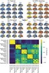
Spatiotemporal subtypes of tau progression. A) Tau-PET pattern of tau-positive (subtyped) individuals. B) Quarternary plot showing probability each individual is classified as each subtype. Dots are labeled by final subtype classification: S1 (blue), S2 (green), S3 (orange) or S4 (pink). Inset box shows individuals that had a probability < 0.5 to be classified as any of the four subtypes (i.e. showing poor fit). C) Average tau-PET pattern for each subtype. The colorbar is the same as Panel A. D) Regions showing significant difference between one subtype and all other subtypes using OLS linear models adjusting for SuStaIn stage, after FDR correction. E) Progression of each subtype through SuStaIn stages. Each image is a mean of individuals classified at the listed stage and up to four stages lower. Only the left hemisphere is shown.
Figure 2
Figure 2
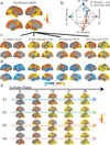
Subtype stability: AD spatiotemporal subtypes replicate in another cohort using a different PET tracer. A) For both the discovery (Orig) and replication (Repl) cohorts, maps showing regions significantly different between one subtype and all others (excluding S0) within the cohort (after FDR correction). Similar spatial patterns were observed, except for a reversed pattern in S4. B) Confusion matrix comparing subtypes identified in the original (discovery) sample (y-axis), and subtypes separately identified in the replication sample (x-axis). Values represent spatial correlation between average regional tau for each subtype. Values along the diagonal indicates similarity between the same subtype across both cohorts.
Figure 3
Figure 3
Progression of AD subtypes. Increasing SuStaIn stage is associated with lower age a) and worse cognition b) across all subtypes. c) Rate of longitudinal decline in MMSE for each subtype. The x-axis was jittered for visualization purposes only. The y-axis shows MMSE across all observations as predicted by linear mixed models adjusted for covariates. d) Boxplots showing the distribution of predicted MMSE slopes for each subtype, stratified by clinical diagnosis (stats in Supplementary Table S2). e) Cross-cohort meta-analysis for the effects of S4: L Temporal declining faster (left) and S3: Posterior declining slower (right) than other subtypes, respectively. Diamonds represent effect sizes, while diamond size reflects relative sample size. Red diamonds indicate significant effects. Error bars = SEM. f) Confusion matrix showing longitudinal stability of subtypes. Each row shows the number of subjects from a given subtype at Visit 1 that were classified as each subtype at Visit 2. The diagonal represents the number of subjects that were classified as the same subtype at Visit 1 and Visit 2. g) Individuals with a higher probability of being classified into their subtype at baseline were more likely to show a stable subtype over time (two-sided t[156,53]=5.26, p=3.6e-07). h) Annual change in SuStaIn stage for each subtype, in individuals with stable subtypes over time (stats in Supplementary Note 3). i) SuStaIn was used to predict longitudinal change in regional tau accumulation. Each dot represents a subject, and the y-axis represents the spatial correlation between the true regional tau change and the predicted regional tau change. Average predictions were significantly greater than chance based on a two-tided, one-sample t-test against 0 (S1: t[78]=5.00,p=3.5e-06; S2: t[52]=2.16,p=0.035; S3: t[45]=3.05,p=0.0039; S4: t[29]=4.93,p=3.1e-05). *p(unc.)<0.05, *** p(unc.)<0.001. Error bars in a-c represent 95% CI of model fit across 1000 bootstrap samples. For boxplots in d, g-i, center line=median, box=inner quartiles, whiskers=extent of data distribution except *=outliers
Figure 4
Figure 4
Application of epidemic spreading model to determine subtype-specific corticolimbic circuit vulnerability. An epidemic spreading model was fit separately for each subtype; once using an entorhinal cortex epicenter (a, blue), and once with a subtype-specific best-fitting epicenter (b, red). For each plot, each dot represents a region. The x-axis represents the mean simulated tau-positive probabilities across the population, while the y-axis represents the mean observed tau-positive probability. Each row represents a subtype. Error bars in a-c represent 95% CI of model fit across 1000 bootstrap samples. c) For each subtype, the probability that each region is the best fitting epicenter for that subtype, based on bootstrap resampling. d) For each subtype, the proportion of individuals at various stages that had best-fitting epicenters within each of five major brain divisions: medial temporal lobe (MTL, blue), temporal lobe (yellow), parietal lobe (purple), occipital lobe (gray) and frontal lobe (turquoise). e) For each subype, spatial representation of ESM results from panel B using best-fitting epicenter. From left to right, observed regional tau-PET probabilities (tau-P), regional connectivity to best-fitting epicenter (Cx), tau-PET probabilities predicted by the ESM. These images show the degree to which constrained diffusion of signal through a connectome (Pred.), starting in a given epicenter and its associated fiber network (Cx.), recapitulates the tau patterns of each subtype (Obs.).
Figure 5
Figure 5
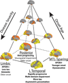
A theoretical model summarizing variation in the spread of tau pathology in AD. Tau pathology varies along an axis of severity (vertical in the diagram), which is inversely associated with onset age. In addition, tau varies along a spatiotempral dimension (horizontal plane in the diagram), such that an individual can be described by their fit along one of at least four trajectories. Text indicates clinical characteristics of each subtypes. Emboldened text reflects robust differences between subtypes, while normal text reflects less-robust characteristics that differentiate subtypes from tau-negative individuals

Similar articles

Cited by

References

    1. Hurd MD, Martorell P, Delavande A, Mullen KJ & Langa KM Monetary Costs of Dementia in the United States. N. Engl. J. Med. 368, 1326–1334 (2013). - PMC - PubMed
    1. Alafuzoff I et al. Staging of Neurofibrillary Pathology in Alzheimer’s Disease: A Study of the BrainNet Europe Consortium. Brain Pathol. 0, 080509082911413-??? (2008). - PMC - PubMed
    1. Hyman BT et al. National Institute on Aging-Alzheimer’s Association guidelines for the neuropathologic assessment of Alzheimer’s disease. Alzheimer’s Dement. 8, 1–13 (2012). - PMC - PubMed
    1. Hardy J & Selkoe DJ The Amyloid Hypothesis of Alzheimer’s Disease: Progress and Problems on the Road to Therapeutics. Science (80-. ). 297, 353–356 (2002). - PubMed
    1. Jack CR et al. Tracking pathophysiological processes in Alzheimer’s disease: An updated hypothetical model of dynamic biomarkers. Lancet Neurol. 12, 207–216 (2013). - PMC - PubMed

Methods References

    1. Iturria-Medina Y, Sotero RC, Toussaint PJ & Evans AC Epidemic Spreading Model to Characterize Misfolded Proteins Propagation in Aging and Associated Neurodegenerative Disorders. PLoS Comput. Biol. 10, (2014). - PMC - PubMed
    1. Cho H et al. Predicted sequence of cortical tau and amyloid-β deposition in Alzheimer disease spectrum. Neurobiol. Aging 68, 76–84 (2018). - PubMed
    1. Craddock C, Sikka S, Cheung B, Khanuja R, Ghosh SS, Yan C, Li Q, Lurie D, Vogelstein J, Burns R, S. C & Mennes M, Kelly C, Di Martino A, F C. and M. M Towards Automated Analysis of Connectomes: The Configurable Pipeline for the Analysis of Connectomes (C-PAC). Front. Neuroinform. 7, (2013).

Publication types