. 2020 Dec 15;53(6):1296-1314.e9.
doi: 10.1016/j.immuni.2020.11.017. Epub 2020 Nov 26.

Longitudinal Multi-omics Analyses Identify Responses of Megakaryocytes, Erythroid Cells, and Plasmablasts as Hallmarks of Severe COVID-19

Joana P Bernardes  1 Neha Mishra  1 Florian Tran  2 Thomas Bahmer  3 Lena Best  4 Johanna I Blase  1 Dora Bordoni  1 Jeanette Franzenburg  5 Ulf Geisen  6 Jonathan Josephs-Spaulding  4 Philipp Köhler  7 Axel Künstner  8 Elisa Rosati  1 Anna C Aschenbrenner  9 Petra Bacher  10 Nathan Baran  1 Teide Boysen  1 Burkhard Brandt  11 Niklas Bruse  12 Jonathan Dörr  6 Andreas Dräger  13 Gunnar Elke  14 David Ellinghaus  1 Julia Fischer  15 Michael Forster  1 Andre Franke  1 Sören Franzenburg  1 Norbert Frey  16 Anette Friedrichs  3 Janina Fuß  1 Andreas Glück  3 Jacob Hamm  1 Finn Hinrichsen  1 Marc P Hoeppner  1 Simon Imm  1 Ralf Junker  11 Sina Kaiser  6 Ying H Kan  1 Rainer Knoll  17 Christoph Lange  18 Georg Laue  1 Clemens Lier  11 Matthias Lindner  14 Georgios Marinos  4 Robert Markewitz  11 Jacob Nattermann  19 Rainer Noth  3 Peter Pickkers  12 Klaus F Rabe  20 Alina Renz  13 Christoph Röcken  21 Jan Rupp  22 Annika Schaffarzyk  6 Alexander Scheffold  23 Jonas Schulte-Schrepping  24 Domagoj Schunk  25 Dirk Skowasch  26 Thomas Ulas  27 Klaus-Peter Wandinger  11 Michael Wittig  1 Johannes Zimmermann  4 Hauke Busch  28 Bimba F Hoyer  6 Christoph Kaleta  4 Jan Heyckendorf  16 Matthijs Kox  29 Jan Rybniker  15 Stefan Schreiber  2 Joachim L Schultze  27 Philip Rosenstiel  30 HCA Lung Biological NetworkDeutsche COVID-19 Omics Initiative (DeCOI)
Collaborators, Affiliations

Longitudinal Multi-omics Analyses Identify Responses of Megakaryocytes, Erythroid Cells, and Plasmablasts as Hallmarks of Severe COVID-19

Joana P Bernardes et al. Immunity. .

Abstract

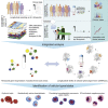
Temporal resolution of cellular features associated with a severe COVID-19 disease trajectory is needed for understanding skewed immune responses and defining predictors of outcome. Here, we performed a longitudinal multi-omics study using a two-center cohort of 14 patients. We analyzed the bulk transcriptome, bulk DNA methylome, and single-cell transcriptome (>358,000 cells, including BCR profiles) of peripheral blood samples harvested from up to 5 time points. Validation was performed in two independent cohorts of COVID-19 patients. Severe COVID-19 was characterized by an increase of proliferating, metabolically hyperactive plasmablasts. Coinciding with critical illness, we also identified an expansion of interferon-activated circulating megakaryocytes and increased erythropoiesis with features of hypoxic signaling. Megakaryocyte- and erythroid-cell-derived co-expression modules were predictive of fatal disease outcome. The study demonstrates broad cellular effects of SARS-CoV-2 infection beyond adaptive immune cells and provides an entry point toward developing biomarkers and targeted treatments of patients with COVID-19.

Keywords: COVID-19; RNA-seq; acute respiratory distress; blood; disease trajectory; immune response; infectious disease; methylation; scRNA-seq; virus.


Conflict of interest statement

Declaration of Interests The authors declare no conflicting interests.

Figures
None
Graphical abstract
Figure 1
Figure 1
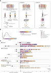
Clinical Definition of Disease Phases for Disease Trajectory Analyses (A) Graphical overview of the study cohorts. (B) Concept of disease phase pseudotimes. Clinical disease phases (pseudotimes) were defined based on inflammatory markers and ventilation need (according to WHO ordinal scale). They reflect temporal disease severity and distinguish between incremental and recovering disease stages. Abbreviation is a follows: Hosp, Hospitalization. For detailed explanation of the scoring and pseudotimes, see Table S2. (C) Overview of the cohort 1. All patients are temporally aligned to the day of initial admission. Squares mark the day of COVID-19-related symptom onset. Frames mark days of in-patient care, and the color represents the disease pseudotime. Sampling days were marked with a white circle. Intubations and extubations are depicted with triangle symbols, if applicable. See also Tables S1 and S2.
Figure 2
Figure 2
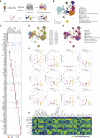
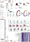
Cellular Changes along COVID-19 Disease Trajectories (A) Schematic workflow. (B) Cell type UMAP representation of all merged samples. Twelve cell types were identified by cluster gene signatures. In total, 358,930 cells are depicted. (C) Dot plot for cell-type-specific signature genes. Genes were selected on the basis of the expression amounts of the ten most characteristic genes. Color discriminates genes with increased (red) or decreased (blue) expression, and point size represents the number of cells per group expressing the corresponding gene. (D) Sample of origin UMAP representation of all merged samples. Cells were colored by the sample. Samples nomenclature is based on patient ID (001–014) and time points of sample collection day 1 (after admission TA), day 3 (TA2), day 8 (TB), day 11 (TB2), day 14 (TC), and day 20 (TE). (E) Pseudotime UMAP representation of all merged samples, colored by pseudotime. (F) Cell proportions grouped by pseudotime. Cell proportions depicted as points referring to percentages based on the total cell numbers of individual samples and horizontal bars depicting the mean. Pseudotimes are represented by colors. p values are based on longitudinal linear mixed model for comparison among COVID-19 pseudotimes and p values are based on Mann-Whitney test for comparisons between healthy and COVID-19 samples. (G) Correlation heatmap between cell-specific proportions and clinical parameters included in routine tests and multiplex ELISA. p < 0.05, ∗∗p < 0.01, and ∗∗∗p < 0.001 in Spearman’s correlation. Color intensity corresponds to correlation coefficient. Abbreviations are as follows: DC, dendritic cells; PB, PBs; MK, megakaryocytes; HSC, hematopoietic stem cell; MEP, megakaryocyte-erythroid progenitor cell; CMP, common myeloid progenitor cell; GMP, granulocyte-monocyte progenitor. See also Figure S1.
Figure 3
Figure 3
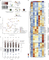
Dynamics of Whole-Blood Gene Expression in COVID-19 (A) Schematic workflow. (B) PCA plot of all control and COVID-19 samples on the basis of the expression of all genes. Samples are color-coded by their pseudotime and labeled by the patient or individual ID. (C) Log2-fold change (y axis) of DEGs between controls and each of the COVID-19 pseudotimes (x axis). Color discriminates genes with increased (red) or decreased (blue) expression, and point size represents statistical significance (adjusted p value). The transparency of the points denotes the number of comparisons in which the genes is significantly differentially expressed. The numbers of genes with increased and decreased expression are written at the top and bottom of the plot, respectively. (D) Heatmap of top 500 longitudinal DEGs across COVID-19 pseudotimes (pseudotimes 1, 3, 4, 5, and 6). Gene expression in controls and pseudotime 2 are shown for comparison on the left and right ends of the heatmap, respectively. The row-wise z-scores of the normalized counts are plotted in the heatmap. Genes are hierarchically clustered by using their adjacency scores as distance. See also Figure S2.
Figure 4
Figure 4
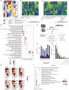
Co-expression Analysis of Differentially Expressed Genes and Integration with Changes in Methylation (A) Group eigengene heatmap of co-expression modules constructed by using all pairwise and longitudinal DEGs. The average eigengene values of all samples within each pseudotime are plotted. The number of genes is plotted as a bar plot (right). (B) Correlation heatmap showing Spearman’s rank correlation coefficients between gene co-expression modules (rows) and cell-specific proportion from scRNA-seq data (columns). p < 0.05, ∗∗ p < 0.01, and ∗∗∗ p < 0.001 in Spearman’s correlation. Color intensity corresponds to correlation coefficient. (C) Correlation heatmap showing Spearman’s rank correlation coefficients between gene co-expression modules (rows) and clinical parameters (columns). p < 0.05, ∗∗p < 0.01, and ∗∗∗p < 0.001 in Spearman’s correlation. Color intensity corresponds to correlation coefficient. (D) Dot plot showing the gene set enrichment analysis (GSEA) of gene co-expression modules against GO (Biological Processes), Hallmark, and Kyoto Encyclopedia of Genes and Genomes (KEGG) gene sets. Size of the dots is proportional to the normalized enrichment score (NES), and the color corresponds to the false discovery rate (FDR). Selected top terms are visualized. (E) Schematic workflow of the analysis performed on the whole-blood EPIC array data and its integration with bulk RNA-seq data. (F) Number of significantly DMPs between controls and each of the COVID-19 pseudotimes. Colors discriminate hypermethylated (red) and hypomethylated (blue) positions in COVID-19 samples compared with those from controls. (G) DMP comparisons between top 30,000 DMPs at each pseudotime. Vertical bar plots indicate the number of specific DMPs (left) shared between time points (right) indicated as connected dots (bottom). Only selected overlaps are visualized. (H) Heatmap showing the significant enrichment, quantified by odds ratio, of TFBS in the DMPs identified at different COVID-19 pseudotimes. Selected top TFs are visualized. (I) Dot plot showing GO terms enriched in DMP-DEG pairs. Size of the dots is proportional to the gene ratio and the color corresponds to the p value of the enrichment. Selected top terms are visualized. See also Figures S2, S3, and S4 and Table S3.
Figure 5
Figure 5
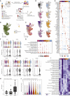
B Cell Compartment Analysis Identifies Plasmablast Changes across the COVID-19 Disease Trajectory (A) Schematic workflow. (B) B cell compartment subtypes represented as a UMAP. In total, 22,190 cells are depicted. Memory B cells (MB) (dark red), naive B cells (N) (red), transitional B cells (trans) (orange), and plasmablasts (PB) (blue). (C) B cell compartment pseudotimes represented as a UMAP. (D) Flow-cytometry analysis of B cell subtypes. CD19+ B cells were stained for CD20 and CD27. CD20CD27high B cells classified as PB, CD20+CD27+ cells as MB, and CD20+CD27 cells as N. Proportions of each cell type among CD19+ B cells is relative to the disease onset, colored by corresponding pseudotime, and connected by patient. (n = 7 individuals). (E) PB-specific UMAP highlighted neutrophil-like cells (NL). Smaller UMAPs corresponding to expression of PB markers (CD27, CD38, and TNFRSF17) and neutrophil-like markers (ELANE, MPO, and CAMP). (F) Cell trajectory analysis of B cell compartment. Cell trajectory was calculated by using Monocle3. The analysis rooted on transitional B cells (purple) and differentiated into 2 branches: B cells naive and memory branch (gray line, culminating in yellow) and an over imposed PB branch (black line, culminating in orange). (G) Dot plot for pseudotime signature genes in PBs. Genes selected on the basis of the increased expression of the ten most characteristic genes. Color discriminates genes with increased (red) or decreased (blue) expression, and point size represents the number of cells per group expressing the corresponding gene. (H) GO enrichment analysis for genes with increased expression during disease trajectory. Dot size is proportional to the gene ratio and the color corresponds to the p value of the enrichment. Selected top terms are visualized. (I) Gene expression of genes of interest in B cell subtypes. Genes of interest selected on the basis of their high expression in PB or NL. For each gene, top violin plot depicting B cell subtypes expression, center violin plot based on pseudotime, and bottom violin plot based on the expression of cohort 2 (healthy control [white], mild disease [light gray], and severe disease [dark gray]). (J) Metabolic pathways enriched in B cell compartment subtypes. Top 20 active metabolic pathways for context-specific metabolic networks reconstructed in PBs are shown. For each B cell subtype, significant differences in metabolic activity were determined by using a Kruskal-Wallis test. Number of reaction counts found per pathway is displayed as color intensity. See also Figure S6L.
Figure 6
Figure 6
Elevated Megakaryocyte Levels as a Feature of COVID-19 (A) Schematic workflow. (B) MKs and their precursors as a UMAP. In total, 6,512 cells are depicted. MKs (green), HSCs (pink), and MEPs (yellow) are shown. (C) MKs pseudotimes represented as a UMAP. In total, 5,870 cells are depicted. (D) MKs across COVID-19 disease trajectory. For each UMAP, pseudotime-specific cells were highlighted by color. (E) Dot plot for disease trajectory signature genes in MKs. Genes selected on the basis of the expression amount of the ten most characteristic genes. Color discriminates genes with increased (red) or decreased (blue) expression, and point size represents the number of cells per group expressing the corresponding gene. (F) Expression of genes of interest in MKs. Top violin plot based on pseudotime and bottom violin plot based on cohort 2 by disease classification; healthy control (white), mild disease (light gray), and severe disease (dark gray). (G) GO enrichment analysis for genes with increased expression during disease trajectory. Dot size is proportional to gene ratio and the color corresponds to the p value of the enrichment. Selected top terms are visualized. (H) Cohort 2 MK proportions grouped by disease severity. Healthy control (white), mild disease (light gray) and severe disease (dark gray) were depicted. AIC and p value are based on linear mixed model. (I) Metabolic pathways enriched in MKs. Top differentially active metabolic pathways for context-specific metabolic networks reconstructed are shown. Significant differences in metabolic activity were determined by using a Kruskal-Wallis test. Number of reaction counts per pathway are displayed as color intensity. (J) Pyruvate metabolism in MKs. Number of pyruvate metabolic pathway active reactions by pseudotime were depicted. p value based on Kruskal-Wallis test. Number of models per pseudotime were denoted as n above each column. See also Figure S6L.
Figure 7
Figure 7
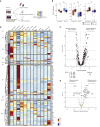
Clinical Significance of Co-expression Modules in a Longitudinal Cohort of Severe COVID-19 Patients (A) Schematic workflow. (B) Module eigengene comparisons between the two sampled time points in survivors and non-survivors for M2, M4 and M7. Error bars depict 1.5 of interquartile distance and *p < 0.05 (Mann Whitney tests). (C) Volcano plot depicting log2-fold changes and FDR-adjusted p values between the two sampled time points in non-survivors. Genes are color-coded by the corresponding co-expression modules. Darker colors represent significantly DEGs. (D) Heatmap showing the average expression of DEGs identified in non-survivors in different cell-types of cohort 1 (from scRNA-seq data). The average expression in severe stages of the disease (pseudotimes 1, 2, and 3) is shown. Row-wise z-scores of the average gene counts are plotted in the heatmap and hierarchically clustered for each module separately. (E) Volcano plot depicting the differential TF activity over time in non-survivors (right) versus survivors (left) versus the −log10 transformed p value. Significant TFs (p < 0.1) are marked in red. See also Table S4.

Similar articles

  • Dynamic blood single-cell immune responses in patients with COVID-19.
    Huang L, Shi Y, Gong B, Jiang L, Zhang Z, Liu X, Yang J, He Y, Jiang Z, Zhong L, Tang J, You C, Jiang Q, Long B, Zeng T, Luo M, Zeng F, Zeng F, Wang S, Yang X, Yang Z. Huang L, et al. Signal Transduct Target Ther. 2021 Mar 6;6(1):110. doi: 10.1038/s41392-021-00526-2. Signal Transduct Target Ther. 2021. PMID: 33677468 Free PMC article.
  • Immune Response in Severe and Non-Severe Coronavirus Disease 2019 (COVID-19) Infection: A Mechanistic Landscape.
    Mukund K, Nayak P, Ashokkumar C, Rao S, Almeda J, Betancourt-Garcia MM, Sindhi R, Subramaniam S. Mukund K, et al. Front Immunol. 2021 Oct 13;12:738073. doi: 10.3389/fimmu.2021.738073. eCollection 2021. Front Immunol. 2021. PMID: 34721400 Free PMC article.
  • COVID-19 immune features revealed by a large-scale single-cell transcriptome atlas.
    Ren X, Wen W, Fan X, Hou W, Su B, Cai P, Li J, Liu Y, Tang F, Zhang F, Yang Y, He J, Ma W, He J, Wang P, Cao Q, Chen F, Chen Y, Cheng X, Deng G, Deng X, Ding W, Feng Y, Gan R, Guo C, Guo W, He S, Jiang C, Liang J, Li YM, Lin J, Ling Y, Liu H, Liu J, Liu N, Liu SQ, Luo M, Ma Q, Song Q, Sun W, Wang G, Wang F, Wang Y, Wen X, Wu Q, Xu G, Xie X, Xiong X, Xing X, Xu H, Yin C, Yu D, Yu K, Yuan J, Zhang B, Zhang P, Zhang T, Zhao J, Zhao P, Zhou J, Zhou W, Zhong S, Zhong X, Zhang S, Zhu L, Zhu P, Zou B, Zou J, Zuo Z, Bai F, Huang X, Zhou P, Jiang Q, Huang Z, Bei JX, Wei L, Bian XW, Liu X, Cheng T, Li X, Zhao P, Wang FS, Wang H, Su B, Zhang Z, Qu K, Wang X, Chen J, Jin R, Zhang Z. Ren X, et al. Cell. 2021 Apr 1;184(7):1895-1913.e19. doi: 10.1016/j.cell.2021.01.053. Epub 2021 Feb 3. Cell. 2021. PMID: 33657410 Free PMC article.
  • Dysregulated Immune Responses in COVID-19 Patients Correlating With Disease Severity and Invasive Oxygen Requirements.
    García-González P, Tempio F, Fuentes C, Merino C, Vargas L, Simon V, Ramirez-Pereira M, Rojas V, Tobar E, Landskron G, Araya JP, Navarrete M, Bastias C, Tordecilla R, Varas MA, Maturana P, Marcoleta AE, Allende ML, Naves R, Hermoso MA, Salazar-Onfray F, Lopez M, Bono MR, Osorio F. García-González P, et al. Front Immunol. 2021 Oct 21;12:769059. doi: 10.3389/fimmu.2021.769059. eCollection 2021. Front Immunol. 2021. PMID: 34745145 Free PMC article.
  • Multiomics: unraveling the panoramic landscapes of SARS-CoV-2 infection.
    Wang X, Xu G, Liu X, Liu Y, Zhang S, Zhang Z. Wang X, et al. Cell Mol Immunol. 2021 Oct;18(10):2313-2324. doi: 10.1038/s41423-021-00754-0. Epub 2021 Sep 1. Cell Mol Immunol. 2021. PMID: 34471261 Free PMC article. Review.

Cited by

References

    1. Alexa A., Rahnenführer J., Lengauer T. Improved scoring of functional groups from gene expression data by decorrelating GO graph structure. Bioinformatics. 2006;22:1600–1607. - PubMed
    1. Alvarez M.J., Shen Y., Giorgi F.M., Lachmann A., Ding B.B., Ye B.H., Califano A. Functional characterization of somatic mutations in cancer using network-based inference of protein activity. Nat. Genet. 2016;48:838–847. - PMC - PubMed
    1. Aran D., Looney A.P., Liu L., Wu E., Fong V., Hsu A., Chak S., Naikawadi R.P., Wolters P.J., Abate A.R. Reference-based analysis of lung single-cell sequencing reveals a transitional profibrotic macrophage. Nat. Immunol. 2019;20:163–172. - PMC - PubMed
    1. Ashrafi G., Schwarz T.L. The pathways of mitophagy for quality control and clearance of mitochondria. Cell Death Differ. 2013;20:31–42. - PMC - PubMed
    1. Assenov Y., Müller F., Lutsik P., Walter J., Lengauer T., Bock C. Comprehensive analysis of DNA methylation data with RnBeads. Nat. Methods. 2014;11:1138–1140. - PMC - PubMed

Publication types

MeSH terms