

Revealing fine-scale spatiotemporal differences in SARS-CoV-2 introduction and spread
- PMID: 33144575
- PMCID: PMC7609670
- DOI: 10.1038/s41467-020-19346-z
Revealing fine-scale spatiotemporal differences in SARS-CoV-2 introduction and spread
Abstract
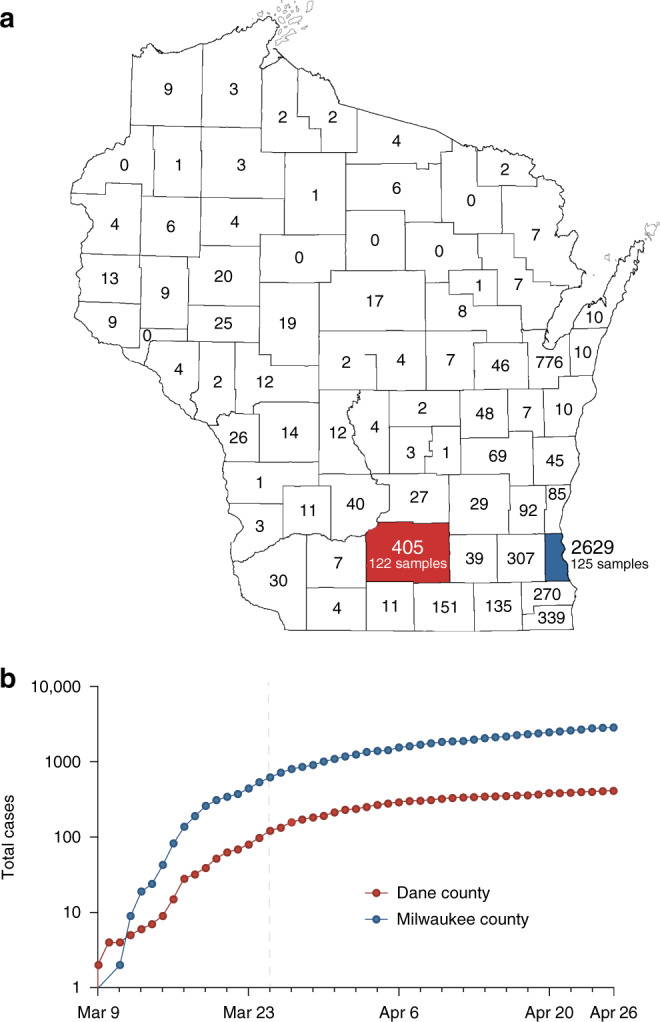
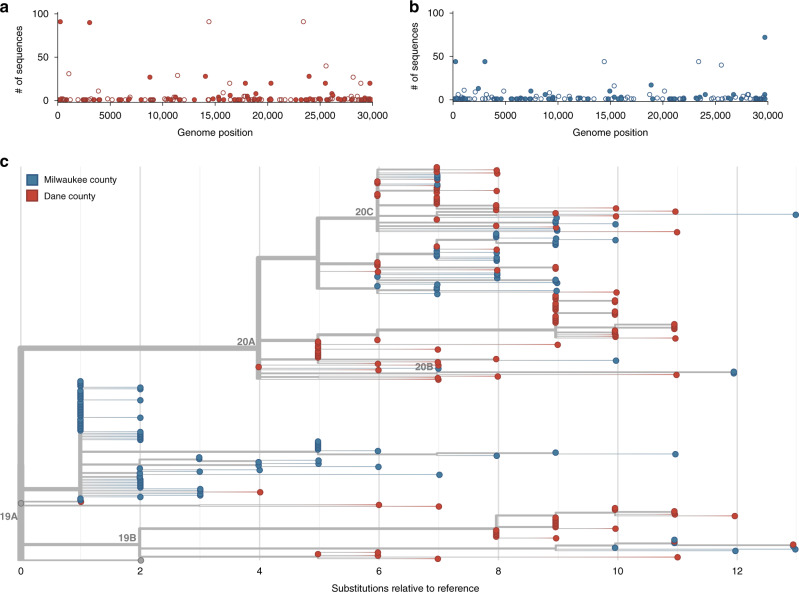
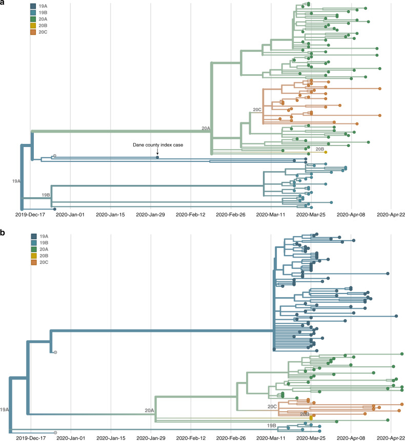
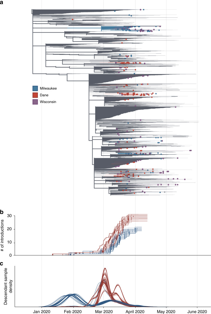
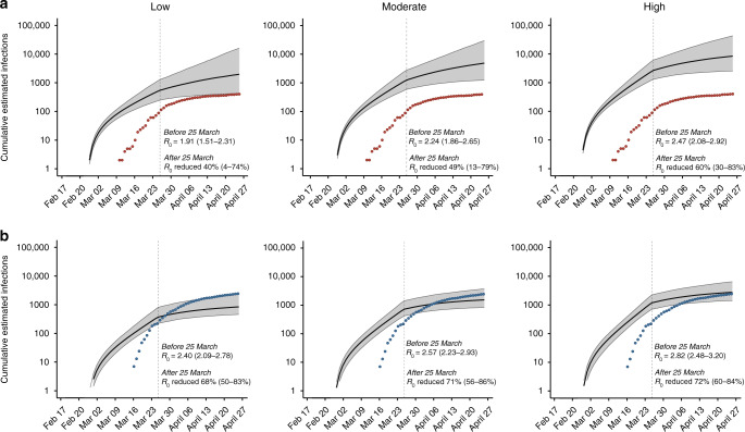
Evidence-based public health approaches that minimize the introduction and spread of new SARS-CoV-2 transmission clusters are urgently needed in the United States and other countries struggling with expanding epidemics. Here we analyze 247 full-genome SARS-CoV-2 sequences from two nearby communities in Wisconsin, USA, and find surprisingly distinct patterns of viral spread. Dane County had the 12th known introduction of SARS-CoV-2 in the United States, but this did not lead to descendant community spread. Instead, the Dane County outbreak was seeded by multiple later introductions, followed by limited community spread. In contrast, relatively few introductions in Milwaukee County led to extensive community spread. We present evidence for reduced viral spread in both counties following the statewide "Safer at Home" order, which went into effect 25 March 2020. Our results suggest patterns of SARS-CoV-2 transmission may vary substantially even in nearby communities. Understanding these local patterns will enable better targeting of public health interventions.
Conflict of interest statement
The authors declare no competing interests.
Figures
Update of
-
Distinct patterns of SARS-CoV-2 transmission in two nearby communities in Wisconsin, USA.medRxiv [Preprint]. 2020 Jul 10:2020.07.09.20149104. doi: 10.1101/2020.07.09.20149104. medRxiv. 2020. Update in: Nat Commun. 2020 Nov 3;11(1):5558. doi: 10.1038/s41467-020-19346-z. PMID: 32676620 Free PMC article. Updated. Preprint.
Similar articles
-
Distinct patterns of SARS-CoV-2 transmission in two nearby communities in Wisconsin, USA.medRxiv [Preprint]. 2020 Jul 10:2020.07.09.20149104. doi: 10.1101/2020.07.09.20149104. medRxiv. 2020. Update in: Nat Commun. 2020 Nov 3;11(1):5558. doi: 10.1038/s41467-020-19346-z. PMID: 32676620 Free PMC article. Updated. Preprint.
-
Full genome viral sequences inform patterns of SARS-CoV-2 spread into and within Israel.Nat Commun. 2020 Nov 2;11(1):5518. doi: 10.1038/s41467-020-19248-0. Nat Commun. 2020. PMID: 33139704 Free PMC article.
-
Time-lapse sentinel surveillance of SARS-CoV-2 spread in India.PLoS One. 2020 Oct 22;15(10):e0241172. doi: 10.1371/journal.pone.0241172. eCollection 2020. PLoS One. 2020. PMID: 33091066 Free PMC article.
-
Transmission and prevention of SARS-CoV-2.Biochem Soc Trans. 2020 Oct 30;48(5):2307-2316. doi: 10.1042/BST20200693. Biochem Soc Trans. 2020. PMID: 33084885 Review.
-
Aerosol transmission of SARS-CoV-2? Evidence, prevention and control.Environ Int. 2020 Nov;144:106039. doi: 10.1016/j.envint.2020.106039. Epub 2020 Aug 7. Environ Int. 2020. PMID: 32822927 Free PMC article. Review.
Cited by
-
Online Phylogenetics using Parsimony Produces Slightly Better Trees and is Dramatically More Efficient for Large SARS-CoV-2 Phylogenies than de novo and Maximum-Likelihood Approaches.bioRxiv [Preprint]. 2022 May 18:2021.12.02.471004. doi: 10.1101/2021.12.02.471004. bioRxiv. 2022. Update in: Syst Biol. 2023 Nov 1;72(5):1039-1051. doi: 10.1093/sysbio/syad031. PMID: 35611334 Free PMC article. Updated. Preprint.
-
Acute SARS-CoV-2 infections harbor limited within-host diversity and transmit via tight transmission bottlenecks.PLoS Pathog. 2021 Aug 23;17(8):e1009849. doi: 10.1371/journal.ppat.1009849. eCollection 2021 Aug. PLoS Pathog. 2021. PMID: 34424945 Free PMC article.
-
Population Genomics Approaches for Genetic Characterization of SARS-CoV-2 Lineages.Front Med (Lausanne). 2022 Feb 21;9:826746. doi: 10.3389/fmed.2022.826746. eCollection 2022. Front Med (Lausanne). 2022. PMID: 35265640 Free PMC article.
-
Genomic surveillance identifies SARS-CoV-2 transmission patterns in local university populations, Wisconsin, USA, 2020-2022.Microb Genom. 2023 Mar;9(3):mgen000970. doi: 10.1099/mgen.0.000970. Microb Genom. 2023. PMID: 37000821 Free PMC article.
-
Severe Acute Respiratory Syndrome Coronavirus 2 Transmission in Intercollegiate Athletics Not Fully Mitigated With Daily Antigen Testing.Clin Infect Dis. 2021 Jul 15;73(Suppl 1):S45-S53. doi: 10.1093/cid/ciab343. Clin Infect Dis. 2021. PMID: 33977295 Free PMC article.
References
-
- USAFacts. Coronavirus locations: COVID-19 map by county and state. https://usafacts.org/visualizations/coronavirus-covid-19-spread-map/ (2020).
Publication types
MeSH terms
Grants and funding
LinkOut - more resources
Full Text Sources
Miscellaneous
