. 2020 Nov;17(11):1111-1117.
doi: 10.1038/s41592-020-0958-x. Epub 2020 Oct 12.

Predicting 3D genome folding from DNA sequence with Akita

Affiliations

Predicting 3D genome folding from DNA sequence with Akita

Geoff Fudenberg et al. Nat Methods. 2020 Nov.

Abstract

In interphase, the human genome sequence folds in three dimensions into a rich variety of locus-specific contact patterns. Cohesin and CTCF (CCCTC-binding factor) are key regulators; perturbing the levels of either greatly disrupts genome-wide folding as assayed by chromosome conformation capture methods. Still, how a given DNA sequence encodes a particular locus-specific folding pattern remains unknown. Here we present a convolutional neural network, Akita, that accurately predicts genome folding from DNA sequence alone. Representations learned by Akita underscore the importance of an orientation-specific grammar for CTCF binding sites. Akita learns predictive nucleotide-level features of genome folding, revealing effects of nucleotides beyond the core CTCF motif. Once trained, Akita enables rapid in silico predictions. Accounting for this, we demonstrate how Akita can be used to perform in silico saturation mutagenesis, interpret eQTLs, make predictions for structural variants and probe species-specific genome folding. Collectively, these results enable decoding genome function from sequence through structure.


Figures

Extended Data Fig. 1
Extended Data Fig. 1. Akita transforms from 1D to 2D representations and benefits from multi-task training.
a. Illustration of transformation from 1D profiles to 2D maps. To convert 1D profiles to 2D maps, we averaged the values at pairs of genomic bins i and j for each filter. This operation transforms a tensor with dimensions [512 length, 64 filters] to a tensor with dimensions [512 length, 512 length, 64 filters]. We also concatenated a positional encoding of the distance between bins, abs∣i-j∣, as an additional filter, producing a [512 length, 512 length, 65 filters] tensor. b. Evaluation of transformation from 1D to 2D. We considered the following operations to transform 1D vector representations derived from the DNA sequence to 2D for Hi-C prediction, holding all other hyper-parameters constant. For every pair of vectors oi and oj for 1D sequence positions i and j, we computed vector t(i,j), with filters indexed by k, via:
  1. “dot”: Element-wise multiplication between each vector position, t(i,j,k) = oi(k)oj(k).

  2. “geo”: Addition of one to all vector values, element-wise multiplication between each position, square root of each position, subtraction of one from all vector values, t(i,j,k)=(oi(k)+1)(oj(k)+1)1.

  3. “max”: Element-wise max between each vector position, t(i,j,k) = max(oi(k),oj(k)).

  4. “concat”: Concatenate the two vectors, t(i,j) = [oi,oj].

  5. “avg”: Element-wise mean between each vector position, t(i,j,k) = (oi(k)+oj(k))/2

c. Multi-task training improves accuracy relative to single dataset training. We trained Akita models for each of the five datasets alone and compared overall Pearson’s R on the test set to the jointly trained multi-task model. Multi-task training benefitted all datasets except for the highest-performing H1hESC dataset. We note that our multi-task framework thus offers a powerful approach to train on many datasets simultaneously and efficiently.
Extended Data Fig. 2
Extended Data Fig. 2. Correlation of Akita’s predictions with experimental data reach those between replicates
a. MSE vs. Spearman R for each target, where each dot shows values for these metrics for an individual region of the test set. Light grey shows values for predictions versus the full experimental dataset, as in Fig. 1C. Purple shows these quantities if reads for each full dataset are randomly split into two datasets. The same normalization and smoothing steps used to generate training data from the full dataset were used to transform each map prior to calculating MSE or Spearman R. Predictions generally show lower MSE and higher correlations than split datasets. This indicates that our model has extracted the majority of the signal in these data, and that current performance is limited at least in part by sequencing depth of even the currently best available datasets. b. MSE vs. Spearman R for the HFF dataset. Light grey and purple as in (a). To obtain contact maps for biological replicates, as defined in Krietenstein et al., 2020, reads were re-processed and aggregated across technical replicates for the same biological replicate (bioRep). Biological replicates represent independently cultured and processed cells, whereas technical replicates represent independent sample preparations from the same cell culture. Green shows results for two biological replicates, and dark grey shows results for predictions versus the first biological replicate. Normalization and smoothing applied as in (a). Since splitting leads to slightly lower MSEs and higher correlations than those between biological replicates, this indicates that splitting reads in half computationally leads to a similar, albeit more stringent, barometer of model performance than the comparison between biological replicates. c. Maps for predictions (top row), bioRep1 (middle) and bioRep2 (bottom) for the same three regions displayed in Fig. 2.
Extended Data Fig. 3
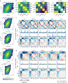
Extended Data Fig. 3. Akita predictions relate to the aggregate CTCF and accessibility signals as well as binarized features of experimental maps.
a-c. Correlations between the strength of Akita’s predictions, strength of experimental patterns, CTCF, and DNAse. a. Map signal strength, measured by mean of squared map values, for predictions versus targets. In regions with more complex features, Akita tends to make more complex predictions. Correlation printed above each plot indicates Spearman’s R across all regions of the test set (n=413, p<1e-6 in all cases). b. Signal strength for predictions versus signal strength for CTCF ChIP-seq, measured by mean squared profile values. Akita predicts more prominent locus-specific patterns in regions with greater CTCF binding. c. Signal strength for predictions versus DNAse-seq. d-f. Akita predictions recapitulate positions of boundaries and dots called from experimental data. d. Experimental HFF Micro-C data for the same regions in Fig. 2. TAD boundaries are overlaid as green lines, for boundary strength >1 and insulation score < −0.5 (15,273 genome-wide). Dots (also termed ‘loops’ or ‘peaks’) are overlaid as purple circles, for strength >2 (36,671 dots genome-wide). Both calculated as in Krietenstein et al., 2020. e. Predictions overlaid with the same features. f. A/B compartment profiles for the indicated regions calculated at 32,768bp (215) resolution, calculated using cooltools (https://github.com/mirnylab/cooltools) from chromosome-wide experimental maps. Note that these 1 Mb regions all largely fall in the A-compartment (values >0), and that B-compartment regions often display the more uniform maps seen in Fig. 1b. Also note that called TAD boundaries and peaks likely have both false positives and false negatives, as derived features extracted by related algorithms from the same Hi-C data can show surprisingly low overlap, and are dependent on the exact thresholds used. Indeed, binarized features alone appear to have minimal predictive value for functional enhancer interactions in CRISPRi tiling screens. The limitations of binarized features underscores a key goal for Akita, which is to enable post-TAD analyses of genome folding data.
Extended Data Fig. 4
Extended Data Fig. 4. Akita displays limited cell-type specificity in predictions.
a. Predicted versus experimental log(observed/expected) values for each bin pair in every region of the test set, separately for each target. This shows predictions are correlated with experimental data across cell types. Color shows log10 number of bin pairs for each set of predicted versus experimental values. Corr shows Spearman R. b. Considering every region in the test set across cell types, we find: Left: models make highly correlated predictions for different cell types (Spearman R(pred(i,j,k1),pred(i,j,k2)), where k1 and k2 index cell types and the correlation is taken across all genomic regions i, and pixels j). Middle: genome folding assayed experimentally is correlated, but less so (Spearman R(data(i,j,k1),data(i,j,k2)). Right: predicted differences across cell types from our models correlate, albeit weakly, with observed differences (Spearman R((pred(i,j,k1) - pred(i,j,k2), data(i,j,k1) - data(i,j,k2)). Note different scales for Spearman R. c. Example of a region showing largely consistent folding across cell types (chr20:50759680-51808256) for targets and predictions. Tracks show binned CTCF ChIP-seq fold-change over control and DNAse-seq density. d. Example of a region showing gains and losses of specific features across cell types (chr5:5179392-6227968) at bin ~300. While the predicted differences across cell types from models correlates with observed differences (b, right), our predictions are not particularly visually distinct for different cell types (c,d). At present, our models appear to primarily tune the dynamic range for the entire prediction, rather than predicting gains and losses of a subset of features (d). Also note in (d) that CTCF is still bound in HCT116 in this region as determined by ChIP-seq, despite the loss of a strong boundary around bin 300. In the future, we hypothesize that pairing improved model architectures and training procedures with a greater number of high-resolution genome folding datasets will enable our models to learn more cell type-specific representations of genome folding, as is currently possible for TF binding, chromatin state, and gene expression.
Extended Data Fig. 5
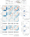
Extended Data Fig. 5. In silico mutagenesis enables rapid screening of transcription factor influence on genome folding.
a. Experimental HFF Micro-C target data for three regions in our held-out test dataset. b. Predictions for these regions. c. Predictions for these regions after randomly mutagenizing all CTCF motifs in these regions, averaged over 10 random samples. d. Number of CTCF motifs per 2048bp bin. CTCF motif matches obtained from JASPAR, and profiles computed separately for the number of motifs on the positive strand (>0) and negative strand (<0). e. Predictions for these regions after mutagenizing all NR3C2 motifs in these regions, averaged over 10 random samples. NR3C2 motifs cover a similar number of base pairs per region as CTCF, but their perturbation has little impact on Akita’s predictions. f. Positions of positively oriented (>0) and negatively (<0) oriented NR3C2 motifs per bin. g. Average disruption, mean( (pred-predmut)2), versus the average number of kb perturbed per region. Note that YY1, suggested to be involved in genome folding,, is predicted to have little aggregate genome-wide impact following motif mutagenesis. This suggests YY1 may operate at a subset of loci in certain developmental contexts or its influence depends on the presence of nearby CTCF motifs or other complex factors and evaded our model. h. Change in signal, mean((pred)2) - mean((predmut)2), versus the average number of kb perturbed per region. This reveals a trend toward negative scores for motifs with many occurrences. i. Average disruption versus the total number of overlaps with CTCF motifs. The strong trend argues that many high scoring motifs likely have large predicted impacts due to frequent overlaps with CTCF motifs, rather than independent effects. j. Change in signal versus the total number of overlaps with CTCF motifs.
Extended Data Fig. 6
Extended Data Fig. 6. Akita learns an orientation-specific role for CTCF and enables mutagenesis of regions defined by ChIP-seq
a-d. Akita learns an orientation-specific role for CTCF a. Predicted map signal strength before versus after in silico perturbations, either for mutagenizing all CTCF motifs (black) or inverting all CTCF motifs (blue). Points show each region in the test set (n=413). Signal strength quantified by mean squared map values. Inversions tend to show smaller perturbations to overall signal strength (blue points deviate less from the x=y line than black points). b. Average disruption for mutagenizing all CTCF motifs or inverting all CTCF motifs. Inversion disrupts maps to a similar extent as mutagenesis (points fall both above and below the x=y line to a similar extent). Jointly with (a), Akita thus predicts changing motif orientation largely alters the positioning of contact patterns, rather than their overall salience across the genome. c. Change in signal strength versus disruption for inverting all CTCF motifs, mean((pred)2) - mean((predinv-CTCF)2). Points show each region of the test set. This indicates that while motif inversions greatly change predicted contact patterns, they can both increase (-) and decrease (+) the signal strength, or salience, of contact patterns. d. Change in signal strength versus disruption for mutagenizing all CTCF motifs in each region of the test set, mean((pred)2) - mean((predmut-CTCF)2). The positive change in signal strength upon mutagenesis shows these perturbations largely decrease features strength in predicted maps. e-g. Akita enables studying the impact of sequences underlying ChIP-seq regions without defined motifs. e. Predicted change in signal versus average disruption for in silico mutagenesis of DNA sequences underlying cohesin peaks. Each point represents one of the 10,268 H1hESC Rad21 cohesin peaks overlapping regions in our test set. Mutagenesis is performed either randomly for all nucleotides under the peak (blue) or only for nucleotides that do not overlap a Jaspar CTCF motif (orange). f. Boxplots for predicted average disruption, stratified by the number of CTCF motifs overlapping the cohesin ChIP peak. Boxplots generated with seaborn defaults for the same n=10,268 peaks (boxes show quartiles, whiskers extend 1.5 times IQR beyond low and high quartiles, points outside this range shown individually). We found that mutagenesis of Rad21 ChIP-seq peaks without CTCF motifs was less disruptive than mutagenesis of peaks with CTCF motifs. Interestingly, we observed no clear trend of increased average disruption for increased numbers of CTCF motifs beyond the first. g. Boxplots as for (f) but with masking the positions of CTCF motifs in these peaks and repeated mutagenesis. On average this led to weaker disruptions of predicted maps (also see the spread of orange versus blue in (e)). However, the trend where mutagenesis of Rad21 ChIP-seq peaks without CTCF motifs was less disruptive than mutagenesis of peaks with CTCF motifs still held. This argues that Akita relies on additional sequence context beyond the immediate 19bp motif in JASPAR to correctly predict its impact on Hi-C maps, similar to how additional sequence context was found to be relevant for CTCF binding assayed by ChIP-exo.
Extended Data Fig. 7
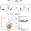
Extended Data Fig. 7. Impacts of predicted disruptions relate to evolutionary conservation and functional annotation categories
a-c. Predicted nucleotide-level impacts correlate with evolutionary conservation in and around CTCF motifs. Results from saturation mutagenesis of 500 bp regions around 500 randomly selected strong CTCF motifs, annotated by JASPAR with p-value < 1e-6, as for Fig. 3D. For each mutation, we computed the disruption score as the L2 norm of the predicted contact difference maps between the reference and alternative alleles. We aggregated scores across the model outputs by taking the mean. For visualization, these figures include a 0.001 pseudocount before taking the natural logarithm. We constructed a single score for each position by taking the maximum across alternative alleles. a. The mean log disruption across regions is greatest within CTCF motifs, but is also high in the flanking regions. b. The mean PhyloP score across regions is greatest within CTCF motifs, with peaks in similar places to nucleotide-level disruption scores. PhyloP values were extracted from the mammalian 30-way alignment for the same regions as in (a). c. Scatter plots for disruption versus PhyloP scores for n=5,220 sites within CTCF motifs (top), n=7,830 sites in the flanking 15bp (middle), and n=73,341 sites beyond 100bp (bottom). We observed significant Pearson correlations within the CTCF motifs (top) and in the directly flanking regions (center), which drops off farther away (bottom). d. Scatter plot for log disruption versus motif strength, computed as the absolute change of the FIMO score, for n=1,817 mutations that showed some evidence of influencing the CTCF motif. The wide range in Akita scores for a given change in FIMO score argues that Akita integrates nucleotide influences on genome folding beyond those described by a position weight matrix approach. e-f. Large-scale mutagenesis reveals impactful annotation categories for single nucleotide variants. To quantify the impact of nucleotides within and near CTCF motifs relative to other genomic features we formed a set of unbiased mutations across the genome. We randomly selected 100,000 positions striding by 256 bp within the test set genomic regions and then selecting a random alternative nucleotide. For each mutation, we computed the disruption score as the L2 norm of the predicted contact difference maps between the reference and alternative allele, averaging across outputs. e. Distributions of nucleotide disruption scores split by annotation category, compared to nucleotides outside of these annotation categories. We observed elevated scores in CTCF motifs, their flanking regions (CTCF Flank 10, CTCF Flank 100), promoters (500bp from GENCODE-annotated transcription start site), and enhancers (FANTOM5-annotated). For visualization we added a 0.001 pseudocount before taking the natural logarithm. f. Two example sites without an annotation category. For visualization we added a 1 pseudocount before taking the natural logarithm (log1p). This suggests there are important DNA sequences for genome folding that remain uncharacterized. g. Predicted maps for a high-scoring non-CTCF GTEx variant. Predicted maps underlying the score for chr7_5898574_G_T_b38 shown in Fig. 4g. Left: prediction for the reference allele. Middle: prediction for the alternative allele. Right: prediction for the (reference - alternate), where green indicates higher predicted contact frequency for the reference allele and pink indicates higher predicted contact frequency for the alternate allele. Top row: full prediction region. Bottom row: zoom into the boundary modified by the variant. Note the different color scales. Grey lines show the position of the variant, at the center of the prediction region. Akita predicts this variant modifies the strength of a nearby boundary. While difficult to see the influence of this single nucleotide change over the full prediction region, the difference becomes apparent upon subtraction of predicted maps. Specifically, this change indicates stronger predicted insulation at this boundary for the alternate allele (exp(0.02) ~= 2% decrease in contact frequency over this boundary).
Extended Data Fig. 8
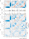
Extended Data Fig. 8. Model predicts a redundant boundary at Lmo2.
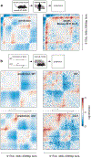
Left: Predicted genome folding for unperturbed Lmo2 locus above the CTCF ChIP-seq profile for the region. Predictions in this figure used hg19 sequence as input and Akita’s output for HFF Micro-C. Right: Numbers above maps indicate the (start,end) position of bins that were deleted, highlighted by purple shading on the zoomed-in CTCF ChIP-seq profile below the predicted WT map. Akita predicts that deleting bins encompassing individual CTCF peaks (top row) would only mildly alter genome folding, and deletion of all three (bottom right) would be more impactful than either pair (bottom left and middle).
Extended Data Fig. 9
Extended Data Fig. 9. Cross-species predictions reveal impact of B2 SINE elements on genome folding in mouse embryonic stem cells
a. MSE versus Spearman R for mouse regions that overlap regions syntenic to the human test set (mm10-syn-test, n=156 regions). MSE and Spearman R are both calculated per region for every (target, prediction) pair. Target Hi-C data was acquired from mouse embryonic stem cells, mapped to mm10 and processed similarly to the previous human datasets. Predictions in this figure were made using mm10 sequence as input and Akita’s output for the H1hESC Micro-C dataset. b. (left) Signal strength of predictions versus targets, for mm10-syn-test, calculated as the mean squared values in each map (same 156 regions shown as above). The model trained on human data shows an overall shift towards overly salient predictions in mouse relative to its predictions for human data (see Extended Data Fig. 3a for comparison). Black line shows x=y for reference here and below. (right) Squared error between targets and predictions correlates with the number of B2 SINE elements in the region (from RepeatMasker). c. Masking B2 SINE elements in input DNA sequences improved MSE for 93/156 predictions (~60%, left), and Spearman R for 106/156 predictions (~67%, right). This suggests that the mouse genome has evolved ways to mitigate the impact of its numerous B2 SINE elements on genome folding, which is supported by recent studies. d, e. Examples of improved predictions for two regions from the mm10-syn-test set after masking B2 SINEs, with the total number of B2 SINE elements per bin in the region displayed below each map. Initial predictions indicated in (a) with orange and green dots. d. chr5:106334208-107382784 (deltaCorr:0.26, corrMutB2:0.72). Rectangle highlights a feature that is incorrectly predicted to be absent prior to masking B2 SINEs, and is correctly predicted following masking B2 SINEs. e. chr14:61751296-62799872 (deltaCorr:0.18, corrMutB2:0.69). Rectangle highlights a feature that is incorrectly predicted to be present prior to masking B2 SINEs, and is correctly predicted following masking B2 SINEs.
Extended Data Fig. 10
Extended Data Fig. 10. A model trained with mouse genomic data correctly learns the minimal influence of B2 SINE sequences on genome folding.
a. MSE vs. Spearman R for a mm10-trained model on mm10 data (blue, n=384 regions shown), and the hg38-trained model on mm10 data (orange, n=156 regions shown). Each point represents a region from their respective test sets. The mm10 model was trained using Hi-C data from Bonev et al. (mESC, CN, ncx_CN, NPC, ncx_NPC) and Micro-C from Hsieh et al. (mESC) with the same multi-task framework used to train our hg38 model. b,c. For the mm10-trained model, masking B2 SINE elements worsened MSE for 243/384 (63%) and Spearman R for 254/384 (66%) regions. MSE and Spearman R are both calculated per region for every (target, prediction) pair, overall pixels in the upper triangular region of predicted maps (n=99681 pixels). Together (a-c) indicate the mm10-trained model correctly learns that B2 SINE elements have little impact on local genome folding and mutagenizing these elements leads to slightly worse predictive performance, in contrast with the hg38-trained model (see Extended Data Fig. 9). d. Predictions for the regions from Extended Data Fig. 9 using the mm10-trained model. Note that the region from chr5 overlaps the training set for the mm10-trained model and the region from chr14 overlaps the test set.
Figure 1:
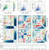
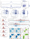
Figure 1:. Akita, a convolutional neural network model for predicting 3D genome folding from DNA sequence.
a. Akita consists of a ‘trunk,’ based on the Basenji architecture, followed by a ‘head’ to transform to 2D maps of genome folding. The trunk involves: (i) input 1Mb of 1-hot encoded DNA; (ii) 1D convolution blocks, where each block performs a max pool operation between adjacent positions to iteratively reduce to a bin size of 2048 bp; (iii) dilated residual 1D convolutions to propagate local information across the sequence. The ‘head’ involves: (i) forming 2D maps from the 1D vectors by averaging each pair of vectors at positions (i, j); (ii) symmetric dilated residual 2D convolutions; (iii) dense layer with linear activation to predict log(observed/expected) chromosome contact maps, with one separate output per dataset. We considered 2048bp binned maps, as high-quality Hi-C and Micro-C datasets ascertain genome folding at this resolution with tractable technical variance. We compared upper triangular regions of maps cropped by 32 bins on each side, making symmetric predictions for 448x448 bin (~917kb) maps. We trained our model on regions of the genome obtained by striding along Hi-C maps, using an 80/10/10 training/validation/test split. b. Predicted and experimental log(observed/expected) contact frequency for two representative regions in the test set for Human Foreskin Fibroblast (HFF) Micro-C. See Supplemental File 1 for images of predictions across the test set. c. Quantification for the held-out test set: mean-squared error (MSE), which we optimize in model training, versus Spearman R, both calculated per region for each pair of targets and predictions for HFF Micro-C. Green and purple circles show regions from (b). Note correlations display a bimodal shape: regions with few locus-specific features have low MSE and low Spearman R.
Figure 2:
Figure 2:. Akita predictions relate to CTCF binding and genome accessibility.
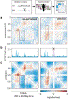
a. Log(observed/expected) target HFF maps for three different genomic regions in the test set, binned to 2048bp. b. Binned profiles at 2048bp for CTCF ChIP-seq fold-change over control and DNAse density, downloaded from the ENCODE data portal. c. Predictions for the same three regions. d. Predictions for inverting all CTCF motifs in each region. Note that patterns are perturbed relative to (c), and have greater saliency as compared with (e). e. Predictions for random mutagenesis of all CTCF motifs within each region, averaged over ten instances. Grey shading shows regions with CTCF binding (from b) that are disrupted in these maps, and yellow shading shows regions with high DNAse but low levels of CTCF binding that are boundaries of residual structures after CTCF motif mutagenesis.
Figure 3:
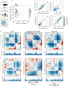
Figure 3:. Akita reveals large impacts of CTCF motif disruptions on genome folding.
a. Predicted map signal strength before versus after mutagenizing all CTCF motifs, for each region in the test set for the HFF model output. Map signal strength is measured as mean((pred)2). Motifs are mutagenized by replacing the DNA sequence at each position in each motif with randomly generated nucleotides. Akita predicts that mutagenizing CTCF motifs leads to more uniform maps, shown by the lower dynamic range after mutagenesis, mean((predΔCTCF)2), confirming the visual trend seen in Fig. 2e across the test set. b. Change in map signal strength, measured by the difference of the mean squared values before versus after mutagenizing each motif in JASPAR, mean((pred)2) - mean((predΔmotif)2). Positive values indicate lower signal after mutagenesis, as for CTCF. c. Average disruption, measured by the mean-squared differences between predictions before versus after mutagenizing each motif in JASPAR, mean((pred- predΔmotif)2). By this metric, CTCF mutagenesis is more than three times as impactful as mutagenesis of any other motif besides CTCFL. Note high scores for other motifs are likely driven at least in part by frequent overlaps with CTCF motifs (Extended Data Fig. 5).
Figure 4:
Figure 4:. Akita extracts informative nucleotide-level features of genome folding
a-c. Saturation mutagenesis around CTCF motifs. a. Mean disruption scores calculated from saturation nucleotide-level mutagenesis of 500bp regions around 500 randomly selected high-quality CTCF motifs (JASPAR p-value < 1e-6) in the test set sequences. Before averaging across the 500 sequences, we constructed a single score for each position by taking the maximum across alternative alleles, added a 0.001 pseudocount to stabilize values for visualization, and computed the logarithm. The motif position is indicated in grey. b,c. Example sites with high disruption scores in flanking regions. Visualizations include a 1 pseudocount preceding the logarithm (log1p) to make all scores positive. Heatmaps show scores for each possible nucleotide substitution. Nucleotide letter heights are drawn proportional to the max across three possible substitutions per position. d,e. Unbiased genome-wide mutagenesis. d. Distributions of disruption scores for 100,000 unbiased mutations across the test set, split by annotation category. Pseudocount and log scale as in (a). Vertical dashed line indicates threshold for mutations considered in (e). e. High disruption mutations (top 356 from (d)) split by annotation category, excluding previous categories in the hierarchy. Categories are considered hierarchically counter clockwise, starting from those that influence CTCF motifs (CTCF, Flank10, Flank100, Promoter, Enhancer, Other). Flank10 and Flank100 represent nucleotides falling within 10 or 100bp of a CTCF motif (see Extended Data Fig. 7 for additional detail). This conservative categorization provides strong evidence for the contribution of nucleotides beyond canonical CTCF motifs for genome folding. f,g. GTEx eQTL mutagenesis. f. Distribution of disruption scores for GTEx eQTL variants falling inside (left) and outside (right) JASPAR CTCF motifs, stratified by casual posterior probability. Boxes represent interquartile ranges, with median marked. Random indicates the distribution for a set of control SNPs with significant genome-wide marginal association with gene expression. Within CTCF, the bar plots represent 57 SNPs with causal posterior probability (PP) >0.5, 138 SNPs with PP from 0.1 to 0.5, and 58 random SNPs with significant genome-wide marginal association with gene expression. Outside CTCF bar plots represent 1,873 SNPs with PP>0.9, 1,820 SNPs with PP from 0.5 to 0.9, 15,926 SNPs with PP from 0.1 to 0.5, and 8,885 random genome-wide significant SNPs. We compared SNP scores with one-sided Mann-Whitney U tests to produce the p-values displayed. g. Saturation mutagenesis around a high-scoring non-CTCF variant: chr7_5898574_G_T_b38, which acts as an eQTL of CCZ1 with high probability. The SNP affects an AGCCCTCTCCTGTA motif that is unrecognizable by the TomTom motif search tool, but lies 70 bp away from a CTCF motif, and may serve to influence its boundary capabilities. Heatmap and letter heights as in (b).
Figure 5:
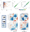
Figure 5:. Predicting a genetically engineered deletion with Akita.
a. Experimental log(observed/expected) 5C data in HEK293T cells for WT (left) and a CRISPR/Cas9-mediated deletion of a ~25kb boundary region (right) at the Lmo2 locus for a 219 bp region centered at the deleted boundary (chr11:33752474-34276762). In wild-type cells (left), this region displays a peak at the boundary (circle) between two ~130kb domains that are relatively insulated from each other (rectangle), separated by a boundary that overlaps a cluster of three CTCF-bound sites. In cells where this boundary has been deleted (right), the two domains merge and display a flare of enriched contact frequency (thin rectangle). b. CTCF profiles for HEK293T. c. Computational predictions for WT (left) and deletion (right) of the boundary, using the HFF output from our human-trained model, showing similar changes. Views centered at the middle of the full predicted window to highlight the region with changes.
Figure 6:
Figure 6:. Akita learns species-specific relationships between DNA sequence and genome folding
a. Predicting mouse genome folding with a human-trained model. Left: computational prediction for mouse genome folding, using the hESC output from our human-trained model after mutagenizing B2 SINE elements. Right: experimental mESC Hi-C data for the same region.See Extended Data Fig. 9 for quantification across the mouse genome. b. Predicting a genetically engineered inversion with a mouse-trained model. Left: Akita predictions from WT DNA sequence (top) and DNA sequence with the inversion (bottom) at the Eph4A locus. Right: Experimental capture-C data for WT (top) and a ~622kb inversion (bottom, Inv1) at the Eph4A locus. Predictions were generated using a mouse-trained model and the mESC output, and show similar changes to those observed experimentally. See Extended Data Fig. 10 for comparison between mouse-trained and human-trained models.

Similar articles

Cited by

References

    1. Merkenschlager M & Nora EP CTCF and Cohesin in Genome Folding and Transcriptional Gene Regulation. Annu. Rev. Genomics Hum. Genet 17, 17–43 (2016). - PubMed
    1. Krijger PHL & de Laat W Regulation of disease-associated gene expression in the 3D genome. Nat. Rev. Mol. Cell Biol 17, 771–782 (2016). - PubMed
    1. Fudenberg G, Abdennur N, Imakaev M, Goloborodko A & Mirny LA Emerging Evidence of Chromosome Folding by Loop Extrusion. Cold Spring Harb. Symp. Quant. Biol 82, 45–55 (2017). - PMC - PubMed
    1. Rodríguez-Carballo E et al. The HoxD cluster is a dynamic and resilient TAD boundary controlling the segregation of antagonistic regulatory landscapes. Genes Dev. 31, 2264–2281 (2017). - PMC - PubMed
    1. Despang A et al. Functional dissection of the Sox9-Kcnj2 locus identifies nonessential and instructive roles of TAD architecture. Nat. Genet 51, 1263–1271 (2019). - PubMed

Publication types