Systematic genetics and single-cell imaging reveal widespread morphological pleiotropy and cell-to-cell variability
- PMID: 32064787
- PMCID: PMC7025093
- DOI: 10.15252/msb.20199243
Systematic genetics and single-cell imaging reveal widespread morphological pleiotropy and cell-to-cell variability
Abstract
Our ability to understand the genotype-to-phenotype relationship is hindered by the lack of detailed understanding of phenotypes at a single-cell level. To systematically assess cell-to-cell phenotypic variability, we combined automated yeast genetics, high-content screening and neural network-based image analysis of single cells, focussing on genes that influence the architecture of four subcellular compartments of the endocytic pathway as a model system. Our unbiased assessment of the morphology of these compartments-endocytic patch, actin patch, late endosome and vacuole-identified 17 distinct mutant phenotypes associated with ~1,600 genes (~30% of all yeast genes). Approximately half of these mutants exhibited multiple phenotypes, highlighting the extent of morphological pleiotropy. Quantitative analysis also revealed that incomplete penetrance was prevalent, with the majority of mutants exhibiting substantial variability in phenotype at the single-cell level. Our single-cell analysis enabled exploration of factors that contribute to incomplete penetrance and cellular heterogeneity, including replicative age, organelle inheritance and response to stress.
Keywords: cell-to-cell variability; endocytosis; high-content screening; phenotype classification; single-cell analysis.
© 2020 The Authors. Published under the terms of the CC BY 4.0 license.
Conflict of interest statement
The authors declare that they have no conflict of interest.
Figures
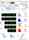
Diagram of the experimental and computational workflow. Yeast mutant arrays harbouring fluorescently tagged proteins marking specific endocytic compartments were constructed using the synthetic genetic array (SGA) method and imaged using automated high‐throughput microscopy. Image and data pre‐processing steps included object segmentation and feature extraction, low‐quality object clean‐up and data standardization. Positive controls and classification training sets were used to train a fully connected 2‐hidden‐layer neural network (2NN), allowing assignment of phenotypes at the single‐cell level and calculation of penetrance.
Illustration of the endocytosis process and compartment markers. The four endocytic compartment markers used in this study are indicated: Sla1 as a marker of the protein coat component of the endocytic patch (light purple); Sac6 as a marker of the actin component of the endocytic patch (blue); Snf7 as a marker of the late endosome (orange); and Vph1 as a marker of the vacuolar membrane (red). The colours chosen for each marker are used throughout this study. FP: fluorescent protein.
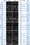
Example micrographs of yeast cells for each of the 21 subcellular endocytic phenotypes identified in this study. The relevant markers are listed to the left of the micrographs. Dashed lines indicate cell outlines. Scale bar: 5 μm.
Pie charts showing the proportion of specific phenotype mutants (SPMs) that have one or more distinct aberrant phenotypes, and non‐phenotype‐specific mutants for each of the compartments screened.
Pie charts showing the proportion of mutant strains that are morphology mutants for one or more markers (left) and specific phenotype mutants (SPMs) that cause one or more aberrant morphological phenotypes (right). The number of mutants in each category is listed within each section.
Box plot illustrating the distribution of the fraction of non‐wild‐type cells for specific phenotype mutants grouped by the number of phenotypes they cause. ** denotes a significant difference between two groups (P < 0.01; significance was determined using analysis of variance (ANOVA) with a post hoc Bonferroni test). Central lines represent the median. The number of specific phenotype mutants in each group ranges from 71 to 751. See Table EV2 for details. Whiskers extend to the 5th and 95th percentile.
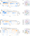
Hierarchical clustering of feature vectors composed of the average CellProfiler feature values across all single cells labelled for each phenotype. Average linkage and the Euclidian distance metric were used.
High‐dimensional feature space for single cells (colour‐coded by phenotype) from the training sets visualized with 2D t‐SNE. Numbers follow the phenotype order listed in Fig 1C.
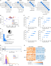
Confusion matrices illustrating the classification accuracies of the 2NN classifiers for all phenotypes. Numbers in the matrix reflect the mean accuracy of both genome‐wide and secondary screens. * denotes phenotypes where the difference in accuracy between the genome‐wide and secondary screens was > 0.10. Numbers in brackets indicate the total number of labelled cells in the two filtered training sets for each phenotype. The classifiers for the two “aggregate” phenotypes (denoted1,2) were trained using < 100 labelled cells in one or both of the screen types. The intensity of the blue colour in each block of the matrix indicates the fraction of cells classified from each class predicted to be in a given class (scale bar to the right). Classification accuracy for each class is indicated by the number in each block.
Scatter plot showing the 2NN classifier accuracy and number of labelled cells for each training set separately (N = 42), where each dot represents one phenotype class. No outline: training set for genome‐wide screen. Black outline: training set for secondary screen.
Comparison of the manually assigned and computationally derived penetrance of positive control strains (see Table EV1 for list of strains). Each dot represents one positive control from either the genome‐wide (GW) screens (light blue dots) or secondary screens (dark blue dots), and grey dots are wild‐type controls. LE = late endosome.
Analysis of penetrance in biological replicates. The bar graph shows the fraction of biological replicates grouped according to their difference in penetrance (N = 15,398 replicate pairs). Less than 10% of replicates have a penetrance difference > 30 (grey bars), with an average penetrance difference of 11.2. Inset pie chart shows a breakdown of the underlying cause of large penetrance differences.
Bootstrapping on wild‐type cell populations to determine the number of cells sufficient to obtain a confident penetrance calculation. The shaded area indicates the range of the minimum sample size across the four screened markers (defined as the sample size where the relative standard deviation falls below 0.2). Data are presented as the mean penetrance across 100 independent samplings for each sample size (blue line) ± SD (error bars).
Penetrance frequency distribution of wild‐type replicates for each of the four markers extracted from genome‐wide screening data. The shaded area indicates the mean (vertical dashed lines) ± 0.2 × mean. Colours represent the different endocytosis markers as shown in the legend.
Evaluation of possible batch effects in the penetrance analysis. Representations of two screened plates illustrating cell count (orange) and computationally derived penetrance (blue) in each well are shown. Empty wells are coloured grey. A darker shade of orange or blue indicates increased cell number or penetrance as shown on the key below the plate representations. Even though uneven growth conditions can lead to plate‐layout effects, such as gradients (top plate) or more favourable edge conditions (bottom plate), the cell density differences due to experimental artefacts do not significantly affect penetrance analysis.

Comparison of the fraction of mutants screened and the fraction identified as morphology mutants in each strain collection. Stacked bar graphs show the fractions of strains in the screened array (array) and in the set of morphology mutants grouped based on the mutant strain collection for each individual marker (deletion mutant collection—dark blue; slow‐growing non‐essential gene‐deletion collection—medium blue; collection of strains with TS mutations in essential genes—light blue). LE: late endosome; vac: vacuole.
Relationship between specific phenotype mutants (SPMs) and essential genes. Bar graph showing the fraction of essential genes in sets of SPMs (light blue) and stringent SPMs (dark blue) for each individual phenotype. The black dashed line represents the fraction of essential genes in the screened mutant array. Blue dashed lines indicate the fraction of essential genes for all SPMs (light blue) and stringent SPMs (dark blue). LE: late endosome.
Bar graph illustrating the relationship between essential genes and morphological pleiotropy. Bar graph showing the fraction of essential genes in specific phenotype mutants (SPMs; light blue) and stringent SPMs (dark blue) grouped by the number of phenotypes they affect. Blue dashed lines indicate the fraction of essential genes for all SPMs (light blue) and stringent SPMs (dark blue). The black dashed line represents the fraction of essential genes in the screened mutant array.
Relationship between conserved genes and morphological phenotypes. Bar graph showing the fraction of conserved genes in specific phenotype mutants (SPMs; light blue) and stringent SPMs (dark blue) grouped by the number of phenotypes they affect. The black dashed line represents the fraction of conserved genes in the screened mutant array. Blue dashed lines indicate the fraction of conserved genes for all SPMs (light blue) and stringent SPMs (dark blue).
Bar graph showing the fraction of conserved genes in our morphology mutant sets for each of the markers for the full dataset, and a truncated dataset with excluded genes annotated to GO Slim biological process terms associated with endocytosis and the endomembrane system. Black dashed line denotes the fraction of conserved genes in the screened mutant array. LE: late endosome.
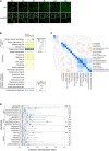
Time‐course analysis of vacuolar class G phenotype formation. Wild‐type and sec18‐1 strains expressing Vph1‐EGFP were first imaged at room temperature (RT), the temperature was then shifted to 37°C, and images were acquired at the indicated time points (in hours after shift). Signal intensity of the magnified insets (in solid boxes within the micrographs) was adjusted to optimize phenotype visualization. Scale bar: 10 μm.
Gene feature enrichment analysis of the morphology mutants for each endocytic marker. Significance was determined using one‐sided Mann–Whitney U‐tests for numeric features, and one‐sided Fisher's exact tests for binary features. For numeric features, dots represent median z‐score normalized values. For binary features (below the solid black line), dots represent fold enrichment. Gene features derived from our genome‐wide screens are indicated with “GW screen data” (shown above the black dotted line). CV: coefficient of variation. GI: genetic interaction. RV: relative variability. LE: late endosome; vac: vacuole.
Heatmap of pairwise Pearson correlations between the 17 mutant phenotypes. A more intense blue colour indicates a higher PCC (scale bar at the top left). Unsupervised hierarchical clustering was performed using the correlation metric and average linkage.
Horizontal box plot showing the distribution of endocytic internalization defect (invertase score as assessed in Burston et al, 2009) for non‐essential specific phenotype mutants (SPMs). Several phenotypes show a significant difference between SPMs with a high specific phenotype fraction (dark blue circle) compared to those with a lower specific phenotype fraction (light blue circle). *, ** denote phenotypes with a significant difference between the two groups (P < 0.05 or < 0.01; significance was calculated using Kolmogorov–Smirnov tests). Black triangle: mean; central black lines: median; black dashed line: mean of phenotypically wild‐type mutants. Numbers in the right‐most column indicate the number of genes included in the analysis. Whiskers extend to the 5th and 95th percentile. LE: late endosome.
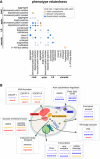
Matrix showing significant overlap of stringent specific phenotype mutants (P < 0.05; significance was determined using Fisher's exact tests). Circle size corresponds to the log value of the overlap odds ratio. Orange circles denote same‐compartment phenotype pairs. Dark blue fill colour indicates phenotype pairs with at least one enriched protein complex in the overlapping set. LE: late endosome.
Diagram illustrating co‐occurrence of endocytic morphology phenotypes associated with protein complex perturbation. Shown are significant protein complexes from (A) with biological processes and linked phenotype pairs. # denotes a phenotype pair without significant enrichment. Phenotype names are colour‐coded by endocytic marker, using the colour key described in Fig 1 and indicated on the yeast cell diagram.
- A
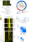
Endocytic patch formation dynamics in the ydl176wΔ (ipf1Δ) strain. Patch dynamics were examined using time‐lapse fluorescence microscopy of wild‐type (WT) and ipf1Δ deletion strains carrying reporters for the coat (Sla1–GFP; green) and actin (Sac6‐tdTomato; red) modules. Upper: Representative kymographs for the WT and ipf1Δ strains. Scale bar: 10 s. Lower: Box plot illustrating the distribution of lifetimes of Sla1‐GFP and Sac6‐tdTomato patches. The box represents IQR (interquartile range). Whiskers extend to the 5th and 95th percentile. Central lines represent the median. At least 100 patches were analyzed per strain and marker. **, ***denote a statistically significant difference between the two groups (P < 0.01 or P < 0.001). Significance was determined using unpaired t‐tests.
- B
Examples of gene clusters obtained with hierarchical clustering of phenotype profiles composed of the 17 specific phenotype fractions. Phenotypes 1–17: [1] coat: increased patch number; [2] coat: aggregate; [3] vacuole: class E; [4] late endosome: condensed; [5] actin: bright patches; [6] late endosome: membrane; [7] actin: aggregate; [8] coat: decreased patch number; [9] actin: decreased patch number; [10] late endosome: fragmented; [11] coat: depolarized patches; [12] actin: depolarized patches; [13] vacuole: multilobed; [14] vacuole: fragmented; [15] vacuole: enlarged; [16] vacuole: class G; [17] vacuole: V‐ATPase defect.
- C
Interaction network of NNF2 and YER043W (GTA1). Genes with phenotype profiles with a correlation > 0.7 and genetic interaction profiles with a correlation > 0.2, and at least two significant correlations to NNF2 and/or GTA1 were included in the network.
- D
Analysis of phenotype profile similarity between mutants in genes encoding proteins in same or different protein complex structures. Box plot indicates distribution of PCCs between pairs of phenotype profiles for genes that encode protein pairs in direct contact in a protein complex experimental structure (Yes ‐ Direct), code for protein pairs in the same protein complex structure but not in direct contact (Yes ‐ Indirect) and code for protein pairs that do not belong to the same protein complex structure (No). The box represents IQR (interquartile range). Whiskers are Q1‐1.5*IQR and Q3+1.5*IQR. Central lines represent the median. The number of pairs evaluated in each set is shown on the left side. Significance was determined using one‐sided Mann–Whitney U‐tests. ***P < 0.001.
- E, F
Differentiation of functionally related protein complexes and protein complex organization using phenotype profiles. Heatmaps showing PCCs between components of the ESCRT complexes (E) and the SPOTS complex (F). A more intense blue colour indicates a higher PCC (scale bar at the top left of each heat map).

Phenotype profile similarity of functionally related pairs of genes. Box plot indicates the distribution of Pearson correlation coefficients (PCCs) between pairs of specific phenotype profiles for genes encoding members of the same or different protein complex (co‐complex); proteins in the same or different pathway (co‐pathway); genes that are co‐expressed or not (co‐expressed), and gene pairs that have a significant GI profile similarity or not (significant GI profile PCC). The box represents IQR (interquartile range). Whiskers are Q1‐1.5*IQR and Q3+1.5*IQR. Central lines represent the median. The number of pairs evaluated in each set is shown on the x‐axis. Significance was determined using one‐sided Mann–Whitney U‐tests. ***P < 0.001.
Phenotype profile cluster containing NNF2 and YER043W (GTA1) (highlighted in blue). Phenotypes 1–17: [1] coat: increased patch number; [2] coat: aggregate; [3] vacuole: class E; [4] late endosome: condensed; [5] actin: bright patches; [6] late endosome: membrane; [7] actin: aggregate; [8] coat: decreased patch number; [9] actin: decreased patch number; [10] late endosome: fragmented; [11] coat: depolarized patches; [12] actin: depolarized patches; [13] vacuole: multilobed; [14] vacuole: fragmented; [15] vacuole: enlarged; [16] vacuole: class G; [17] vacuole: V‐ATPase defect. Fraction: specific phenotype fraction.
Relationship between protein complexes and morphological phenotype profile correlations. Scatter plot showing mean mutant phenotype fraction (y‐axis) and mean within‐complex phenotype profile PCCs (Pearson correlation coefficient; x‐axis) for individual protein complexes (n = 202). The inset pie chart shows the proportion (and number) of protein complexes that affect 1, 2, 3 or all 4 markers. Mean penetrance was calculated only from affected markers. Complexes are colour‐coded based on the number of markers they affect.
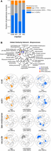
Stacked bar graph with fractions of penetrance mutants belonging to each penetrance bin for the four endocytic markers. act: actin; LE: late endosome; vac: vacuole.
SAFE (Spatial Analysis of Functional Enrichment) of penetrance mutants grouped according to penetrance. Top: Bioprocess key for interpreting the global similarity network of yeast genetic interactions visualized using SAFE, which identifies regions of the network enriched for specific biological processes (Costanzo et al, 2016). Coloured dots denote the localization of the 4 marker genes within the global similarity network. Below: SAFE of penetrance mutants grouped according to their penetrance and marker. Orange: genes whose mutation caused high penetrance; grey: intermediate penetrance genes; blue: low penetrance genes. Numbers in brackets refer to the number of unique ORFs in each group.
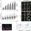
Penetrance as a function of replicative age. Top: Bar graph showing the fraction of outliers in populations of increasing replicative age (# of divisions) for wild‐type (WT), and 5 mutant strains (rrd2Δ, rpl20bΔ, cka2Δ, vac8Δ and vac17Δ). Data are presented as mean of three biological replicates ± SD. Bottom: Box plot with the distribution of cell sizes for the same populations of cells. Central lines represent the median. Whiskers extend to the 5th and 95th percentile. At least 6,800 cells were analyzed per strain (up to 19,500 cells).
Micrographs of young (top row of images) and older (bottom row of images) wild‐type (WT) cells expressing Vph1‐EGFP (green vacuole) and stained with CF640R WGA (magenta bud scars). Dashed lines denote cell outlines. Scale bar: 5 μm.
Combined effect of replicative age and a vacuole inheritance defect on penetrance. Micrographs of wild‐type and vac17Δ cells expressing Vph1‐EGFP (green vacuole) and Hta2‐mCherry (red nucleus), stained with CF640R WGA (magenta bud scars). Cells with increasing bud scar staining (replicative age) are shown from left to right. Dashed lines denote cell outlines. Scale bar: 5 μm.
Relationship between stress response and penetrance. Single‐cell UPRE‐RFP levels were measured in ˜60 different mutant strains that we had identified as penetrance mutants with intermediate penetrance with defects in actin or vacuole morphology. Cells were binned into equal‐sized bins, from low to high stress response, assessed as outlier or inlier and clustered based on their penetrance profile (composed from the fraction of outliers in each stress response bin). Each line plot represents a penetrance profile. * denotes the cluster with a profile most similar to wild type. Inset pie charts show the proportion of mutant strains in each cluster.

Similar articles
-
Extent and context dependence of pleiotropy revealed by high-throughput single-cell phenotyping.PLoS Biol. 2020 Aug 17;18(8):e3000836. doi: 10.1371/journal.pbio.3000836. eCollection 2020 Aug. PLoS Biol. 2020. PMID: 32804946 Free PMC article.
-
Essential gene disruptions reveal complex relationships between phenotypic robustness, pleiotropy, and fitness.Mol Syst Biol. 2015 Jan 21;11(1):773. doi: 10.15252/msb.20145264. Mol Syst Biol. 2015. PMID: 25609648 Free PMC article.
-
A Flow Cytometry-Based Phenotypic Screen To Identify Novel Endocytic Factors in Saccharomyces cerevisiae.G3 (Bethesda). 2018 May 4;8(5):1497-1512. doi: 10.1534/g3.118.200102. G3 (Bethesda). 2018. PMID: 29540444 Free PMC article.
-
Genome-wide analysis of yeast aging.Subcell Biochem. 2012;57:251-89. doi: 10.1007/978-94-007-2561-4_12. Subcell Biochem. 2012. PMID: 22094426 Review.
-
Beyond the simplicity of Mendelian inheritance.C R Biol. 2016 Jul-Aug;339(7-8):284-8. doi: 10.1016/j.crvi.2016.04.006. Epub 2016 Jun 22. C R Biol. 2016. PMID: 27344551 Review.
Cited by
-
Computational Methods for Single-Cell Imaging and Omics Data Integration.Front Mol Biosci. 2022 Jan 17;8:768106. doi: 10.3389/fmolb.2021.768106. eCollection 2021. Front Mol Biosci. 2022. PMID: 35111809 Free PMC article. Review.
-
BIONIC: biological network integration using convolutions.Nat Methods. 2022 Oct;19(10):1250-1261. doi: 10.1038/s41592-022-01616-x. Epub 2022 Oct 3. Nat Methods. 2022. PMID: 36192463 Free PMC article.
-
Rapid mechanical phenotyping of breast cancer cells based on stochastic intracellular fluctuations.iScience. 2024 Oct 4;27(11):110960. doi: 10.1016/j.isci.2024.110960. eCollection 2024 Nov 15. iScience. 2024. PMID: 39493877 Free PMC article.
-
From Petri Plates to Petri Nets, a revolution in yeast biology.FEMS Yeast Res. 2022 Feb 22;22(1):foac008. doi: 10.1093/femsyr/foac008. FEMS Yeast Res. 2022. PMID: 35142857 Free PMC article. No abstract available.
-
Systematic High-Content Screening of Fluorescently Tagged Yeast Double Mutant Strains.Methods Mol Biol. 2021;2381:57-78. doi: 10.1007/978-1-0716-1740-3_3. Methods Mol Biol. 2021. PMID: 34590270
References
-
- Andag U, Neumann T, Schmitt HD (2001) The coatomer‐interacting protein Dsl1p is required for Golgi‐to‐endoplasmic reticulum retrieval in yeast. J Biol Chem 276: 39150–39160 - PubMed
-
- Avery SV (2006) Microbial cell individuality and the underlying sources of heterogeneity. Nat Rev Microbiol 4: 577–587 - PubMed
-
- Babu M, Vlasblom J, Pu S, Guo X, Graham C, Bean BD, Burston HE, Vizeacoumar FJ, Snider J, Phanse S et al (2012) Interaction landscape of membrane‐protein complexes in Saccharomyces cerevisiae . Nature 489: 585–589 - PubMed
-
- Bakal C, Aach J, Church G, Perrimon N (2007) Quantitative morphological signatures define local signaling networks regulating cell morphology. Science 316: 1753–1756 - PubMed
-
- Balderhaar HJ, Ungermann C (2013) CORVET and HOPS tethering complexes ‐ coordinators of endosome and lysosome fusion. J Cell Sci 126: 1307–1316 - PubMed
Publication types
MeSH terms
Substances
Grants and funding
- FDN-143264/Gouvernement du Canada|Canadian Institutes of Health Research (CIHR)/International
- R01HG00583/HHS|National Institutes of Health (NIH)/International
- R01 HG005853/HG/NHGRI NIH HHS/United States
- P30 CA008748/CA/NCI NIH HHS/United States
- FDN-143265/Gouvernement du Canada|Canadian Institutes of Health Research (CIHR)/International
LinkOut - more resources
Full Text Sources
Molecular Biology Databases

