. 2020 May 5;118(9):2229-2244.
doi: 10.1016/j.bpj.2019.11.017. Epub 2019 Nov 22.

Nonequilibrium Biophysical Processes Influence the Large-Scale Architecture of the Cell Nucleus

Affiliations

Nonequilibrium Biophysical Processes Influence the Large-Scale Architecture of the Cell Nucleus

Ankit Agrawal et al. Biophys J. .

Abstract

Model approaches to nuclear architecture have traditionally ignored the biophysical consequences of ATP-fueled active processes acting on chromatin. However, transcription-coupled activity is a source of stochastic forces that are substantially larger than the Brownian forces present at physiological temperatures. Here, we describe an approach to large-scale nuclear architecture in metazoans that incorporates cell-type-specific active processes. The model predicts the statistics of positional distributions, shapes, and overlaps of each chromosome. Simulations of the model reproduce common organizing principles underlying large-scale nuclear architecture across human cell nuclei in interphase. These include the differential positioning of euchromatin and heterochromatin, the territorial organization of chromosomes (including both gene-density-based and size-based chromosome radial positioning schemes), the nonrandom locations of chromosome territories, and the shape statistics of individual chromosomes. We propose that the biophysical consequences of the distribution of transcriptional activity across chromosomes should be central to any chromosome positioning code.


Figures

Figure 1
Figure 1
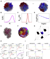
Model schematics and active temperature assignments. (A) Several simulated configurations of 23 pairs of chromosomes within a spherical nucleus, with pairs of chromosomes 18 and 19 highlighted in the background of other chromosomes, are shown in grayscale. Each bead represents a 1 Mb section on each chromosome. We average all calculated quantities, such as distribution functions, over a large number of such configurations in steady state. (B) A schematic of the DNA distribution S(R) of each chromosome, plotted against the radial coordinate R and averaged over many nuclei in our simulations, is given. (C) A schematic of the center-of-mass distribution of each chromosome, SCM(R), plotted against the radial coordinate R and computed from an average over many simulated nuclei, is given. (D) A schematic of the contact probability P(s) between beads of chromosomes, for two monomers separated by an internal (genomic) distance s along the polymer, is given. (E) The shapes of individual chromosome territories extracted from simulation configurations are shown. Such shapes are used to compute a number of geometrical properties of chromosome territories, e.g., their volume, surface area, asphericity, and other shape parameters. (F) A typical image of chromosome territories computed in our simulations is given, with each chromosome colored a different color, illustrating the emergence of territoriality. (G) A schematic illustrating a 2D projection of a 3D chromosome territory, projected along the xy, yz, and xz planes, is shown. The ellipticity and regularity parameters can be computed from such 2D projections and compared to 2D FISH data. (H) The logarithm of gene expression values for each 1 Mb monomer, plotted in order of increasing gene expression, is given. These are computed from transcriptome data. Data are shown for five cell types, as indicated in the title to each panel. The horizontal lines drawn motivate our assignment of effective temperatures as discussed in the text and correspond to our assignment of activity in proportion to gene expression. The last panel plots these data together, illustrating that the shape of the activity profile is largely similar, even though individual monomers in different cell types can be classified differently on the basis of their activity. (I) Assignment of effective temperature to each monomer for the combined model is hsown. The red monomers are simulated at T = 1, yellow at T = 6, yellow-green at T = 7, green at T = 8, cyan at T = 9, blue at T = 10, indigo at T = 11, and violet at T = 12 times the physiological temperature Tph. To see this figure in color, go online.
Figure 2
Figure 2
Model predictions for large-scale features of nuclear architecture. (A) Chromosome territories computed in our simulations are shown, with each chromosome colored a different color. Note the tendency of each chromosome to overlap relatively little, visually representing territoriality. (B) A cutaway sphere representation of the average spatial distribution of euchromatin (or active white) and heterochromatin (or inactive black) monomers as computed for the GM12878 cell type is given. Here, the active monomers are defined as those having an effective temperature in excess of the physiological one. Heterochromatin is found more peripherally compared to euchromatin, which is located toward the nuclear interior. (C) A cutaway sphere representation of average effective temperatures within the simulated nucleus, as computed for the GM12878 cell type, is shown. This illustrates the larger effective temperatures, indicating enhanced activity, obtained toward the center of the nucleus, in comparison to a lower effective temperature in the nuclear periphery. (D) A cutaway sphere representation of the average gene density within the simulated nucleus, computed for the GM12878 cell type, is shown. This illustrates the excess in gene density seen toward the center of the nucleus in comparison to the gene density in the nuclear periphery. This separation of gene-dense and gene-poor 1 Mb segments of chromatin correlates to the distinction in the spatial positioning of euchromatin and heterochromatin. To see this figure in color, go online.
Figure 3
Figure 3
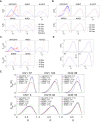
Predicted radial distribution functions S(R) compared to experimental data. (A) Distribution of monomer density S(R), reflecting the local density of DNA, is shown for chromosomes 18 and 19 (red (dashed) and blue (smooth) lines, respectively) across five cell types as indicated in the titles of each panel. Experimental data obtained from (68) for the GM12878 cell type are plotted together with the simulation predictions (red ovals: Chr 18, blue crosses: Chr 19). If chromosomes are distributed randomly across the nucleus, S(R) ∼ R2 is expected, as shown with magenta (dotted) lines. (B) Distribution of the density of monomers, reflecting the local density of DNA, is shown for Chr 12 and 20 (blue (dashed) and red (smooth) lines, respectively) across five cell types as indicated in the titles of each panel. Experimental data obtained from (68) for the GM12878 cell type are plotted (red ovals: Chr 18, blue crosses: Chr 19), together with the simulation prediction. (C) Distribution of chromosome centers of mass for Chr 18 and 19 (red (dashed) and blue (smooth) lines, respectively) is shown for five cell types, as indicated in the titles of each panel. Experimental data obtained from (69) for the GM12878 cell type are plotted (red ovals: Chr 18, blue crosses: Chr 19) together with the simulation prediction. (D) Density distribution S(R) of overall numbers of active (red, dashed) and inactive (blue, smooth) monomers is shown for the GM12878 cell type. These are plotted for four chromosomes: the largest, Chr1; the smallest, Chr 21; gene-poor Chr 13; and gene-rich Chr 19. The distribution of active monomers is more interior with respect to inactive monomers. Here, inactive monomers refer to those monomers assigned a temperature of T = 1; all other monomers are active. (E) Density distribution SM(R) of specific monomers as indicated, on chromosomes 1, 2, 7, 15, and 6, is plotted for five cell types studied here. These monomer-specific distributions can differ depending on cell type, suggesting that loci associated to these monomers can be positioned differently depending on their levels of activity but also on the levels of inhomogeneous activity of the chromosome they belong to. To see this figure in color, go online.
Figure 4
Figure 4
Predicted chromosome center-of-mass locations compared to experimental data. Predictions from simulations for the mean center-of-mass location for each chromosome, for the GM12878 cell type, as a function of chromosome size in the upper row (A and B), and as a function of chromosome gene density per Mb in the lower row (C and D) are shown. These predictions are compared to experimental data on the average radial position of the center of mass of each chromosome as obtained from (69). Simulation and experimental points are shown using red squares and blue circles respectively, together with error bars indicating one standard deviation from the mean with filled colors. The relative radial position 0 and 1 represent the center and periphery of the nucleus. Chromosome numbers are indicated above or below each error bar. The simulation and experimental points fitted to a straight line including all chromosomes are shown in panels (A) and (C); fits excluding the two smallest chromosomes 21 and 22 are shown in panel (B). The smaller and larger size chromosomes in panel (B) are fitted with two separate fits. The slope and intercept value with error for experimental and simulation fitted lines are provided in each panel. The χ2 error associated to the fitted lines is provided in each panel. To see this figure in color, go online.
Figure 5
Figure 5
Structural properties of individual simulated chromosomes in our model. (A) A snapshot of simulated configurations of both homologs of chromosomes 12 and 20 is given. Each chromosome is colored differently so that they can be separately visualized. (B) A snapshot of simulated configurations of both homologs of chromosomes 18 and 19 is shown. Each chromosome is colored differently so that they can be separately visualized. (C) Ellipticity and regularity for each chromosome as predicted by the model and obtained from simulations representing the GM12878 (blue) and IMR90 (green) cell types are shown. These are compared to experimental data (red ovals) from 2D FISH experiments (19) for a cell type closely related to the IMR90 cell type. Ellipticity values of 1 represent a perfect elliptical chromosome, and regularity values of 1 refer to a perfectly regular chromosome, without roughness. The x axis is plotted in order of increasing gene density. The χ2-value and its p-value are mentioned for the GM12878 and IMR90 cell types, respectively, in blue (dark) and green (light) colors. (D and E) Summed volume overlap of chromosomes in GM12878 and IMR90 cell types is shown with the x axis, plotted in order of increasing gene density per chromosome. There is a weak increase with gene density in both cell types, shown as the solid line, representing the best linear fit to the data. The IMR90 cell shares more volume overlaps with other chromosomes compared to the GM12878 cell type. The (self-) volume overlap for the same chromosome is taken to be 0. To see this figure in color, go online.
Figure 6
Figure 6
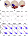
Predicted distributions and structural features of the inactive and active X chromosomes. (A) A snapshot of a typical configuration of the active Xa and inactive Xi chromosomes obtained from simulations is given. (B) Monomer density distribution S(R) vs. R for the Xi and Xa chromosomes is shown, as obtained from simulations across five cell types, named in the header to each panel. The inactive X chromosome, Xi, is shown in red (solid or dotted line), and the active X chromosome, Xa, is shown with a blue dashed line. Loops on the Xi in the GM12878 cell type can include (red solid line) or exclude (red dotted line) “superloops” as seen in recent experiments (59,76). (C) Distribution of the location of the center of mass of the Xi and Xa chromosomes is shown as obtained from simulations across five cell types, named in the header to each panel. The inactive X chromosome, Xi, is shown in red, and the active X chromosome, Xa, is shown in blue (dashed line). Superloops on the Xi in the GM12878 cell type can include (red solid line) or exclude (red dotted line). (D) Contact probability P(s) vs. s is shown for the active (top row) and inactive (bottom row) X chromosomes, computed for five cell types within our simulations. The Xa chromosome exhibits a reasonable power-law decay of P(s) with an exponent α between 1.1 and 1.25. The Xi chromosome shows a reduced region of power-law scaling, with an exponent across this reduced range that is between 1.5 and 1.7. Red lines show the power-law fit in both cases, with the fit parameters indicated within each panel. Error bars indicate one standard deviation about the mean. In the absence of superloops on the Xi (GM12878), α1.5 (fitted line not shown), whereas the fit in the presence of superloops reduces α to α1.18. Note the base of the log is 10. To see this figure in color, go online.
Figure 7
Figure 7
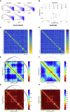
Predicted chromosome contact probabilities, shape parameters, distance maps, and contact maps. (A) Contact probability P(s) as a function of genomic distance for Chr 1 is shown computed across a range of 1–15 MB and plotted for five different cell types. Our data are plotted with blue dots displayed with error bars. Error bars indicate one standard deviation about the mean. Depending on the region that is fitted, a power-law scaling is obtained with an exponent between roughly 1.17 and 1.22; these fits are shown with red colors. Note the base of the log is 10. (B) Calculated average values of the prolateness parameter (Σ) and the asphericity parameter (Δ) for the GM12878 cell type are shown. Larger (smaller) chromosomes have smaller (larger) values of Σ and Δ, implying that larger chromosomes are more close to spherical, whereas smaller chromosomes prefer a more prolate, rod-like shape. The data suggest that values of Σ and Δ for Chr 1 and 21 take more extremal values than for the other chromosomes, as shown by the ellipse drawn together with the data. (C) A heat map of mean distances between monomers, the distance map, is given, in which chromosomes are ordered by their gene density, shown for the GM12878 cell type. (D) A heat map of mean distances between monomers, the distance map, is given, in which chromosomes are ordered by their gene density, shown for the IMR90 cell type. (E and F) A heat map of the distance matrix for chromosome 1, expanded out from (C) and (D), is shown. The locations of the permanent loops inferred from the Hi-C data are plotted in black. Individual monomers at T = 6 and 7 ≤ T ≤ 12 are shown in green and black, adjacent to the x and y axes, respectively. (G and H) A contact map inferred from the distance matrix for chromosome 1, (C) and (D), is shown. The locations of the permanent loops inferred from the Hi-C data are plotted in black. Individual monomers at T = 6 and 7 ≤ T ≤ 12 are shown in green and black, adjacent to the x and y axes, respectively. To see this figure in color, go online.

Similar articles

Cited by

References

    1. Meaburn K.J., Misteli T. Cell biology: chromosome territories. Nature. 2007;445:379–781. - PubMed
    1. Cremer T., Cremer M. Chromosome territories. Cold Spring Harb. Perspect. Biol. 2010;2:a003889. - PMC - PubMed
    1. Bickmore W.A., van Steensel B. Genome architecture: domain organization of interphase chromosomes. Cell. 2013;152:1270–1284. - PubMed
    1. Lieberman-Aiden E., van Berkum N.L., Dekker J. Comprehensive mapping of long-range interactions reveals folding principles of the human genome. Science. 2009;326:289–293. - PMC - PubMed
    1. Dixon J.R., Selvaraj S., Ren B. Topological domains in mammalian genomes identified by analysis of chromatin interactions. Nature. 2012;485:376–380. - PMC - PubMed

Publication types

LinkOut - more resources