

Some methods for heterogeneous treatment effect estimation in high dimensions
- PMID: 29508417
- PMCID: PMC5938172
- DOI: 10.1002/sim.7623
Some methods for heterogeneous treatment effect estimation in high dimensions
Abstract
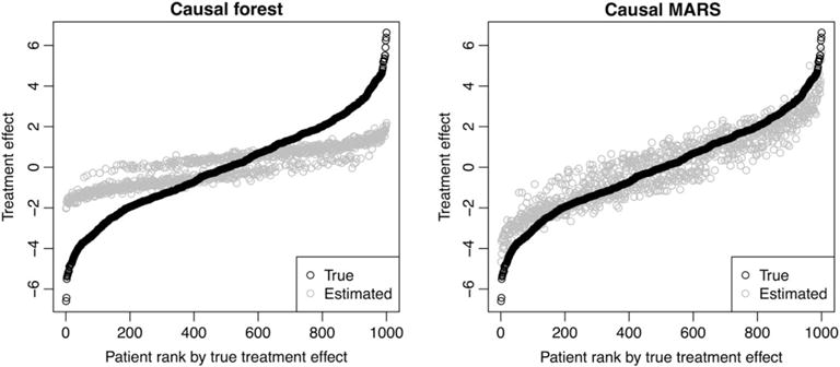
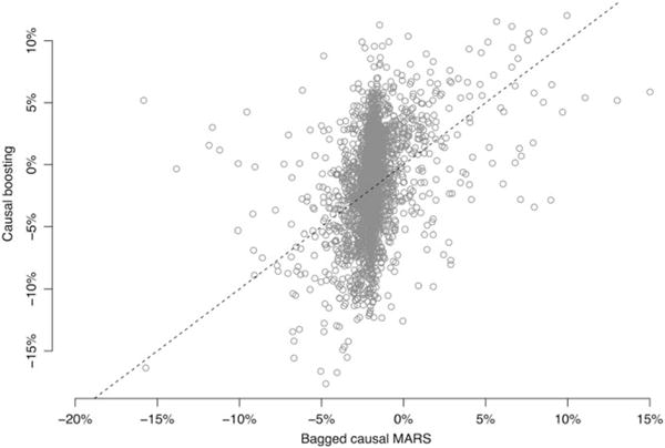
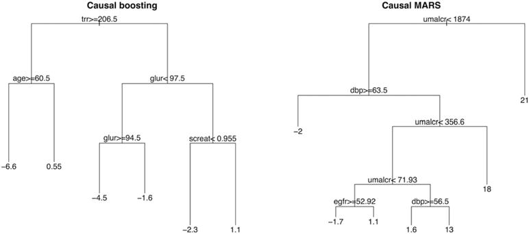
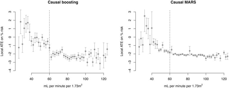
When devising a course of treatment for a patient, doctors often have little quantitative evidence on which to base their decisions, beyond their medical education and published clinical trials. Stanford Health Care alone has millions of electronic medical records that are only just recently being leveraged to inform better treatment recommendations. These data present a unique challenge because they are high dimensional and observational. Our goal is to make personalized treatment recommendations based on the outcomes for past patients similar to a new patient. We propose and analyze 3 methods for estimating heterogeneous treatment effects using observational data. Our methods perform well in simulations using a wide variety of treatment effect functions, and we present results of applying the 2 most promising methods to data from The SPRINT Data Analysis Challenge, from a large randomized trial of a treatment for high blood pressure.
Keywords: causal inference; machine learning; personalized medicine.
Copyright © 2018 John Wiley & Sons, Ltd.
Figures
Similar articles
-
Comparing methods for estimation of heterogeneous treatment effects using observational data from health care databases.Stat Med. 2018 Oct 15;37(23):3309-3324. doi: 10.1002/sim.7820. Epub 2018 Jun 3. Stat Med. 2018. PMID: 29862536
-
Targeted Maximum Likelihood Estimation for Causal Inference in Observational Studies.Am J Epidemiol. 2017 Jan 1;185(1):65-73. doi: 10.1093/aje/kww165. Epub 2016 Dec 9. Am J Epidemiol. 2017. PMID: 27941068
-
Simultaneous record linkage and causal inference with propensity score subclassification.Stat Med. 2018 Oct 30;37(24):3533-3546. doi: 10.1002/sim.7911. Epub 2018 Aug 1. Stat Med. 2018. PMID: 30069901
-
Using observational data for personalized medicine when clinical trial evidence is limited.Fertil Steril. 2018 Jun;109(6):946-951. doi: 10.1016/j.fertnstert.2018.04.005. Fertil Steril. 2018. PMID: 29935652 Review.
-
From Real-World Patient Data to Individualized Treatment Effects Using Machine Learning: Current and Future Methods to Address Underlying Challenges.Clin Pharmacol Ther. 2021 Jan;109(1):87-100. doi: 10.1002/cpt.1907. Epub 2020 Jun 28. Clin Pharmacol Ther. 2021. PMID: 32449163 Review.
Cited by
-
Measuring the performance of prediction models to personalize treatment choice.Stat Med. 2023 Apr 15;42(8):1188-1206. doi: 10.1002/sim.9665. Epub 2023 Jan 26. Stat Med. 2023. PMID: 36700492 Free PMC article.
-
Heterogeneous treatment effect analysis based on machine-learning methodology.CPT Pharmacometrics Syst Pharmacol. 2021 Nov;10(11):1433-1443. doi: 10.1002/psp4.12715. Epub 2021 Oct 30. CPT Pharmacometrics Syst Pharmacol. 2021. PMID: 34716669 Free PMC article.
-
Estimated Population Health Benefits of Intensive Systolic Blood Pressure Treatment Among SPRINT-Eligible US Adults.Am J Hypertens. 2023 Aug 5;36(9):498-508. doi: 10.1093/ajh/hpad047. Am J Hypertens. 2023. PMID: 37378472 Free PMC article.
-
Principled estimation and evaluation of treatment effect heterogeneity: A case study application to dabigatran for patients with atrial fibrillation.J Biomed Inform. 2023 Jul;143:104420. doi: 10.1016/j.jbi.2023.104420. Epub 2023 Jun 14. J Biomed Inform. 2023. PMID: 37328098 Free PMC article.
-
Machine-learning-based high-benefit approach versus conventional high-risk approach in blood pressure management.Int J Epidemiol. 2023 Aug 2;52(4):1243-1256. doi: 10.1093/ije/dyad037. Int J Epidemiol. 2023. PMID: 37013846 Free PMC article.
References
-
- Shah NH. Performing an informatics consult. Big Data in Biomedicine Conference-Stanford Medicine. 2016 http://bigdata.stanford.edu/pastevents/2016-presentations.html. Accessed May 1, 2017.
-
- Splawa-Neyman J, Dabrowska DM, Speed TP. On the application of probability theory to agricultural experiments. Essay on principles. Section 9. Stat Sci. 1990;5(4):465–472.
-
- Rubin DB. Estimating causal effects of treatments in randomized and nonrandomized studies. J Educ Psychol. 1974;66(5):688–701.
-
- Gail M, Simon R. Testing for qualitative interactions between treatment effects and patient subsets. Biom. 1985;41(2):361–372. - PubMed
-
- Bonetti M, Gelber RD. Patterns of treatment effects in subsets of patients in clinical trials. Biostat. 2004;5(3):465–481. - PubMed
Publication types
MeSH terms
Grants and funding
LinkOut - more resources
Full Text Sources
Other Literature Sources
Miscellaneous