Draw pie charts and bar diagrams with this script.
Tested with fpdf2 2.4.5, Pillow 8.3.1, Python 3.8.10
Just put PDFDiagrams.py in your project directory and import it.
#!/usr/bin/python3
# Ported from PHP to Python by Björn Seipel in 2021
# License: MIT
# Original Author (Sector): Maxime Delorme
# License: FPDF
# http:#www.fpdf.org/en/script/script19.php
# Original Author (Diagrams): Pierre Marletta
# License: FPDF

from fpdf import FPDF
from math import pi, sin, cos, floor, ceil

class PDFDiagrams(FPDF):
    legends=''
    wLegend=''
    sum=0
    NbVal=0

    def sector(self, xc, yc, r, a, b, style='FD', cw=True, o=90):

        d0 = a - b
        if cw:
            d = b
            b = o - a
            a = o - d
        else:
            b += o
            a += o

        while a<0:
            a += 360
        while a>360:
            a -= 360
        while b<0:
            b += 360
        while b>360:
            b -= 360
        if a > b:
            b += 360
        b = b/360*2*pi
        a = a/360*2*pi
        d = b - a
        if d == 0 and d0 != 0:
            d = 2*pi
        k = self.k
        hp = self.h
        if sin(d/2):
            myArc = 4/3*(1-cos(d/2))/sin(d/2)*r
        else:
            myArc = 0
        #first put the center
        self._out('%.2F %.2F m' % ((xc)*k,(hp-yc)*k))
        #put the first point
        self._out('%.2F %.2F l' % ((xc+r*cos(a))*k,((hp-(yc-r*sin(a)))*k)))
        #draw the arc
        if d < pi/2:
            self.sector_arc(xc+r*cos(a)+myArc*cos(pi/2+a),
                        yc-r*sin(a)-myArc*sin(pi/2+a),
                        xc+r*cos(b)+myArc*cos(b-pi/2),
                        yc-r*sin(b)-myArc*sin(b-pi/2),
                        xc+r*cos(b),
                        yc-r*sin(b)
                        )
        else:
            b = a + d/4
            myArc = 4/3*(1-cos(d/8))/sin(d/8)*r
            self.sector_arc(xc+r*cos(a)+myArc*cos(pi/2+a),
                        yc-r*sin(a)-myArc*sin(pi/2+a),
                        xc+r*cos(b)+myArc*cos(b-pi/2),
                        yc-r*sin(b)-myArc*sin(b-pi/2),
                        xc+r*cos(b),
                        yc-r*sin(b)
                        )
            a = b
            b = a + d/4
            self.sector_arc(xc+r*cos(a)+myArc*cos(pi/2+a),
                        yc-r*sin(a)-myArc*sin(pi/2+a),
                        xc+r*cos(b)+myArc*cos(b-pi/2),
                        yc-r*sin(b)-myArc*sin(b-pi/2),
                        xc+r*cos(b),
                        yc-r*sin(b)
                        )

        #terminate drawing
        if style=='F':
            op='f'
        elif style=='FD' or style=='DF':
            op='b'
        else:
            op='s'
        self._out(op)

    def sector_arc(self, x1, y1, x2, y2, x3, y3 ):

        h = self.h
        self._out('%.2F %.2F %.2F %.2F %.2F %.2F c' %
            (x1*self.k,
            (h-y1)*self.k,
            x2*self.k,
            (h-y2)*self.k,
            x3*self.k,
            (h-y3)*self.k))

    def pie_chart(self, w, h, data, format, colors=None):

        self.set_font('Helvetica', '', 10)
        self.set_legends(data,format)

        xPage = self.get_x()
        yPage = self.get_y()
        margin = 2
        hLegend = 5
        radius = min(w - margin * 4 - hLegend - self.wLegend, h - margin * 2)
        radius = floor(radius / 2)
        xDiag = xPage + margin + radius
        yDiag = yPage + margin + radius
        if colors == None:
            for i in range(0,self.NbVal):
                gray = i * int(255 / self.NbVal)
                colors[i] = (gray,gray,gray)

        #sectors
        self.set_line_width(0.2)
        angleStart = 0
        angleEnd = 0
        i = 0
        for val in data.values():
            angle = (val * 360) / float(self.sum)
            if angle != 0:
                angleEnd = angleStart + angle
                self.set_fill_color(colors[i][0],colors[i][1],colors[i][2])
                self.sector(xDiag, yDiag, radius, angleStart, angleEnd)
                angleStart += angle

            i+=1

        #Legends
        self.set_font('Helvetica', '', 10)
        x1 = xPage + 2 * radius + 4 * margin
        x2 = x1 + hLegend + margin
        y1 = yDiag - radius + (2 * radius - self.NbVal*(hLegend + margin)) / 2
        for i in range (0, self.NbVal):
            self.set_fill_color(colors[i][0],colors[i][1],colors[i][2])
            self.rect(x1, y1, hLegend, hLegend, 'DF')
            self.set_xy(x2,y1)
            self.cell(0,hLegend,self.legends[i])
            y1+=hLegend + margin

    def bar_diagram(self, w, h, data, format, color=None, maxVal=0, nbDiv=4):

        self.set_font('Helvetica', '', 10)
        self.set_legends(data,format)

        xPage = self.get_x()
        yPage = self.get_y()
        margin = 2
        yDiag = yPage + margin
        hDiag = floor(h - margin * 2)
        xDiag = xPage + margin * 2 + self.wLegend
        lDiag = floor(w - margin * 3 - self.wLegend)
        if color == None:
            color=(155,155,155)
        if maxVal == 0:
            maxVal = max(data.values())

        valIndRepere = ceil(float(maxVal) / float(nbDiv))
        maxVal = valIndRepere * nbDiv
        lRepere = floor(lDiag / nbDiv)
        lDiag = lRepere * nbDiv
        unit = lDiag / maxVal
        hBar = floor(hDiag / (self.NbVal + 1))
        hDiag = hBar * (self.NbVal + 1)
        eBaton = floor(hBar * 80 / 100)

        self.set_line_width(0.2)
        self.rect(xDiag, yDiag, lDiag, hDiag)

        self.set_font('Helvetica', '', 10)
        self.set_fill_color(color[0],color[1],color[2])
        i=0
        for val in data.values():
            #Bar
            xval = xDiag
            lval = int(val * unit)
            yval = yDiag + (i + 1) * hBar - eBaton / 2
            hval = eBaton
            self.rect(xval, yval, lval, hval, 'DF')
            #Legend
            self.set_xy(0, yval)
            self.cell(xval - margin, hval, self.legends[i],0,0,'R')
            i+=1

        #Scales
        for i in range(0, nbDiv):
            xpos = xDiag + lRepere * i
            self.line(xpos, yDiag, xpos, yDiag + hDiag)
            val = i * valIndRepere
            xpos = xDiag + lRepere * i - self.get_string_width(str(val)) / 2
            ypos = yDiag + hDiag - margin
            self.text(xpos, ypos, str(val))

    def set_legends(self, data, format):

        self.legends=[]
        self.wLegend=0
        self.sum=sum(data.values())
        self.NbVal=len(data)
        for l, val in zip(data.keys(),data.values()):
            p=('%.2f' % (val/self.sum*100)) + '%'
            legend=format.replace('%l',str(l)).replace('%v', str(val)).replace('%p', str(p))
            self.legends.append(legend)
            self.wLegend=max(self.get_string_width(legend),self.wLegend)
Import the script and use pyFPDF as usual.
pie_chart(float w, float h, dict data, string format [, list colors])
- w: maximum width of the diagram.
- h: maximum height of the diagram.
- data: dict containing the labels and the corresponding data.
- format: format used to display the legends. It is a string which can contain the following special values: %l (label), %v (value) and %p (percentage).
- colors: list with lists containing the colors. If not given, some grayscale colors will be used.
bar_diagam(float w, float h, dict data, string format [, list colors [, int maxVal [, int nbDiv]]])
- w: width of the diagram.
- h: height of the diagram.
- data: dict containing the labels and the corresponding data.
- format: format used to display the legends. It is a string which can contain the following special values: %l (label), %v (value) and %p (percentage).
- color: color of the bars. If not given, gray will be used.
- maxVal: high value of the scale. Defaults to the maximum value of the data.
- nbDiv: number of subdivisions of the scale (4 by default).
#!/usr/bin/python3
from PDFDiagrams import PDFDiagrams as FPDF
pdf = FPDF()
pdf.add_page()
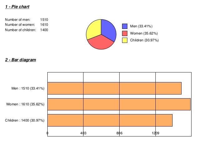
data = {'Men':1510, 'Women':1610, 'Children':1400}
#Pie chart
pdf.set_font('Helvetica', 'BIU', 12)
pdf.cell(0, 5, '1 - Pie chart', 0, 1)
pdf.ln(8)
pdf.set_font('Helvetica', '', 10)
valX = pdf.get_x()
valY = pdf.get_y()
pdf.cell(30, 5, 'Number of men:')
pdf.cell(15, 5, str(data['Men']), 0, 0, 'R')
pdf.ln()
pdf.cell(30, 5, 'Number of women:')
pdf.cell(15, 5, str(data['Women']), 0, 0, 'R')
pdf.ln()
pdf.cell(30, 5, 'Number of children:')
pdf.cell(15, 5, str(data['Children']), 0, 0, 'R')
pdf.ln()
pdf.ln(8)
pdf.set_xy(90, valY)
col1=(100,100,255)
col2=(255,100,100)
col3=(255,255,100)
pdf.pie_chart(100, 35, data, '%l (%p)', (col1,col2,col3))
pdf.set_xy(valX, valY + 40)
#Bar diagram
pdf.set_font('Helvetica', 'BIU', 12)
pdf.cell(0, 5, '2 - Bar diagram', 0, 1)
pdf.ln(8)
valX = pdf.get_x()
valY = pdf.get_y()
pdf.bar_diagram(190, 70, data, '%l : %v (%p)', (255,175,100))
pdf.set_xy(valX, valY + 80)
pdf.output('demo.pdf')