This project is part of the @thi.ng/umbrella monorepo.
- About
- Installation
- Dependencies
- Usage examples
- API
- How it works
- SVG conversion
- Supported shape types
- Attributes
- Authors
- License
Declarative canvas scenegraph & visualization for @thi.ng/hdom.
This package provides a re-usable canvas component, which accepts child nodes defining a scene tree of different shape types in standard @thi.ng/hiccup syntax/format (i.e. nested arrays) and then translates these into canvas API draw calls during the hdom update process / cycle.
STABLE - used in production
- @thi.ng/geom - Functional, polymorphic API for 2D geometry types & SVG generation
- @thi.ng/hdom - Lightweight vanilla ES6 UI component trees with customizable branch-local behaviors
- @thi.ng/hiccup-svg - SVG element functions for @thi.ng/hiccup & @thi.ng/hdom
yarn add @thi.ng/hdom-canvasPackage sizes (gzipped): ESM: 3.2KB / CJS: 3.3KB / UMD: 3.3KB
Several demos in this repo's /examples directory are using this package.
A selection:
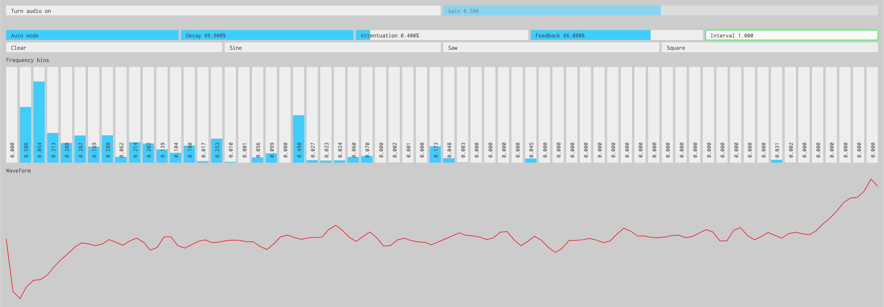
Interactive inverse FFT toy synth
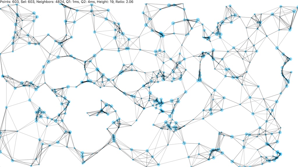
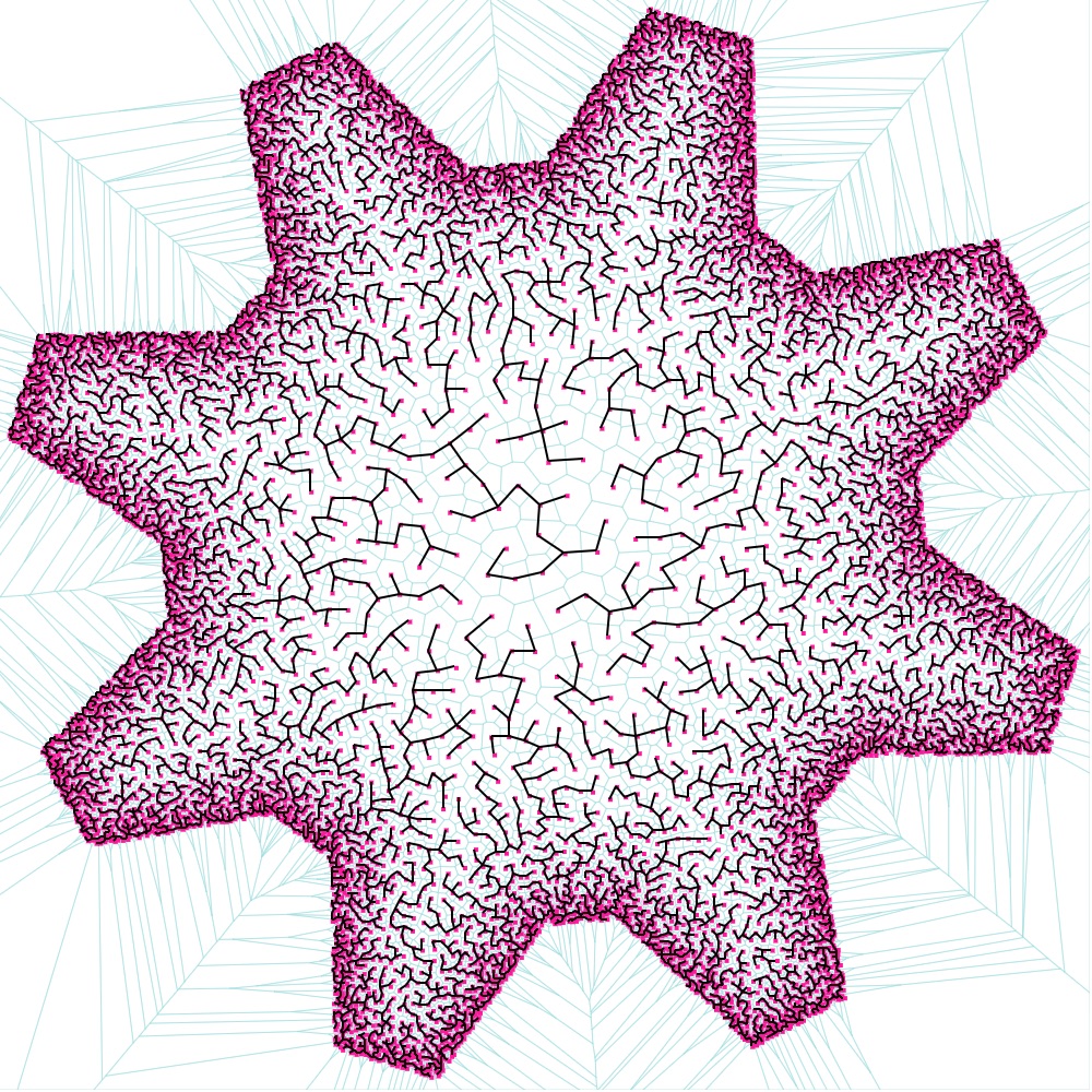
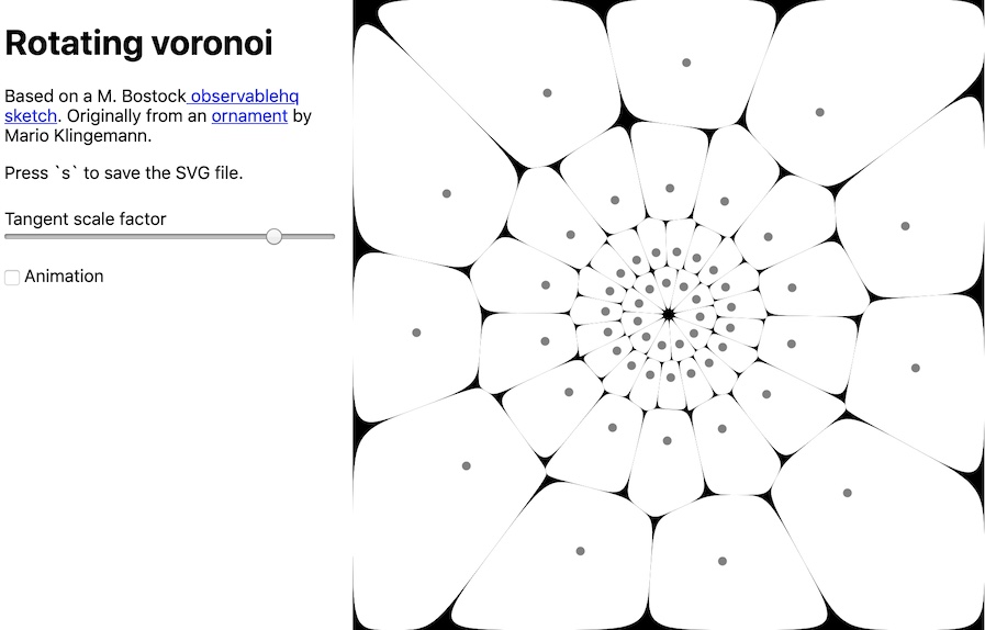
Poisson-disk shape-aware sampling, Voronoi & Minimum Spanning Tree visualization
Realtime clock demo for @thi.ng/hdom-canvas
Interactive @thi.ng/hdom-canvas pattern drawing demo using transducers
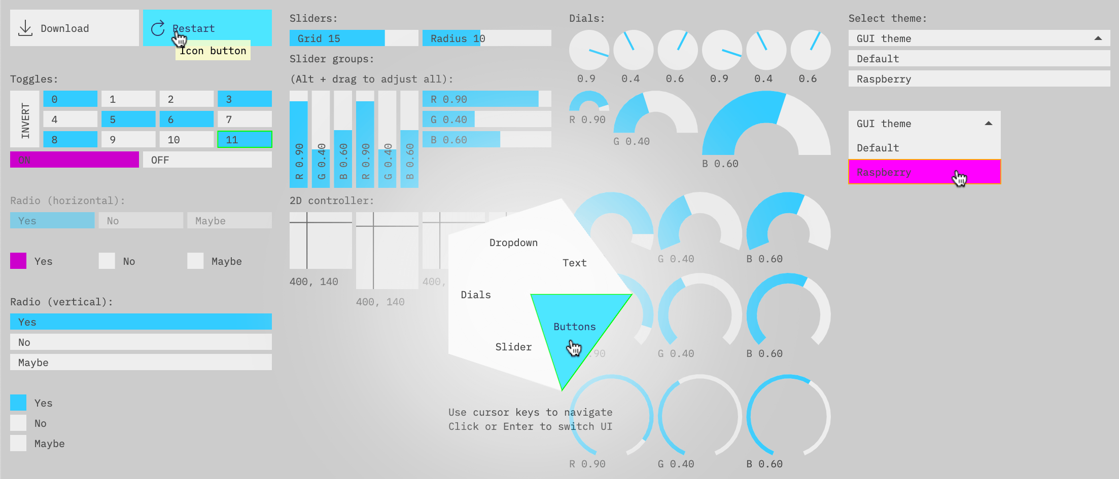
Canvas based Immediate Mode GUI components
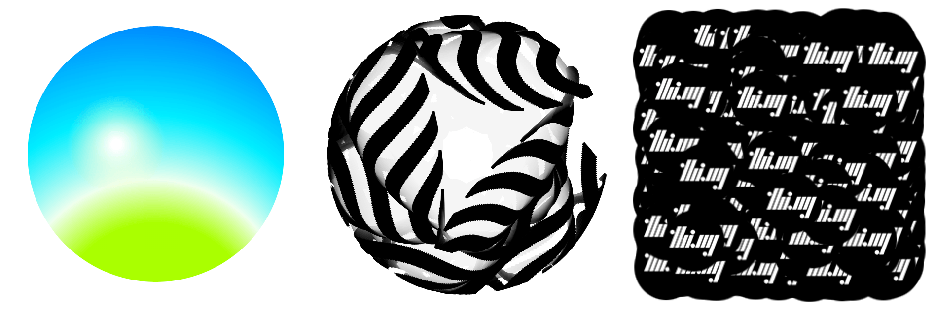
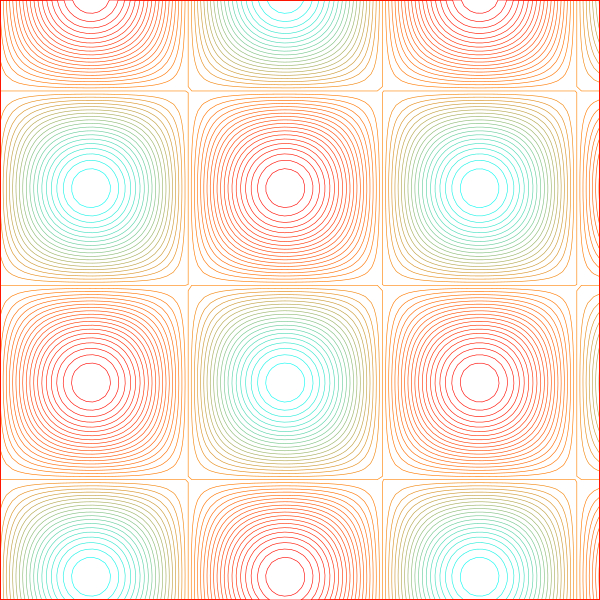
Animated sine plasma effect visualized using contour lines
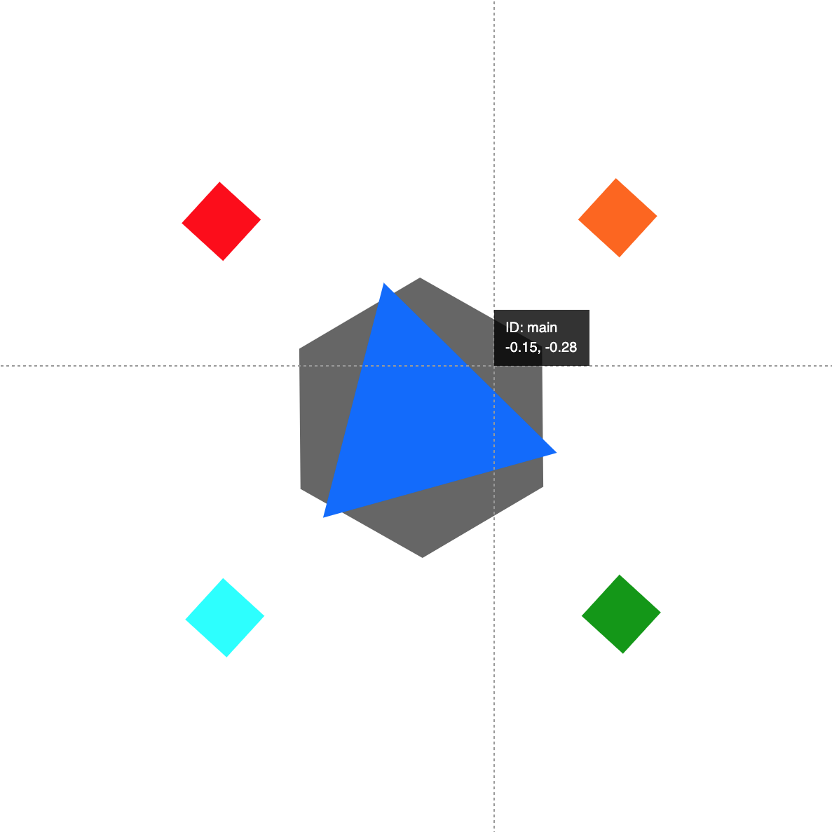
Basic @thi.ng/rstream-gestures multi-touch demo
Unison wavetable synth with waveform editor
import { start } from "@thi.ng/hdom";
import { canvas } from "@thi.ng/hdom-canvas";

start(() => {
    const t = Date.now() * 0.001;
    return [canvas, { width: 100, height: 100 },
        ["circle", { fill: "red", stroke: "black" }, [50, 50], 25 + 25 * Math.sin(t)]
    ];
});
Usage with @thi.ng/geom shape primitives:
import { start } from "@thi.ng/hdom";
import { canvas } from "@thi.ng/hdom-canvas";
import * as g from "@thi.ng/geom";

start(() => {
    const t = Date.now() * 0.001;
    return [canvas, { width: 100, height: 100 },
        g.group(
            [
                g.withAttribs(
                    g.asPolygon(g.circle(50), 6),
                    { rotate: t % Math.PI, stroke: "red" }
                ),
                g.star(25 + 25 * Math.sin(t), 6, [0.5, 1], { stroke: "blue" }),
            ],
            { translate: [50, 50], fill: "none" }
        )
    ];
});The package provides a canvas component which uses the branch-local
behavior implementation feature of
@thi.ng/hdom
v5.0.0 to support virtual SVG-like shape elements / components. These
are defined as part of the main UI component tree just like any other
component, but are then translated into canvas API draw commands during
the hdom update process. Any embedded shape component functions receive
the user context object as first arg, just like normal hdom components.
Shape components are expressed in standard hiccup syntax (or as objects
implementing the IToHiccup() interface, like the shape types provided
by
@thi.ng/geom),
and with the following...
- Shape component objects with life cycle methods are only partially
supported, i.e. only the
render&releasemethods are used. - For performance reasons
releasemethods are disabled by default. If your shape tree contains stateful components which use thereleaselife cycle method, you'll need to explicitly enable the canvas component's__releasecontrol attribute by setting it totrue. - Currently no event listeners can be assigned to shapes (ignored), though this is planned for a future version. The canvas element itself can of course have event handlers as usual.
For best performance it's recommended to ensure all resulting shapes elements are provided in already normalized hiccup format, i.e.
[tag, {attribs}, ...] // or
[tag, null, ...]
That way the __normalize: false control attribute can be added either
to the canvas component itself (or to individual shapes / groups), and
if present, will skip normalization of that element's children.
Likewise, for animated scenes, the __diff control attribute should be
set to false to skip unnecessary diffing and force redraws.
To disable the automatic background clearing of the canvas, set the __clear attribute to false.
[canvas, { width: 100, height: 100, __clear: false }, ...]The canvas component automatically adjusts its size for HDPI displays by
adding CSS width & height properties and pre-scaling the drawing
context accordingly before any shapes are processed. For fullscreen
canvases simply set the width & height attribs to:
[canvas,
    {
        width: window.innerWidth,
        height: window.innerHeight
    },
    // shapes
    ...
]Even though the element names & syntax are very similar to SVG
elements, for performance reasons all geometry data given to each shape
remains un-stringified (only styling attributes are). However, the
@thi.ng/hiccup-svg
package provides a convertTree() function which takes the arguably
more "raw" shape format used by hdom-canvas and converts an entire shape
tree into SVG compatible & serializable format. Note: the tree MUST
first be normalized (if not already) using hdom-canvas'
normalizeTree().
import { serialize } from "@thi.ng/hiccup";
import { convertTree, svg } from "@thi.ng/hiccup-svg";
import { normalizeTree } from "@thi.ng/hdom-canvas";

serialize(
    svg({ width: 100, height: 100},
        convertTree(
            normalizeTree(
                {}, // default normalization options
                ["g",
                    {
                        fill: "red",
                        stroke: "none",
                        translate: [50, 50]
                    },
                    ["circle", {}, [0, 0], 25],
                    ["polygon", { fill: "white" },
                        [[-10,10],[10,10],[0,-10]]
                    ]
                ]
            )
        )
    )
);<svg version="1.1" xmlns="http://www.w3.org/2000/svg" xmlns:xlink="http://www.w3.org/1999/xlink" width="100" height="100">
<g transform="translate(50.00 50.00)" fill="red" stroke="none">
<circle cx="0.00" cy="0.00" r="25.00"/>
<polygon points="-10.00,10.00 10.00,10.00 0.00,-10.00" fill="white"/>
</g>
</svg>In the near future, factory functions for these shape types will be provided...
["g", attribs, child1, child2, ...]Attributes defined at group level are inherited by child elements.
["defs", {}, def1, def2, ...]Special group / container for gradient definitions. If used, should always come first in a scene tree.
["circle", attribs, [x, y], radius]["arc", attribs, [x, y], radius, startAngle, endAngle, anticlockwise?]Only circular arcs are supported in this format. Please see note about differences to SVG.
["ellipse", attribs, [x, y], [rx, ry], axisTheta?, start?, end?, ccw?]["rect", attribs, [x, y], w, h, radius?]If radius is given, creates a rounded rectangle. radius will be
clamped to Math.min(w, h)/2.
["line", attribs, [x1, y1], [x2, y2]]["hline", attribs, y]["vline", attribs, x]["polyline", attribs, [[x1, y1], [x2, y2], [x3, y3]...]]Always non-filled (even if fill attrib is given or inherited)
["polygon", attribs, [[x1, y1], [x2, y2], [x3, y3]...]]Always closed, can be filled and/or stroked.
["path", attribs, [seg1, seg2, ...]]Path segments are tuples of [type, [x,y]...]. The following segment
types are supported and (as with SVG), absolute and relative versions
can be used. Relative versions use lowercase letters and are always
relative to the end point of the previous segment. The first segment
(usually of type "M") must be absolute.
| Format | Description |
|---|---|
["M", [x, y]] |
Move |
["L", [x, y]] |
Line |
["H", x] |
Horizontal line |
["V", y] |
Vertical line |
["C", [x1,y1], [x2, y2], [x3, y3]] |
Cubic / bezier curve |
["Q", [x1,y1], [x2, y2]] |
Quadratic curve |
["A", [x1,y1], [x2, y2], r] |
Circular arc (see below) |
["Z"] |
Close (sub)path |
IMPORTANT: Currently, due to differences between SVG and canvas API arc handling, SVG paths containing arc segments are NOT compatible with the above format. This issue is being worked on, but in the meantime, to use such paths, these should first be converted to use cubics or polygon / polyline. E.g. here using @thi.ng/geom:
import { normalizedPath, pathFromSVG, asPolyline } from "@thi.ng/geom";

// path w/ arc segments (*not* usable by hdom-canvas)
const a = pathFromSvg("M0,0H80A20,20,0,0,1,100,20V30A20,20,0,0,1,80,50")[0];

// normalized to only use cubic curves (usable by hdom-canvas)
const b = normalizedPath(a);

// converted to polyline (usable by hdom-canvas)
const c = asPolyline(a);

asSvg(b);
// <path d="M0.00,0.00C26.67,0.00,53.33,0.00,80.00,0.00C..."/>

asSvg(c);
// <polyline fill="none" points="0.00,0.00 80.00,0.00 81.57,0.06..."/>["points", attribs, [[x1,y1], [x2,y2],...]]The following shape specific attributes are used:
shape:circleorrect(default)size: point size (radius for circles, width for rects) - default: 1
Similar to points, but uses a single packed buffer for all point
coordinates.
["packedPoints", attribs, [x1,y1, x2,y2,...]]Optional start index, number of points, component & point stride lengths (number of indices between each vector component and each point respectively) can be given as attributes.
Defaults:
- start index: 0
- number of points: (array_length - start) / estride
- component stride: 1
- element stride: 2
["packedPoints", { cstride: 1, estride: 4 },
    [x1, y1, 0, 0, x2, y2, 0, 0, ...]]

["packedPoints", { offset: 8, num: 3, cstride: 4, estride: 1 },
[0, 0, 0, 0, 0, 0, 0, 0, x1, x2, x3, 0, y1, y2, y3, 0...]]["text", attribs, [x,y], "body...", maxWidth?]["img", { width?, height? }, img, dpos, spos?, ssize?]IMPORTANT: Since v2.0.0 this element has new/changed args...
img MUST be an HTML image, canvas or video element. dpos, spos,
ssize are 2D vectors. The latter two are optional, as are width and height attribs. Defaults:
width- original image widthheight- original image heightspos-[0,0]ssize-[width, height]
Note: For SVG conversion spos & ssize will be ignored. Sub-image
blitting is not supported in SVG.
Gradients MUST be defined within a root-level defs group, which itself
MUST be given prior to any other shapes. Use the $ prefix to refer to
a gradient in a fill or stroke attribute, e.g. {stroke: "$foo" }
["linearGradient",
    {id: "foo", from: [x1,y1], to: [x2, y2]},
    [[offset1, color1], [offset2, color2], ...]
]["radialGradient",
{id: "foo", from: [x1,y1], to: [x2, y2], r1: r1, r2: r2 },
[[offset1, color1], [offset2, color2], ...]
]Some attributes use different names than their actual names in the
CanvasRenderingContext2D:
| Attribute | Context 2D property |
|---|---|
| align | textAlign |
| alpha | globalAlpha |
| baseline | textBaseline |
| compose | globalCompositeOperation |
| dash | setLineDash |
| dashOffset | lineDashOffset |
| direction | direction |
| fill | fillStyle |
| filter | filter |
| font | font |
| lineCap | lineCap |
| lineJoin | lineJoin |
| miterLimit | miterLimit |
| shadowBlur | shadowBlur |
| shadowColor | shadowColor |
| shadowX | shadowOffsetX |
| shadowY | shadowOffsetY |
| smooth | imageSmoothingEnabled |
| stroke | strokeStyle |
| weight | lineWidth |
Color conversions are only applied to fill, stroke, shadowColor
attributes and color stops provided to gradient definitions.
String color attribs prefixed with $ are replaced with url(#...)
refs (e.g. to refer to gradients), else used as is (untransformed)
Interpreted as ARGB hex value:
{ fill: 0xffaabbcc } => { fill: "#aabbcc" }
Interpreted as float RGB(A):
{ fill: [1, 0.8, 0.6, 0.4] } => { fill: "rgba(255,204,153,0.40)" }
Colors defined via the @thi.ng/color package can be automatically converted to CSS color strings:
{ fill: hcya(0.1666, 1, 0.8859) } => { fill: "#ffff00" }
Coordinate system transformations can be achieved via the following attributes (for groups and individual shapes). Nested transformations are supported.
If using a combination of translate, scale and/or rotate attribs,
the order of application is always TRS.
{ transform: [xx, xy, yx, yy, ox, oy] }{ setTransform: [xx, xy, yx, yy, ox, oy] }Similar to transform but completely overrides transformation matrix,
rather than concatenating with existing one.
See MDN docs for further details.
Also see the 2x3 matrix functions in the @thi.ng/matrices package for creating different kinds of transformation matrices, e.g.
{ transform: skewX23([], Math.PI / 12) }
{ translate: [x, y] }{ scale: [x, y] } // non-uniform
{ scale: x } // uniform{ rotate: theta } // in radians- Karsten Schmidt (@postspectacular)
- Arthur Carabott (@acarabott)
© 2018 - 2020 Karsten Schmidt // Apache Software License 2.0
