This project is part of the @thi.ng/umbrella monorepo and anti-framework.
- About
- Features
- Use cases
- Status
- Related packages
- Installation
- Dependencies
- Usage examples
- API
- Authors
- License
CSS from nested JS data structures. This is a support package for @thi.ng/hiccup.
Following a similar pattern as the @thi.ng/hiccup package, this library generates CSS from plain nested arrays / data structures, functions, iterators.
- Uses JS arrays to define selector scopes
- Uses JS object to define selector properties
- Multiple objects per scope are combined automatically
- Supports nested selectors and computes their cartesian products
- Optional CSS class scoping
- DOM stylesheet injection
- Configurable auto-prefixed properties & vendor prefixes (disabled by default)
- Automatically consumes embedded iterators
- Supports embedded functions, either:
- to define entire selector branches/scopes
- to produce single selector items
- to produce property values
- Quoted functions to support CSS-as-JSON definitions
- Various @-rule function wrappers:
@import@keyframes@media(incl. nested media queries)@namespace@supports
- Attribute selector functions
- Unit formatting wrappers (no conversions yet)
- Customizable formatting (2 defaults for compact & pretty printing)
- Same as LESS / SASS etc., but enables full use of ES6 to define style rules
- CSS framework & theme generators
- Dynamic CSS generation for components
The overall approach of using S-expressions was inspired by these Clojure projects:
STABLE - used in production
Search or submit any issues for this package
- @thi.ng/hiccup-html - 100+ type-checked HTML5 element functions for @thi.ng/hiccup related infrastructure
- @thi.ng/hiccup-svg - SVG element functions for @thi.ng/hiccup & related tooling
yarn add @thi.ng/hiccup-cssES module import:
<script type="module" src="https://cdn.skypack.dev/@thi.ng/hiccup-css"></script>For Node.js REPL:
const hiccupCss = await import("@thi.ng/hiccup-css");Package sizes (brotli'd, pre-treeshake): ESM: 2.08 KB
Several demos in this repo's /examples directory are using this package.
A selection:
| Screenshot | Description | Live demo | Source |
|---|---|---|---|
 |
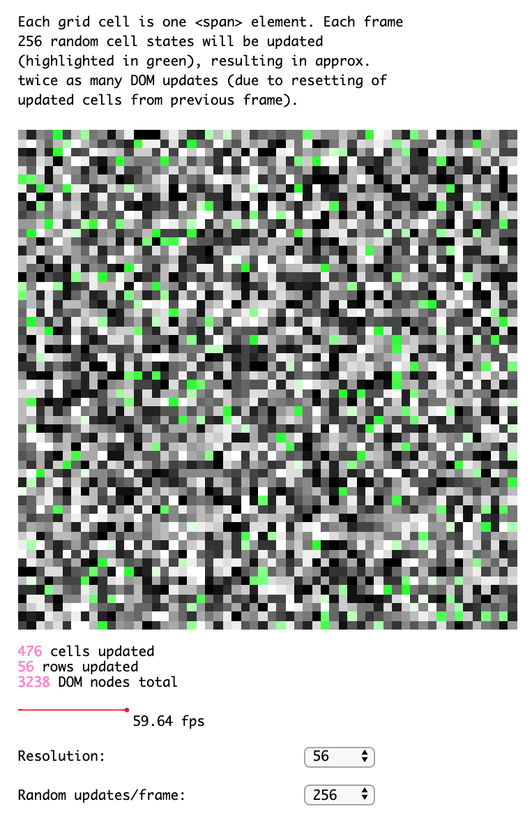
hdom update performance benchmark w/ config options | Demo | Source |
 |
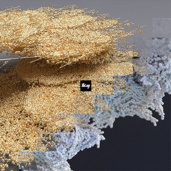
Generating pure CSS image transitions | Demo | Source |
import * as css from "@thi.ng/hiccup-css";Signature: css(rules: any, opts?: CSSOpts): string
This is the main function exposed by this module. It accepts a JS data
structure (array, object, iterator or function) and returns a CSS
string. The optional opts arg is used to control formatting,
auto-prefixing and other conversion options. See
api.ts
for reference.
By default the generated CSS uses the css.COMPACT format, causing
"minimized" outputs. Pretty printing is supported via the css.PRETTY
format preset, see examples further below.
This feature is only intended for setting an element's .style attrib:
css.css({
    position: "absolute",
    border: 0,
    // function is evaluated during serialization
    top: () => css.percent((Math.random() * 100) | 0),
    // the entire properties object is passed to functions
    left: (props) => css.px(props.border),
    // arrays are joined with `,`
    // nested arrays are joined w/ ` `
    font: [["72px", "ComicSans"], "sans-serif"]
});

// "position:absolute;border:0;top:23%;left:0px;font:72px ComicSans,sans-serif;"css.css(
[
["html", "body", { margin: 0, padding: 0 }],
["div", { "max-width": css.rem(30)}],
["div.title", { color: "red" }]
],
{ format: css.PRETTY }
);html, body {
margin: 0;
padding: 0;
}
div {
max-width: 30rem;
}
div.title {
color: red;
}// re-usable property snippets
const border = { border: "1px solid black" };
const red = { color: "red" };
css.css(
[
["#foo", { background: "white" }, border, red],
["#bar", { background: "yellow", color: "black" }, border]
],
{ format: css.PRETTY }
);#foo {
background: white;
border: 1px solid black;
color: red;
}
#bar {
background: yellow;
color: black;
border: 1px solid black;
}import * as tx from "@thi.ng/transducers";
// single rule generator
// e.g. `[".w25", { width: "25%" }]`
const prop = (id, key) => (x) => [id + x, {[key]: css.percent(x)}];
css.css(
// define iterator to produce a number of width & height css classes
// `juxt` is used to process given percentage values in parallel and produces a tuple
// `mapcat` is used to dissolve the tuple and produce a flat stream of generated rules
// REMEMBER: iterators are lazy and can only be consumed once (not a problem here)
tx.iterator(
tx.mapcat(tx.juxt(prop(".w", "width"), prop(".h", "height"))),
tx.range(25, 101, 25)
),
// supply a scope ID (suffix) for all class names
{ format: css.PRETTY, scope: "_xyz" }
);.w25_xyz {
width: 25%;
}
.h25_xyz {
height: 25%;
}
.w50_xyz {
width: 50%;
}
.h50_xyz {
height: 50%;
}
.w75_xyz {
width: 75%;
}
.h75_xyz {
height: 75%;
}
.w100_xyz {
width: 100%;
}
.h100_xyz {
height: 100%;
}Selector nesting can be easily done via array nesting. Each new nesting level defines a child scope of the current selector. The actual CSS selectors are computed using the cartesian product of any selectors in the current scope and their previously defined parents:
css.css(
    ["header", "footer", { "font-size": css.rem(1.25) },
        ["nav", { background: "#000", color: "#666" },
            ["ul", { "list-style": "none" }],
            ["li", { padding: css.rem(0.5) },
                [css.withAttrib("selected"), { color: "#0cf" }]]]],
    { format: css.PRETTY }
)
header nav ul, footer nav ul {
list-style: none;
}
header nav li[selected], footer nav li[selected] {
color: #0cf;
}
header nav li, footer nav li {
padding: 0.5rem;
}
header nav, footer nav {
background: #000;
color: #666;
}
header, footer {
font-size: 1.25rem;
}Pseudo-classes follow the same pattern as other nested selectors shown above:
css.css(
    ["p", ["a", [":link", {color: "red"}], [":visited", {border: 0}]]],
    { format: css.PRETTY }
);
p a:link {
color:red;
}
p a:visited {
border: 0;
}| hiccup-css selector function | CSS |
|---|---|
withAttrib(id) |
[id] |
attribEq(id, x, caseSensitve?) |
[id=x] |
attribContains(id, x, caseSensitve?) |
[id~=x] |
attribPrefix(id, x, caseSensitve?) |
[id^=x] |
attribSuffix(id, x, caseSensitve?) |
[id$=x] |
attribMatches(id, x, caseSensitve?) |
[id*=x] |
(Currently, only prefixed properties are supported. Auto-prefixing based on property values is planned, but currently low priority.)
css.css(
    ["div", {"border-radius": "4px"}],
    { autoprefix: ["border-radius"], format: css.PRETTY }
);
div {
-moz-border-radius: 4px;
-ms-border-radius: 4px;
-o-border-radius: 4px;
-webkit-border-radius: 4px;
border-radius: 4px;
}Media queries (optionally nested) are supported via the at_media() and
at_supports() functions, both taking an object (or string) of
conditionals and a body which will be based to css().
The key-value pairs of the conditional object are interpreted as follows
and ALWAYS combined using and:
| Key/Value pair | Result |
|---|---|
"min-width": "10rem" |
(min-width: 10rem) |
print: true |
print |
print: false |
not print |
print: "only" |
only print |
css.css(
    css.at_media(
        { screen: true, "min-width": css.rem(10) },
        [
            [".col", { width: css.percent(50)}],
            [
                css.at_media(
                    { "min-width": "20rem" },
                    [".col", { padding: css.rem(1) }]
                )
            ]
        ]
    ),
    { format: css.PRETTY }
);
@media screen and (min-width:10rem) {
.col {
width: 50%;
}
@media (min-width:20rem) {
.col {
padding: 1rem;
}
}
}css.css(
css.at_keyframes("fadein", { opacity: 0 }, { opacity: 1 }),
{ format: css.PRETTY }
);@keyframes fadein {
0% {
opacity: 0;
}
100% {
opacity: 1;
}
}css.css(
css.at_keyframes(
"fadein",
{
0: {
color: "red"
},
50: {
color: "green"
},
100: {
color: "blue"
}
}
),
{ format: css.PRETTY }
);@keyframes fadein {
0% {
color: red;
}
50% {
color: green;
}
100% {
color: blue;
}
}Animations can be defined via the animation() function and define new
@keyframes with given id and related class of same name to configure
given animation opts. Only the durationoption is given a default
value (250ms), all others are optional.
css(
animation(
"delayed-fade-in",
{ delay: "0.5s" },
{ opacity: 0 },
{ opacity: 1 }
)
);Results in:
@keyframes delayed-fade-in {
0% {
opacity: 0;
}
100% {
opacity: 1;
}
}
.delayed-fade-in {
animation-duration: 250ms;
animation-name: delayed-fade-in;
animation-delay: 0.5s;
}CSS strings can be installed into the DOM <head> element via injectStyleSheet():
css.injectStyleSheet(
css.css([
"body", { background: "#000", color: "#fff" }
])
);Functions are handled differently based on their position in the rule tree. Also see the section on Quoted functions below...
If a function is given as arg to css() or is in the head position
(first element) of a rule scope, the function is expected to produce
output directly and is called with an empty result accumulator array and
the CSSOpts object passed to css(). This form is mainly used by the
various at_*() functions provided (e.g. at_media() example above).
css.css(at_import("foo.css", "screen"));
// "@import url(foo.css) screen;"The following example illustrates the head position placement, using the
comment() function to emit CSS comments.
css.css([
// comments are usually omitted with the default format (css.COMPACT)
// pass `true` as 2nd arg to force inclusion
css.comment("generated, please don't edit", true),
["div", { margin: 0 }]
]);
// "/*generated, don't edit*/div{margin:0;}"If a function is located anywhere else in a rule scope array (2nd index or later), it will be called without arguments and the return value used in its place. Any returned functions will be eval'd recursively in the same manner.
One of this project's use cases is to support stylesheets defined as JSON. Since functions cannot be used there, an optional mechanism to map strings to functions is provided:
["function-name", ...args]
The quoted function name is looked up in a dictionary and if found,
called with all remaining elements in the same array. I.e. ["@import", "foo.css"] will be the same result as at_import("foo.css").
IMPORTANT: Quoted functions are only supported in the head position of a scope.
const styles = [
["@comment", " CSS from JSON"],
["@import", "print.css", "print"],
["@media",
{ "screen": true, "min-width": "10em" },
["div", { "font-size": "80%" }]
],
["@keyframes", "fadein", { "opacity": 0}, { "opacity": 1 }]
];
css.css(styles, { format: css.PRETTY, fns: css.QUOTED_FNS });
// btw. QUOTED_FNS is simply:
const QUOTED_FNS = {
"@comment": comment,
"@import": at_import,
"@keyframes": at_keyframes,
"@media": at_media,
"@namespace": at_namespace,
"@supports": at_supports,
}/*
CSS from JSON
*/
@import url(print.css) print;
@media screen and (min-width:10em) {
div {
font-size: 80%;
}
}
@keyframes fadein {

    0% {
        opacity: 0;
    }

    100% {
        opacity: 1;
    }

}If this project contributes to an academic publication, please cite it as:
@misc{thing-hiccup-css,
  title = "@thi.ng/hiccup-css",
  author = "Karsten Schmidt",
  note = "https://thi.ng/hiccup-css",
  year = 2016
}© 2016 - 2023 Karsten Schmidt // Apache License 2.0