. 2013 Apr 18;38(4):831-44.
doi: 10.1016/j.immuni.2012.12.008.

Systems scale interactive exploration reveals quantitative and qualitative differences in response to influenza and pneumococcal vaccines

Affiliations

Systems scale interactive exploration reveals quantitative and qualitative differences in response to influenza and pneumococcal vaccines

Gerlinde Obermoser et al. Immunity. .

Abstract

Systems immunology approaches were employed to investigate innate and adaptive immune responses to influenza and pneumococcal vaccines. These two non-live vaccines show different magnitudes of transcriptional responses at different time points after vaccination. Software solutions were developed to explore correlates of vaccine efficacy measured as antibody titers at day 28. These enabled a further dissection of transcriptional responses. Thus, the innate response, measured within hours in the peripheral blood, was dominated by an interferon transcriptional signature after influenza vaccination and by an inflammation signature after pneumococcal vaccination. Day 7 plasmablast responses induced by both vaccines was more pronounced after pneumococcal vaccination. Together, these results suggest that comparing global immune responses elicited by different vaccines will be critical to our understanding of the immune mechanisms underpinning successful vaccination.


Figures

Figure 1
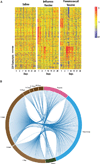
Figure 1. Blood Transcriptional Profiles of Vaccinated Subjects
(A) Patterns of changes in transcript abundance are shown on a heatmap for a robust set of 239 transcripts using an FDR of 0.10 and fold change >2). For each subject, data are normalized to the average of the two baseline time points. Red represents relative increase in abundance, blue represents relative decrease, and yellow represents no change. (B) Lists of genes differentially expressed in response to each treatment for all time points or at each time point for all treatments are represented as segments on a circle. The length of the segments is proportional to the number of genes in each list. A link between two segments on this circular plot indicates an overlap between two gene lists between treatments (segments on the right) and time points (segments on the left). An interactive supplement is available for this figure that dynamically highlights how shared genes of one segment are distributed across all other segments and displays symbols for the corresponding genes (iFigure 1B: http://www.interactivefigures.com/dm3/circleChart/arcCirclePlot). It also provides the user with the ability to dynamically add a cutoff based on fold-change expression over baseline and to adjust the aspect of the graph. For study design, see Figure S2 and Table S1, Table S2, and Table S5; for comparison of transcriptional profiles across cohorts, see Figure S3.
Figure 2
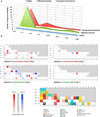
Figure 2. Modular Mapping of the Global Changes in Blood Transcript Abundance Elicited by Vaccination
Changes in transcript abundance measured in blood by using whole-genome arrays were mapped against a preconstructed modular analysis framework. The proportion of transcripts for which abundance was significantly changed in comparison to prevaccination levels was determined for each module. When this proportion exceeded the false discovery rate (set at 10%), the module was considered to be responsive to treatment. (A) The number of responsive modules is plotted on a graph at each time point for all three of the treatment groups. (B) Responsive modules are mapped on a grid for the two vaccine groups at days 1 and 7. The proportion of significant transcripts for each module is represented by a spot of color, with red representing increased abundance and blue representing decreased abundance. The position on the grid indicates the round and order of selection. For instance, the fourth module of the third round of selection (M3.4) is situated in the fourth column, third row. The degree of intensity of the spots denotes the percentage of significant transcripts. A legend is provided with functional interpretations indicated at each position of the grid by a color code. An interactive supplement is available for this figure that provides access to gene level data and extensive functional annotations for each module. The interactive figure also allows users to dynamically adjust the stringency of the analysis (iFigure 2B: http://www.interactivefigures.com/dm3/vaccine-paper/figure-2.gsp).
Figure 3
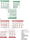
Figure 3. Functional Interpretation of Influenza and Pneumococcal Vaccine Day 1 Sig-natures
Modules specifically responsive to the influenza (A) or pneumococcal (B) vaccines were subjected to pathway analysis. Only the genes within each module for which transcript abundance was significantly changed following vaccination were included in this analysis. Genes with at least one connection (indicating for instance protein-protein interaction or regulation) are represented in this figure. An interactive supplement for this figure provides access to the entire list of genes that constitute each module and to extensive functional annotations (iFigure 3: http://www.interactivefigures.com/dm3/vaccine-paperfigure-3.gsp).
Figure 4
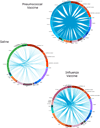
Figure 4. Mapping of the Response to Vaccines In Vivo and the Response to Innate Immune Ligands In Vitro
Lists of genes differentially expressed at nine consecutive time points post vaccine administration or following in vitro treatment of blood for 6 hr with a wide range of innate stimuli are represented as segments of a circle. The lengths of the segments are proportional to the number of genes in each list. A link between two segments on this circular plot indicates an overlap between two gene lists. The degree of connectivity between the various segments on this plot indicates the degree of overlap between in vivo- and in vitro-derived gene lists. An interactive supplement is available for this figure. Overlapping genes are listed when segments are selected. The tension of lines and stringency of the filters (fold change and p value slider) can be adjusted dynamically. For computation of the p value slider, baseline and time point microarray data were used in paired t tests. For each paired in vitro/in vivo gene, the greater p value of the pair is used in the p value filter (iFigure 4: http://www.interactivefigures.com/dm3/vaccine-paper/figure-4.gsp).
Figure 5
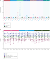
Figure 5. Profiling the Interferon Response within the First 48 hr following Vaccination
(A) Baseline-normalized whole-blood expression levels of genes forming module M1.2 (IFN-inducible gene module) were averaged and plottedonagraph. Values are shown at multiple consecutive time points for the influenza vaccine and saline control groups. For concomitant serum increase of IFN-inducible chemokine CXCL10 (IP-10), see Figure S4. (B) Baseline-normalized expression levels of genes forming module M1.2 were averaged and plotted on a graph. Values are shown for different cell populations isolated from the blood of subjects24 hr postvaccination. Box plots with whiskers indicating minimum and maximum value. An interactive supplement is available for this figure, where detailed sample information is accessible seamlessly for each data point on the graph (iFigure 5: http://www.interactivefigures.com/dm3/vaccine-paper/figure-5.gsp).
Figure 6
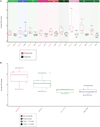
Figure 6. Plasma Cell Precursor Immune Signature
(A) Baseline-normalized whole blood expression levels of genes forming module M4.11 (plasma cell precursors module) were averaged and plotted on a graph. Values are shown at multiple consecutive time points for the influenza vaccine, pneumococcal vaccine and saline control groups. (B) Abundance of plasmablasts measured by multi-parameter flow cytometry is plotted on a graph. Values are shown at multiple consecutive time points for the influenza vaccine, pneumococcal vaccine and saline control groups. Box plots with whiskers indicating minimum and maximum value. An interactive supplement is available for this figure where detailed sample information including dot plots for flow cytometry measurements is seamlessly accessible for each data point on the graph (iFigure 6: http://www.interactivefigures.com/dm3/vaccine-paper/figure-6.gsp).
Figure 7
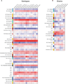
Figure 7. Correlation Patterns of Day 7 Transcriptional Data and Antibody Titers
Correlations between day 7 baseline-normalized averaged modular expression profiles and fold change of day 28 antibody titer over baseline for all available pneumococcal serotypes and influenza vaccine strains are represented on a heatmap. Modules are shown in rows and serotypes in columns. Red indicates strong positive correlation, and blue indicates strong negative correlation. (A) shows pneumococcal vaccine, and (B) shows influenza vaccine (D28/baseline fold change [FC] in virus neutralization [VN] and hemagglutinin [HAI] titers). An interactive supplement is available for this figure that allows users to dynamically filter modules and select additional parameters for correlation (iFigure 7: http://www.interactivefigures.com/dm3/vaccine-paper/figure-7.gsp). Correlations and associated p values were calculated via the Spearman method and can be adjusted by using a slider; Benjamini-Hochberg multiple testing correction is controlled by an on/off toggle. For details on serological response, see also Figure S1 and Table S3 and Table S4.

Comment in

  • From finger pricks to point-and-click.
    Narayanan M, Tsang JS. Narayanan M, et al. Immunity. 2013 Apr 18;38(4):622-4. doi: 10.1016/j.immuni.2013.04.003. Immunity. 2013. PMID: 23601677 Free PMC article.

Similar articles

Cited by

References

    1. Alakulppi N, Seikku P, Jaatinen T, Holmberg C, Laine J. Feasibility of diagnosing subclinical renal allograft rejection in children by whole blood gene expression analysis. Transplantation. 2008;86:1222–1228. - PubMed
    1. Benjamini Y, Hochberg Y. Controlling the False Discovery Rate: A Practical and Powerful Approach to Multiple Testing. J.R. Stat. Soc. 1995;57:289–300.
    1. Bennett L, Palucka AK, Arce E, Cantrell V, Borvak J, Banchereau J, Pascual V. Interferon and granulopoiesis signatures in systemic lupus erythematosus blood. J. Exp. Med. 2003;197:711–723. - PMC - PubMed
    1. Berry MP, Graham CM, McNab FW, Xu Z, Bloch SA, Oni T, Wilkinson KA, Banchereau R, Skinner J, Wilkinson RJ, et al. An interferon-inducible neutrophil-driven blood transcriptional signature in human tuberculosis. Nature. 2010;466:973–977. - PMC - PubMed
    1. Bucasas KL, Franco LM, Shaw CA, Bray MS, Wells JM, Niño D, Arden N, Quarles JM, Couch RB, Belmont JW. Early patterns of gene expression correlate with the humoral immune response to influenza vaccination in humans. J. Infect. Dis. 2011;203:921–929. - PMC - PubMed

Publication types